Your ads will be inserted here by
AdSense Now!.
Please go to the plugin admin page to paste your ad code.
Hello there everybody and welcome to another design tutorial here on HV-Designs! Today you will be learning how to create a clean black and white-themed WordPress layout using some awesome Photoshop effects and tricks. You will end up with elegant design depends only on Black and White colors as main ones, and with a feeling like you draw this theme with a pencil! Using various gradients of both black and white colors as main …. So let’s don’t be late and get started now!
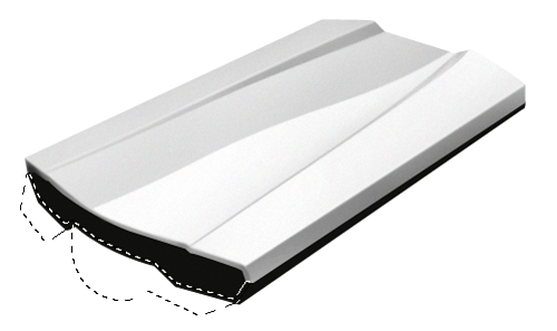
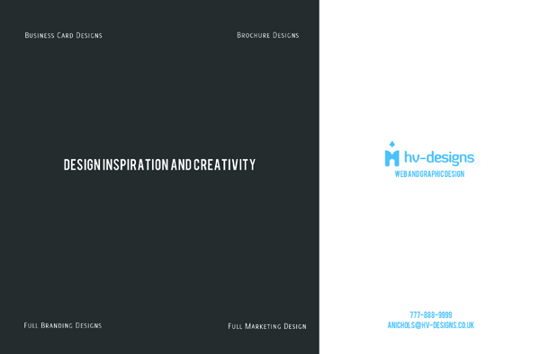
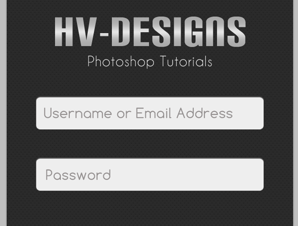
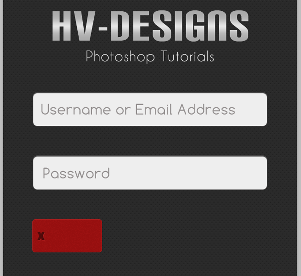
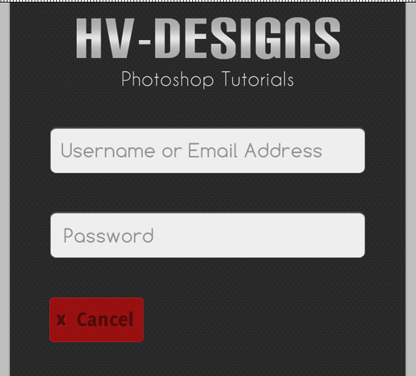
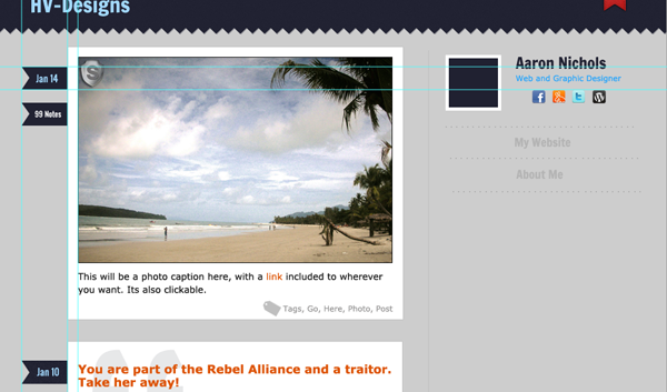
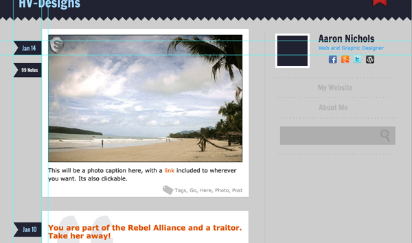
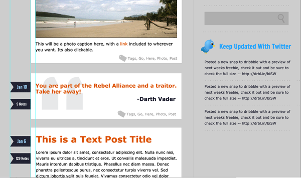
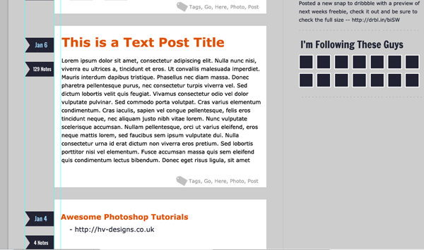
The Final result:


(Click on the image to see the full size)
Tutorial Details
Program: Adobe Photoshop
Version: CS5
Difficulty: Intermediate
Estimated Completion Time: 2.5 Hours
Resources you’ll need:
Ecqlipse 2 (.PNG) by chrfb
Mini Social Icon set by design deck.
Creating the Background and the General Design Look:
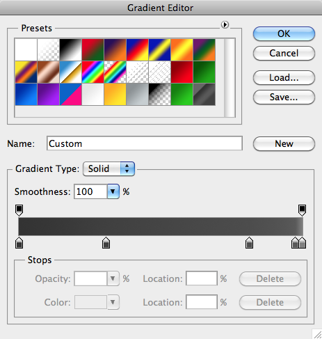
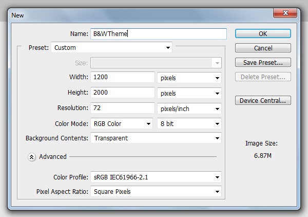
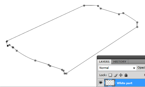
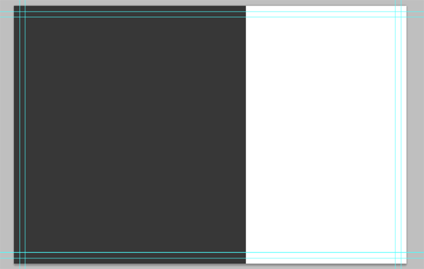
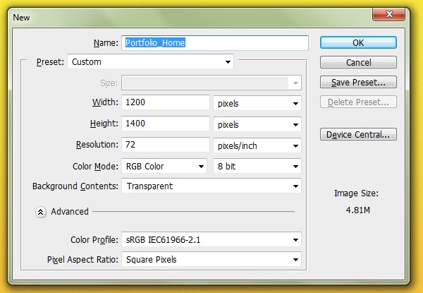
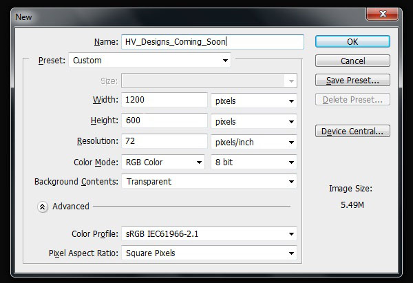
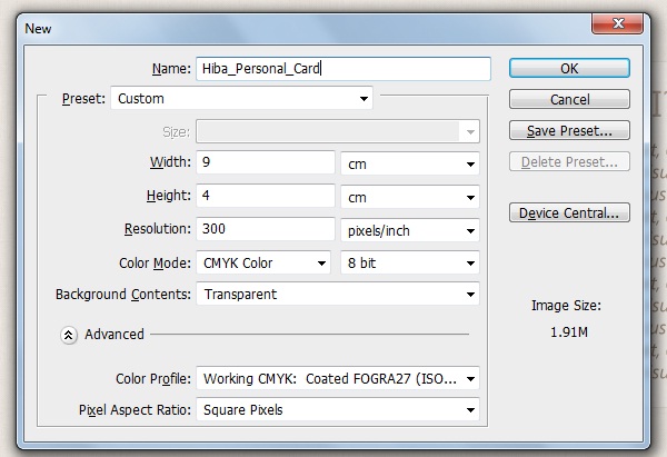
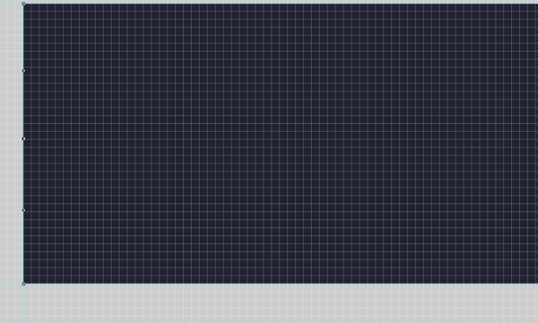
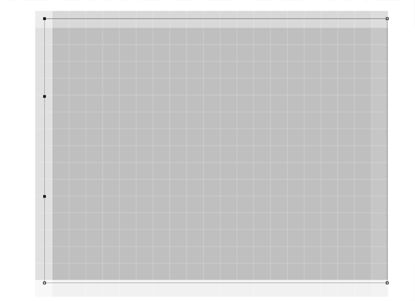
As usual, we’ll create new PS document by going to (File > New) “Ctrl +N”, our new work will be as the following:
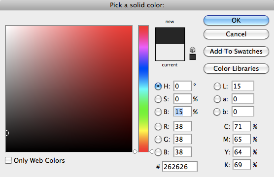
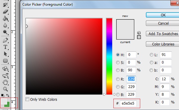
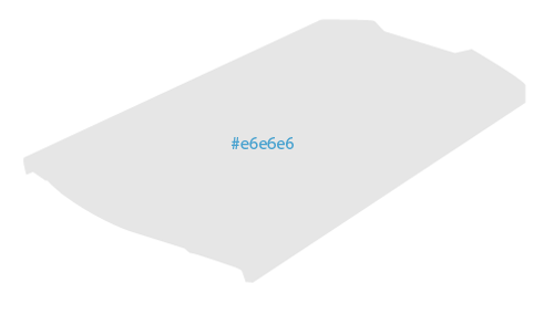
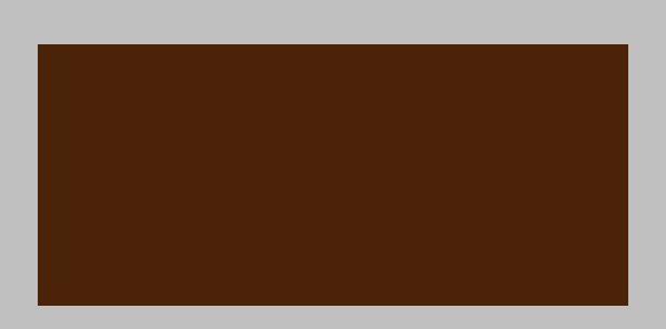
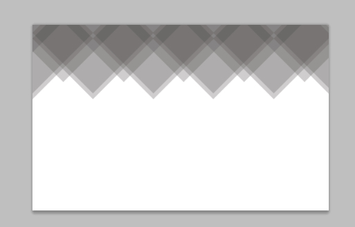
Fill up your background with the color value: #e5e5e5:
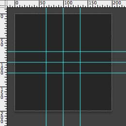
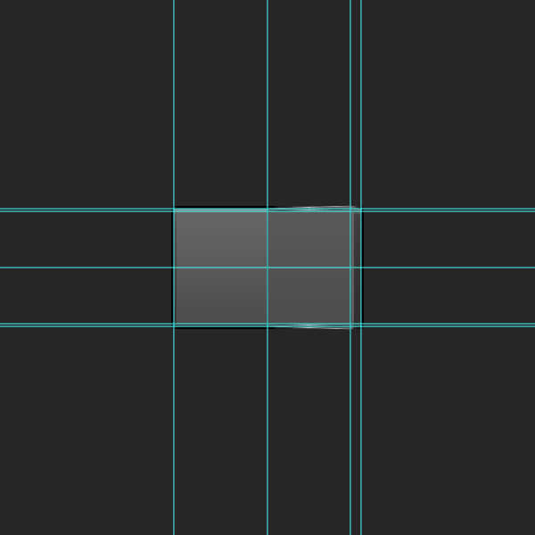
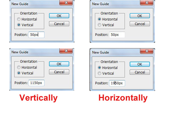
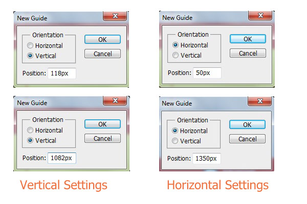
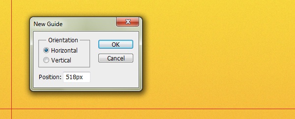
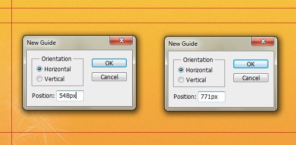
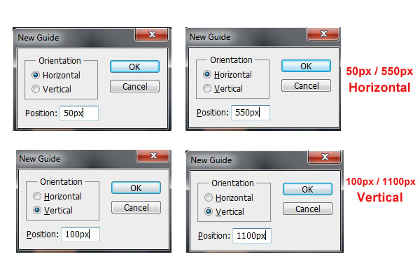
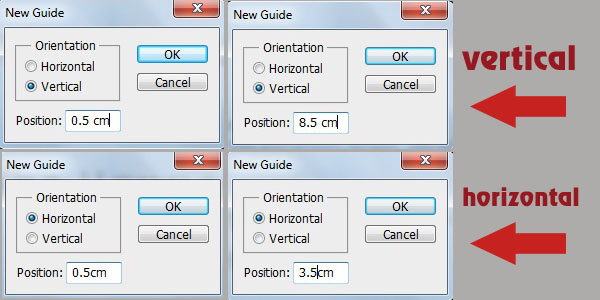
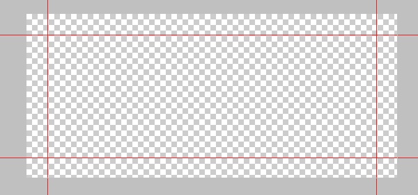
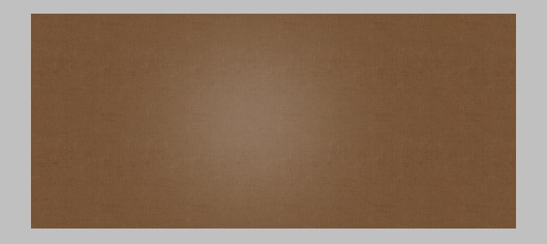
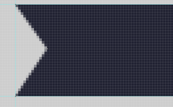
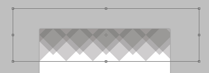
Set the main guidelines as you see below, and notice that we’ll set the rest through the design process (I prefer this way):
Creating the Top Navigation Bar:
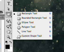
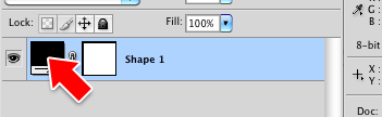
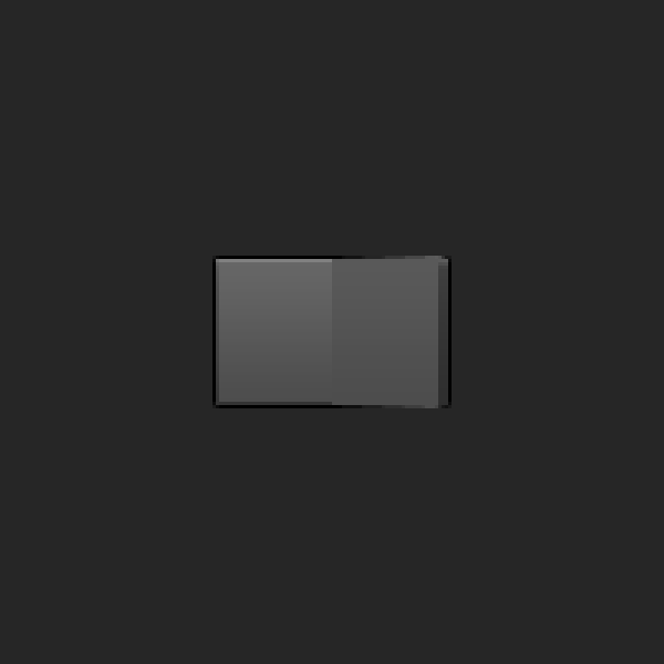
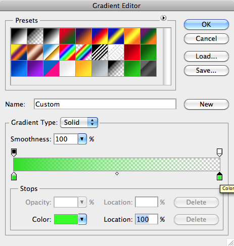
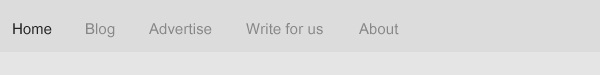
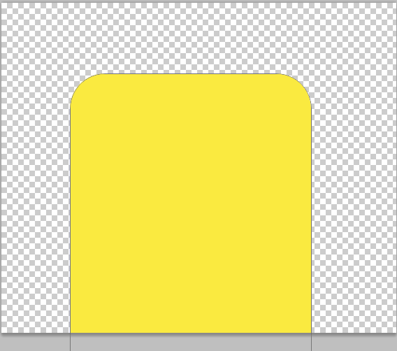
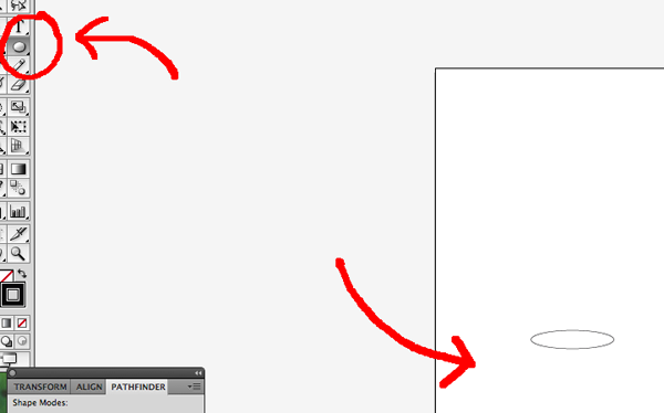
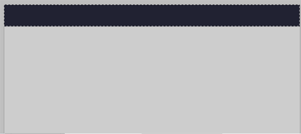
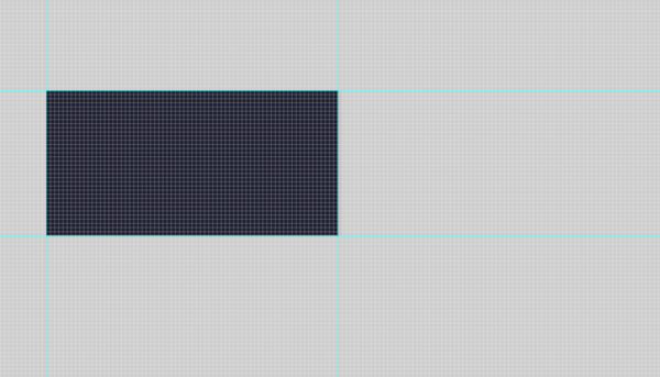
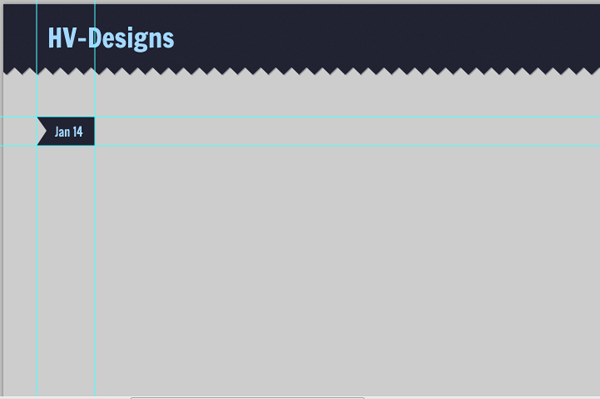
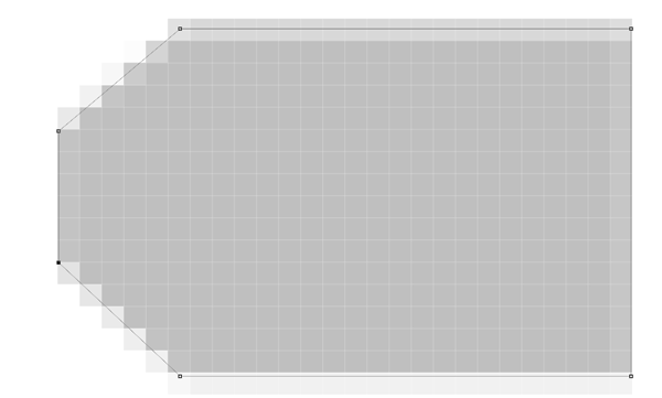
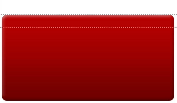
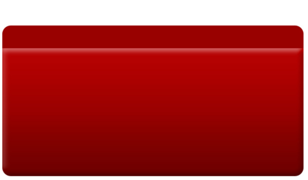
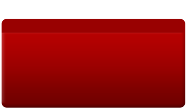
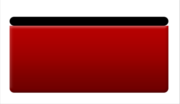
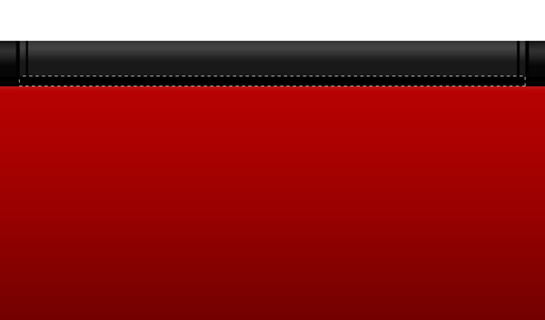
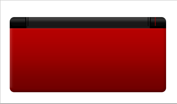
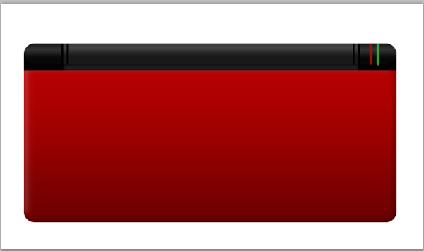
Select the “Rectangle Tool” (U) and set the color value to black #000000, then draw a shape like the one you see below with 58px as height, rasterize the layer and label it “top_bg”. Reduce the opacity of this layer to 4%.

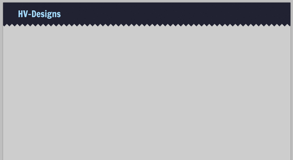
Time to use “Type Tool” (T) and type the pages names, use the following character settings:
Font Family: Utsaah, Size: 5pt, Weight: Regular, Anti-aliasing setting: Smooth, Color: #242424 (for active page) and #878787 (for rest (inactive)), Leading: Auto, Tracking: 5.
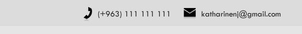
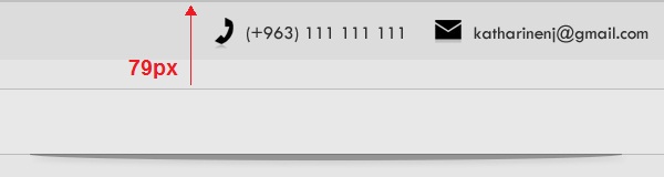
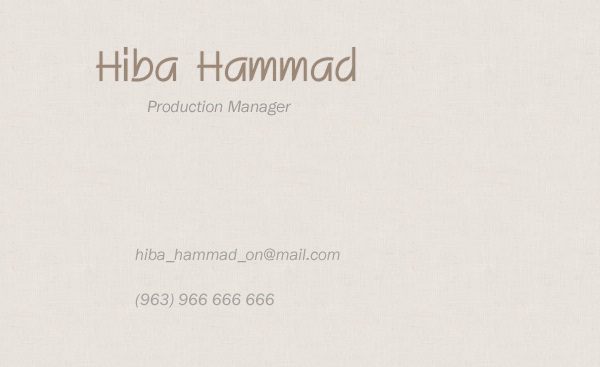
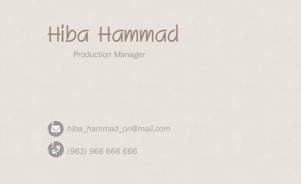
Now, we’ll add email and phone number for quick contact, download the icon set listed above in resources (by chrfb) and add the following phone and email icons to your layout. Then use “Type Tool” with the following character settings to type phone number and email address:
Font Family: Tw Cen MT, Size: 4pt, Weight: Regular, Anti-aliasing setting: Smooth, Color: #2f2f2f, Leading: Auto, Tracking: 5.
Note: Use “Ctrl +T” to get size handles around each icon and control its size.
Creating the Categories Navigation Bar:
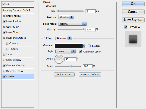
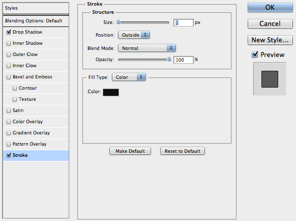
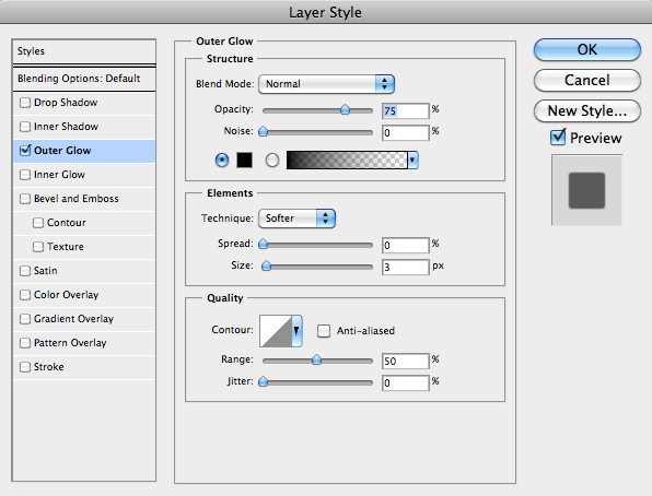
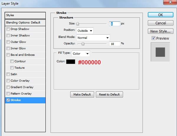
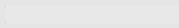
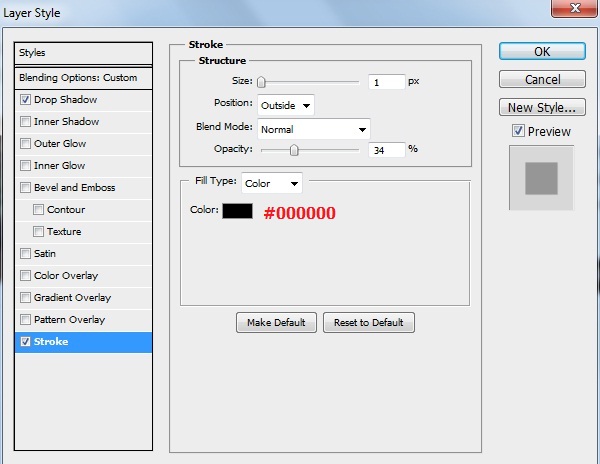
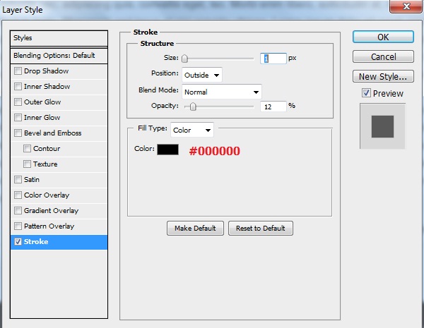
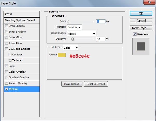
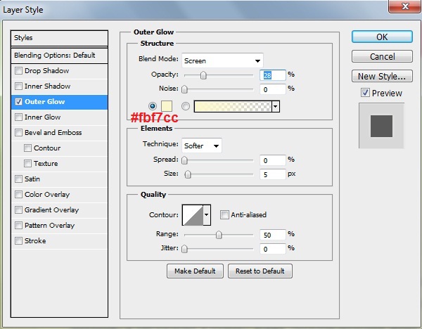
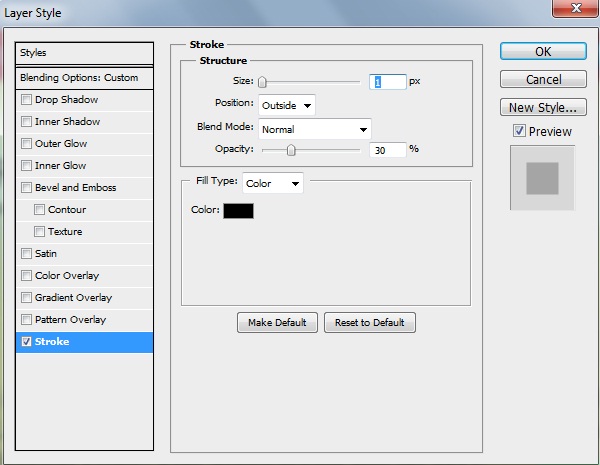
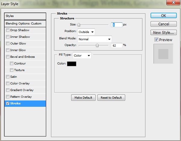
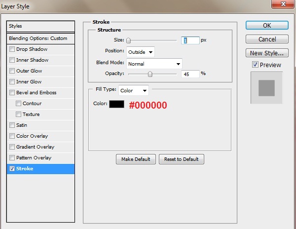
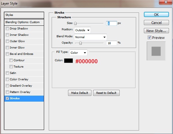
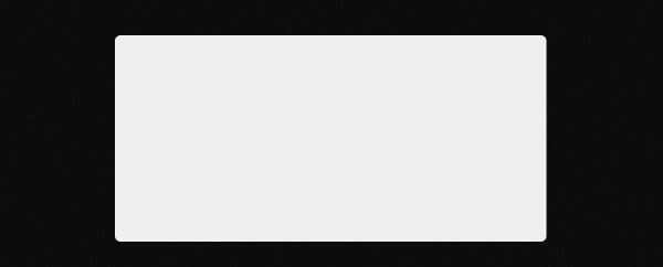
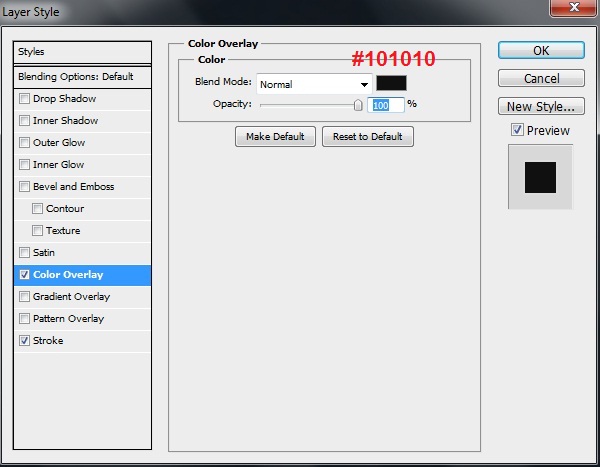
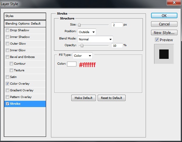
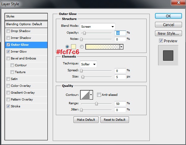
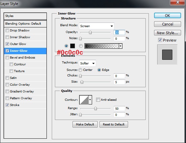
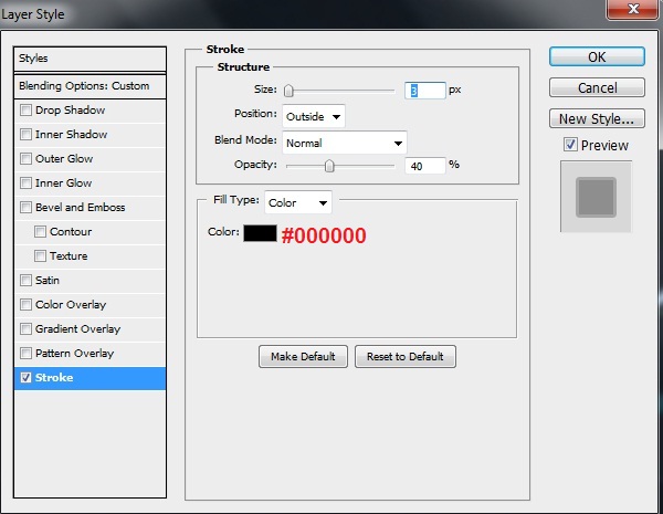
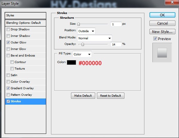
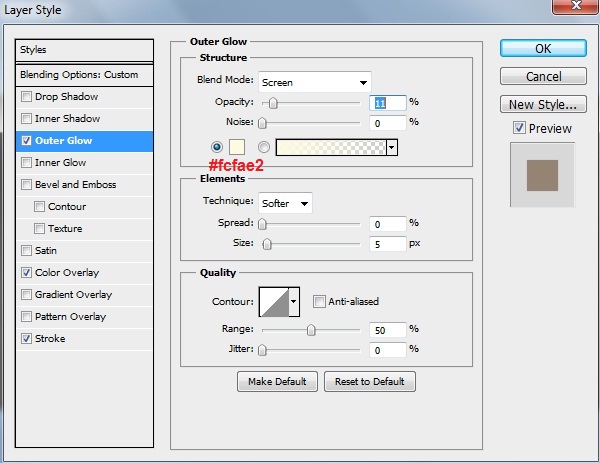
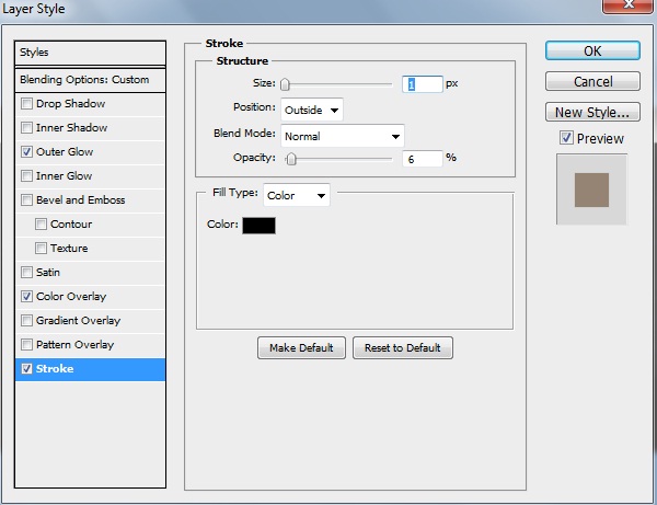
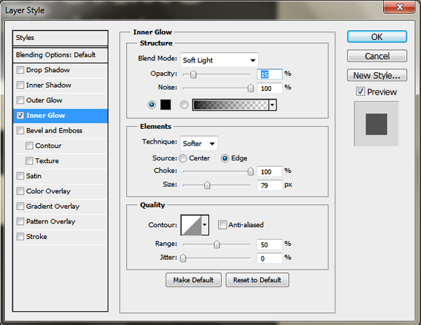
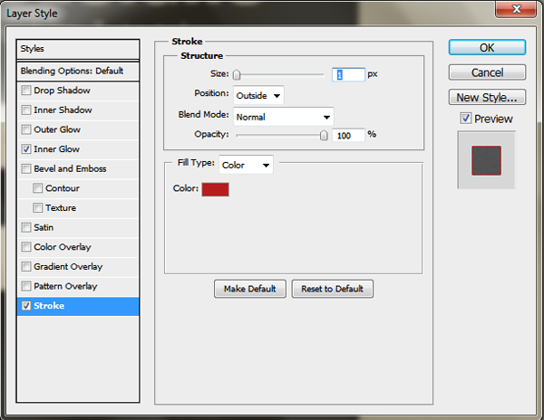
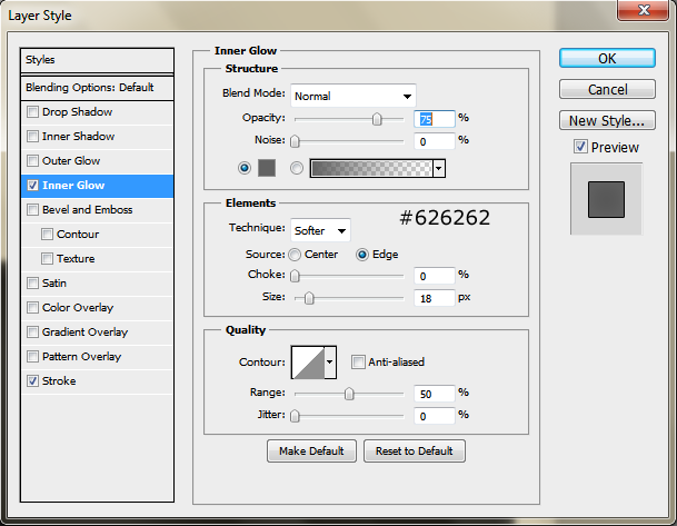
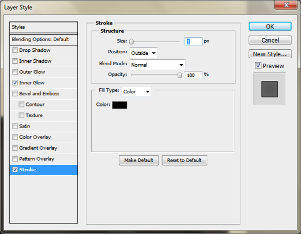
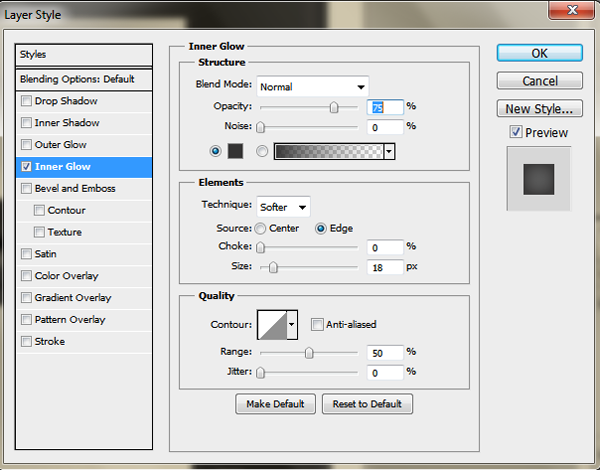
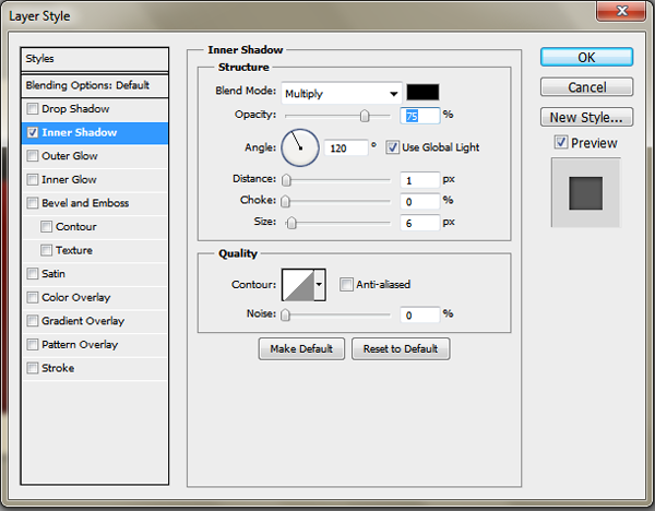
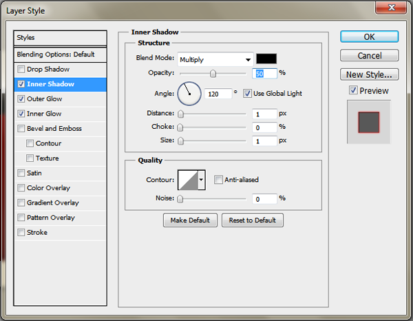
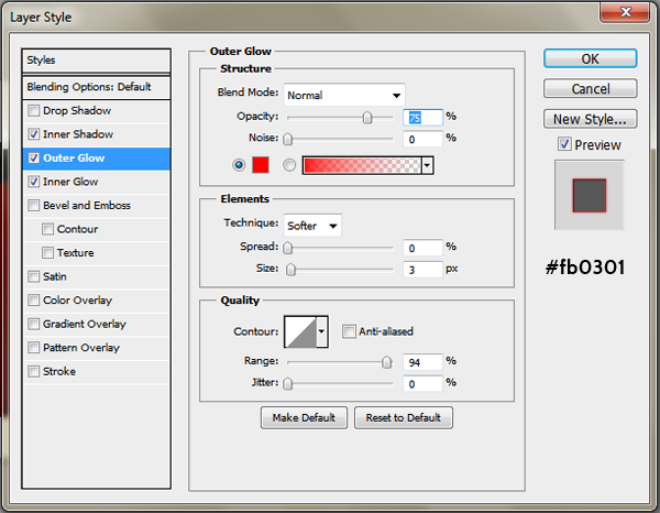
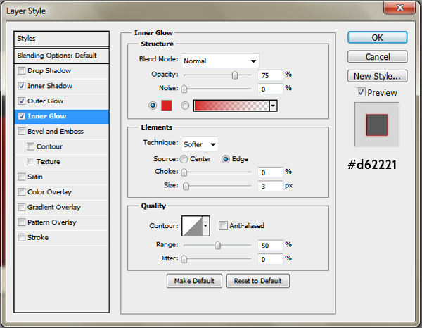
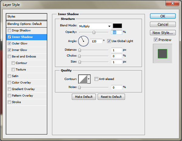
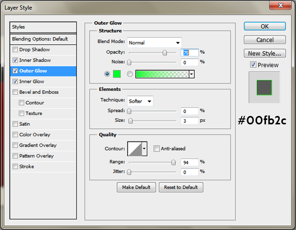
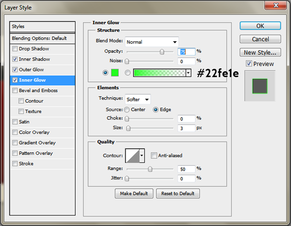
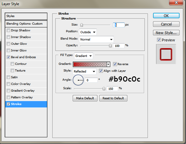
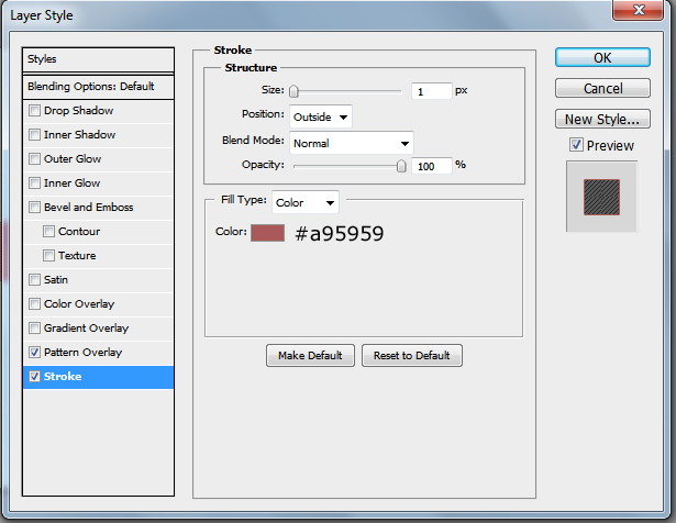
Use the “Rounded Rectangle Tool” (U) with 5px as radius and color: #e8e8e8 to draw a shape starting from maximum right side of your layout. Once finished, rasterize the layer then label it “categories_bg”. Make it with 79px far from top. Now apply the following “Stroke” layer style settings (Layer > Layer Style > Stroke):
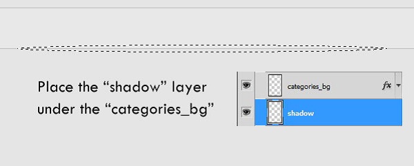
Now, we’ll apply a nice trick to add smooth shadow under the bar, we’ll do that by creating new layer (label it “shadow”) and place it under the “categories_bg “ one then selecting “Elliptical Marquee Tool” (M) and draw a selection like that:
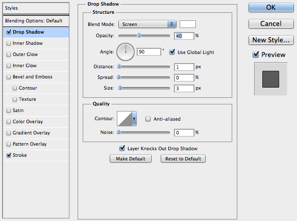
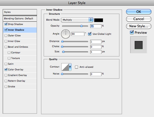
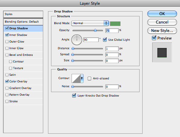
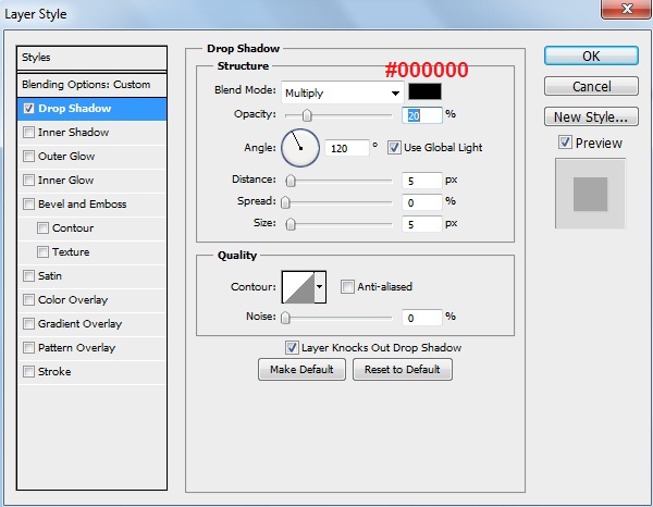
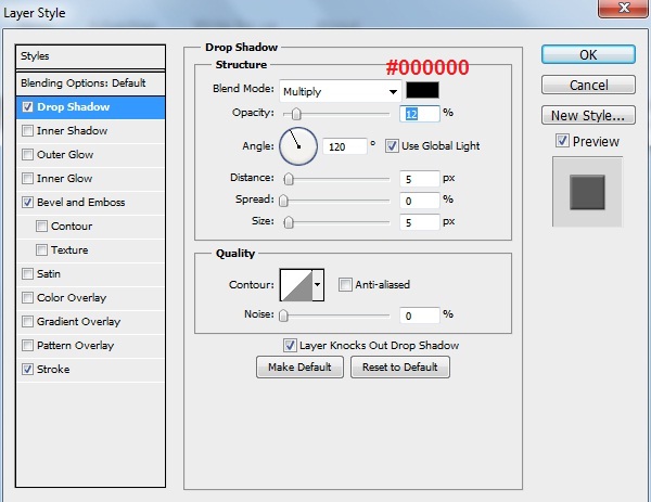
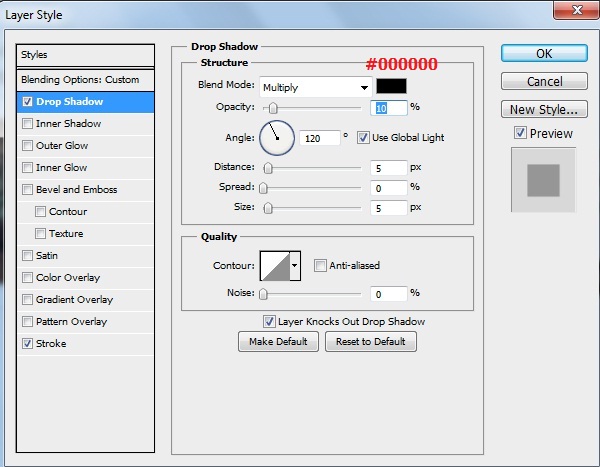
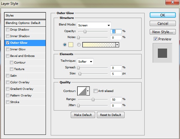
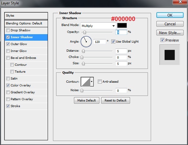
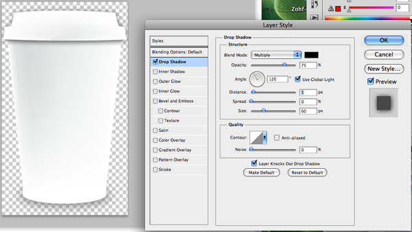
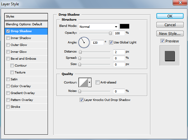
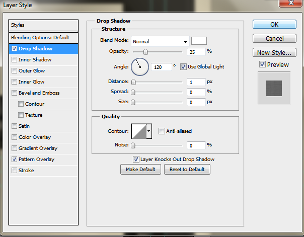
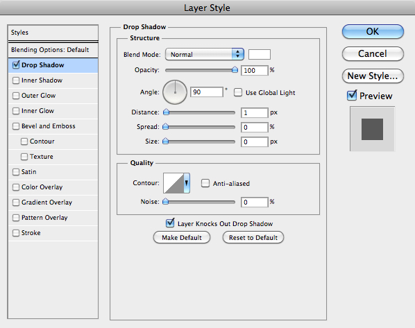
Fill up the “shadow” layer (inside selection) with black color: #000000, reduce the opacity of this layer to 38%, and then apply the following “Drop Shadow” layer style settings:
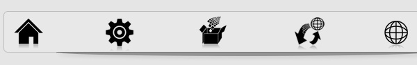
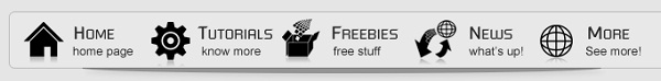
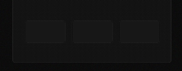
Well … it’s time to add icons and text. You can get the icons from the same icon set listed above (Ecqlipse 2), add them and use “Ctrl +T” to get handles and control the size … you should locate them like that: (and make sure to keep the same distance between the one and the other)
Add titles text by selecting the “Type Tool” (T) using the following character settings:
Font Family: Futured, Size: 4.5pt, Weight: Regular, Anti-aliasing setting: Smooth, Color: #2c2b2b, Leading: Auto, Tracking: 0.
Then, type some short description under each title with the same previous character settings, but you need to reduce the font size to 3%.
Creating Title and Slogan:
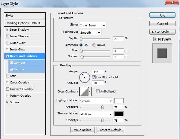
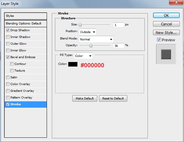
Use the “Type Tool” (T) to type the title “Black and White” using the following character settings:
Font Family: BankGothicic Lt BK, Size: 10pt, Weight: Light, Anti-aliasing setting: Smooth, Leading: Auto, Tracking: 5.

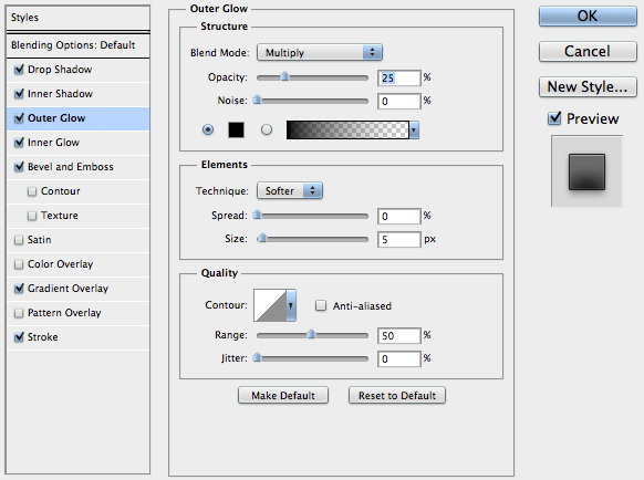
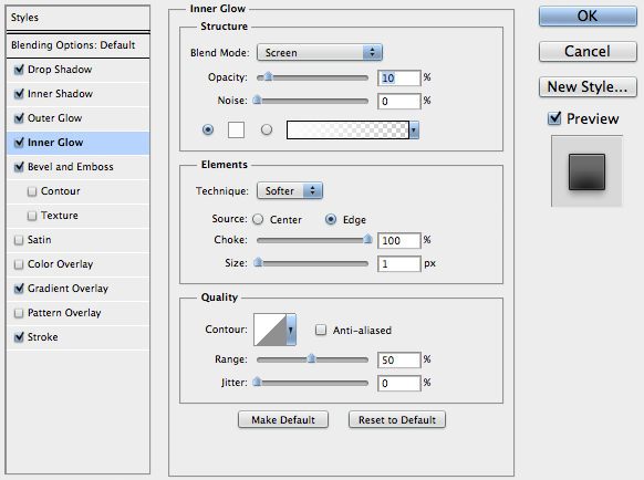
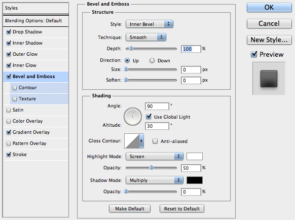
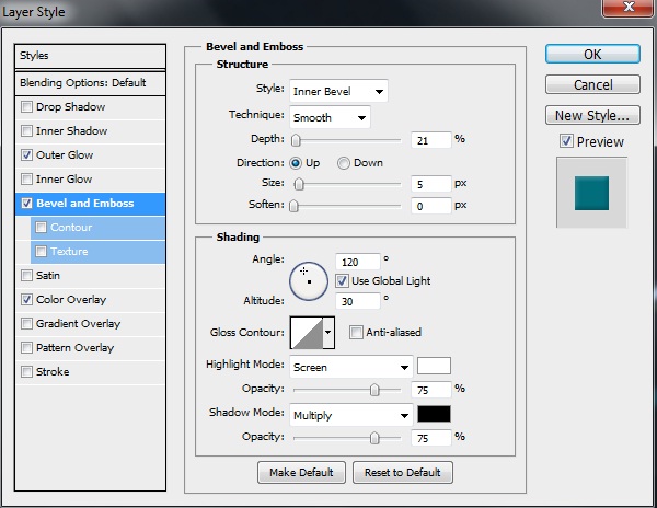
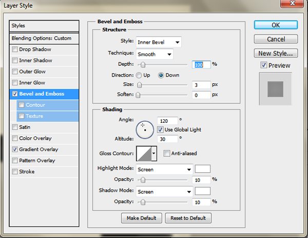
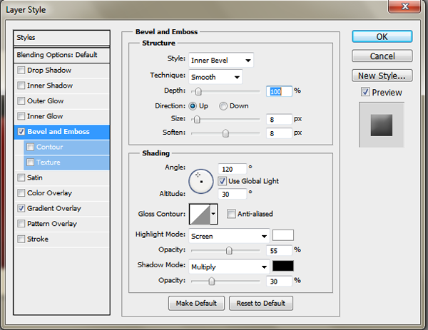
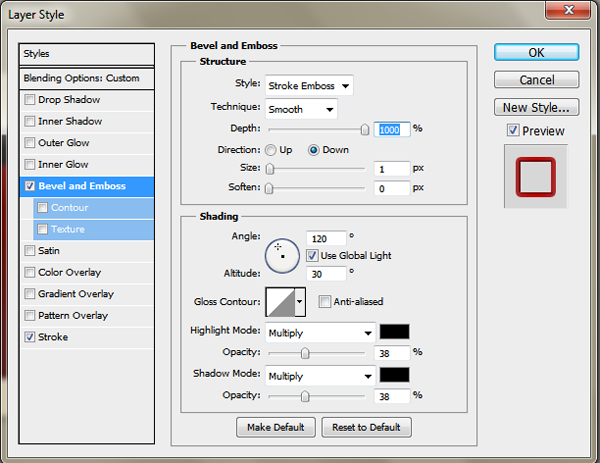
Then apply the following “Drop Shadow”, “Bevel and Emboss” and “Stroke” layer styles settings:

For slogan, type whatever description you like using the following character settings:
Font Family: Square721 Dm, Size: 5pt, Weight: Normal, Anti-aliasing setting: Smooth, Color: #a8a8a8, Leading: Auto, Tracking: 5.

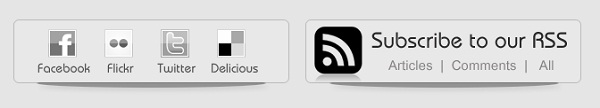
Creating the RSS & Socials:
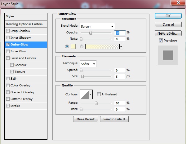
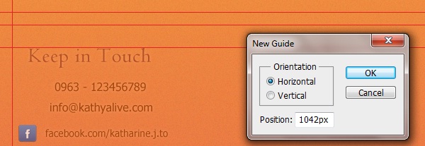
Let’s begin with creating bars (backgrounds). First, drop a guideline and set it at the left edge of categories bar, just so you can create the social one at the same alignment (You’ll see it in coming screenshots).
Select the “Rounded Rectangle Tool” (U) with 5px as radius and color: #e8e8e8, draw a shape with the following sizes (307px (width) and 70px (height)) then rasterize the layer and label it “socials_bg”. Make it with 182px far from top. Finally here, you need to apply the same “Stroke” layer style settings that you’ve done for “categories_bg” layer (just go back to it and apply it for this layer too).

The same way we’ve created the shadow for “categories_bg” layer, we’ll just do it for this one and for the RSS coming one as well. Just go back to it and apply the same steps. You should get something like this:

Now, label the layers with “socials_bg” and “socials_shadow” then duplicate those both layers, you’ll get tow new layers, select them both and drop them horizontally (to right side) while holding the “Shift” key from keyboard for almost 20px then re-label them respectively with “rss_bg” and “rss_shadow”. This is what you should get:
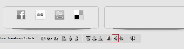
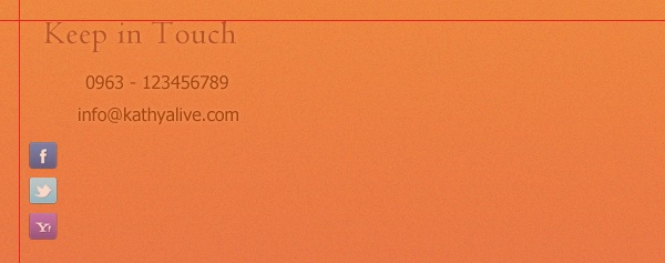
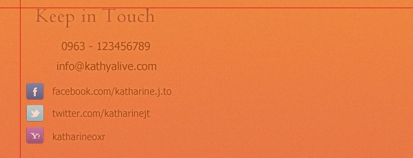
The next step is to download the social icon set listed above in resources, and then add the following ones to your layout. To make sure that the icons is aligned horizontally with each other, select all icons layers then click on “Distributes Horizontal Centers” which can be found in the toolbar top panel.
By “Type Tool” (T), use the following character settings to type socials networks names under icons:
Font Family: Bauhaus Md BT, Size: 3.5pt, Weight: Medium, Anti-aliasing setting: Smooth, Color: #565656, Leading: Auto, Tracking: 0.
Let’s move to rss now, add the rss icon from Ecqlipse icon set and place it like you’ll see below, then type text that says “Subscribe to RSS” using the following character settings:
Font Family: Bauhaus Md BT, Size: 6pt, Weight: Medium, Anti-aliasing setting: Smooth, Color: #2c2b2b, Leading: Auto, Tracking: 5.
Another text we’ll type now and it should be like that “Articles | Comments | All” using the following character settings:
Font Family: Utsaah, Size: 5pt, Weight: Regular, Anti-aliasing setting: Smooth, Color: #888585, Leading: Auto, Tracking: 5. This is the result:
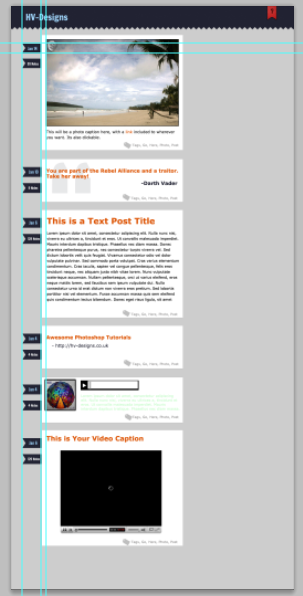
Creating the Theme Posts:
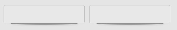
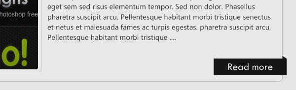
Select the “Rounded Rectangle Tool” (U) with 5px as radius and color: #e8e8e8, draw a shape with the following sizes (734px (width) and 278px (height)), rasterize the layer and label it “rounded_rect”. It should be 295px far from top. Once you’ve happy with the shape, apply the same “Stroke” layer style settings that you’ve done for categories, social and RSS BG’s layers.
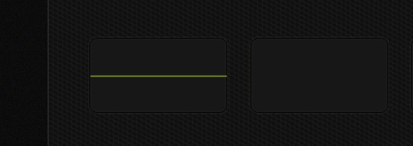
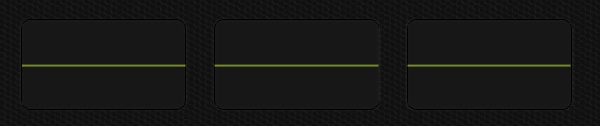
Use the “Line Tool” (U) with the color value: #a0a0a0 and make one like below, you should get the following:
To type post title, make a text rectangle using the “Type Tool” (T) then type whatever title you like using the following character settings:
Font Family: BubbleBoy2, Size: 3.5pt, Weight: Regular, Anti-aliasing setting: Smooth, Color: #595959, Leading: 6, Tracking: 10.
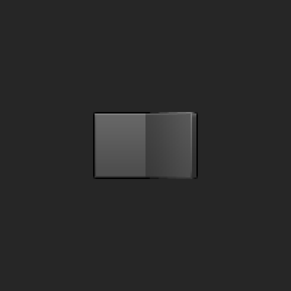
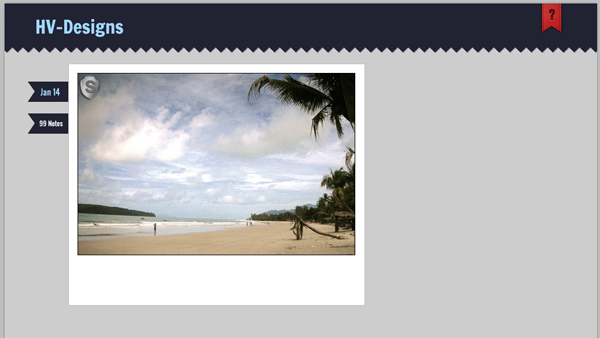
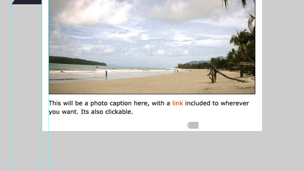
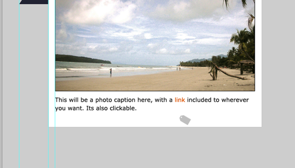
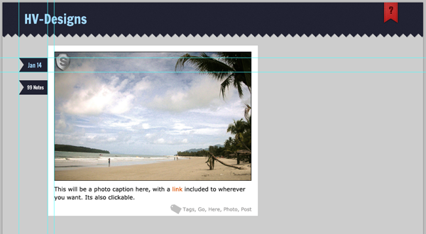
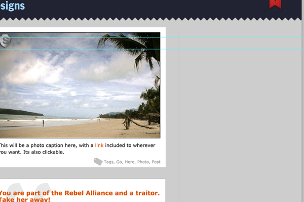
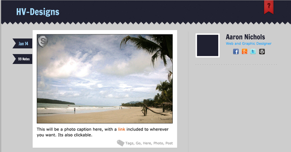
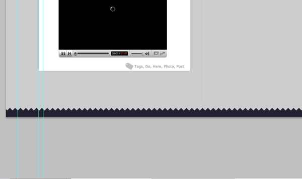
Now, we’ll make a holder rounded rectangle to surround the post thumbnail, just do it by drawing it using the “Rounded Rectangle Tool” (U) with 5px as radius and color: #e8e8e8. Once finished, apply the same “Stroke” layer style settings that you’ve done for categories, social and RSS BG’s layers. Next, Pick up some thumbnail, I choose nice one from “Design Darken and Impressive Coming Soon Page” tutorial, then used “Ctrl +T” to control its size to fit shape just like that:
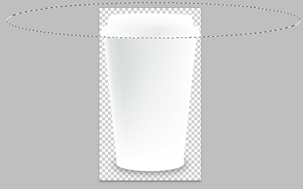
Note: you can get the rounded corners for thumbnail by selecting the part you want from the main image then go to (Select > Modify > Smooth) then put the value you want then copy the selection.
Type some text as post content using the following character settings:
Font Family: Ebrima, Size: 3.5pt, Weight: Regular, Anti-aliasing setting: Smooth, Color: #585555, Leading: 5, Tracking: 10.
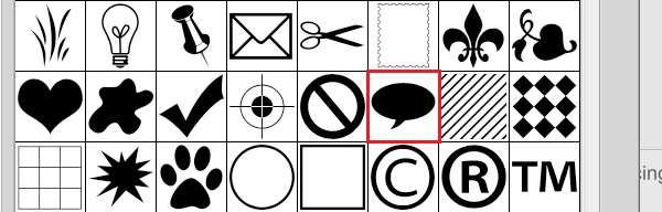
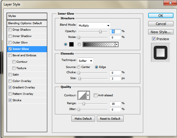
Select the “Custom Shape Tool” (U) and choose the following comment bubble from toolbar (it’s default) with color: #e8e8e8. Once finished, rasterize the layer and label it “comments_icon” then apply the same “Stroke” layer style settings that you’ve done for categories, social and RSS BG’s layers. Finally here, reduce the opacity of this layer to 75%.
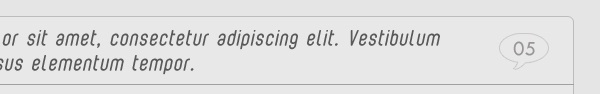
Type some numbers using the following character settings:
Font Family: Tw Cen MT, Size: 5pt, Weight: Regular, Anti-aliasing setting: Smooth, Color: #989696, Leading: Auto, Tracking: 5.
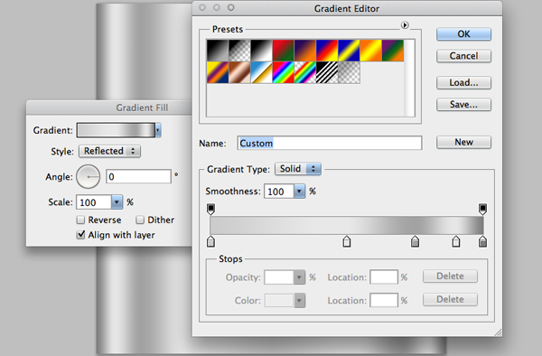
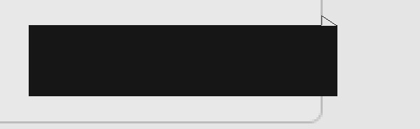
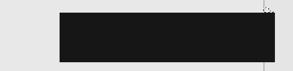
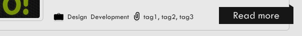
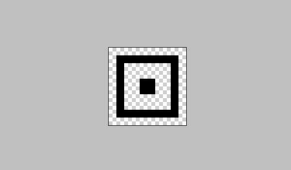
With “Rectangle Tool” (U) and after set color value to #161616, we’ll draw a shape like the following one, then rasterize the layer and label it “readmore_bg”.

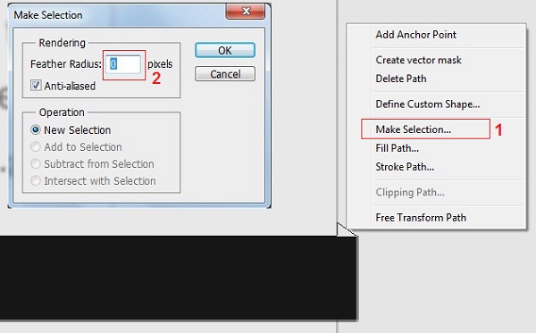
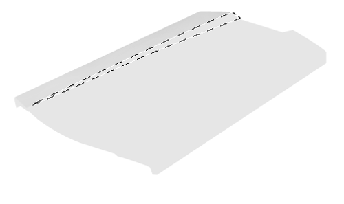
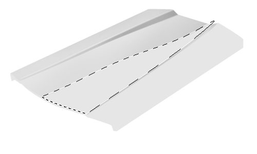
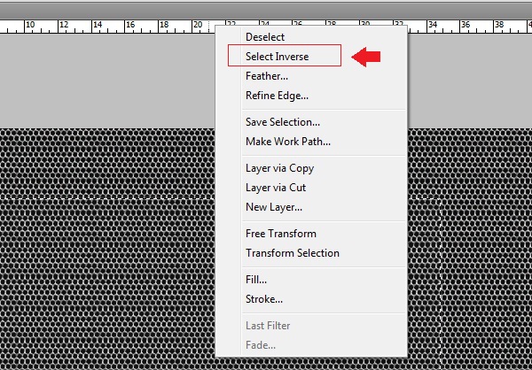
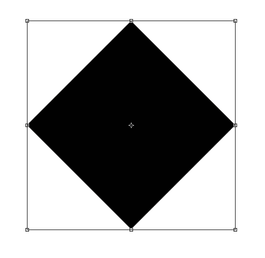
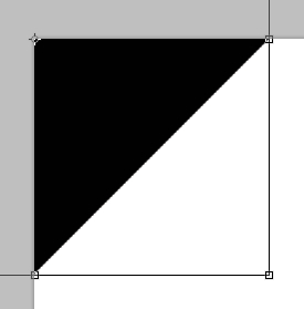
Next, select the “Pen Tool” (P) and make a bath like the following:
Click by Left-click mouse button on the shape then select “Make Selection” and let it be with 0 feather radius just like this:
Your ads will be inserted here by
AdSense Now!.
Please go to the plugin admin page to paste your ad code.
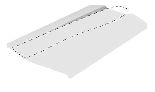
Now fill up this new shape with same color value #161616 and click “Ctrl + D” to set the selection. This is what you should get:
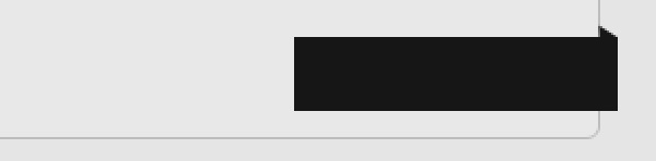
Type a text that says “Read more” above the previous layer using the following character settings:
Font Family: Tw Cen MT, Size: 5pt, Weight: Regular, Anti-aliasing setting: Smooth, Color: #e5e5e5, Leading: Auto, Tracking: 5.
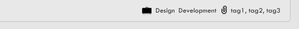
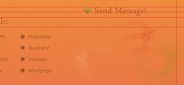
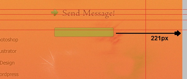
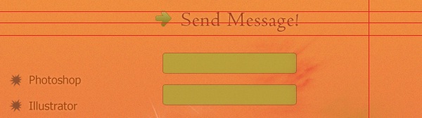
From Ecqlipse icon set, add the following icons for categories and tags (you can use “Ctrl + T” to make them smaller and fit your layout and guidelines to keep them aligned).
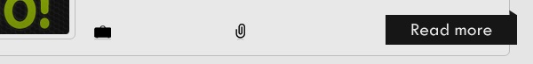
Add some text using the following character settings:
Font Family: Tw Cen MT, Size: 3.5pt, Weight: Regular, Anti-aliasing setting: Smooth, Color: #333333, Leading: Auto, Tracking: 5.
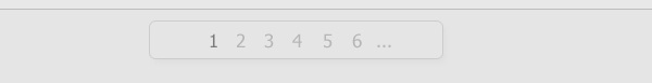
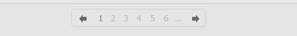
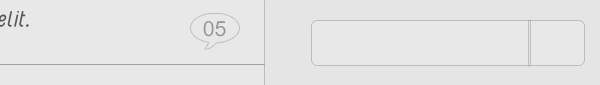
Creating Page Numbers Section:
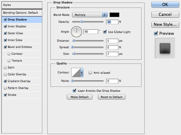
The first thing is to make a smooth rounded rectangle using the “Rounded Rectangle Tool” (U) with color: #e5e5e5 and following sizes: 269px for width, 34px for height. Once you’re happy with it, rasterize the layer and apply the following “Drop Shadow” and “Stroke” layer style settings:
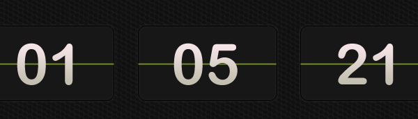
Type the page numbers by “Type Tool” (T) using the following character settings:
Font Family: Tahoma, Size: 4pt, Weight: Regular, Anti-aliasing setting: Smooth, Color: #333232 (for active number), #969696 (for inactive), Leading: Auto, Tracking: 0.
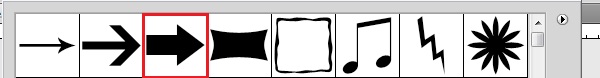
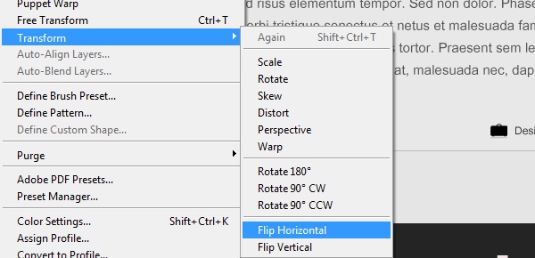
By “Custom Shape Tool” (U), choose the following shape from toolbar above and use the color: #696969 to draw a shape like below, then rasterize the layer and duplicate it. Now go to (Edit > Transform > Flip Horizontal) then drop the new one to the other side. You should get something like that:
Make the Single Post:
First, we have to hide the four posts groups and page numbers group. Then create a new one with the name “Full Post” (Layer > New > Group).
The same way we create the previous posts, we’ll just do now! So select the “Rounded Rectangle Tool” (U) with 5px as radius and color: #e8e8e8, draw a shape with the following sizes (734px (width) and 1206px (height)), rasterize the layer and label it “full_rounded_rect”. It should be 295px far from top as the first post we’ve created. Once it’s ok, apply the same “Stroke” layer style settings that you’ve done for categories, social and RSS BG’s layers.
Use the “Line Tool” (U) with the color value: #a0a0a0 and make one like you’ve done before for the previous posts … the same settings for typing title and creating comments bubble as well.
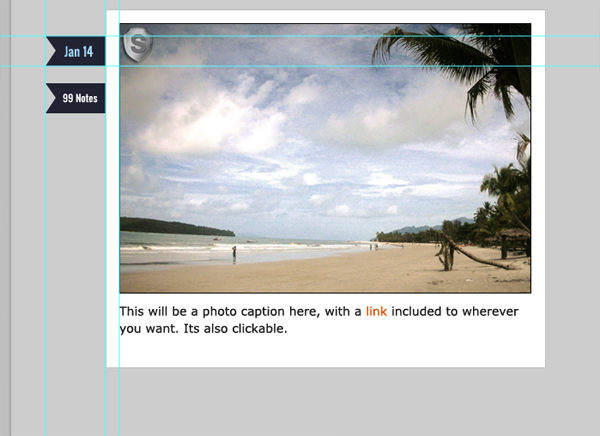
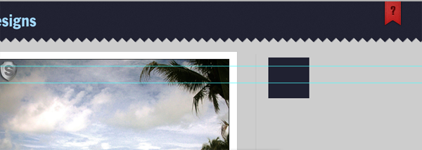
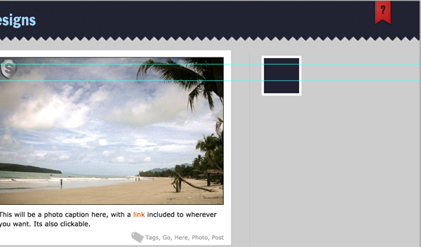
The single post style, just as you see, is keeping the same main typing and style settings, we’ll do the images holders (rounded backgrounds) as we’ve do it previously …
Make attention to the sizes of second image holder, it’s 686px width, the height can be as you wish. (The main imaged is taken almost 669px as width; you can control these sizes as you want, of course).
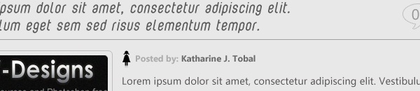
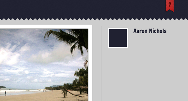
For single post, I add text leading to author name, using the following character settings:
Font Family: Ebrima, Size: 3pt, Weight: Bold, Anti-aliasing setting: Smooth, Color: #acacac (and #6b6b6b for author name), Leading: Auto, Tracking: 5.
Use the following icon from Ecqlipse icon set, and reduce the size using control handles … you’ll get a result like that:
At the button of the post, we’ll create category and tag links, just as we’ve done before but this time let them be at the right side like you see below:
The next step is to select the “Custom Shape Tool” (U), select the shape you see below (it’s default) then draw one with color value: #e8e8e8 at the right side, rasterize the layer and label it “right_arrow”. Once you’ve done, apply the following “Stroke” layer settings on you layer:
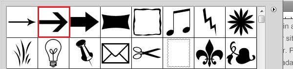
Duplicate this layer then go (Edit > Transform > Flip Horizontal) to get a new one with opposite direction. Now drop the new one down horizontally (re-label it “left_arrow”) while holding the “Shift” key from keyboard to be located just like you see:
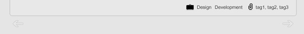
Now, type two texts that say: Next Post, Previous Post using the following character settings:
Font Family: Tw Cen MT, Size: 4pt, Weight: Regular, Anti-aliasing setting: Smooth, Color: # 474141, Leading: Auto, Tracking: 5.

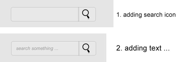
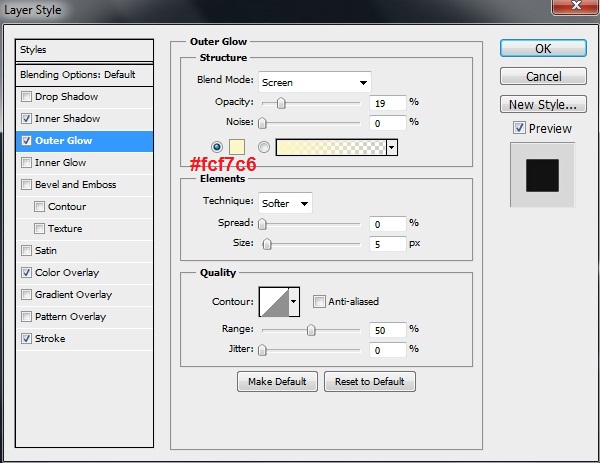
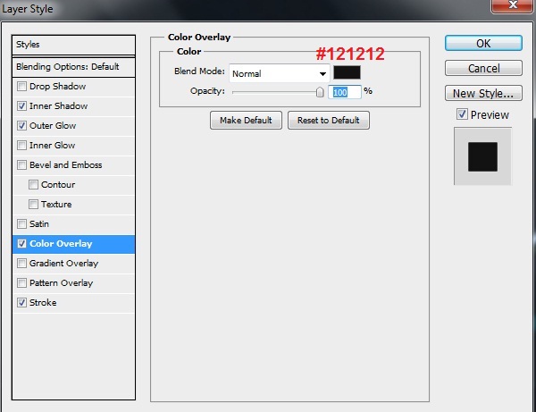
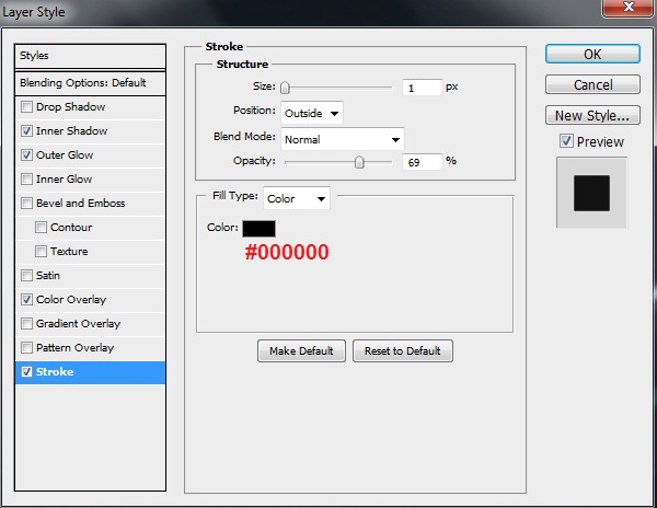
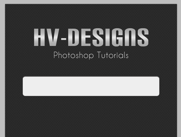
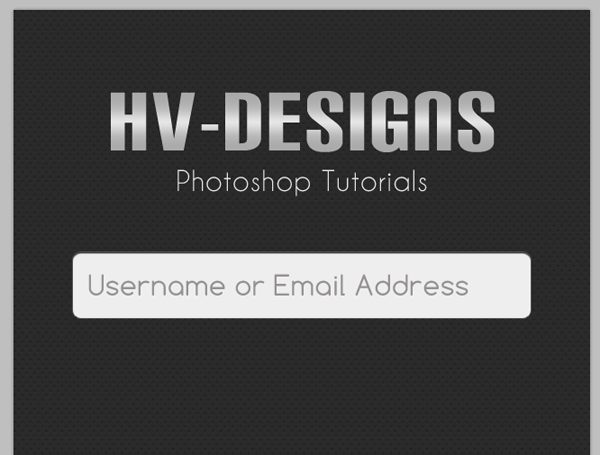
Creating the Search:
With “Rounded Rectangle Tool” (U) and after set color value to #e8e8e8, we’ll draw a shape with 272px as width and 44px as height, then rasterize the layer and label it “search_bg”. Then apply the same “Stroke” layer style settings that you’ve done for categories, social and RSS BG’s layers.
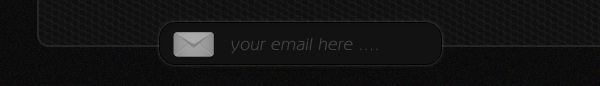
Now, select the “Line Tool” (U) with 2px radius and draw a line like the one below, rasterize the layer and label it “separator” then apply the same “Stroke” layer style settings that you’ve done for search, categories, social and RSS BG’s layers.
Add the following search icon from Ecqlipse icon set, and reduce the size using control handles … Now with “Type Tool” (T), type text (that says: search something …) using the following character settings:
Font Family: Utsaah, Size: 5pt, Weight: Italic, Anti-aliasing setting: Smooth, Color: #969595, Leading: Auto, Tracking: 5.
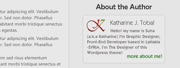
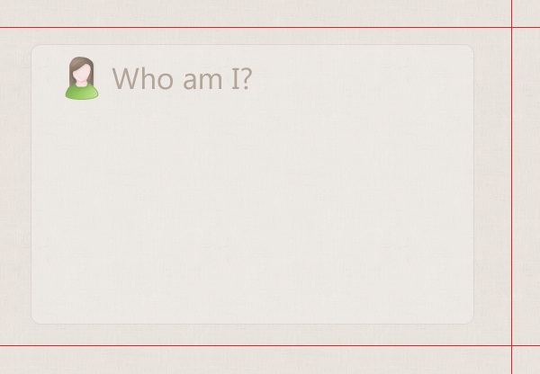
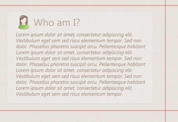
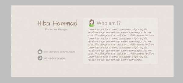
Creating “About the Author” Block:
With “Rounded Rectangle Tool” (U) and after set color value to #e8e8e8, we’ll draw a shape with 272px as width and 160px as height, then rasterize the layer and label it “author_bg”. Then apply the same “Stroke” layer style settings that you’ve done for search, posts, categories, social and RSS BG’s layers.
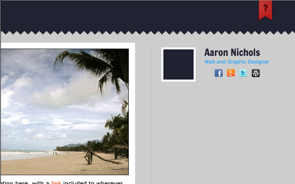
For me, I add my personal logo “K” and place it at the left side, then type my name with “Type Tool” using the following character settings:
Font Family: Cf Kaveros, Size: 5pt, Weight: Regular, Anti-aliasing setting: Smooth, Color: #4e4a4a, Leading: Auto, Tracking: 0.
And the following ones to type some summery about myself:
Font Family: Cf Kaveros, Size: 3.5pt, Weight: Bold, Anti-aliasing setting: Smooth, Color: #797474, Leading: 4.32pt, Tracking: 5.
Type another text for reading more an it’s “more about me!” here using the following character settings:
Font Family: Cf Kaveros, Size: 4pt, Weight: Bold, Anti-aliasing setting: Smooth, Color: #338129, Leading: Auto, Tracking: 0.
Now, type the text “About the Author” using the following character settings:
Font Family: Berlin Sans FB, Size: 6pt, Weight: Regular, Anti-aliasing setting: Smooth, Color: #338129, Leading: Auto, Tracking: 5.
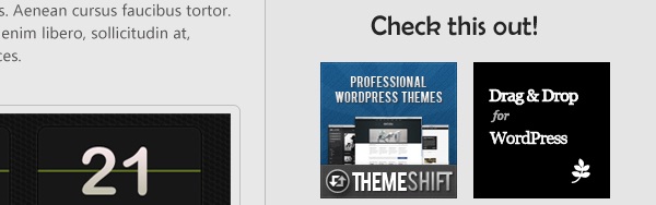
Creating Advertisement Block:
With the same font settings that we used for “About the Author” text, apply it again for “Check this out!” one (and notice that it will be apply for “Categories” text too). Then add some 125x125px ads images just as you see:
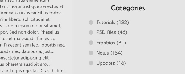
Creating the Categories Block:
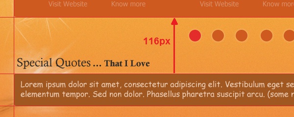
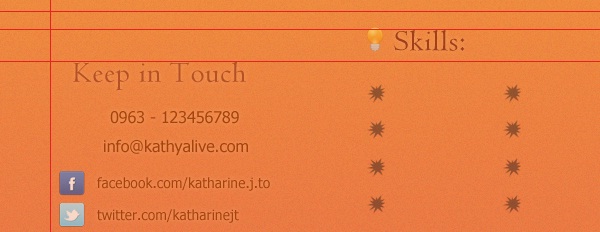
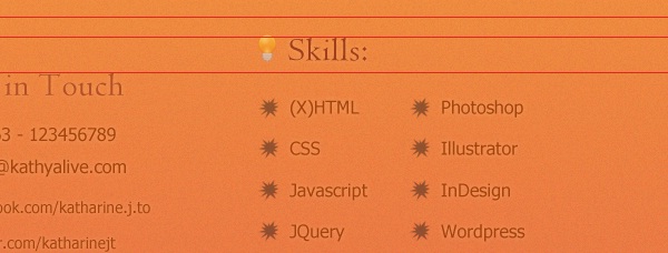
As we mention previously, we’ll reapply the same font settings that we used for “About the Author” text on the new one here and it’s “Categories” … after that, use the “Eclipse Tool” (U) and draw a small circle with the color value: #c5c5c5, rasterize the layer then duplicate many times and drop copies down while holding the “Shift” key from keyboard. Then use “Type Tool” (T) to type some categories names and how much entries each one contain … use the following character settings:
Font Family: Bauhaus Md BT, Size: 4pt, Weight: Medium, Anti-aliasing setting: Smooth, Color: #605f5f, Leading: Auto, Tracking: 5.
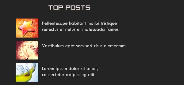
Creating “Top Posts” Footer Block:
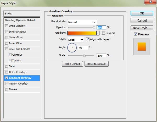
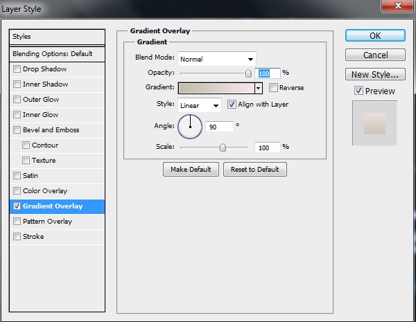
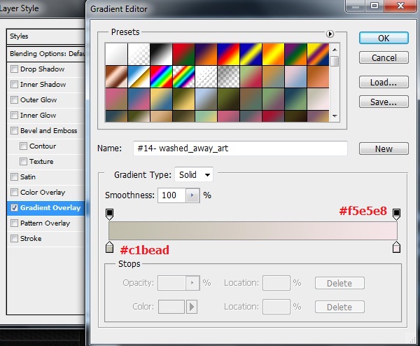
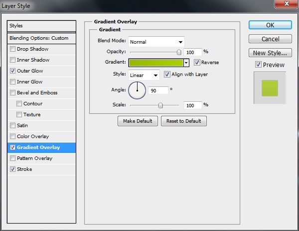
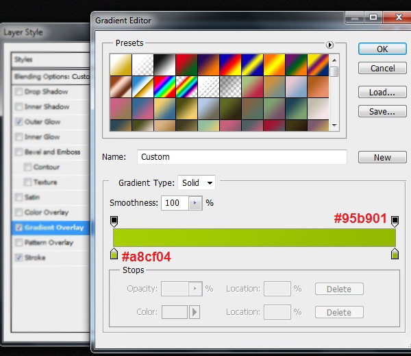
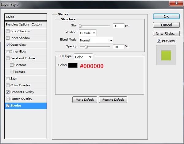
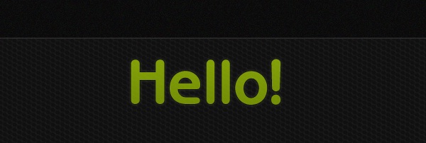
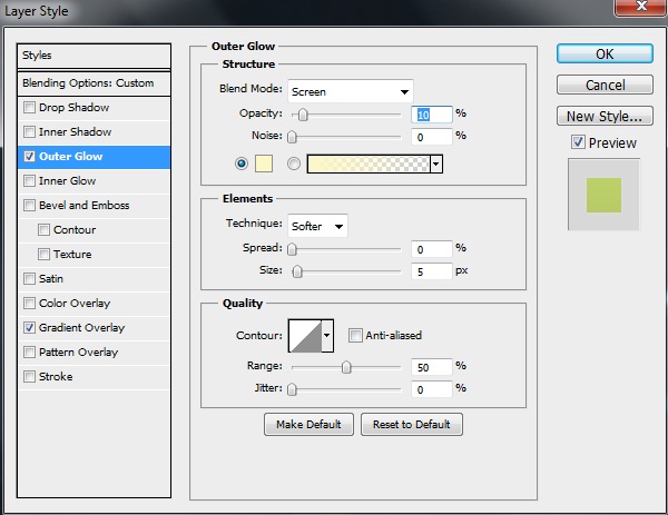
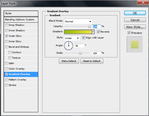
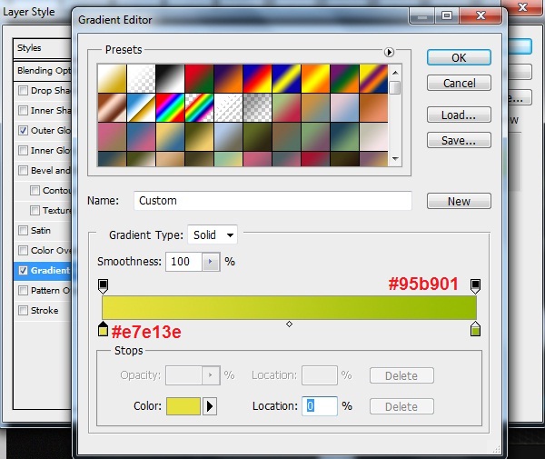
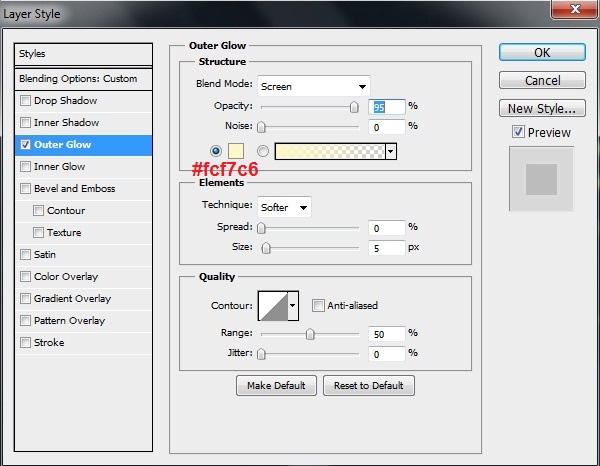
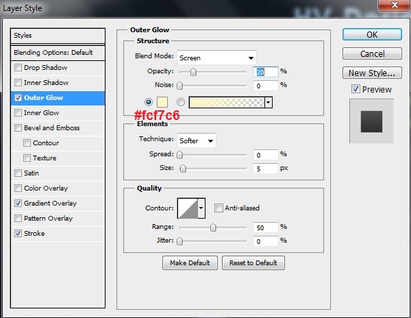
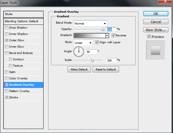
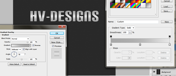
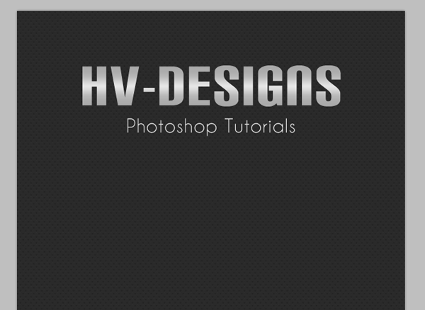
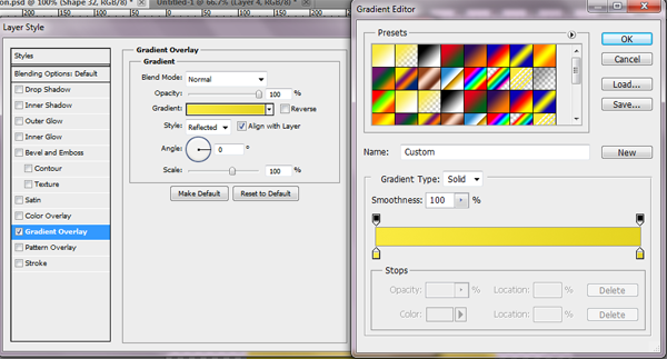
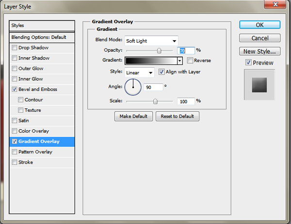
The title for the three coming footer blocks will take the same layer styles so I’m going to add screenshot for one time, so the first step is to type the text “Top Posts”, use the following character settings:
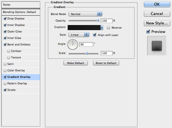
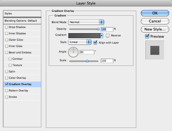
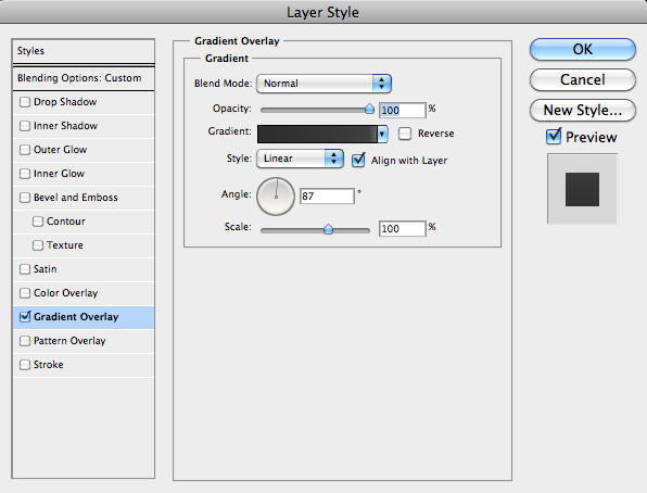
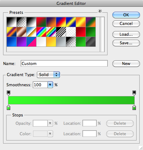
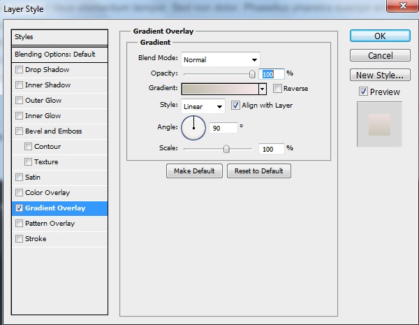
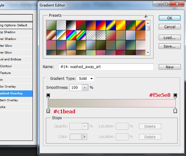
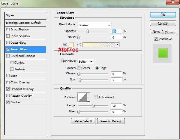
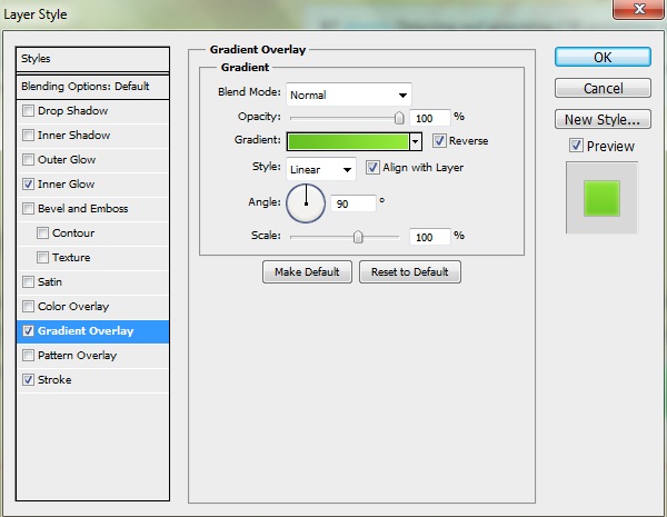
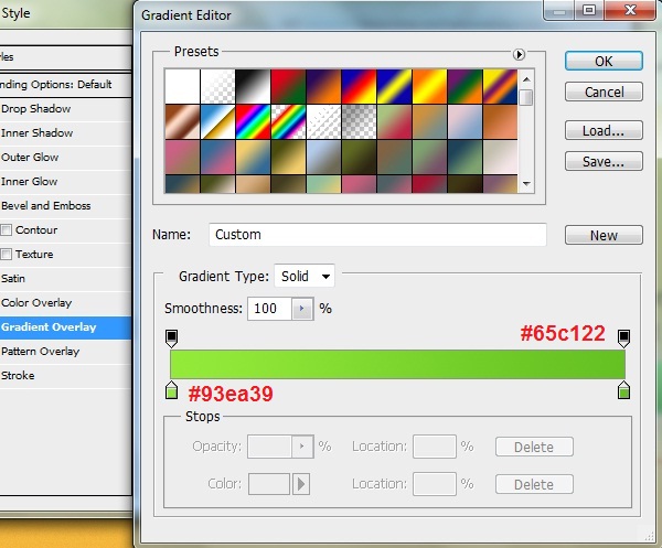
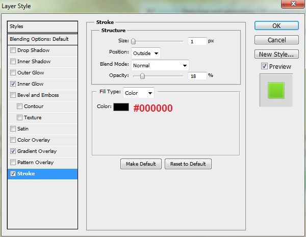
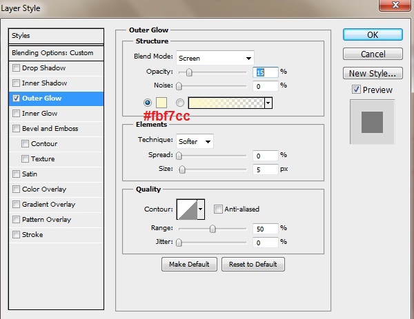
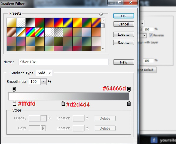
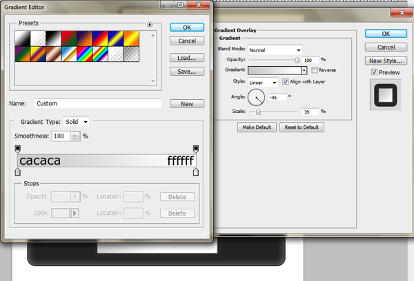
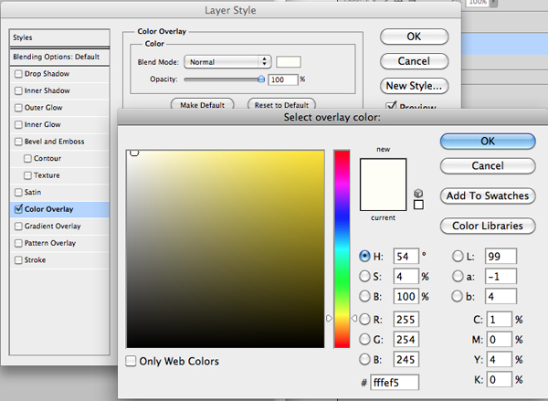
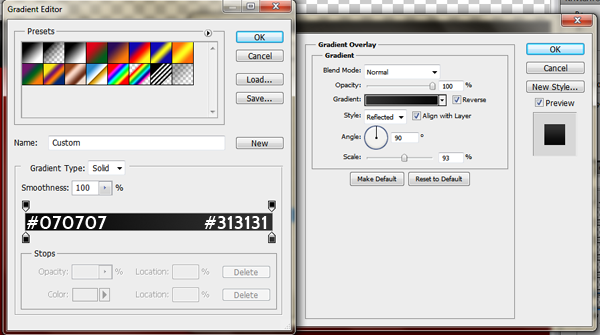
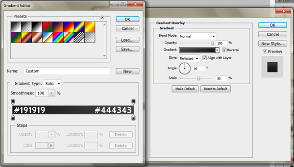
Font Family: Tycho, Size: 5pt, Weight: Regular, Anti-aliasing setting: Smooth, Leading: Auto, Tracking: 5. It doesn’t matter about the color, we’ll apply some “Gradient Overlay” layer style setting on our layer, make it like this:
Add some posts thumbnails (73px width, 63px height) … Then use “Type Tool” (T) and make a text rectangle to type posts titles, use the following character settings:
Font Family: Tw Cen MT, Size: 4pt, Weight: Regular, Anti-aliasing setting: Smooth, Color: #d6d6d6, Leading: Auto, Tracking: 5.
Creating “Flickr” Footer Block:
The same typing setting we’ve done for “Top Posts “ should be applied here for the title “From Our Flickr!” and once you’re finished add some flickr photos like below. I add 84px (width), 59px (height) photos … this is my result:

The next step is to add brilliant text that tells visitors to join your website flickr group! As usual, select “Type Tool” (T) and use the following character settings:
Font Family: Utsaah, Size: 6pt, Weight: Regular, Anti-aliasing setting: Smooth, Color: #7d7b7b, Leading: Auto, Tracking: 5. Now, apply the following “Stroke” layer style settings on your text layer:

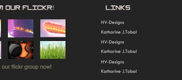
Creating “Links” Footer Block:
The same typing setting we’ve done for “Top Posts “ should be applied here for the title “Links” and once you’re finished, add some other texts using the following character settings:
Font Family: Tw Cen MT, Size: 4pt, Weight: Regular, Anti-aliasing setting: Smooth, Color: #d6d6d6, Leading: Auto, Tracking: 5.
Conclusion
We’re done now! We’ve just created this black and white WordPress layout using Photoshop. I’ll be happy to see your comments below and know what you think, as well as see more results of applying theses simple steps.
“This post is written in partnership with PrintRunner, an online printing company which offers quality printing services.”
Your ads will be inserted here by
AdSense Now!.
Please go to the plugin admin page to paste your ad code.


 9a.png


