Your ads will be inserted here by
AdSense Now!.
Please go to the plugin admin page to paste your ad code.
With our last two giveaways being about business cards I figured it was time to give you guys a tutorial for designing a business card. Today we are proud to bring you an awesome business card design tutorial that, when you are finished, will be 100% print ready. The techniques and styles displayed in this tutorial can be adjusted to fit different colors and textures with little effort. Well, I think it’s about time to let Eric walk you through how to create these amazing business cards.
Getting Started
Hello! Welcome. I’m not one for intros, so let’s get started.
We’re going to be creating a simple business card today, using mainly a sweet pattern and the Museo Slab font (free) (I’m using the Square Serif font, but both are quite similar, so it shouldn’t make too much of a difference).
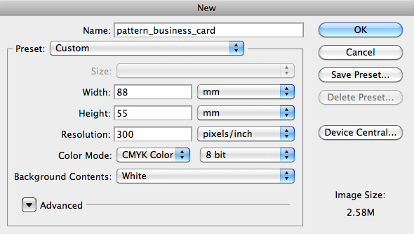
Open a new document in Photoshop with the dimensions of a business card, namely 88mm by 55mm and the resolution should be 300 pixels per inch (as you might want to print this, you better have a high resolution, otherwise the quality of the printed card won’t be very good). Set the color mode to CMYK (the RGB (red, green, blue) color mode is usually used for web, CMYK (cyan, magenta, yellow, key black) is used for print). Press OK.
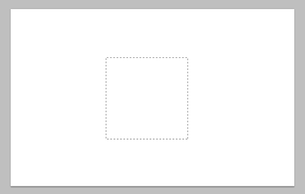
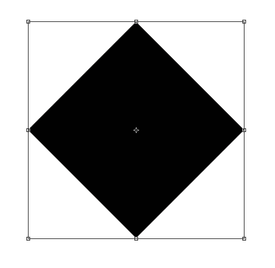
Using the rectangular marquee tool (M), select an area of 300px by 300px (select Fixed Size in the style dropdown located in the menu bar). Fill it with black (or any color, it doesn’t matter right now) by pressing CMD (or CTRL) + Backspace.
![]()
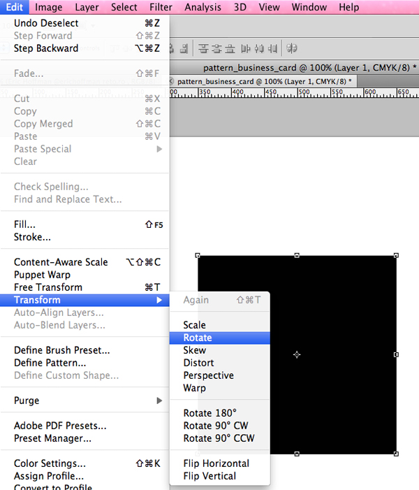
Select the rectangle with the move tool (V) and press Edit – Transform – Rotate. In the input box that appears above (the one with the angle beside it) enter 45°, thus rotating the square by 45 degrees. Now it should look like a diamond.
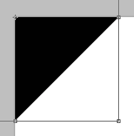
Align the diamond to the top left corner of your canvas. In Photoshop CS5 it aligns automatically (snaps to the grid), otherwise you can add two guides and align the diamond with their help. Set the diamond’s opacity to 40% or lower, thus simplifying the following steps.
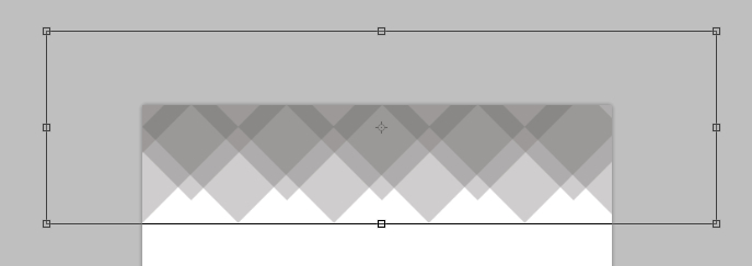
Duplicate the shape (CMD or CTRL + ALT + right arrow key) horizontally. Align the center of the duplicated shape with the right edge of the original. Do this multiple times, until you’ve filled up the entire document (horizontally). Select the layers (not the background layer) and group them, I’ve called the group first.
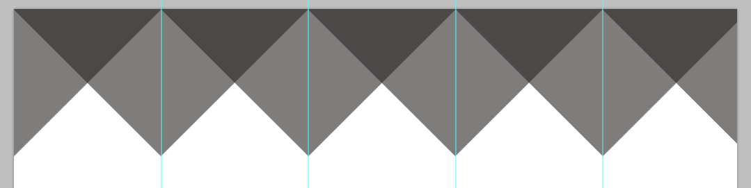
Duplicate the entire first group (CMD or CTRL + ALT + down arrow key) and move it downwards. Move it to the right by a bit, make sure both layers are centered (see image).
Your ads will be inserted here by
AdSense Now!.
Please go to the plugin admin page to paste your ad code.
Duplicate the second layer, and move it upwards by a bit.
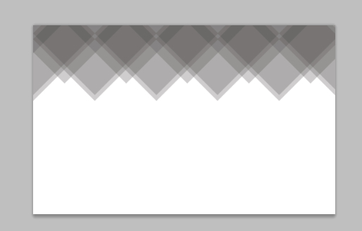
Now. Add a color overlay to all the textures, the pattern effect will be arise thanks to the opacity of only 40%, meaning multiple layers will be darker, spaces with only one layer will be lighter. Double click on one of the layers, the layer styles panel will pop up. Select color overlay and choose any color you like. Although my favorite color is blue, I’ll be going with a darker brown (#807e69) that goes well with the background we’ll be creating in a moment.
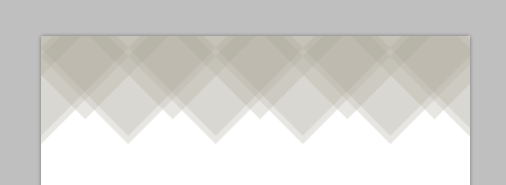
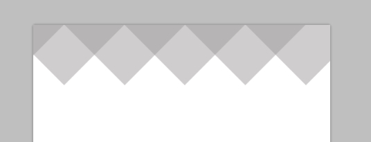
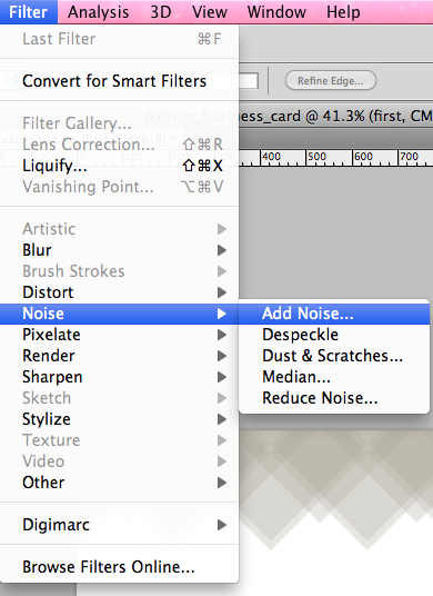
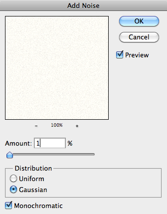
If you like the pattern we made, and don’t want to make any further changes, you can combine all shapes to one layer by pressing CMD (or CTRL) + E. Right click the layer, and select convert to smart object. Then rasterize the layer by right clicking and selecting rasterize. Select Filter – Noise – Add Noise to add a light noise overlay. The noise amount should be between 2% and 4%, I choose 3%.
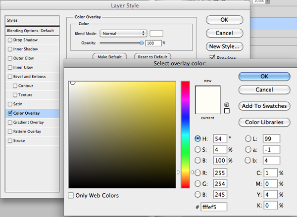
Double click the background layer and press enter, thus making it editable. Double click again, this time bringing up the layer style panel. Add a color overlay of #fffef5 and confirm. Again, right click the layer, and select convert to smart object. Then rasterize the layer by right clicking and selecting rasterize. As before, add a noise overlay of 1%.
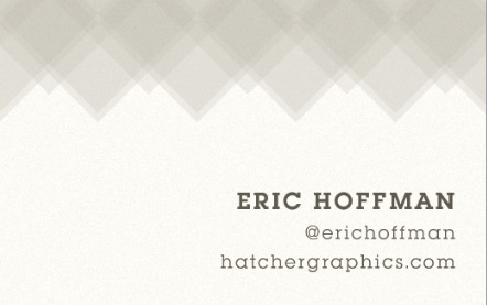
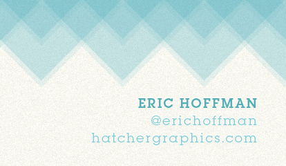
Now select the type tool (T). Enter some details you’d like to appear on your business card, I for example list my name, twitter handle and company website. Use Museo Slab as your typeface. Depending on if you’re using Museo Slab or Square Serif as font, the sizes will vary. I’ve chosen to change the font weight of my name to bold the size to 12pt, and for the other information the font size is two pt smaller, 10pt.
Place your information to the right and align the text to the right. Make sure you leave some white space at the bottom and the right, this is the “bleed area”. Set the text color to #5d5a4e, a dark brown.

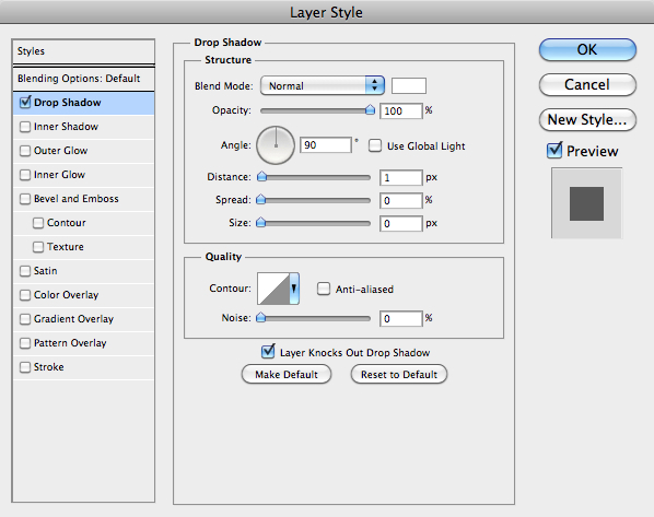
Finally add a light drop shadow to the text.
Conclusion
Download PSD FILE
Great job! You’ve completed the tutorial successfully! With these techniques, you can now create similar cards, just play around with different shapes, textures and colors! See what I did below, using the same technique, in under 10 minutes! Try it yourself, and add your results to the comment section below!
Your ads will be inserted here by
AdSense Now!.
Please go to the plugin admin page to paste your ad code.