

May 24th, 2011 in Photoshop Tutorials by Aaron
Tumblr Theme Design Series Pt. I
 3 Votes, Rating: 5.00
I know you guys have waited forever for this tutorial but it’s finally here. In today’s tutorial I will walk you through the first step of creating a Tumblr Theme, designing up the bad boy. Because I want you guys to grasp all the aspects of creating a Tumblr theme from scratch our theme will be using every available call for a Tumblr home page. This is Stage 1 of a 5 stage tutorial that will walk you through creating your custom Tumblr theme. So, let’s get started shall we?
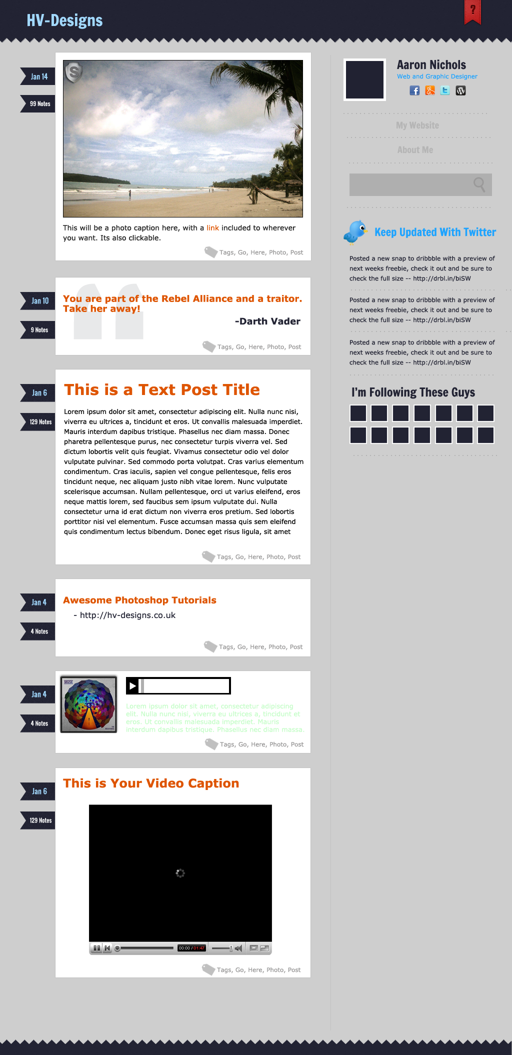
As always, this is what we will be creating:
Resources
Francois One Font by Google Webfonts
Free Pretty Little Ribbon by Orman Clark
Superhug Landscape Stock Images
Getting Started
Start out by creating a new document that is 1024px by 2110px and fill it with #cecece.
Please note that I will be zoomed in at 100% for most of the duel so we will not be seeing the full length of the document.
Alright, now grab your rectangular marquee tool and drag out a rectangle that is 1024px by 75px. Create a new layer and fill it with #222333.

Alright, now be sure to open up the ribbon texture that we downloaded earlier from Designmoo. Now make a new selection that is 1024px by 15px and line that selection up with the bottom of the block we just created. Create a new layer and fill it with black. We will now lowere our fill to 0% so that nothing is showing up on your layer.
For the next step open up your blending options and choose pattern overlay. Choose the pattern that you downloaded earlier and leave all the values at their default.
Now, when you fill the pattern it will look a little bit funny. You simply need to move the pattern around so that it looks the way it should. Like this:

Awesome, now we just need to give it some color. What you are going to do is right click your Layer 2 and choose “Convert to Smart Object” and then right click again and choose “Rasterize Layer”. Awesome, now we can add a blending option to our layer.
We are going to add a color overlay with the exact same #222333 color that we used earlier. You should now have a flowing ribbon style for your header and its looking pretty spiffy.

Now the next step is to right click your Layer 2 again and choose “Merge Layer Down”. This will merge the two layers, obviously, but it will also allow us to add a subtle bit of noise to both layers and let it flow smoothly.
To add noise go to Filter–Noise–Add Noise and choose .58%, Gaussian, and Monochromatic for your settings.

Awesome, now we have the background for our header. Sexy right? Well let’s get moving then. Go ahead and grab your text tool and choose the Francois One font that we downloaded earlier. Set your font size to 32pt and have the color be #a2d9ff.
Now type out whatever you want for your header. I am going to be using HV-Designs for my header text. Space your header text 55px from the left of your document and 28px from the top of your document.

Alright, now that’s all that we are going to do because other than @font-face I want this tutorial to create a design that is easily rendered in all browsers but if you wanted to add a shadow to the text or other features you are more than welcome to.
And now to add our final piece to the header. Tumblr has an awesome feature that allows someone to ask you questions and you can respond to them so I figured we would include that in this tutorial, and what better way to include it than with an awesome freebie? Open up the ribbon that we downloaded earlier from Orman Clark. Now change the text on it to whatever you want. I removed both stars and simply added a question mark instead.
Once you have that finished you can drag over the whole ribbon group from the PSD file to our document. Now hit CTRL+T and drag your ribbon layers down to be 45px by 70px. A quick but important note, the transform box will not only include the ribbon and that is fine, that is what my scale is set to as well.

Now bring the ribbon over and place it on your document. The ribbon is a little bit too tall for what we are after so you will want to drag the excess of the screen until you have a nice, even spacing between the question mark. It is also spaced 55px from the right of our document.
And there you go. The ribbon comes with a nice shadow already attached to it, which fits perfectly in our design already so we don’t need to make any changes.
Now, you should have this for your header so far:

and this is what your document will look like at full size:

Pretty boring so far at full size but you are now done with your Header and its time to move on to making our first post!
Post Area
Alright, now let’s get started creating our post area. The first thing that we have to do is set up a few rulers. You will want to set up your first ruler at the 40 mark and our second at the 110 mark.

We are going to be using this 70px width of rulers we just set up for our post ribbons. Now, let’s get started on our first ribbon. Set up another ribbon at 135 and another at 170. The 35px height that we just set up will be the height for our ribbon.
Now, grab your rectangle shape tool and set your foreground to #222333. Drag out a rectangle that fits in between the rulers we just set up.

Now grab your pen tool and choose the Add Anchor Point tool, within the pen tool. Add an anchor point in the exact middle of our rectangle. Don’t do anything with it yet but add the anchor point for right now.

Now, in your pen tool area select the convert anchor point tool. Go ahead and click on anchor point we just created and convert it. Now grab your add anchor point tool again and move that anchor point back 12 pixels.

Now, grab a web safe font that you want to use. We are using Oswald, which can be found on Google Webfonts. Set your color to #a2d9ff and user 14pt as the size. Type out a filler date and center it both vertically and horizantally on your menu.

Great! Now go ahead and duplicate your two layers and space it 20px from the bottom of your first ribbon. Now change the text to say xx Notes and change the color to white and size to 11px.

Depending on how you went about changing things you may have to recenter the text, but that’s not very hard so I will leave that up to you guys.
Anyway, our post ribbons are done now and we need to move on to creating our main conent area. Grab your rectangle tool again and change your foreground to white. Drag out a rectangle that is 510px wide by 415px tall and line it up with the very end of our ribbons.

Now move your white box up 30px and to the right one pixel. Now apply a 1px stroke to the box and use the color #c0c0c0. Now everything should line up quite nicely.
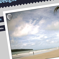
Now open up whatever stock image that you chose from Superhug and crop/scale the image down to 480px wide by 315px tall and give it a 1px inner stroke, black. Now drag over your image and space it 15px from the left and 15px from the top, not including your stroke, of your white box.

Now grab your text tool again and choose standard black for your foreground color. Choose whichever web safe font that you want, I am going to be using Verdana, at 14pt. Drage out a text area that is 480px wide by however tall you want to fit in, I am using 40px tall. Since this is a photo post most of the captions are not very long so we are typing out just a quick two sentences.
We want to make sure we cover our basis so we are going to add a link state in the text as well. Just select whatever text you want to use and change the color to #de5400.
Now space it 15px from the bottom of your image and 15px from the left of your content area.

Alright, now time for our tag icon. You could just use a tag icon from one of the millions of icon sets, but I wanted to create our own little icon for this because its pretty easy. Grab your rectangle tool and change your foreground color to #c0c0c0. Drag out a rectangle that is 20px wide and 15px tall. Space it wherever right now because we will be moving it after we are finished.

Now grab your add anchor point tool again and add two points to the rectangle. The top point will be 5px from the top and the bottom 5px from the bottom.

Now convert those points with the convert anchor point tool and then drag them up 5 pixels. This gives us that nice tag icon.

Now go ahead and rasterize your layer as we don’t need this icon to be vector. Grab your ellipse marquee tool and create a perfect 3px circle and space it 2px from the left end of our tab. Hit delete to remove the selection and then you have your tab.

Now hit CTRL+T to enter Free Transform mode and rotate your tag three times while holding the shift key to give it a nice angle.

Now grab your text tool again and choose #c0c0c0 for your color. I am again using verdana at 12pt for the tags. Type out whatever tags that you want to use and then space it 5px from the bottom and 15px from the right.

And there we go, that’s our post area. Now to create more posts you can just duplicate your layers, you may want to group them first, and then resize the post content area to fit whatever you need. The colors are all used the same, so by the preview you can see what we are using.

The font sizes are as follows:
Quote: 18pt Bold
Quote Source: 18pt Bold (same color as ribbon)
Text Header: 30pt Bold
Link: 18pt Bold
Link Source: 16pt
Video Header: 24pt Bold
To achieve the subtle background for the quote just type out a quote and give it a huge size and lower the opacity. Really, that’s all you do to get that super awesome background.
About Me Area
Sweet! Now let’s move on to our sidebar. We need to set up our sidebar spacer really quick. Grab your line tool and change your foreground color to #c0c0c0. Set your size to 1px and drag out a line that is 1950px tall. Space it 35px from the right side of your post area and 25px from the bottom of your header.


Now grab your rectangle marquee tool and drag out a perfect square that is 85px. Create a new layer and fill your selection with #212232. Move your layer over so it is space 25px from your spacer.

Now give it a nice 5px inner stroke with the color #FFFFFF. Yea, it’s white.

Now grab your text tool and choose Francois One, 24pt, and use #212232 for the color. Type out your name and space it 3px from the top of your photo and 25px from the left of your photo.

Now, grab your text tool again and choose Verdana for your font, 12pt for your size, and #1da3ff for your color. Type out your description of yourself. Line it up with your name and space it 10px from the bottom of your name.

Sweet, now open up those awesome icons by Rogie that we grabbed earlier and choose the four icons that you want to use. We will be using the facebook, gowalla, twitter, and wordpress icons, all resized to 20px by 20px. You will want to space your icons 5px from each other, 15px from the bottom of your description, and center them on your description.

Now grab your ecpliticle marquee tool and drag out a perfect circle that is 2px with #b3b3b3 for your color. Duplicate your layer 35 times and space them 5px between each other to create a nice spacer. Space it 35px from the bottom of your icons.
This is what you should have so far:

Links Area
Now grab your text tool and choose #b5b5b5, Francois One for your font, and 18pt as your size. Type out whatever you want for your “links” and center it on your spacer, and 15px from the bottom of your spacer.

Now duplicate your spacer layer and space it 15px from the bottom of your link. Repeat the step as many times as you want for however many pages you want to show in your PSD file.

Search Area
Now, create a new layer. Grab your rectangle marquee tool and drag out a new rectangle that is 285px by 45px and fill it with #afafaf. Space it 15px from the bottom of your spacer and if everything was done right it should be the same length as your spacer and line right up. Duplicate your spacer layer and space it 15px from the bottom of the search bar you just created. For the final touch grab your favorite Magnifying Glass icon, change its color to #9a9999.

Twitter Area
Now, we are going to follow the same principle for our twitter area. Grab your favorite icon for twitter and drag it over. Then set up your tweet header, and tweet area. Our font for the header is Francois One, #1da3ff, 22pt and is a standard Verdana, Black, 12pt for the actual twitter area. The only differences in the spacing is we are using 10px spacing between each of our tweets instead of 15 so it’s not too spread out.

Following Area
Now, for the final piece of the puzzle. Grab your type tool again and use Francois One for the font, #222333 for the color and 24pt for the size. Type out “I’m Following These Guys” and line it up with your spacer and 15px from the bottom of your last spacer.
Grab your rectangle marquee tool again and drag out a perfect square, by holding the SHIFT key, that is 35px by 35px. Create a new layer and fill it with #222333. Now give your layer a 3px white inner stroke to finish it off. Space your layer 15px from your header and line it up on the left with your header. Now duplicate your layer so you have two rows of eight (8), spaced 8px from each other.

And that is all you need to do. To finish off your theme duplicate your top layer, flip it horizantally, and move it to the bottom. You may want to make it a little bit smaller, but the exact size is up to your preference.

Conclusion
As alwaysI hope that you enjoyed the first part of this tutorial. In Part II we will be designing the actual pages themselves before moving on to converting the theme to HTML, and then of course to Tumblr! I would love to see what you guys come up with for the tutorial. At the end of the series you will be able to purchase the entire tutorial series source files from the HV-Shop.

Be Part Of The Community!
Become part of the hv-designs community.
Subscribe Via RSS or Follow Us On Twitter.


3 Responses to “Tumblr Theme Design Series Pt. I”