Competition: Wallpaper (closed)

Your ads will be inserted here by

AdSense Now!.

Please go to the plugin admin page to paste your ad code.

It seems we have a few problems regarding entries…. NEED YOUR HELP from the people who entered.


The Problem

ALL ENTRIES should have been submitted and added to the hv-designs flickr group. All entries also should have been tagged with “comp_wallpaper”. There is only one submission from what i can see inside the flickr group.

For Those Who Entered

Your ads will be inserted here by

AdSense Now!.

Please go to the plugin admin page to paste your ad code.

If you entered the competition can you please please e-mail me the link “[email protected]” so i can get this competition wrapped up.

What If…

If no-one manages to get in touch by the 30th November il assume only one person entered the competition. (Hopefully this is not the case).

Thanks for your help, il look forward to seeing your entries.

Your ads will be inserted here by

AdSense Now!.

Please go to the plugin admin page to paste your ad code.

PSD Pack #3

Your ads will be inserted here by

AdSense Now!.

Please go to the plugin admin page to paste your ad code.

Every month up until christmas i’l be giving away a FREE PSD pack. Each pack will contain 10 FREE PSD files for your photoshop pleasure.


PSD PACK #3

PSD PACK #3

PSD PACK #3

PSD PACK #3

PSD PACK #3

Your ads will be inserted here by

AdSense Now!.

Please go to the plugin admin page to paste your ad code.

PSD PACK #3

PSD PACK #3

PSD PACK #3

PSD PACK #3

PSD PACK #3

PSD PACK #3

License and Attribution

This PSD PACK is licensed under the Creative Commons license and can be used for personal purposes ONLY. No attribution is needed but it is always appreciated.

Your ads will be inserted here by

AdSense Now!.

Please go to the plugin admin page to paste your ad code.

Minimal Portfolio Layout PSD Sitebuild

Your ads will be inserted here by

AdSense Now!.

Please go to the plugin admin page to paste your ad code.

In this web design tutorial, you’ll see a process for converting a Photoshop mockup to working HTML/CSS template. This is Part 2 of a tutorial series that will show you how to create the design, and then convert it to an HTML/CSS template. (Submission On Six Revisions)


Minimal And Modern Portfolio Layout

Your ads will be inserted here by

AdSense Now!.

Please go to the plugin admin page to paste your ad code.

As some of you know i sometimes write articles/tutorials for other blogs, one of the recent tutorials i’ve wrote has just been published over at six revisions. Check it out!

I look forward to your comments.

Your ads will be inserted here by

AdSense Now!.

Please go to the plugin admin page to paste your ad code.

15 Inspirational Typography Examples

Your ads will be inserted here by

AdSense Now!.

Please go to the plugin admin page to paste your ad code.

In this round-up ive listed 15 examples of some wonderful inspirational typography.


Panna

01

The 4 Elements

02

Surealizam Broken

03

Well Being

04

Fire Starter

05

Bob Marley

06

Balance

07

3D Colorfull Text

Your ads will be inserted here by

AdSense Now!.

Please go to the plugin admin page to paste your ad code.

08

Soldier

09

Victory Over Death

10

For Someone Special

11

Red

12

Spirit

13

Danger

14

Changing Actions

15

Favourites??

Id honestly have to say there all really good but my favourites are… Fire Starter, Balance and Changing Actions. Which wants do you like?? or maybe you like some typography not listed here, feel free to share it with us below.

Your ads will be inserted here by

AdSense Now!.

Please go to the plugin admin page to paste your ad code.

Windows 7 FREE PSD & CSS Navigation

Your ads will be inserted here by

AdSense Now!.

Please go to the plugin admin page to paste your ad code.

Download the windows 7 navigation PSD file for free. Download also includes the fully functional CSS coded versions. Enjoy.


Windows 7 Coded Navigations

Your ads will be inserted here by

AdSense Now!.

Please go to the plugin admin page to paste your ad code.

Windows 7 PSD

Windows 7 PSD File

Windows 7 PSD

Download SOURCE

License and Attribution

This PSD & CSS Navigation is licensed under the Creative Commons license and can be used for personal purposes ONLY. Attribution is needed and is always appreciated.

Your ads will be inserted here by

AdSense Now!.

Please go to the plugin admin page to paste your ad code.

Windows 7 Navigation Code

Your ads will be inserted here by

AdSense Now!.

Please go to the plugin admin page to paste your ad code.

hello, welcome, in this tutorial il be showing / explaining how to transform the windows 7 inspired navigation into a fully working CSS navigation.


Lets Get Started!

Before we start diving into the HTML and CSS we need to make a few adjustments to the PSD file and create a background to demonstrate the PNG transparancy. We’ll start with the background first.

Create a new document 800 x 600 pixels, set your foreground color to #1592d7 and background color to #136da2. Select the gradient tool with a radial gradient.

Step1

Once you’ve selected the gradient tool start from the middle of the canvas and drag downwards about half-way. Create a new layer above your background layer then select the custom shape tool from the menu on the left.

Step2

Once you’ve selected the tool, at the top you’ll see the word shape, click the little arrow to open the shapes panel. Find the “registration target” shape.

Step3

If you dont see then registration target shape click the little black arrow in the top right hand corner, you and load more preset shapes there. Once you’ve selected the shape drag it out over your canvas, make the shape as big as you can. Place the shape so that the streaks are flowing nicely over the canvas.

Fill the shape with the color white then add a guassian blur of 5pixels. Finish off by setting the layer opacity to 30% and blending mode to overlay.

We now need to blend in our streaks with the background, add a layer mask to the streaks layer, select the gradient tool with a linear gradient. Drag the linear gradient from the left of the canvas towards the right, BUT dont go all the way across the canvas, you just want to fade in the edges. Repeat the process for the right side also, you should have something like this.

Step4

Create a new folder for your navigation, inside this folder create another folder called images. Save the background as “background.png” inside the images folder.

Modifying The PSD File

Open up your windows 7 navigation PSD file, select the zoom tool and zoom into the top and bottom lines.

Step5

Select the eye dropper tool and pick the colors of the white and black line.

Step6

Re-create the top and bottom lines using the colors from the eye dropper. The reason were doing this is because the lines were orginally white and black with the opacity lowered. When we save the images for the navigation the lines wont retain there opacity, they’l simply change back to black and white.

Slicing The Navigation Background

Select the rectangular marquee tool and make a 1 pixel wide selection around the navigation background. Hide the background layer and the white streaks layer.

Step7

Once you’ve made the selection go to “edit > copy merged”. Create a new document, the dimensions of the selection should automatically be inputted into the dimension fields. Paste the selection into the new document then delete the background layer, save the image as “navigation_background.png” inside the images folder.

Slicing The Navigation Button

Still with the rectangular marquee tool this time make a selection around one of the buttons.

Step8

Your ads will be inserted here by

AdSense Now!.

Please go to the plugin admin page to paste your ad code.

Once you’ve made the selection hide the background and background streaks then go to “edit > copy merged”, copy and paste the selection to a new document and save as “nav_button.png” on a transparent background inside the images folder.

Creating The Hover Button

Duplicate the button shine layer then change the gradient overlay to the following settings.

Step9

Hide the orginal button shine layer, then select the rectangular marquee. With the rectangular marquee tool make a selection around the new button.

Step10

Hide your background layer and the white streaks layer then go to “edit > copy merged”, paste the selection to a new document with a transparent background. Save the image as “nav_hover.png” inside the images folder.

Were now ready to start coding.

Setting Up Our Files

You should already have a folder in which we created earlier, inside the folder create a blank CSS and HTML file. You should have 2 files and 1 folder, index.html, styles.css and a folder called images.

Open up your HTML and CSS file in your code editor. The first thing we’l do is add our 800×600 pixel background so that we can see that the PNG files are still transparent.

In your CSS file add the following code.

1
2
3
4
5
6
7
8
9
body {
    background-color: #1570a4;
    background-image: url(../images/background.png);
    background-repeat: no-repeat;
    background-position: center top;
    font-family: Verdana, Arial, Helvetica, sans-serif;
    font-size: 12px;
    margin-top: 10px;
}

Marking Up The Containers

Before we start with all the navigation stuff lets first create a couple of containers so that our navigation centers across our streaky background. Create a new DIV called container, inside the container DIV create another DIV called navigation1.

The menu im going to show you how to code will be a fixed width menu spanning 800 pixels. There are four menus in total but im only showing you this one, il provide all menus for you to download though.

1
2
3
4
<div id="container">
<div id="navigation1">
</div><!--NAVIGATION 1 ENDS-->

In your CSS file add the following CSS rules.

1
2
3
4
5
6
7
8
9
10
#container {
    width: 800px;
    margin: auto;
}
#navigation1 {
    height: 50px;
    float: left;
    width: 800px;
}

The container styles are pretty simple, were just setting a fixed width of 800 pixels and setting the margins to auto, settiing the margins to auto will center the container in a browser. The navigation 1 DIV is pretty much the same only this time its floated left and has a fixed hieght. The fixed height is the height of our navigation image.

Marking Up The Navigation

Now mark-up a simple navigation using an unordered list inside the DIV navigation1. The code should look something like this.

1
2
3
4
5
6
7
8
9
10
11
12
<div id="navigation1">
<ul class="nav1">
<li><a href="#" title="#">Button1</a></li>
<li><a href="#" title="#">Button2</a></li>
<li><a href="#" title="#">Button3</a></li>
<li><a href="#" title="#">Button4</a></li>
<li><a href="#" title="#">Button5</a></li>
<li><a href="#" title="#">Button6</a></li>
<li><a href="#" title="#">Button7</a></li>
<li><a href="#" title="#">Button8</a></li>
</ul>
</div><!--NAVIGATION 1 ENDS-->

We start off with an un-order list which has a class of “nav1″, we then have our list items with our links.

Adding The CSS Code

1
2
3
4
5
6
7
8
9
10
11
12
13
14
15
16
17
18
19
20
21
22
23
24
.nav1 li {
    display: block;
    background-image: url(../images/nav_button.png);
    background-repeat: no-repeat;
    float: left;
}
.nav1 li a {
    display: block;
    float: left;
    height: 50px;
    width: 91px;
    text-align: center;
    text-decoration: none;
    font-size: 12px;
    color: #FFFFFF;
    line-height: 48px;
}
.nav1 li a:hover {
    color: #FFFFFF;
    background-image: url(../images/nav_button_hover.png);
    background-repeat: no-repeat;
}

CSS Code Explained

We start off by styling our individual list items (li), each link will be displayed as a block element which is floated left. We then add our navigatiob button PNG as a background then set the background-repeat property to no repeat.

Next we have our list links (li a), the links are also displayed as a block element and floated left. Any text inside the list will be centered, will have a font size of 12px in the color white (#ffffff) and finally have a line height of 48px. The line height pushes the text into the center of the button vertically. Each link item will also have a fixed width and height, the width and height should be the same as your nav-button image.


Step11

Finally we style our hover state of our navigation (li a:hover), we simply add a navigation hover button as background which isn’t repeated. You can also change the color of the text if you wish or keep it set to white (#ffffff).

The DEMO

Heres the demo for you all to look at, ive provided 4 navigations some with text and some with icons, the menus also range from fixed width menus or ones with 100% width background. The navigations should all be transparent without using any additional CSS code, try using a busy background to really notice the difference.

Windows 7 Navigation Demo

Thanks

Thats it for this tutorial, hope you found it worth reading. Dont forget to DIGG and RE-Tweet, your help is much appreciated.

Your ads will be inserted here by

AdSense Now!.

Please go to the plugin admin page to paste your ad code.

Things You Dont See Everyday

Your ads will be inserted here by

AdSense Now!.

Please go to the plugin admin page to paste your ad code.

In this round-up ive listed 14 examples of some weird image/photo manipulations. You wouldn’t believe how realistic some of these are, and you definetly dont see things like this everyday.


Wall Waterfall

01

Velocity

02

The Art Scholar

03

Our Evil Side

04

The Skin

05

Breaking Apart

06

Nature

Your ads will be inserted here by

AdSense Now!.

Please go to the plugin admin page to paste your ad code.

07

Slow Tongue

08

No Strings Attached

09

Lose Weight Fast

10

Oooops

11

Peugeot Hibernating Beer

12

Extreme Thirst

13

Huevo Refresco

14

Pretty Cool Uh?

Thanks for reading, maybe you’d like to share some of your photo manipulations???? feel free to list them below or add them to the hv-designs flickr group.

Your ads will be inserted here by

AdSense Now!.

Please go to the plugin admin page to paste your ad code.

Windows 7 Inspired Navigation

Your ads will be inserted here by

AdSense Now!.

Please go to the plugin admin page to paste your ad code.

Hello, welcome to another tutorial by hv-designs. In todays tutorial il be showing you how to replicate the windows 7 taskbar, only this taskbar will be a navigation bar for a website. In another tutorial il be showing you how to code it.


Lets get started!

Creating The Background

Create a new document 600×400 pixels, you dont need a massive sized document for this tutorial, feel free to do so if you want to. Set your foreground color to #1592d7 and background color to #136da2. Select the gradient tool with a radial gradient.

Step1

Once you’ve selected the gradient tool start from the middle of the canvas and drag in any direction. You should have something like this.

Step2

Adding The Background Light Streaks

Create a new layer above your background layer then select the custom shape tool from the menu on the left.

Step3

Once you’ve selected the tool, at the top you’ll see the word shape, click the little arrow to open the shapes panel. Find the “registration target” shape.

Step4

If you dont see then registration target shape click the little black arrow in the top right hand corner, you and load more preset shapes there.

Once you’ve selected the shape drag it out over your canvas, make the shape as big as you can. Place the shape so that the streaks are flowing nicely over the canvas.

Step5

Select the pen tool and right-click on your shape, when the menu opens go to “fill path”. Make sure you have the color white selected as your forground (#ffffff).

Step5

Right-click once more and go to “delete path”.

Step7

Now go to “filter > blur > guassian blur”, blur the shape by about 5 pixels then click ok. Set your shapes blending mode to “soft light” and opacity to “30%”. Finish off by labelling the layer “background streaks”.

Step8

Creating The Navigation Background

Create a new layer called “navigation” then select the rectangular marquee tool with the color black (#000000). Drag out a rectangle spanning the width of the canvas and about 45-50 pixels in height depending on how high you want the navigation. Fill the rectangle with the color black.

Step9

Change the fill percentage of the navigation layer to around 10%.

Step10

Create a new layer called “top line”, select the rectangular marquee tool and create two 1 pixel lines on top of each other, color the line nearest the bottom white and the top one black. Finally set the opacity to 50%.

Your ads will be inserted here by

AdSense Now!.

Please go to the plugin admin page to paste your ad code.

Step11

Duplicate the layer “top line” then rename the duplicated layer “bottom line”. Move the bottom line down to the bottom of the navigation.

Step12

Creating The Navigation Buttons

Create a new layer called “button stroke”, select the rectangular marquee tool and make a rectangle the size of the button you need. The top bit of the rectangle should cover the top white line and the bottom of the rectangle should be above the two lines.

Step13

Fill the rectangle in the color black then add these layer styles.

Step14

Step15

Duplicate the layer “button stroke” then rename the duplicated layer “button shine”. Right click the layer and go to “clear layer styles” then add these layer styles.

Step14

Step16

Step17

You should have something like this.

Step18

Create a new layer called “white corner stroke”. Select the rectangular marquee tool and make two 1 pixel selections around the right edge and the bottom edge. Fill the selections with the color white (ffffff).

Step19

Add a layer mask to the “white corner stroke” layer, set the foreground the black and background to white. With a linear gradient start from the top of one right 1 pixel line and drag down about half way. Right click the mask in the layers window and go to “apply mask”, repeat the process for the bottom line only this time drag from left to right. You should have something like this.

Step20

Finally, select the pen tool and make a rounded path around the top left corner of the button.

Step21

Once you’ve made the path create a new layer called “button shine 2″. Select the pen tool and right-click inside the path, when the menu pops open select “fill path”, fill the path in the color white. While “button shine 2″ layer is selected, click on the “button shine” layer whilst holding down the CTRL key on the keyboard, this should load a selection. Now go to “select > inverse”, when the inverse has been done hit the delete key to remove the excess. Finish off by setting the layers opacity to 10%.

Step22

More Buttons

Duplicate all the button elements to create more buttons as needed, finally label each button as you would with any other navigation.

Step23

Thank You

Thanks for reading this tutorial hope you all enjoyed it and found it helpfull, now help me and promote this post, DIGG and RE-TWEET, you help is appreciated. I suggest you subscribe via twitter or RSS as the second part of this tutorial will be coding it. See you all soon.

Learn to code This Navigation

You can learn to code this navigation by following a follow-up tutorial written here.

Your ads will be inserted here by

AdSense Now!.

Please go to the plugin admin page to paste your ad code.

Adobe Photoshop CS5

Your ads will be inserted here by

AdSense Now!.

Please go to the plugin admin page to paste your ad code.

Check out these two videos, giving us a sneak peak and some of the technologies coming to adobe photoshop cs5.


Patchmatch

Your ads will be inserted here by

AdSense Now!.

Please go to the plugin admin page to paste your ad code.

CS5 technologies

Want More????

I’l try and keep you all posted on any more videos coming and any other information regarding CS5. In the mean time you can DIGG and RE-TWEET this post.

Your ads will be inserted here by

AdSense Now!.

Please go to the plugin admin page to paste your ad code.

Web Design Layout #11

Your ads will be inserted here by

AdSense Now!.

Please go to the plugin admin page to paste your ad code.

Good evening everyone, today il be showing you how to make a colorful web design company layout. The website features multiple enlightening colors and a simplistic navigation with a 3D hover.


Creating Our Document & Guides

Create a new document 1200 x 1055 pixels with a white background.

Step1

Once you’ve created your document we need to create two guides. Go to “view > new guide” enter the settings below.

Step2

Repeat the steps above only this time use the settings below.

Step3

Now select the gradient tool with a linear gradient, set your foreground color to #e6f7ff and background color to #ffffff. Drag the gradient over your canvas starting from the top and ending towards the middle.

Step4

Creating The Website Title

Select the text tool with the font verdana, set the font size to 30pt then set the color to #92a6a6. Add your website title at the top of the canvas.

Step5

Once you’ve created your title text add the following layer styles.

Step6

Step7

You should have something like this.

Step8

Creating The Search Field

Select the rounded rectangle tool with a radius of 10px.

Step9

On the right side of the canvas inline with the website title create a long rounded rectangle.

Step10

Once you’ve created your rectangle add the following layer styles.

Step11

Step12

You should have something like this.

Step13

Were now going to create a 3D search button, create a rounded rectangle with a radius of 10px, create the rectangle about 80 x 50 pixels.


Using the rectangular marquee make a rectangle over the top half of the rectangle. Fill the rectangle the same layer as the rounded rectangle.

Step15

Duplicate the rounded rectangle then rotate the duplicated layer 180 degrees by going to “edit > transform > rotate 180″. Finally, place the shapes next to each other making sure there level

Step16

Make a selection around the bottom half of the duplicated shape using the rectangular marquee tool. Once you’ve made a selection, hit the delete key.

Step17

Align the duplicated shape next to the orginal shape, making sure they are not directly overlapping. Once moved into place, Ctrl + click your duplicated shape layer’s thumbnail within the layers window to load a selection around it.

Step18

Select the orginal shapes layer then hit the delete key to remove the selection. Repeat the steps above for the other side of the shape then finally you should have something like this.

Step19

Now add these layer styles to your shape.

Step20

Step21

Your ads will be inserted here by

AdSense Now!.

Please go to the plugin admin page to paste your ad code.

Resize and place your shape over your search field.

Step22

On a new layer below your shape create two small circles where either side where the shape bends out. Finally label the tab like shape with the word search.

Step23

Creating The Navigation

Create a big rounded rectangle 850 x 250 pixels, fill the rectangle with the color white then add a 1 pixel stroke using the color #cfeaea.

Step24

Using the same methods as we did for our 3D part on the search field, do the same for the rectangle you just created. The rectangle will be a featured area and navigation all rolled into one.

Step25

Adding A Splash Of Color

Using the rounded rectangle with a radius of 5 px create another rectangle inside the bigger rectangle you just created. Fill the rectangle with any color.

Step26

Now add a gradient overlay using the settings below.

Step27

You should have something like this.

Step28

Click your multicolored rectangle whilst holding down the CTRL key on the keyboard, this should load a selection. Create a new layer then go to “filter > render > clouds”.

Step29

Now go to “filter > artistic > underpainting”, use the settings below.

Step30

Were now going to add abit of blur, go to “filter > blur > motion blur”. Make sure your selection is still active or else the motion blue will evade the rectangle and cover the bigger rectangle, which we dont want.

Step31

Finally set the opacity to 50% and layer blending mode to “vivid light”. You should have something like this.

Step32

Using the text tool add some nice looking text, if you add a heading like on mine add an outer glow to it using the default settings. Finish off by creating like a shine effect using the pen tool.

Step33

Creating The Service Boxes

Using the rounded rectangle tool with a radius of 10px create 3 boxes next to each other totalling 850 pixels, be sure to leave a gap inbetween each rectangle.

Step34

Fill the rectangles with any color then add these layer styles.

Step35

Step36

Im now going to use a few icons from “wefunction” to build up my service’s sections. Im going to start by adding a little icon then a heading, the color of the heading will picked from the colorfull featured area using the eye dropper tool.

Step37

After the heading im going to add a short paragraph using lorem ipsum text, after the paragraph im going to create a short list using the circle tick icon from wefunction as the list bullet. Im then going ti finish off the services section by creating a read more button, created with the rounded rectangle tool.

Step38

Creating The Main Content Box

Once again with the rounded rectangle tool create a full size rectangle with a width of 850px, fill the rectangle with the color #e7f7ff then add a 1 pixel stroke using the color #d5f0fc.

Step39

Add the little home icon from the wefunction icon set to the top left corner of the rectangle, next to it add your welcome message. Finally fill the rectangle with your dummy text.

Step40

Creating The Footer

Finish off the layout with a plain white small round rectangle underneath the main content rectangle, add a 1 pixel stroke to the footer using the color #d5f0fc. Finally add your copyright information to the footer.

Step41

The Finished Layout

Thats it all done, heres the final product.

Step42

Final Note

Thanks for reading through my tutorial, hope you enjoyed it. Dont forget to re-tweet and digg this turtorial, your help and support is much appreciated. Cheers…

Your ads will be inserted here by

AdSense Now!.

Please go to the plugin admin page to paste your ad code.

Competition: Wallpaper – 2 Weeks Left (closed)

Your ads will be inserted here by

AdSense Now!.

Please go to the plugin admin page to paste your ad code.

2 weeks left of the official hv-designs contest to kick the month of october. Get your submissions in before 31st October or miss out.


About The Contest

All’s you have to do is create a hv-designs featured wallpaper. The theme for the wallpaper should be what you think hv-designs is all about.

How To Enter

To enter the competition, contestants must submit designs into the HV-Designs Flickr Group. (located in the sidebar). Be sure to follow these guidelines

  • All entries must be tagged with “comp_wallpaper”.
  • Submit a JPG image that is 1680x 1050 pixels or larger.
  • Include in the description of your Flickr entry any stock or source images you have used including URLs to those images. (always credit your sources).
  • Please make sure your entries are added to the hv-designs flickr pool.

What Do We Win?

1st Place Prizes:

2nd Place Prizes:

  • 5 Vector packs, 5 Icon packs, 5 Photoshop brush packs with extended license (Worth £131)
  • Free PSD to HTML conversion service from SB Designs Uk (Worth £85)

3rd Place Prizes:

  • 1 Vector pack, 1 Icon pack1, 1 Photoshop brush pack with extended license (Worth £26)

Terms and Conditions

  • Entries must be submitted before OR on 31/10/2009.
  • Entries into the competition must be entirely your work.
  • All stocks used must be credited with a working URL. (triple check your allowed to use the image)
  • No prize can be redeemed for cash.
  • If you live outside europe or USA the book from packt publishing will be substituted as a digital E-Book.

Sponsors

competition closed01 competition closed02 competition closed04

Your ads will be inserted here by

AdSense Now!.

Please go to the plugin admin page to paste your ad code.


Good Bye


Your ads will be inserted here by

AdSense Now!.

Please go to the plugin admin page to paste your ad code.

PSD Pack #2

Your ads will be inserted here by

AdSense Now!.

Please go to the plugin admin page to paste your ad code.

Every month up until christmas i’l be giving away a FREE PSD pack. Each pack will contain 10 FREE PSD files for your photoshop pleasure.


PSD PACK #2

PSD PACK #2

PSD PACK #2

PSD PACK #2

PSD PACK #2

Your ads will be inserted here by

AdSense Now!.

Please go to the plugin admin page to paste your ad code.

PSD PACK #2

PSD PACK #2

PSD PACK #2

PSD PACK #2

PSD PACK #2

PSD PACK #2

License and Attribution

This PSD PACK is licensed under the Creative Commons license and can be used for personal purposes ONLY. No attribution is needed but it is always appreciated.

Your ads will be inserted here by

AdSense Now!.

Please go to the plugin admin page to paste your ad code.

DeviantArt Illustrations #2

Your ads will be inserted here by

AdSense Now!.

Please go to the plugin admin page to paste your ad code.

The internet is full of great artists and in this round-up ive listed 10 exceptional illustrations from “deviantART”. You’ll be amazed at some of this work.

Surface

Surface

My Red Bike

My Red Bike

Salute

Salute

Review 8

Review 8

Skate On The Horizon

Skate On The Horizon

Team Chow With Alex And Alge 6

Your ads will be inserted here by

AdSense Now!.

Please go to the plugin admin page to paste your ad code.

Team Chow With Alex And Alge 6

Deborah

Deborah

Heart Breaker

Heart Breaker

Balloon

Balloon

Kill The Herectic

Kill The Herectic

Which ones are your favourite??? “Kill The Herectic” is a winner for me. Dont forget to DIGG and Re-Tweet this post. Thanks.

Your ads will be inserted here by

AdSense Now!.

Please go to the plugin admin page to paste your ad code.

Hosting Layout #2: Sitebuild Pt.2

Your ads will be inserted here by

AdSense Now!.

Please go to the plugin admin page to paste your ad code.

PART TWO of the PSD sitebuild for Hosting Layout #2. If you havent already download the FREE PSD here.


Welcome to part two, lets get started.

Slicing And Marking-Up The Content Area

The content area will be sliced and coded similar to the navigation, there will be top part, a middle part and a bottom part. The top and bottom parts will contain one image, while the middle part will contain a small image which will repeat over and over with the flow of content.

The only dis-advantage of doing it this way is the sidebar will always be as big as the content area, but because the layout has the 3D part seperating the sidebar from the content area, i dont see how else it can be done.

Open up your PSD file, then hide all sidebar and content text layers, leaving just the content box and sidebar. Select the rectangular marquee tool then make a selection around the top half of the main content area and also the sidebar.

Step9

Repeat the same process for the bottom area, then save both images as “content_top.png” and content_bottom.png” inside the images folder, if both images are the same dimensions it will make life alot easier. Next, make a selection around the middle part of both the content and sidebar area. The selection doesnt need to be any bigger than 1 pixel high, just as long as its 900 pixel’s wide.

Step10

In your HTML file create 3 class, “content-top”, “content-middle” and “content-bottom”. In the top and bottom classes insert your top and bottom images.

1
2
3
4
5
6
7
8
9
10
<div class="content-top">
<img src="images/content_top.png" />
</div>
<div class="content-middle">
</div>
<div class="content-bottom">
<img src="images/content_bottom.png" />
</div>

We can now add our CSS styles, because our top and bottom styles will be the same we can group our top and bottom set of styles just like we did on our navigation. Both styles should be floated left and have a fixed width and height which match the dimensions of the images. If your images are different dimensions you’ll have to seperate the styles.

For the middle class we do exactly the same only this time remove the fixed height and apply the content_middle.png image as a background. Finally the background should be repeated vertically.

1
2
3
4
5
6
7
8
9
10
11
12
13
14
/*--------------- MAIN CONTENT IMAGES ---------------*/
.content-top, .content-bottom {
    float: left;
    height: 20px;
    width: 900px;
}
.content-middle {
    background-image: url(../images/content_middle.png);
    background-repeat: repeat-y;
    float: left;
    width: 900px;
}

Creating The Sidebar

Now all our images are setup we can begin to add template content. All our content will be adding inside a DIV inside the content-middle class. We’ll start with the sidebar.

Inside the content-middle class create a new DIV called sidebar. Inside the DIV sidebar create an H2 tag with a class of plan, this is where we add our plan number (PlanOne). Around the number add a span class of “plan-color2″.

1
2
3
<div id="sidebar">
<h2 class="plan">Plan<span class="plan-color2">One</span></h2>
</div><!--SIDEBAR ENDS-->

Before we add the CSS for our sidebar elements we must first slice our little icons. Make a selection around the plan and list icons using the rectangular marquee tool.


Step11

Save each icon in PNG format on transparent backgrounds inside the images folder. Now for the sidebar CSS.

Your ads will be inserted here by

AdSense Now!.

Please go to the plugin admin page to paste your ad code.

Give the sidebar a fixed width of 229px, i know the size of the sidebar as it was measured in photoshop before hand. Add 10px padding all the way around the DIV then finally float the DIV left.

1
2
3
4
5
6
7
/*--------------- LEFT CONTENT ---------------*/
#sidebar {
    float: left;
    width: 229px;
    padding: 10px;
}

The span class we added inside the H2 tag is just to change the color of the text. The 2H2 tag styles you should already be familar with so il move straight onto the the H2 class “plan”. In the class we need to add our little icon, we simply set it as a background then use padding to shift the text over away from the icon.

1
2
3
4
5
6
7
8
9
10
11
12
13
14
15
16
17
span.plan-color2 {
    color: #14a7ec;
}
h2 {
    font-size: 24px;
    text-transform: capitalize;
    color: #373737;
    letter-spacing: -2px;
    margin-bottom: 10px;
}
h2.plan {
    background-image: url(../images/plan_icon.png);
    background-repeat: no-repeat;
    padding-left: 40px;
}

Creating The Sidebar Plan Lists

Before we attempt to style and code the sidebar plan lists, lets slice our final image from the PSD file, the learn more button. Slice the learn more button from the PSD file using the methods already explored, then save it inside the images folder.


Step12

The HTML mark-up for the plan lists is quite easy, we first create an unorderlist with a class of “plan-list”, then add our individual list items (LI).

1
2
3
4
5
6
7
8
<ul class="plan-list">
<li>100MB Webspace</li>
<li>1.5GB Bandwidth</li>
<li>15 Mailboxes</li>
<li>1 Database</li>
<li>1 Domain Name</li>
<li>24 Hour Support</li>
</ul>

We can also add our learn more image inside the actual list, underneath th last list item create a new list item with a class of “learn-more”. Inside the learn more list item just insert the image using the normal image code. Finally, add a class of “learn-more-image” to the actual image.

1
<li class="learn-more"><img src="images/learn_more.png" alt="Learn More" class="learn-more-image" /></li>

The CSS for our list looks like this.

1
2
3
4
5
6
7
8
9
10
11
12
13
14
15
16
17
18
19
20
21
22
23
24
25
26
27
28
ul.plan-list {
    margin-top: 20px;
}
.plan-list li {
    background-image: url(../images/list_icon.png);
    background-repeat: no-repeat;
    padding-left: 20px;
    border-bottom-width: 1px;
    border-bottom-style: dotted;
    border-bottom-color: #c7c7c7;
    padding-bottom: 5px;
    margin-bottom: 5px;
    margin-top: 5px;
    padding-top: 5px;
    background-position: left center;
}
li.learn-more {
    background-image: none;
    border-bottom-style: none;
    margin-top: 20px;
    margin-bottom: 20px;
}
.learn-more-image {
    float: right;
}

We can now add as many lists as we like. Heres all 3 plans together.

1
2
3
4
5
6
7
8
9
10
11
12
13
14
15
16
17
18
19
20
21
22
23
24
25
26
27
28
29
30
31
32
33
34
35
36
37
38
<div id="sidebar">
<h2 class="plan">Plan<span class="plan-color2">One</span></h2>
<ul class="plan-list">
<li>100MB Webspace</li>
<li>1.5GB Bandwidth</li>
<li>15 Mailboxes</li>
<li>1 Database</li>
<li>1 Domain Name</li>
<li>24 Hour Support</li>
<li class="learn-more"><img src="images/learn_more.png" alt="Learn More" class="learn-more-image" /></li>
</ul>
<h2 class="plan">Plan<span class="plan-color2">Two</span></h2>
<ul class="plan-list">
<li>100MB Webspace</li>
<li>1.5GB Bandwidth</li>
<li>15 Mailboxes</li>
<li>1 Database</li>
<li>1 Domain Name</li>
<li>24 Hour Support</li>
<li class="learn-more"><img src="images/learn_more.png" alt="Learn More" class="learn-more-image" /></li>
</ul>
<h2 class="plan">Plan<span class="plan-color2">Three</span></h2>
<ul class="plan-list">
<li>100MB Webspace</li>
<li>1.5GB Bandwidth</li>
<li>15 Mailboxes</li>
<li>1 Database</li>
<li>1 Domain Name</li>
<li>24 Hour Support</li>
<li class="learn-more"><img src="images/learn_more.png" alt="Learn More" class="learn-more-image" /></li>
</ul>
</div><!--SIDEBAR ENDS-->

Creating The Content Area

As soon as the sidebar ends we can add another DIV called “main-content”.

1
2
<div id="main-content">
</div><!--MAIN CONTENT ENDS-->

Inside this DIV is where all our main content will go. The CSS looks like this.

1
2
3
4
5
6
7
8
9
#main-content {
    float: left;
    width: 614px;
    margin-left: 17px;
    padding-right: 10px;
    padding-left: 10px;
    line-height: 20px;
    text-align: justify;
}

We float our DIV left which will bring it inline with the sidebar, we then need to add a left margin to push the content across away from the 3D part of the image. The content area has a fixed width, which was measured in photoshop, we then add padding to the left and right of the DIV to push the text away from the edges, top and bottom padding is not needed on the main content DIV as the top and bottom images provide a decent enough gap.

You should be able to add some paragraphs inside the “main-content” DIV and any other content you might want.

Coding The Footer

For the footer we need to create a DIV outside of the container area.

1
2
3
4
5
6
7
8
9
</div><!--CONTAINER ENDS-->
<div id="footer">
<p>Copyright Yourwensite | All Rights Reserved</p>
<p>Design By <a href="http://www.richard-carpenter.co.uk">Richard Carpenter</a></p>
</div><!--FOOTER ENDS-->
</body>
</html>

Once you’ve created the DIV add the following CSS styles.

1
2
3
4
5
6
7
8
9
/*--------------- FOOTER ---------------*/
#footer {
    clear: both;
    margin-right: auto;
    margin-bottom: auto;
    margin-left: auto;
    padding-top: 20px;
    text-align: center;

For the footer to remain under the container we need to clear both floats. For the footer to remain in the middle of the browser we need to set left and right margins to auto, just like we did our container.

Things Left To Do

You should now have a complete layout, however there are some elements which still need to be styled things like, hyperlinks, headers 3 onwards and anything else you might want to add. Ive uploaded my coded version for you all to look at, take alook at the code and take alook at the CSS stylesheet.


Your ads will be inserted here by

AdSense Now!.

Please go to the plugin admin page to paste your ad code.

Hosting Layout #2: Sitebuild Pt.1

Your ads will be inserted here by

AdSense Now!.

Please go to the plugin admin page to paste your ad code.

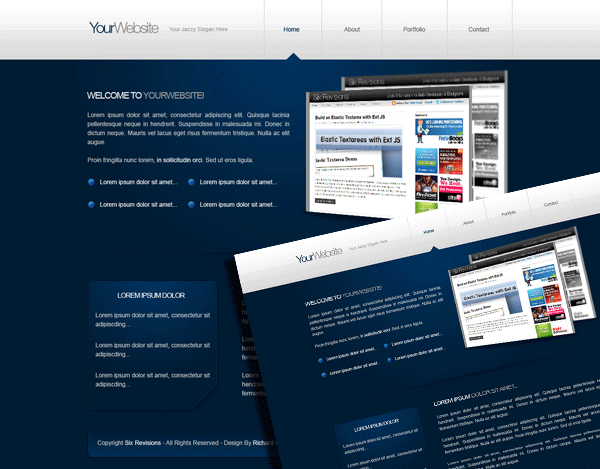
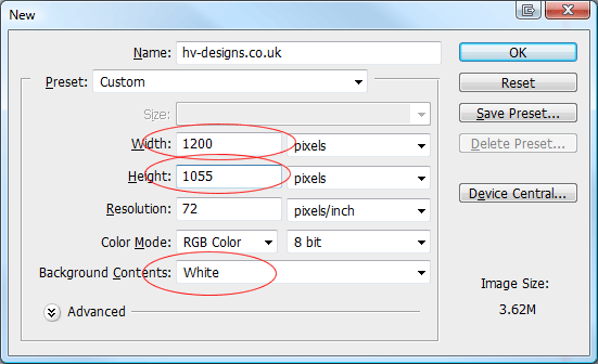
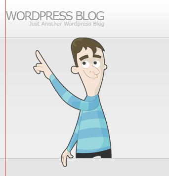
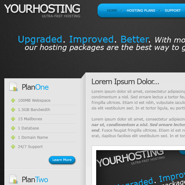
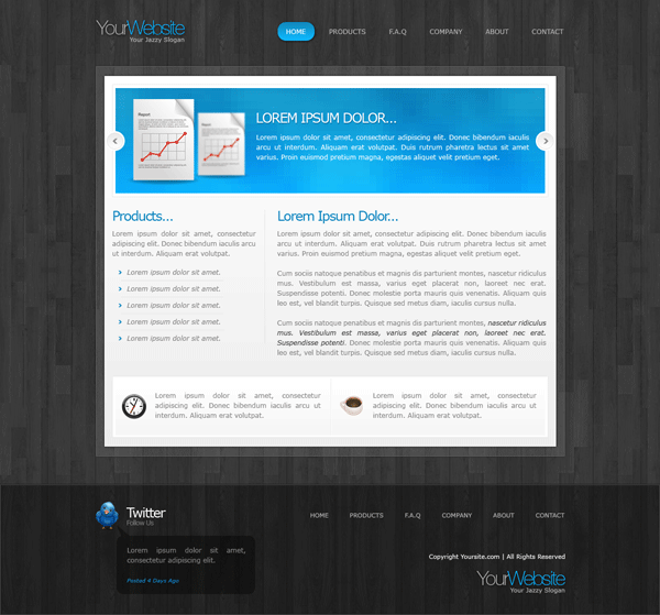
Hello everybody as requested heres the PSD sitebuild for Hosting Layout #2. If you havent already download the FREE PSD here.


Right lets get started

Preparing Our Folders And Files

Create a new folder on your desktop called “Hosting Layout”, inside this folder create another two new folders. Rename one folder “Stylesheets” and the other “Images”.

Step1

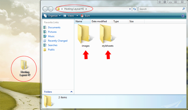
Inside the folder “Stylesheets” create two empty CSS files, one called “styles.css” and another called “reset.css”. Inside the main directory create a blank HTML file called “index.html”.

Step2

Preparing Our HTML And CSS Files

Open up your HTML file in your favourite code editor, il be using adobe dreamweaver. Inside your empty HTML file add the doctype, website title and link the styles.css stylesheet. The code should look something like this.

1
2
3
4
5
6
7
8
9
10
11
12
13
<!DOCTYPE html PUBLIC "-//W3C//DTD XHTML 1.0 Transitional//EN" "http://www.w3.org/TR/xhtml1/DTD/xhtml1-transitional.dtd">
<html xmlns="http://www.w3.org/1999/xhtml">
<head>
<meta http-equiv="Content-Type" content="text/html; charset=utf-8" />
<title>YOUR HOSTING - Template By Richard Carpenter | www.hv-designs.co.uk</title>
<link href="stylesheets/styles.css" rel="stylesheet" type="text/css" />
</head>
<body>
</body>
</html>

Now open up the “reset.css” file in your code editor. Inside the “reset.css” file were going to add a global reset for the whole website, the reset im using is based upon the “Yahoo! User Interface Library“.

1
2
3
4
5
6
7
8
9
10
11
12
13
14
*, html, body, div, dl, dt, dd, ul, ol, li, h1, h2, h3, h4, h5, h6, pre, form, label, fieldset, input, p, blockquote, th, td { margin:0; padding:0 }
table { border-collapse:collapse; border-spacing:0 }
fieldset, img { border:0 }
address, caption, cite, code, dfn, em, strong, th, var { font-style:normal; font-weight:normal }
ol, ul, li { list-style:none }
caption, th { text-align:left }
h1, h2, h3, h4, h5, h6 { font-size:100%; font-weight:normal }
q:before, q:after { content:''}
/* Global reset-RESET */
/* The below restores some sensible defaults */
strong { font-weight: bold }
em { font-style: italic }
a img { border:none } /* Gets rid of IE's blue borders */

Close the “reset.css” file as we won’t be needing it again. Now open up the “styles.css” file, at the very top of the file were going to import our “reset.css” file. We do this by adding the code below.

1
2
3
/*--------------- ADDITIONAL STYLESHEETS ---------------*/
@import url("reset.css");

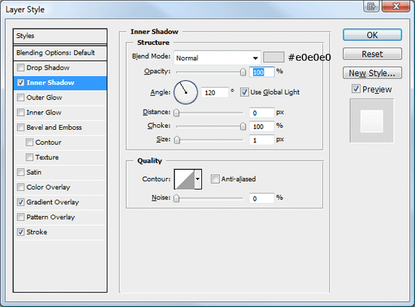
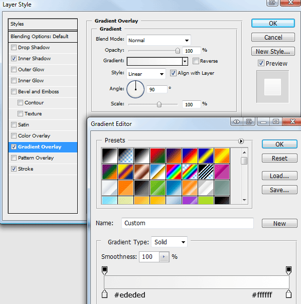
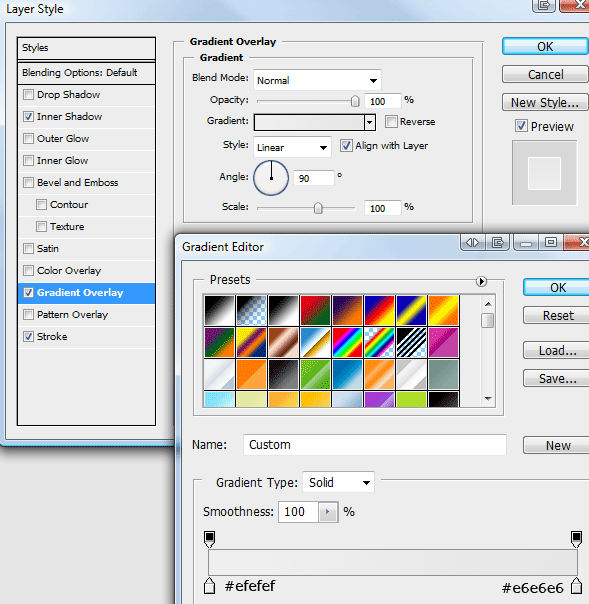
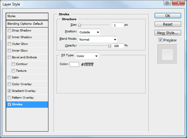
Coding The PSD Background

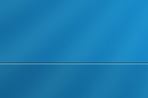
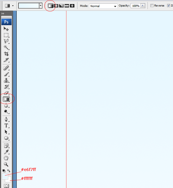
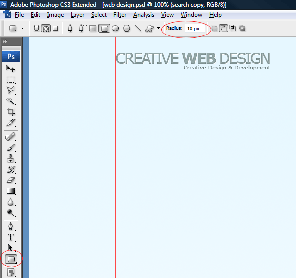
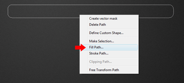
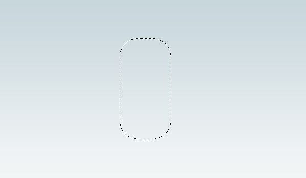
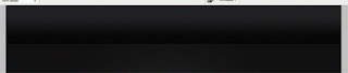
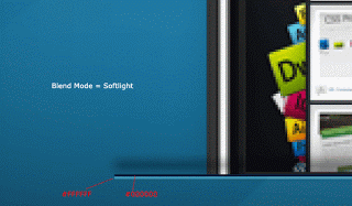
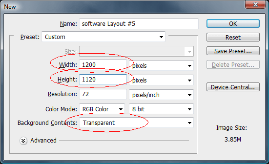
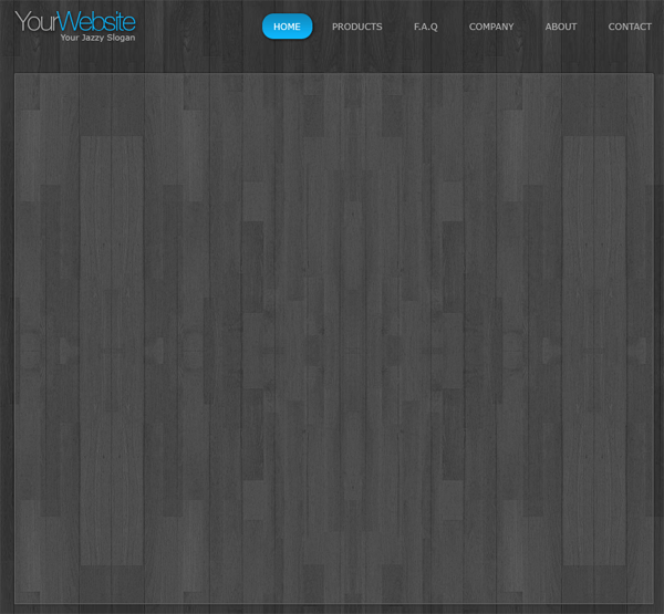
Now all our prep work has been done lets get down to business. Open up the hosting layout PSD file, then select the rectangular marquee tool. Scroll down to the very bottom of the canvas and make a rough selection.


Step3

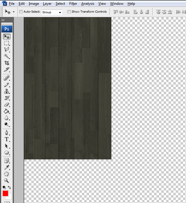
The size of the selection isn’t really that important hence why i said rough selection. Now you’ve made the selection go to “edit > copy merged”, then go to “file > new” (the dimensions should automatically be entered) then “edit > paste”. Save the file as “background.png” inside the images folder.

Inside the “styles.css” file create a style for the body tag, inside the style for the body tag enter the following styles.

1
2
3
4
5
6
7
8
9
10
11
/*--------------- MAIN BODY ---------------*/
body {
    font-family: Verdana, Arial, Helvetica, sans-serif;
    font-size: 12px;
    color: #898989;
    background-image: url(../images/background.png);
    background-repeat: repeat;
    margin-top: 30px;
    margin-bottom: 30px;
}

Lets just go through the styles above, we first set our font family for our website, i used the font “verdana” mostly inside the PSD file so we’l set that our as primary font. We then add our font size of 12 pixels along with the primary color of our text.

The chunk of background we just copied from the PSD file we set as our background image then set the background to repeat. Finally we add a top and bottom margin to the body which in turn will give us a gap at the top and bottom of our layout, just like the PSD file.

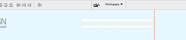
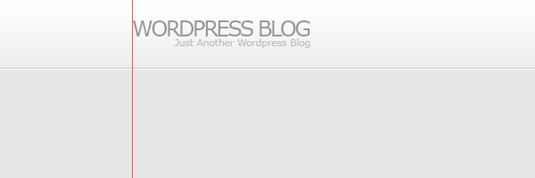
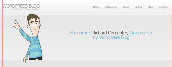
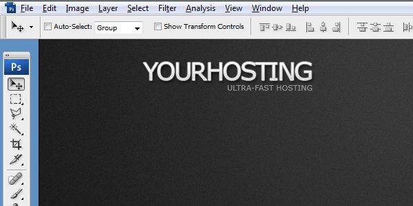
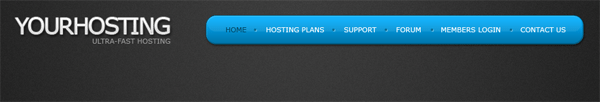
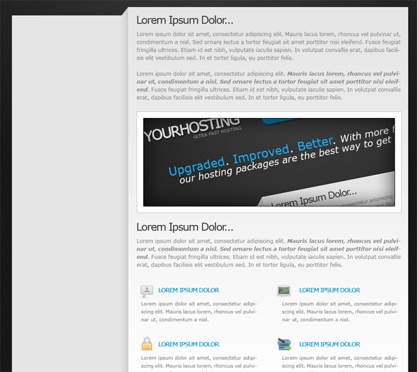
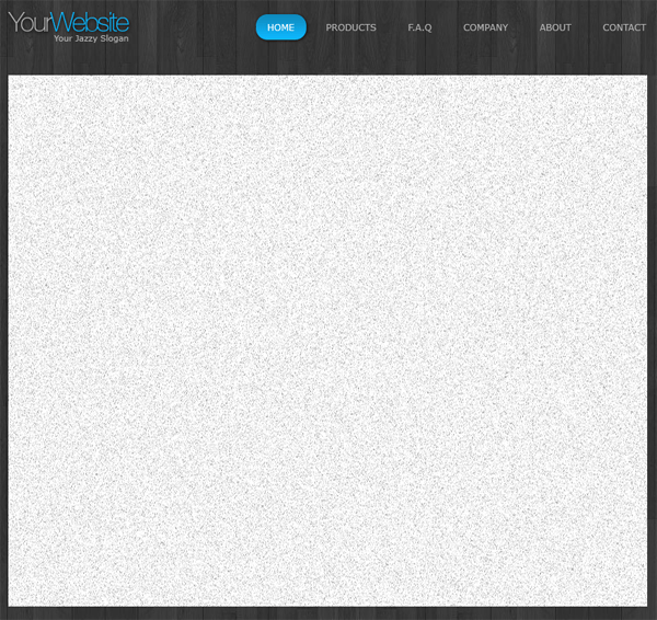
Coding The Website Title

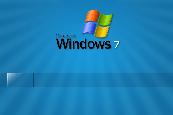
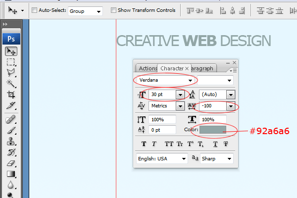
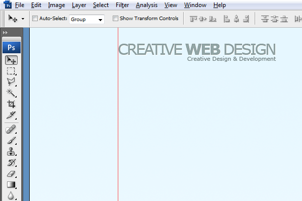
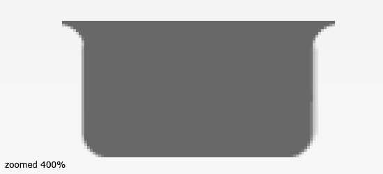
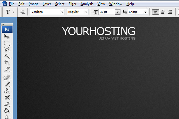
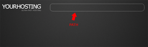
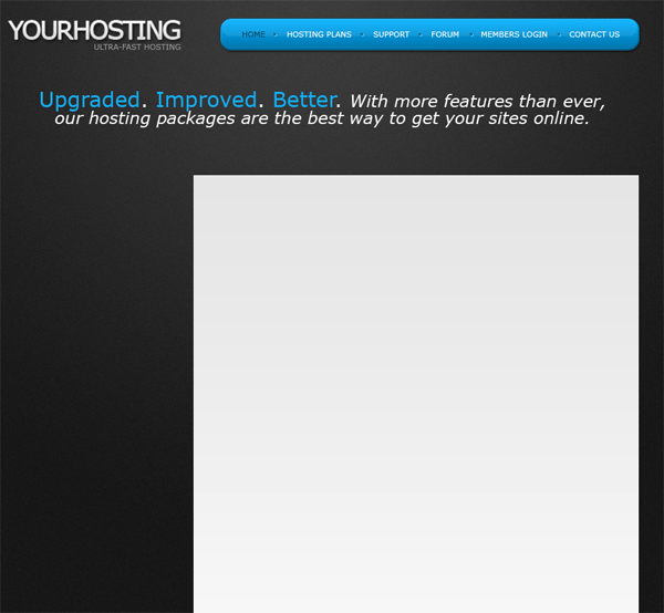
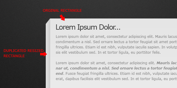
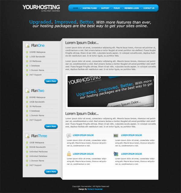
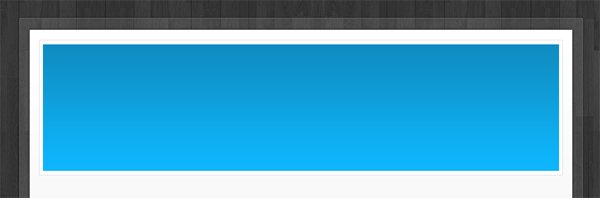
Head over to the PSD file, select the rectangular marquee tool then make a selection around the website title and slogan.


Step4

Try and get the selection as close as possible. Before we copy and paste to a new document we need to hide the background layer, as we need the image to be on a transparent background. Once you’ve hid the background layer go to “edit > copy merged” then paste to a new document. Save the image as “title.png” inside the images folder.

Lets now mark-up some code in our HTML file. We start off with a “container DIV” which is what our site will be contained in.

1
2
3
4
5
6
7
8
</head>
<body>
<div id="container">
</div><!--CONTAINER ENDS-->
</body>
</html>

Inside our “container DIV” we then add another DIV called “title”, inside the “DIV title” we insert our website title image.

1
2
3
4
5
6
7
<div id="container">
<div id="title">
<a href="http://www.hompage.com"><img src="images/title.png" alt="Website Title Here" /></a>
</div><!--TITLE ENDS-->
</div><!--CONTAINER ENDS-->

Lets style the two DIV’s we just created. We’ll start with the “container DIV”, our website PSD was based upon the website being 900px wide, so we first set a width of 900px, we then want the website to be centered in our browser so we set our margin’s to auto. The code looks like this.

1
2
3
4
5
6
/*--------------- MAIN CONTAINER ---------------*/
#container {
    margin: auto;
    width: 900px;
}

For our “title DIV” we need to create a fixed width and height, the dimensions for the width and height should be the same as our title image.


Step5

Your ads will be inserted here by

AdSense Now!.

Please go to the plugin admin page to paste your ad code.

The dimensions on your image might be slightly different compared to mine. We then float our DIV left and add a margin at the top of 2px. The margin at the top of 2px will bring the title DIV level with our navigation, you wont know this yet but i will as ive pre-coded my layout. The code looks like this.

1
2
3
4
5
6
7
8
/*--------------- TITLE ---------------*/
#title {
    float: left;
    height: 43px;
    width: 250px;
    margin-top: 2px;
}

Coding The Navigation

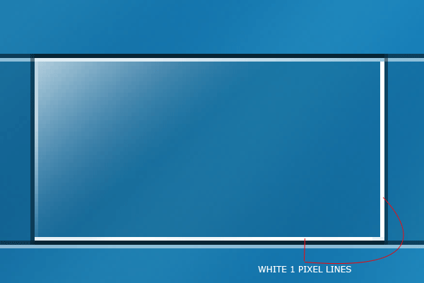
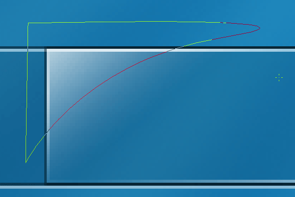
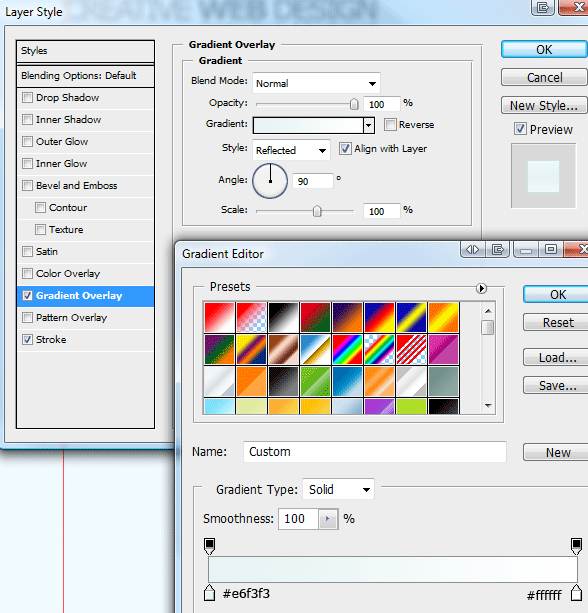
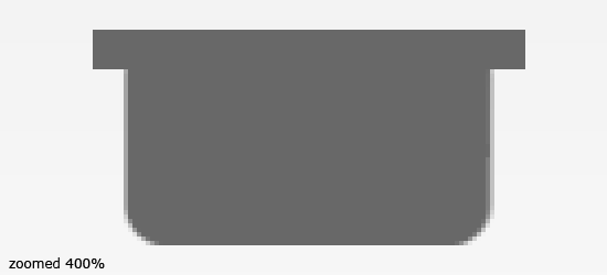
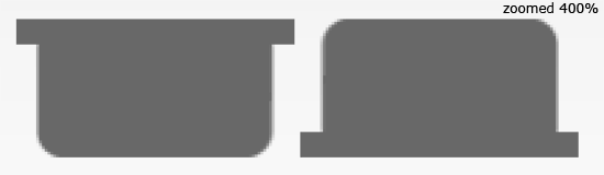
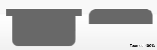
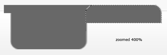
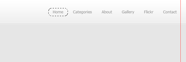
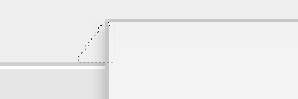
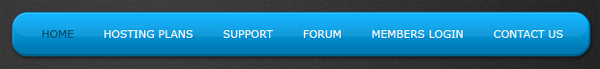
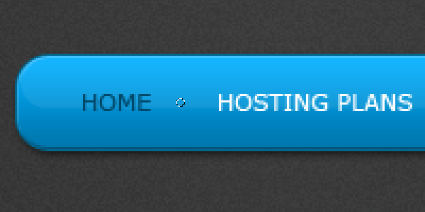
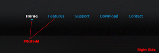
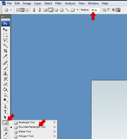
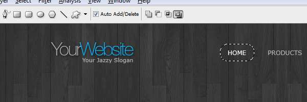
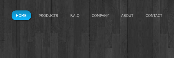
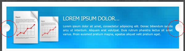
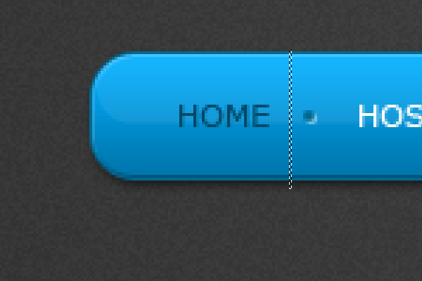
Lets move onto the navigation bar, now because the navigation is rounded were going to have to slice the navigation into 3 seperate images. In your PSD file make a selection around the left side of the navigation.


Step6

Copy the selection to a new document on a transparent background, then save the image as “nav_left.png” inside the images folder. Either repeat the same process for the right side of the navigation or just go to “image > rotate canvas > flip horizontally” then save the image again as “nav_right.png”.

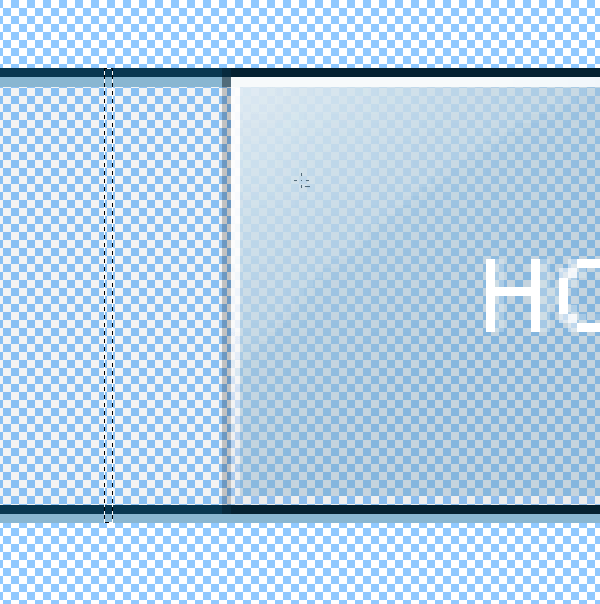
For the middle part of the navigation we just need to make a small selection about 1 pixel wide, make sure the selection is the same height as the two left and right images.

Step7

Save the middle slice as “nav-middle.png” inside the images folder. Right lets move onto marking up our navigation in our HTML file.

The Navigation Mark-Up

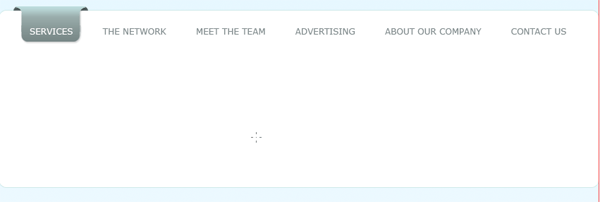
For our navigation we start off with a DIV called “navigation” inside this DIV we then add 3 classes. “navigation-left”, “navigation-middle” and “navigation-right”, the left and right classes will contain our rounded corners, while the middle will hold our content.

Inside the “navigation-middle” class add an unorder list (UL) with a class of “nav-links” then add your navigation items in list form. Give the very last list item a class of “no-divider”, the no-divider class will remove the bullet point from the very last link in the navigation.

In the left and right navigation classes insert your left and right images. The code looks like this.

1
2
3
4
5
6
7
8
9
10
11
12
13
14
15
16
17
18
19
20
21
22
<div id="navigation">
<div class="navigation-left">
<img src="images/nav_left.png" />
</div>
<div class="navigation-middle">
<ul class="nav-links">
<li><a href="#" title="Homepage">home</a></li>
<li><a href="#" title="Hosting Plans">hosting plans</a></li>
<li><a href="#" title="Support">support</a></li>
<li><a href="#" title="Forum">forum</a></li>
<li><a href="#" title="Members Login">members login</a></li>
<li class="no-divider"><a href="#" title="Contact Us">contact us</a></li>
</ul>
</div>
<div class="navigation-right">
<img src="images/nav_right.png" />
</div>
</div><!--NAVIGATION ENDS-->

Before we add our styles for our navigation lets first slice the little bullet point between each link.


Step8

Save the little bullet point as “nav_divider.png” inside the images folder. Lets now add our navigation styles to our style sheet.

The first item we style will be our main navigation DIV. We start off by floating the DIV to the right then add a fixed height, the height of the navigation DIV should be the same height as our navigation slices. All my slices have a height of 49px, the code looks like this.

1
2
3
4
5
6
/*--------------- NAVIGATION ---------------*/
#navigation {
    float: right;
    height: 49px;
}

We can now style our left, right and middle part of the navigation, now because we inserted the rounded corners as images into the HTML file we dont need to add them as backgrounds or anything in our CSS file, which also means the left and right class styles can be grouped together.

First we float our two classes left inside of our navigation DIV, we then add a fixed width and height which should be the same pixels as our left and right images. If your images are not the same width and height then id suggest you modify them so they are, it will make life much easier. The code looks like this.

1
2
3
4
5
.navigation-left, .navigation-right {
    float: left;
    height: 49px;
    width: 18px;
}

The middle class is very similar as the left and right styles, the only difference is we add our navigation middle image as a background and repeat it horizontally, the fixed width is also removed which will allow the navigation to expand with the amount of content that is added.

1
2
3
4
5
6
.navigation-middle {
    background-image: url(../images/nav_middle.png);
    background-repeat: repeat-x;
    float: left;
    height: 49px;
}

Lets now style our lists and hyperlinks. Each list element will be displayed as a block and floated left, the little bullet point image will be added as a background on each list, then the little bullet points background position will have to be adjusted to align in the middle of the navigation, the position should be set to the right and shifted down 22px.

We then remove the background style from the class “no-divider” which will remove the bullet point from the last navigation item.

1
2
3
4
5
6
7
8
9
10
11
.nav-links li {
    display: block;
    float: left;
    background-image: url(../images/nav_divider.png);
    background-repeat: no-repeat;
    background-position: right 22px;
}
li.no-divider {
    background-image: none;
}

Finally we style navigation links and set the hover state of each link. The links will also be floated left and displayed as a block element, each link will have a height of 49px the same as our navigation DIV and images. We can seperate each link item by adding a left and right margin, adding some top padding will also push down our links to the middle of the navigation.

1
2
3
4
5
6
7
8
9
10
11
12
13
14
15
16
.nav-links li a {
    display: block;
    float: left;
    height: 49px;
    margin-right: 15px;
    margin-left: 15px;
    padding-top: 16px;
    color: #FFFFFF;
    text-decoration: none;
    text-transform: uppercase;
    font-size: 11px;
}
.nav-links li a:hover {
    color: #004869;
}

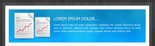
Coding The Featured Sentance

In our PSD file we had a featured sentance, we’ll achieve the same look in CSS by using span classes. Start off by creating a DIV called “featured-text”, inside the DIV add your featured sentance wrapped in a H1 tag. Insert a span class of “featured-text2″ on the words you want in a different color. The code looks like this.

1
2
3
4
<div id="featured-text">
<h1><span class="featured-text2">Upgraded. Improved. Better. </span>With more features than ever,
our hosting packages are the best way to get your sites online.</h1>
</div><!--FEATURED TEXT ENDS-->

The “featured-text DIV” will be floated left inside our container and will have a fixed width of 900px, no fixed height is set as we want the DIV to expand with the amount of content added. Finsh it off with a top and bottom margin of 40px which will provide a nice decent size gap between the sentance and the other content.

The H1 tag will contain our primary text color, size and font style, then the span class will will provide the additional styles for the blue bigger words. The code looks like this.

1
2
3
4
5
6
7
8
9
10
11
12
13
14
15
16
17
18
19
20
/*--------------- FEATURED TEXT ---------------*/
#featured-text {
    float: left;
    width: 900px;
    margin-bottom: 40px;
    margin-top: 40px;
}
h1 {
    text-align: center;
    font-size: 24px;
    font-style: italic;
    color: #FFFFFF;
}
span.featured-text2 {
    font-size: 30px;
    color: #14aff7;
}

Stay Tuned…

Thats it for part one, look out for part two tomorrow, i suggest you subscribe VIA our RSS feeds if you havent already. I’ll look forward to all your comments, questions and part one results.


Your ads will be inserted here by

AdSense Now!.

Please go to the plugin admin page to paste your ad code.

WordPress Layout #6

Your ads will be inserted here by

AdSense Now!.

Please go to the plugin admin page to paste your ad code.

Welcome to tutorial 230, in this tutorial il be showing you how to create a sleek, clean and spacious wordpress blog.


Setting Up The Canvas And Guides

Create a new document 1200 x 1520, fill your background layer with the color #e6e6e6.

Step1

The layout were making is going to be 900px wide, so were going to need to setup some guides. Go to “view > new guide” from the menu at the top, in the box that pops up enter the following settings.

Step2

Do the same again only this time enter these settings.

Step3

Creating The Header

Select the rectangular marquee tool, then create a rectangle the width of the canvas and about 80 pixels in height. Fill the rectangle with any color then add these layer styles.

Step4

Step5

Step6

You should have something like this.

Step7

On the left side add your wordpress website title and slogan, fill the text using the color #979797. Once you’ve added your title and slogan add a drop shadow using the settings below.

Step8

You should have something like this.

Step9

Creating The Navigation

Using the text tool add some dummy links to the right side of the header.

Step10

Using the rounded rectangle tool make a selection around each navigation link.

Step11

Fill the rectangles in any color then add these layer styles.

Step12

Step13

Step14

You should have something like this.

Step15

Creating The Welcome Area

Using the rectangular marquee tool make a selection underneath the header, make sure the selection is on a new layer underneath the header.

Step16

Fill the selection with any color then add these layer styles.

Step17

Step18

Step19

You should have something like this.

Step20

Were now going to add a character from wefunction, click here (http://wefunction.com/2008/11/free-character-pack/) and download the character pack. Once you’ve downloaded it, extract it too your hard drive then open up “002__002.eps” in photoshop. Drag the character over onto your canvas and position it like the image below.

Step21

Chop the characters legs off just below the stroke on the welcome area.

Step22

Your ads will be inserted here by

AdSense Now!.

Please go to the plugin admin page to paste your ad code.

Finally add a drop shadow using the settings below.

Step23

On the right side of the character add a simple sentance about your blog.

Step24

Creating The Content Area

Select the rectangular marquee tool and make a selection on the right side of the canvas against the right guide. the rectangle should be about 600 pixels in width and as long as you see fit, you can always resize the rectangle later to fit the content.

Step25

Fill the selection with any color then add these layer styles.

Step26

Step27

Step28

Create a new layer underneath the content rectangle, then select the polygonal lasso tool. On the corner of the content rectangle create a triangular shape like the image below.

Step29

Make sure the selection doesn’t go below the welcome area’s stroke. Once you’ve created the selection fill it with the color #a9a9a9. You should have something like this.

Step30

Mocking Up The WordPress Posts

Inside our content area, lets begin to mock up our dummy posts. Select the type tool and add an example posts title using the color #666666 and font size 24pt. Underneath the post title add some meta data (E.G post time, post date, author and category).

Step31

Underneath the post meta data add a 1 pixel line using a light grayish color. Now head over to woothemes and download this icon pack (http://www.woothemes.com/2009/09/woofunction-178-amazing-web-design-icons/). On the right side of the post title add the speech bubble icon with some text saying comment here.

Step32

Finish off the post with a dummy image and some dummy text. After you’ve added the dummy text add a read more button using the buttons from the navigation. Ive also thrown in some social buttons for good measure.

Step33

Creating The Sidebar

The sidebar will be located on the left side, opposed to many blogs which display it on the right. In the sidebar im going to add a flickr gallery first, create a heading using a font size of 18pt, use the color #666666 for the heading color.

Step34

Underneath the flickr gallery title add some small thumbnail like images to act as our dummy flickr gallery. Before we continue adding our sidebar elements let seperate each part using a simple separator. Select the rectangular marquee tool, then create two 1 pixel lines on top of each other. Fill the lines in two different colors, the line thats on the bottom fill with white and the line that sits on top fill in a grayish color darker than the sidebar background. Finally drag the separator lines layer underneath the content box layer so they disapear nicely behind the content box.

Step35

Continue to bloat out your sidebar with the elements you’d want in the sidebar, ive added a simple recent comments list and some website sponsors.

Step36

Step37

Creating The Footer

Duplicate your welcome area background then drag it down to the bottom of the canvas. Open up the layer styles window then switch the colors between the stroke and the inner shadow. You need the make sure the white line is underneath the dark gray line else you wont get the indented effect.

Step38

On the left side of the footer add a nice twitter icon with speech bubble next to it. The speech bubble was from the custom shapes libary from within photoshop.

Step39

Add a dummy twitter post inside the speech bubble then stick a header over the top. On the right side of the footer add your copyright information and maybe another little character image from wefunction.

Step40

Creating The Pagination

Select the rectangular marquee tool or the rectangle tool and create a couple of square boxes just over the footer stroke. Using the same method as we did for our content box , add the little triangular grey shapes to make them look as if they are wrapping around the footers stroke.

Step41

On the right side of the footer add 1 single square with a little arrow inside it, again use the same method as above to get the 3D effect.

Step42

Well Done… Finished

Thats it all done, heres the finished layout.

Finished Layout

Final Note

Thanks for taking part in this tutorial, il look forward to your comments. Also look out for the finished wordpress theme which will be available to download for FREEEE. Subscribe via our RSS feeds to stay tuned.

Thank You.

Your ads will be inserted here by

AdSense Now!.

Please go to the plugin admin page to paste your ad code.

Hosting Layout #2: Freebie

Your ads will be inserted here by

AdSense Now!.

Please go to the plugin admin page to paste your ad code.

Grab your free PSD file of the hosting layout #2 ready for the PSD conversion tutorial sometime this week. Enjoy!


Hosting Layout #2

Your ads will be inserted here by

AdSense Now!.

Please go to the plugin admin page to paste your ad code.

Download PSD FILE

License and Attribution

This PSD is licensed under the Creative Commons license and can be used for personal purposes ONLY. Attribution is needed before using.

Your ads will be inserted here by

AdSense Now!.

Please go to the plugin admin page to paste your ad code.

Hosting Layout #2

Your ads will be inserted here by

AdSense Now!.

Please go to the plugin admin page to paste your ad code.

Hello, welcome to another tutorial from hv-designs. Today il be showing you how to create a hosting layout with a 3D aspect to it.


Setting Up The Background

Create a new document 1200 x 1200 pixels, set your foreground color to #3e3e3e and background color to #191919. Select the gradient tool with a radial gradient.

Step1

Once you have the radial gradient selected, start from the top middle of the canvas then drag downwards about halfway down. Now go to “filter > noise > add noise”, use the settings below.

Step2

You canvas should now look something like this.

Step3

Creating The Website Title

Select the type tool then add your website title to the canvas. I used the font verdana and a font size of 36pt.

Step4

Add these layer styles to your website title text.

Step5

Step6

Step7

Step8

You should have something like this.

Step9

Creating The Navigation Bar

Select the rounded rectangle tool with a radius of 15 pixels.

Step10

Drag out your path along side the website title, leaving a decent size gap inbetween each element.

Step11

Once you’ve dragged out your path select the pen tool. Right-click inside the path and go to fill path.

Step12

Finally right-click inside the path again and go to delete path. Now add the following layer styles.

Step13

Step14

Step15

Step16

You should have something like this.

Step17

Using the same method as explained above create another rounded rectangle inside the navigation. Fill the rectangle with the color white.

Step18

Now set the opacity of the white rectangle to 8% then add your navigation links.

Step19

Inbetween each navigation link add a small circle using the elliptical marquee tool.

Step20

Fill the circle using the color #00688f then add a drop shadow using the settings below.

Step21

Your ads will be inserted here by

AdSense Now!.

Please go to the plugin admin page to paste your ad code.

Your navigation should now look like this.

Step22

Creating The Content Area

Underneath the website title and navigation add a catchy sentance of some sort, then using the rectangular marquee tool create a rectangle on the right side.

Step23

Add a gradient overlay to the rectangle you just created using the settings below.

Step24

Inside the rectangle add some dummy content. Use the color #373737 for the titles and a size of 14pt, for all paragraphs use the color #898989 with a size of 12pt. Also within the content area throw in some snazzy icons in a nice list form, the icons ive used are from woothemes.

Step25

Creating The Sidebar

Duplicate your content rectangle layer, then drag the duplicated layer underneath its orginal. Press “ctrl + t” to free transform the rectangle, resize the rectangle to a thin rectangle, then move it side by side to the content rectangle.

Step26

With your duplicated rectangle layer still selected go to “edit > transform > perspective”. Select the top left anchor point and move it downwards whilst holding down the shift key on the keyboard.

Step27

Update the gradient overlay on the duplicated rectangle to the settings below.

Step28

Duplicate the content rectangle once more, resize the rectangle using the free transform tool. The rectangle should be resized to fit side by side the first rectangle we duplicated.

Step29

On each crease where the rectangles meet, add a divider using the color’s specified below. The dividers should span the whole height of the each crease.

Step30

You should have something like this.

Step31

Adding The Sidebar Content

Using the type tool and the plus icon from the woothemes icon set, create a simple list displaying dummy content.

Step32

Inbetween each list item add a dotted divider. You can easily create the dotted divider by using the type tool and hold down the full stop key. (………)

Step33

Underneath the list add a simple learn more button. Select the rounded rectangle tool with a radius of 15px same as our navigation bar, drag out a small sized button then fill with any color. Right click the navigation layer and go to “copy layer styles”, right click the learn more button layer and go to “paste layer styles”.

Step34

Repeat the steps above to create more plans as needed.

Step35

Step36

Finally inbetween each plan add a divider to seperate the content. Create two 1 pixel lines using the colors below.

Step37

Finally…

Finally add your footer content underneath the content rectangle using the type tool. Thats it all done, hope you enjoyed this tutorial, il look forward to your comments.

Step38

Dont Forget

Dont forget to digg and re-tweet this tutorial, your help and support is much appreciated. Thank You.!

Learn To Code This Layout

You can learn to code this layout into a working CSS template by following these two follow-up tutorials. Part #1 and Part #2.


Enjoy

Your ads will be inserted here by

AdSense Now!.

Please go to the plugin admin page to paste your ad code.

Competition: Wallpaper (closed)

Your ads will be inserted here by

AdSense Now!.

Please go to the plugin admin page to paste your ad code.

Welcome to the second official hv-designs contest to kick the month of october. This competition is alot easier than the last one so even photoshop novice users should be able to participate.


About The Contest

As mentioned above the competition is fairly easy, all’s you have to do is create a hv-designs featured wallpaper. The theme for the wallpaper should be what you think hv-designs is all about.

How To Enter

Your ads will be inserted here by

AdSense Now!.

Please go to the plugin admin page to paste your ad code.

To enter the competition, contestants must submit designs into the HV-Designs Flickr Group. (located in the sidebar). Be sure to follow these guidelines

  • All entries must be tagged with “comp_wallpaper”.
  • Submit a JPG image that is 1680x 1050 pixels or larger.
  • Include in the description of your Flickr entry any stock or source images you have used including URLs to those images. (always credit your sources).
  • Please make sure your entries are added to the hv-designs flickr pool.

What Do We Win?

1st Place Prizes:

2nd Place Prizes:

  • 5 Vector packs, 5 Icon packs, 5 Photoshop brush packs with extended license (Worth £131)
  • Free PSD to HTML conversion service from SB Designs Uk (Worth £85)

3rd Place Prizes:

  • 1 Vector pack, 1 Icon pack1, 1 Photoshop brush pack with extended license (Worth £26)

Terms and Conditions

  • Entries must be submitted before OR on 31/10/2009.
  • Entries into the competition must be entirely your work.
  • All stocks used must be credited with a working URL. (triple check your allowed to use the image)
  • No prize can be redeemed for cash.
  • If you live outside europe or USA the book from packt publishing will be substituted as a digital E-Book.

Sponsors

competition closed01 competition closed02 competition closed04


Good Bye.

Your ads will be inserted here by

AdSense Now!.

Please go to the plugin admin page to paste your ad code.

Desk Environments Layouts

Your ads will be inserted here by

AdSense Now!.

Please go to the plugin admin page to paste your ad code.

Hello, welcome to another round up of inspiration. This time we’ll be looking at desk environments made with photoshop.


System Six Desk Design

Desk01

Desk Layout #2

Desk02

Desk Layout #3

Desk013

Desk Portfolio

Desk04

Classical Desk

Desk05

Desk Layout #6

Your ads will be inserted here by

AdSense Now!.

Please go to the plugin admin page to paste your ad code.

Desk06

Learner Driving Desk Environment

Desk07

Desk Layout #8

Desk08

Spring Blog

Desk09

Desk Layout #10

Desk10

Desk Layout #11

Desk11

Have you made a desk environment layout you’d like to share with us???? feel free to list them in the comments area below. Thanks for reading.

Your ads will be inserted here by

AdSense Now!.

Please go to the plugin admin page to paste your ad code.

PSD Pack #1

Your ads will be inserted here by

AdSense Now!.

Please go to the plugin admin page to paste your ad code.

Every month up until christmas i’l be giving away a FREE PSD pack. Each pack will contain 10 FREE PSD files for your photoshop pleasure.


PSD PACK #1

PSD Pack #1 contains the following PSD files. Enjoy. Dont forget to re-tweet and digg this post. Thank You

PSD PACK #1

PSD PACK #1

PSD PACK #1

PSD PACK #1

Your ads will be inserted here by

AdSense Now!.

Please go to the plugin admin page to paste your ad code.

PSD PACK #1

PSD PACK #1

PSD PACK #1

PSD PACK #1

PSD PACK #1

PSD PACK #1

License and Attribution

This PSD PACK is licensed under the Creative Commons license and can be used for personal purposes ONLY. No attribution is needed but it is always appreciated.

Your ads will be inserted here by

AdSense Now!.

Please go to the plugin admin page to paste your ad code.

PC Mouse Tutorial

Your ads will be inserted here by

AdSense Now!.

Please go to the plugin admin page to paste your ad code.

Good evening everybody,…. today il be showing you how to create a PC mouse from scratch. Right lets get started!


You can download the PSD file for free.

Creating Our Document

For the purpose of this tutorial im going to be using a smaller background than you might use. Il be using 600 x 350 pixels, id recommed a nice big canvas size depending on how big you want your mouse. Create your a new document using your recommended settings, fill your background with a nice subtle color, nothing in particular just not white.

Step1

Drafting Out The Mouse

Select the rounded rectangle tool with a radius of 35 pixels.

Step2

Drag out a rectanglular path as big as you want your mouse to be.

Step3

Once you’ve dragged out the path to your rectangle select the pen tool from the side menu, right-click inside the rectangular path and go to “make selection”. Select the gradient tool with a radial gradient, using the colors #262a2d and #090f0d drag out the radial gradient.

Step4

Were now going to customize our rectangle’s shape with the warp tool, go to “edit > transform > warp” (if your using a version of photoshop before CS2 then the warp tool wont be available)

Once you’ve selected the warp tool transform the shape into your mouse. Drag the corner anchor points inwards towards each other, then drag the middle lines out towards the edges of the canvas. Your aiming for a bloated version of the orginal rectangle.

Step5

You should have something like this.

Step6

Cutting The Buttons

Duplicate your mouse layer then hide the duplicated layer as we’ll be using it later to create the mouses shadow. Select the elliptical marquee tool and make a selection around the top half of the mouse.

Step7

Once you’ve made the selection go to “edit > cut” then “edit > paste”. The top half of the mouse should now have been detached, re-position the top half of the mouse back to where it was cut from then add a gradient overlay using the settings below.

Step8

You should have something that looks like this.

Step9

Adding Some Mouse Body Details

Were now going to add some minor details to the mouse body just to bring it to like abit. Firstly lets add abit of noise to the mouse body, select the mouse body layer whilst holding the ctrl key on the keyboard this should load the selection. Once the selection has been loaded go to “filter > noise > add noise”.

Step10

Once the noise has been added keep the selection active. Select the dodge tool with a brush size of around 45pixels, change the exposure to 25%.

Step11

Gently brush some highlights around the top edge of the body, along the middle and towards the bottom. Check the image below for my result.

Step12

Next add a inner shadow to the mouse body layer using the settings below.

Step13

Lastly were going to add a stroke to the top half of our mouse body, to do this we need to load a selection around the mouse body, then go to “edit > stroke”, us the color #3f434a for your stroke. Once you’ve applied the stroke remove the stroke from around the sides and edges of the mouse leaving the top part.

Step14

Duplicate the stroke which is left then move it up by 1 pixel, color the new stroke black by adding a black color overlay.

Step15

Adding The Mouse Buttons

Select the rectangular marquee tool on a new layer create 3 single lines, color the first one #f8f8f9, color the middle one black #000000 then color the last one white #888a94. Place all 3 lines in the middle of top part of the mouse.

Your ads will be inserted here by

AdSense Now!.

Please go to the plugin admin page to paste your ad code.

Step16

Add a layer mask to the lines then drag a linear gradient from the top downwards. The look were going for is to have the line faded at the top then gradually have it come back to normal as it reaches the bottom part of the mouse buttons.

Step17

Adding The Mouse Wheel

Select the rounded rectangle tool with a radius of 35 pixels, drag out a rectangle over the lines we created in the previous step.

Step18

Select the gradient tool with a radial gradient, set your foreground color to #4a4e55 and background color to #0d0d12. Drag the radial gradient from the top towards the bottom of the rounded rectangle.

Step19

Now add these layer styles to your mouse wheel.

Step20

Step21

Finally were going to add a second stroke around the mouse wheel, load a selection around your mouse wheel then go to “edit > stroke” change the strokes color to #a3a5ad. You should have something like this.

Step22

Adding The Mouse L.E.D

Select the circle tool or elliptical marquee tool and create a circle just below the mouse buttons on the mouse body.

Step23

Fill the circle with any color then add these layer styles.

Step24

Step25

Step26

Step27

You should have something like this.

Step28

Were now going to add a little light sparkle. Select the paint brush tool, then click the little black arrow where you select your brush and size. Inside this window there is another black arrow, click it then go to “assorted brushes”.

Step29

Now select the crosshatch brush from with the brushes window.

Step30

With the color white and a brush size of around 25 add the crosshatch in the middle of the L.E.D.

Step31

Once you’ve added the crosshatch remove two of the lines using your prefered cutting tool then add a gradient overlay using the settings below.

Step32

You should have something like this.

Step33

Finishing Up

Finally add your mouse brand or logo on the body of the mouse, you can use the warp tool to make the text slightly rounded. Unhide your duplicated mouse layer which we tooked away earlier, make sure its underneath all the other layers then add a guassian blur, blur by about 1.5 – 2 pixels. Set the shadow layers opacity to about 50% then move it a couple of pixels towards the right.

Step34

Thats it all done, you should now have something like the image above, BUT dont leave it there why not add a little bit more. Maybe a wire here and there or even the USB connection or even a different colored mouse.

Step34

Hope you’ve enjoyed this tutorial, dont forget to re-tweet and digg. Il look forard to your comments.

Your ads will be inserted here by

AdSense Now!.

Please go to the plugin admin page to paste your ad code.

Software Layout #5: Free PSD

Your ads will be inserted here by

AdSense Now!.

Please go to the plugin admin page to paste your ad code.

Software Layout #5 FREE PSD File.


Software Layout #5

Your ads will be inserted here by

AdSense Now!.

Please go to the plugin admin page to paste your ad code.

Download PSD FILE>

License and Attribution

This PSD is licensed under the Creative Commons license and can be used for personal purposes ONLY. Attribution is needed before using.

Your ads will be inserted here by

AdSense Now!.

Please go to the plugin admin page to paste your ad code.

Software Layout #5

Your ads will be inserted here by

AdSense Now!.

Please go to the plugin admin page to paste your ad code.

Hello welcome to another tutorial by hv-designs, today we’ll be making software layout with a nice wooden texture applied as a background.


Creating Our Document And Background

Create a new document 1200 x 1120 pixels with a transparent background.

Step1

Once you’ve created your document download this wooden texture by “Matt Hamm”. Once you’ve downloaded the texture place it in the top left corner of the canvas.

Step2

Duplicate the texture by right-clicking the layer and going to “duplicate layer”. Once duplicated flip the duplicated texure horizontally then place it next to its orginal.

Step3

Repeat the process until you’ve reached the other side of the canvas. Once you’ve reached the right side of the canvas repeat the process again only this time flipping the texture vertically. When the whole canvas is covered merge all the layers into one layer called background. Finally desaturate the background by going to “image > adjustments > desaturate”

Step4

Creating The Title And Navigation

Select the type tool then add your website title in the top left corner. The font and settings ive used are listed in the image below.

Step5

Once you’ve added the text add these layer styles.

Step6

Step7

Once you’ve sorted the website title on the right side add a simple text style navigation using the color #b3b3b3. On the first text link change the color to white (#ffffff).

Step8

On the link that is coloured white were going to add a hover state. Select the rounded rectangle tool with a radius of 15px.

Step9

On a new layer underneath the navigation text create a small rectangle around the link.

Step10

Fill the rectangle with any color then add these layer styles.

Step11

Step12

You should have something like this.

Step13

Creating The Outer Content Area

Select the rectangular marquee tool and create a big white rectangle, the rectangle should be about 850 x 700 pixels. Once you’ve created the rectangle add 15% noise by going “filter > noise > add noise”.

Step14

Once you’ve added the noise apply these layer styles.

Step15

Step16

Step17

You should have something like this.

Step18

Creating The Inner Content Area

Click the “Outer Content Area” box whilst holding down the CTRL key on the keyboard, this should load a selection around the rectangle. Once the selection is loaded go to “select > modify > contract”. Contract the selection by 20pixels then fill the selection with the color white on a new layer.

software layout step19

Now add these layer styles to the new inner rectangle.

Step20

Step21

Step22

Your ads will be inserted here by

AdSense Now!.

Please go to the plugin admin page to paste your ad code.

Step23

You should have something like this.

Step24

Creating The Featured Area

Click the “Inner Content Area” box whilst holding down the CTRL key on the keyboard, this should load a selection around the rectangle. Once the selection is loaded go to “select > modify > contract”. Contract the selection by 20pixels then fill the selection with the color white on a new layer. Once filled add a 1 pixel stroke using the color #e4e4e4.

Select the rectangular marquee tool OR your prefered cutting tool, make a selection around the rectangle you just created starting from the bottom. Leave about 200pixels at the top, then hit the delete key. You should be left with a 200 pixel wide box.

Step25

Click the “Rectangle” you just cut whilst holding down the CTRL key on the keyboard, this should load a selection around the rectangle. Once the selection is loaded go to “select > modify > contract”. Contract the selection by 5-10 pixels then fill the selection with the color white on a new layer. Once filled add this gradient overlay.

Step26

You should have something like this.

Step27

Click the “Rectangle” you just created whilst holding down the CTRL key on the keyboard, this should load a selection around the rectangle. Create a new layer then go to “filter > render > clouds”, now go to “filter > pixelate > mosaic” use the settings below.

Step28

Now set the layer blend mode to “soft light” and opacity to 75%. You should have something like this.

Step29

Inside the blue rectangle add some dummy content and maybe an icon of some sort. Im using an icon from one of smashing magazine’s icon sets.

Step30

Creating The Featured Area Buttons

Create two circles either side of the featured area, make the circles small dont make them too big. Once you’ve created the circles add these layer styles.

Step31

Step32

Step33

You should have something like this.

Step34

Finish off the little buttons by adding a dark gray arrow to it.

Step35

The Dummy Content

This next part doesnt really need a “step-by-step” as its just all text done with the type tool. Create simple blue headings with subtle gray text underneath, maybe add a list or two to break the layout up abit. Leave an area at the bottom for some additional content.

Step36

In the area at the bottom create a box in the same way we did our featured area outer box. The layer styles for this new box at the bottom are also the same as the featured area outer box. Fill the outer box with some a dummy paragraph or two and maybe an icon or two. The icons ive used this time are from “wefunction”.

Step37

Creating The Footer

Select the rectangular marquee tool and create a black rectangle across the bottom of the canvas, over the wood texture. Set the fill % of the black box to 40%.

Step38

Now add these layer styles to the layer.

Step39

Step40

Using a twitter icon and a speech bubble from photoshop’s custom shapes libary, create a follow us area on the left side of the footer. The twitter icon ive used is from smashing magazine.

Step41

On the right side of the footer add a duplicate of your website title and slogan. Then add your copyright information and any other information you would find inside of the footer area.

Step42

Finished Layout

Step43

Congratulations you’ve finished the tutorial, hope you found it intresting, thanks for reading il look forward to your comments.

Dont forget to re-tweet and digg this tutorial, your help and support is much appreciated.

Your ads will be inserted here by

AdSense Now!.

Please go to the plugin admin page to paste your ad code.

15 DeviantArt Illustrations

Your ads will be inserted here by

AdSense Now!.

Please go to the plugin admin page to paste your ad code.

The internet is full of great artists and in this round-up ive listed 15 exceptional illustrations from “deviantART”. You’ll be amazed at some of this work.


Pepper Smile

Pepper Smile

Synergy

Synergy

Dreams Of A City

Dreams Of A City

Elastigirl

Elastigirl

New Frontiers

New Frontiers

Extravaganza

Extravaganza

Fat Donald

Fat Donald

For The Dragon

Your ads will be inserted here by

AdSense Now!.

Please go to the plugin admin page to paste your ad code.

For The Dragon

Micheal Jackson Always Alive

Micheal Jackson Always Alive

Burnout

Burntout

The Web – Issue 1

The Web - Issue 1

Nika

Nika

PF Dark Ryu

PF Dark Ryu

Lost

Lost

Sexy

Sexy

Which ones your favourite??? Or do you know any exeptional illustrations by any other artists?? Please share them with us all.

Your ads will be inserted here by

AdSense Now!.

Please go to the plugin admin page to paste your ad code.