Your ads will be inserted here by
AdSense Now!.
Please go to the plugin admin page to paste your ad code.
Hello welcome to part 2 of the 5 page template series. Today we’ll be converting our PSD into a one page working CSS template. In part 3 we’ll begin to add our additional pages.
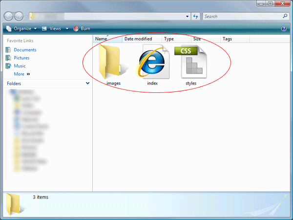
Right lets get started, the first thing you need to do is create a blank HTML and blank CSS file inside a folder called “your project”, save your blank HTML file as index.html and your blank CSS file as styles.css. Also inside your folder create an empty folder called images.
Open up your blank HTML file and add your website title inbetween the title tag, underneath the title tag link your css file.
|
1
2
3
4
5
6
7
8
9
10
11
12
|
<!DOCTYPE html PUBLIC "-//W3C//DTD XHTML 1.0 Transitional//EN" "http://www.w3.org/TR/xhtml1/DTD/xhtml1-transitional.dtd">
<html xmlns="http://www.w3.org/1999/xhtml">
<head>
<meta http-equiv="Content-Type" content="text/html; charset=utf-8" />
<title>Your PROject - Welcome...</title>
<link href="styles.css" rel="stylesheet" type="text/css" />
</head>
<body>
</body>
</html>
|
We can now start to mockup the top half of our layout, we start with a container div, this will be the big box our website lives in. Everything we create will go inside this container div.
|
1
2
3
4
5
6
7
8
9
10
11
12
13
14
15
16
17
18
|
<!DOCTYPE html PUBLIC "-//W3C//DTD XHTML 1.0 Transitional//EN" "http://www.w3.org/TR/xhtml1/DTD/xhtml1-transitional.dtd">
<html xmlns="http://www.w3.org/1999/xhtml">
<head>
<meta http-equiv="Content-Type" content="text/html; charset=utf-8" />
<title>Your PROject - Welcome...</title>
<link href="styles.css" rel="stylesheet" type="text/css" />
</head>
<body>
<div id="container">
EVERYTHING GOES INBETWEEN HERE
</div>
</body>
</html>
|
Our next div will be our header div.
|
1
2
3
4
5
6
7
|
<div id="container">
<div id="header">
</div>
</div>
|
Inside our header div we need to add our website logo and navigation. Ive chosen to also wrap the logo and navigation in another div called top-elements, ive done this because i dont want any alignment / postioning issues when we code the featured area. So our code now looks like this.
|
1
2
3
4
5
6
7
8
9
10
11
12
13
14
15
16
17
|
<div id="container">
<div id="header">
<div id="top-elements">
<div id="logo">
</div>
<div id="nav-bar">
</div>
</div>
</div>
</div>
|
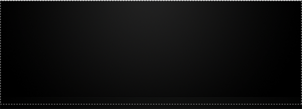
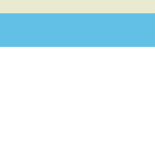
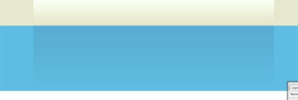
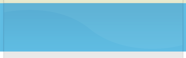
Before we start to add our styles in the style sheet we need to create a few images from our PSD file. Open up your PSD file in photoshop, hide all the layers associated with the featured area then make a selection like this.
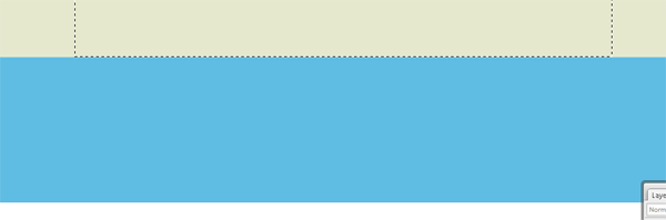
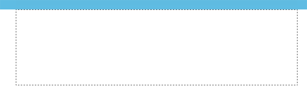
Make sure you select the background underneath the divider line, the selection should also be the whole width of your canvas (900px). Save the file as “bg.png” inside your images folder. You also need to make a selection around your website logo.
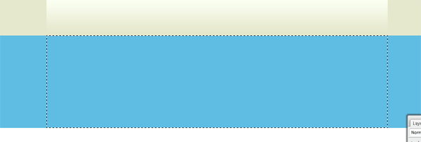
Get your selection around the logo has tight as you can get it. Copy and paste your logo to a new canvas with a transparant background then save the image as “logo.png”. We now also need the background in the header, so make a selection around the top part of the header including the divider line.
You dont have to use the big image if you dont want to, if you prefer you can use a chunk of the background and repeat it then code the divider line seperatly. Right now we have some images to work with lets begin to add our css styles, head over to your css style sheet and add the following code. (refer to commented code for each style)
|
1
2
3
4
5
6
7
8
9
10
11
12
13
14
15
16
17
18
19
20
21
22
23
24
25
26
27
28
29
30
31
32
33
34
35
36
37
38
39
40
41
42
43
44
45
46
47
48
49
50
51
52
53
54
55
56
57
58
59
60
61
62
63
64
65
66
67
68
69
70
71
72
73
74
75
76
77
78
79
80
81
82
83
84
85
86
87
88
89
90
91
92
93
94
95
96
97
98
99
100
101
102
103
104
105
106
107
108
109
110
111
112
113
114
115
116
117
118
119
120
121
122
123
124
125
126
127
128
129
130
131
132
133
134
135
136
137
138
139
140
141
142
143
144
145
|
* {
margin: 0px;
padding: 0px;
}
body {
font-family: Verdana, Arial, Helvetica, sans-serif;
background-color: #000000;
color: #999a9a;
background-image: url(images/bg.png);
background-repeat: repeat-y;
background-position: center;
}
a:link {
color: #0096FF;
}
a:visited {
color: #FFFFFF;
}
a:hover {
color: #FFFFFF;
}
a:active {
color: #0096FF;
}
p {
font-size: 0.7em;
line-height: 18px;
text-align: justify;
}
h1 {
color: #727372;
text-transform: uppercase;
font-size: 1.2em;
font-weight: normal;
}
h2 {
color: #FFFFFF;
text-transform: uppercase;
font-size: 1em;
font-weight: normal;
}
h3 {
color: #727372;
text-transform: uppercase;
font-size: 0.9em;
font-weight: normal;
}
h4 {
color: #727372;
text-transform: uppercase;
font-size: 0.8em;
font-weight: normal;
}
img {
border:none;
}
.float-left {
float:left;
}
.float-right {
float:right;
}
#container {
width: 900px;
margin-top: 0px;
margin-right: auto;
margin-left: auto;
}
#header {
background-image: url(images/hd_bg.png);
background-repeat: no-repeat;
float: left;
width: 900px;
}
#top-elements {
float: left;
width: 900px;
padding-top: 20px;
}
#logo {
float: left;
height: 37px;
width: 270px;
}
#nav-bar {
float: right;
height: 29px;
padding-top: 8px;
margin-bottom: 40px;
}
.navlinks ul {
margin: 0px;
padding: 0px;
}
.navlinks li {
display: inline;
list-style-type: none;
padding-left: 20px;
}
.navlinks li a {
text-decoration: none;
font-size: 12px;
color: #FFFFFF;
padding-bottom: 2px;
}
.navlinks li a:hover {
border-bottom-width: medium;
border-bottom-style: solid;
border-bottom-color: #0096ff;
}
.navlinks li.current a{
border-bottom-width: medium;
border-bottom-style: solid;
border-bottom-color: #0096ff;
}
|
Loads of css, believe it or not but that huge chunk isnt even half of the css file. In the css code above we have set our header tags up to H4, we’ve added the styles for our hyperlinks and some minor styles for images and paragraphs all pretty straight forward stuff. We have also set our styles for our container, logo and navigation, so now we can start adding our items to our header. Head over to your index.html file, inbetween the logo start and ending div insert your logo as an image. Inbetween the start and ending nav-bar div add a simple unorder list with a class of navlinks. The code looks like this.
|
1
2
3
4
5
6
7
8
9
10
11
12
13
|
<div id="logo">
<img src="images/logo.png" alt="Welcome To Your PROject" />
</div>
<div id="nav-bar">
<ul class="navlinks">
<li class="current"><a href="index.php">Home</a></li>
<li><a href="services.php">Services</a></li>
<li><a href="products.php">Products</a></li>
<li><a href="testimonials.php">Testimonials</a></li>
<li><a href="contact.php">Contact Us</a></li>
</ul>
</div>
|
Notice in our style sheet the navigation should have a medium solid blue line underneath each link. If you test your layout in firefox and internet explorer you will see that internet explorer doesnt have the bottom line. We now have to do some cross browser styles to make it work. Open up a blank notepad file and save it as “ie.css” inside your main folder. Opne up the ie.css file inside your code editor, inside this file we need to add all our little fixes for internet explorer. To fix our little navigation problem we need to add these styles.
|
1
2
3
4
5
6
7
|
.navlinks li a:hover {
position: relative;
}
.navlinks li.current a{
position: relative;
}
|
Before we go ahead and test out our layout again we need to link our ie.css file in our index.html file, when we link the ie.css file we dont do it in the normal way we basically want to insert a statment which says “if im using internet explorer overwrite the following styles”. We can do that by adding this bit of code inside the head section of our index.html file.
|
1
2
3
|
<!--[if IE 7]>
<link href="ie.css" rel="stylesheet" type="text/css" />
<![endif]-->
|
Save your work and test your layout in firefox and internet explorer, the navigation should now work as planned. Also in our navigation code you will notice the “home” link has an ID of current this ID of current will basically keep the link hover styling for that specific page, so if your on the home page the medium solid blue line will stay under the link “home” when we create our additional pages later on we’ll need to remove the ID of current from the home link and add it to another link which ever page your making next.
Your ads will be inserted here by
AdSense Now!.
Please go to the plugin admin page to paste your ad code.
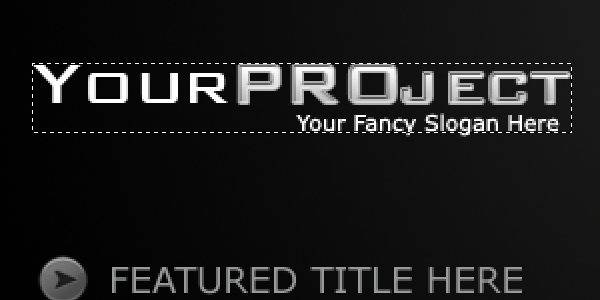
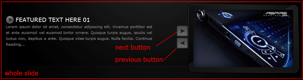
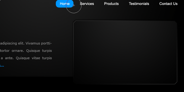
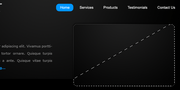
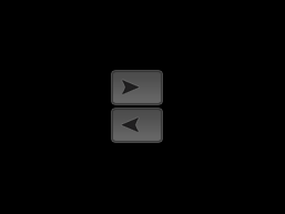
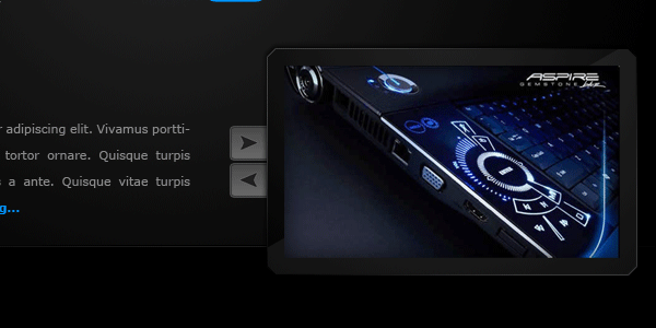
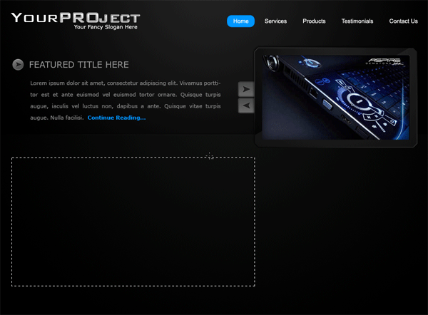
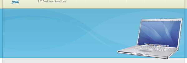
Moving on… we now have to code up our featured section, head over to your PSD file, the images we need to slice are the little bullet point in the featured title area, our featured image with frame, our left button and our right button.
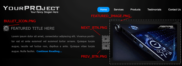
Save all images separatly on transparant backgrounds within your images folder. We can now begin to add our div’s for our featured area. Add the following code underneath our ending div for our top elements but above our header ending div. Ive also added dummy text and titles for our featured area.
|
1
2
3
4
5
6
7
8
9
10
11
12
13
14
15
16
17
|
</div>
<div id="featured">
<div class="featured-text">
<h1 class="featured">featured text here 01</h1>
<p>Lorem ipsum dolor sit amet, consectetur adipiscing elit. Vivamus porttitor est et ante euismod vel euismod tortor ornare. Quisque turpis augue, iaculis vel luctus non, dapibus a ante. Quisque vitae turpis augue. Nulla facilisi. Continue Reading...</p>
</div>
<div id="featured-image01">
<div class="featured-buttons">
<div class="featured-btn"><img src="images/next_btn.png" alt="Next" /></div>
<div class="featured-btn"><img src="images/prev_btn.png" alt="Previous" /></div>
</div>
</div>
</div>
</div>
|
We can now style our featured content area using the following styles. (please refer to commented code for each style).
|
1
2
3
4
5
6
7
8
9
10
11
12
13
14
15
16
17
18
19
20
21
22
23
24
25
26
27
28
29
30
31
32
33
34
35
36
37
38
39
40
41
42
43
44
45
46
47
48
49
50
51
52
53
54
55
56
57
58
59
60
61
62
63
64
|
#featured {
float: right;
width: 900px;
margin-bottom: 20px;
}
.featured-text {
float: left;
width: 450px;
margin-top: 40px;
}
#featured-text p {
font-size: 0.7em;
line-height: 24px;
text-align: justify;
padding-top: 10px;
}
#featured-image01 {
float: right;
width: 449px;
background-repeat: no-repeat;
background-position: right;
height: 214px;
}
#featured-image01 {
background-image: url(images/featured_image.png);
}
h1.featured {
color: #FFFFFF;
text-transform: uppercase;
font-size: 18px;
background-image: url(images/bullet_icon.png);
background-repeat: no-repeat;
padding-left: 30px;
line-height: 24px;
}
#featured-image {
float: right;
width: 449px;
background-image: url(images/featured_image.png);
background-repeat: no-repeat;
background-position: right;
height: 214px;
}
.featured-btn {
height: 34px;
width: 34px;
cursor: pointer;
}
.featured-buttons {
height: 144px;
width: 34px;
margin-left: 75px;
padding-top: 70px;
}
|
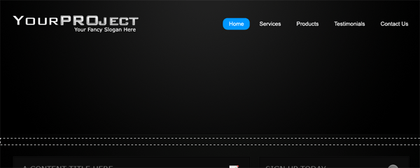
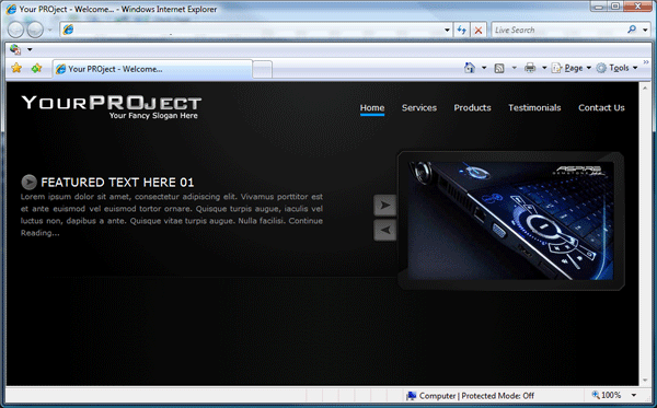
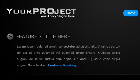
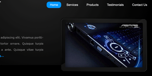
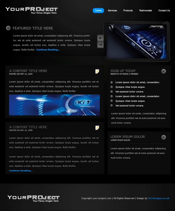
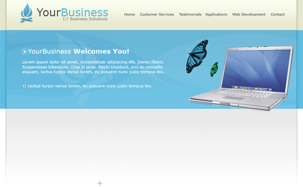
Test your layout inside your browser and see how it looks i have something like this.
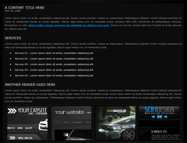
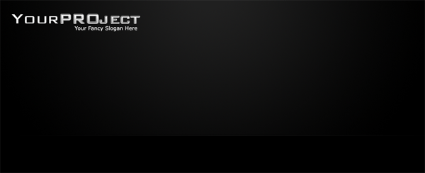
Time to move onto our main content area, we’ll be start with the left content first. The boxes for our content will all be made using css. If you look at the PSD file you will see the boxes have two strokes in two different colors we can accomplish this by creating a div with one of the borders, then inside that div create another div slightly smaller with the other border added. We mock it up like this.
|
1
2
3
4
5
6
7
8
9
10
11
|
<div id="content-left">
<div class="box">
<div class="box-inside">
<h2 class="boxtitle1">a content title here</h2>
<h2 class="boxtitle2">May 20, 2009</h2>
<p>SOME TEXT HERE</p>
</div>
</div>
</div>
|
The styles for our left content area look like this.
|
1
2
3
4
5
6
7
8
9
10
11
12
13
14
15
16
17
18
19
20
21
22
23
24
25
26
27
28
29
30
31
32
33
34
35
36
37
38
39
40
41
42
43
44
45
46
47
|
#content-left {
float: left;
width: 600px;
padding-bottom: 40px;
}
.box {
float: left;
width: 498px;
border: 1px solid #121212;
margin-bottom: 15px;
width: 490px;
}
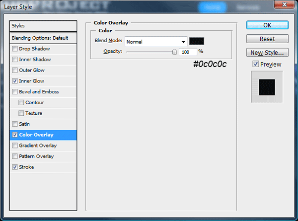
.box-inside {
background-color: #0c0c0c;
border: 1px solid #030303;
float: left;
width: 576px;
padding: 10px;
}
.box-inside p {
padding-top: 10px;
}
.boxtitle1 {
color: #FFFFFF;
text-transform: uppercase;
font-size: 1em;
font-weight: normal;
background-image: url(images/post_icon.png);
background-repeat: no-repeat;
background-position: right;
}
.boxtitle2 {
color: #aaaaaa;
text-transform: uppercase;
font-size: 0.7em;
background-image: url(images/divider.png);
background-repeat: repeat-x;
background-position: bottom;
padding-bottom: 10px;
}
|
If you look at the class “boxtitle1″ you will see it has a background image of “post_icon.png”, this is the little paper icon in the right side of content box. Cut the icon from your PSD and save it as “post_icon.png”, You will also need to cut out the divider from underneath sample header. Thats all you need to do for the left content, if you want more boxes all’s you need to do is copy all the code from the class “box” then paste it underneath. Alter the content as needed. So two boxes would looks like this.
|
1
2
3
4
5
6
7
8
9
10
11
12
13
14
15
16
17
18
19
|
<div id="content-left">
<div class="box">
<div class="box-inside">
<h2 class="boxtitle1">a content title here</h2>
<h2 class="boxtitle2">May 20, 2009</h2>
<p>SOME TEXT HERE</p>
</div>
</div>
<div class="box">
<div class="box-inside">
<h2 class="boxtitle1">a content title here</h2>
<h2 class="boxtitle2">May 20, 2009</h2>
<p>SOME TEXT HERE</p>
</div>
</div>
</div>
|
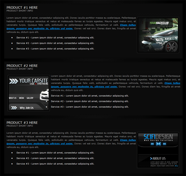
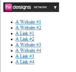
We code and style the sidebar in exactly the same way, only difference is the widths will be alot smaller and you need to use a different icon.
|
1
2
3
4
5
6
7
8
9
10
11
|
<div id="content-right">
<div class="sidebar">
<div class="sidebar-inside">
<h2 class="sidebar-title1">a content title here</h2>
<h2 class="sidebar-title2">May 20, 2009</h2>
<p>CONTENT HERE</p>
</div>
</div>
</div>
|
The css looks like this.
|
1
2
3
4
5
6
7
8
9
10
11
12
13
14
15
16
17
18
19
20
21
22
23
24
25
26
27
28
29
30
31
32
33
34
35
36
37
38
39
40
41
42
43
44
|
#content-right {
float: right;
width: 290px;
margin-left: 10px;
padding-bottom: 40px;
}
.sidebar {
float: left;
width: 287px;
border: 1px solid #121212;
margin-bottom: 15px;
float: left;
}
.sidebar-inside {
background-color: #0c0c0c;
border: 1px solid #030303;
float: left;
width: 266px;
padding: 10px;
}
.sidebar-inside p {
padding-top: 10px;
}
.sidebar-title1 {
background-image: url(images/sidebar_bullet.png);
background-repeat: no-repeat;
background-position: right;
}
.sidebar-title2 {
color: #aaaaaa;
text-transform: uppercase;
font-size: 0.7em;
background-image: url(images/divider.png);
background-repeat: repeat-x;
background-position: bottom;
padding-bottom: 10px;
}
|
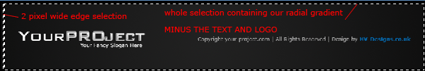
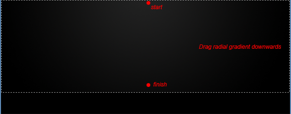
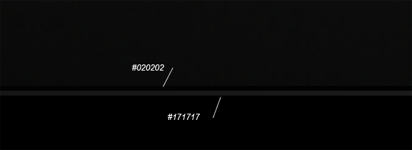
Now for our footer,…. we need to create our footer outside of our container div as were having the footer span across the hole browser. You will need two images for the footer, the first one will be the last 1 – 2 pixels from the edge of the canvas and the other one will be the whole footer image containing our radial gradient image.
We then mock up our footer like this.
|
1
2
3
4
5
6
7
8
9
10
11
|
</div>
<div id="footer">
<div id="footer-content">
<p>Copyright © your project | All Rights Reserved</p>
<p>Design By <a href="http://www.richard-carpenter.co.uk">Richard Carpenter</a></p>
</div>
</div>
</body>
</html>
|
We then add our footer css styling like this.
|
1
2
3
4
5
6
7
8
9
10
11
12
13
14
15
16
17
18
19
20
21
22
23
|
#footer {
background-image: url(images/footer_bg.png);
background-repeat: repeat-x;
height: 140px;
clear: both;
margin-top: 40px;
}
#footer-content {
background-image: url(images/footer_contentbg.png);
background-repeat: no-repeat;
margin: auto;
height: 90px;
width: 900px;
clear: both;
padding-top: 50px;
}
#footer-content p {
text-align: center;
}
|
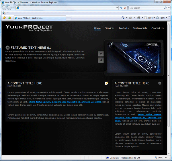
Your first page should now be completed, watch out for the 3rd part where we’ll be creating additional pages. Subscribe to our RSS feeds to stay updated. See you next time.
Other Parts To This Project
Download The FREE Template
You can download the FREE CSS Template by clicking HERE.
Your ads will be inserted here by
AdSense Now!.
Please go to the plugin admin page to paste your ad code.


