Richard-Carpenter.co.uk – Re Launch

Your ads will be inserted here by

AdSense Now!.

Please go to the plugin admin page to paste your ad code.

Re-Launched my portfolio. Now its even better than before.


Hello, just sharing with you guys my new shiny portfolio. I decided to give it all a big fresh new look, and on top of that i decided to use wordpress as it has good CMS capabilities.

Your ads will be inserted here by

AdSense Now!.

Please go to the plugin admin page to paste your ad code.

Richard Carpenter - Creative Design

Richard Carpenter - Creative Design

Check it out and let me know what you think. Il look forward to your comments.

Your ads will be inserted here by

AdSense Now!.

Please go to the plugin admin page to paste your ad code.

WordPress Posts Explained…

Your ads will be inserted here by

AdSense Now!.

Please go to the plugin admin page to paste your ad code.

Once your WordPress installation is up and running, you are ready to start blogging. WordPress is the right choice for blogging because it’s quite a powerful tool with a seemingly infinite array of options and possibilities.

The main focus of this article is to explain how to make a blog post and how to control all of the information for that post, and not just the title and content. In this article by Hasin Hayder and April Hodge Silver, we will explore how to keep your content organized and searchable using tags and categories.

Adding A Simple Post

Let’s review the process of adding a simple post to your blog. Whenever you want to do maintenance on your WordPress website, you have to start by logging in to the WP Admin (WordPress Administration panel) for your site. To get to the admin panel, just point your web browser to http://yoursite.com/wp-admin.

Remember that if you have installed WordPress in a subfolder (for example, blog), then your URL has to include the subfolder (that is, http://yoursite.com/blog/wp-admin).

When you first log into the WP Admin, you’ll be at the Dashboard. The Dashboard has a lot of information on it. The very top bar, which I’ll refer to as the top menu, is mostly dark grey and on the left, of course, is the main menu. The top menu and the main menu exist on every page within the WP Admin. The main section on the right contains information for the current page you’re on. In this case, we’re on the Dashboard. It contains boxes that have a variety of information about your blog, and about WordPress in general.

The quickest way to get to the Add New Post page at any time is to click on the New Post link at the top of the page in the top bar (top menu).

This is the Add New Post page:

01

To quickly add a new post to your site, all you have to do is:

–Type in a title into the text field under Add New Post (for example, Making Lasagne).–
–Type the text of your post in the content box. Note that the default view is Visual, but you actually have a choice of the HTML view as well.–
–Click on the Publish button, which is at the far right. Note that you can choose to save a draft or view a preview of your post.–

In the following image, the title field, the content box, and the Publish button of the Add New Post page are highlighted:

02

Once you click on the Publish button, you have to wait while WordPress performs its magic. You’ll see yourself still on the Edit Post page, but now the following message has appeared telling you that your post was published and giving you a link to View post:

03

If you go to the front page of your site, you’ll see that your new post has been added at the top (newest posts are always at the top):

04

Common Post Options

Categories and tags are two similar types of information that you can add to a blog post. We use them to organize the information in your blog by topic and content (rather than just by, say, date), and to help visitors find what they are looking for on your blog.

Categories are primarily used for structural organizing. They can be hierarchical. A relatively busy blog will probably have at least 10 categories, but probably not more than 15 or 20. Each post in this blog will likely have one to four categories assigned to it. For example, a blog about food might have these categories: Cooking Adventures, In The Media, Ingredients, Opinion, Recipes Found, Recipes Invented, and Restaurants.

Tags are primarily used as shorthand for describing the topics covered in a particular blog post. A relatively busy blog will have anywhere from 15 to 30 tags in use. Each post in this blog will likely have three to ten tags assigned to it. For example, a post on the food blog about a recipe for butternut squash soup may have these tags: soup, vegetarian, autumn, hot, easy.

Let’s add a new post to the blog. This time, we’ll give it not only a title and content, but also tags and categories. When adding tags, just type your list of tags into the Tags box on the right, separated by commas:

05

Then click on the Add button. The tags you just typed in will appear below the text field with little xs next to them. You can click on an x to delete a tag. Once you’ve used some tags in your blog, you’ll be able to click on the Choose from the most popular tags link in this box so that you can easily re-use tags.

Categories work a bit differently than tags. Once you get your blog going, you’ll usually just check the boxes next to existing categories in the Categories box. In this case, as we don’t have any existing categories, we’ll have to add one or two.

In the Categories box on the right, click on the + Add New Category link. Type your category into the text field and click on the Add button. Your new category will show up in the list, already checked. Look at the following screenshot:

06

If in the future you want to add a category that needs a parent category, select Parent category from the pull-down menu before clicking on the Add button. If you want to manage more details about your categories, move them around, rename them, assign parent categories, and assign descriptive text. You can do this on the Categories page, which we’ll see in detail later in this article.

Now fill in your title and content here:

07

Click on the Publish button and you’re done. When you look at the front page of your site, you’ll see your new post on the top, your new category in the sidebar, and the tags and category (that you chose for your post) listed under the post itself:

08

Adding An Image To A Post

You may often want to have an image show up in your post. WordPress makes this very easy. Let’s add an image to the post we just created. You can click on Edit underneath your post on the front page of your site to get there quickly. Alternatively, go back to the WP Admin, open Posts in the main menu, and then click on Edit underneath your new post.

To add an image to a post, first you’ll need to have that image on your computer. Before you get ready to upload an image, make sure that your image is optimized for the Web. Huge files will be uploaded slowly and slow down the process of viewing your site. You can re-size and optimize images using software such as GIMP or Photoshop. For the example in this article, I have used a photo of butternut squash soup that I have taken from the website where I got the recipe, and I know it’s on the desktop of my computer. Once you have a picture on your computer and know where it is, follow these steps to add the photo to your blog post:

Click on the little photo icon, which is next to the word Upload/Insert and below the box for the title:

09

In the box that appears, click on the Select Files button and browse to your image. Then click on Open and watch the uploader bar. When it’s done, you’ll have a number of fields you can fill in:

10

The only fields that are important right now are Title, Alignment, and Size. Title is a description for the image, Alignment will tell the image whether to have text wrap around it, and Size is the size of the image. As you can see, I’ve chosen the Right alignment and the Thumbnail size.

Now click on Insert into Post. This box will disappear, and your image will show up in the post on the edit page itself:

11

Now click on the Update Post button and go look at the front page of your site again. There’s your image!

12

You may be wondering about those image sizes. What if you want bigger or smaller thumbnails? You can set the pixel dimensions of your uploaded images and other preferences by opening Settings in the main menu and then clicking on Media. This takes you to the Media Settings page:

13

Here you can specify the size of the uploaded images for:

–Thumbnail–
–Medium–
–Large–

If you change the dimensions on this page and click on the Save Changes button, only images you upload in the future will be affected. Images you’ve already uploaded to the site will have had their thumbnail, medium, and large versions created already using the old dimensions.

Using The Visual Editor Vs The HTML Editor

WordPress comes with a Visual editor, otherwise known as a WYSIWYG editor (pronounced wissy-wig, which stands for What You See Is What You Get). This is the default editor for typing and editing your posts. If you’re comfortable with HTML, you may prefer to write and edit your posts using the HTML editor—particularly useful if you want to add special content or styling.

To switch from the rich text editor to the HTML editor, click on the HTML tab next to the Visual tab at the top of the content box:

14

You’ll see your post in all its raw HTML glory and you’ll get a new set of buttons that lets you quickly bold and italicize text as well as add link code, image code, and so on. You can make changes and swap back and forth between the tabs to see the result.

If you want the HTML tab to be your default editor, you can change this on your Profile page. Navigate to Users | Your Profile, and select the Disable the visual editor when writing checkbox.

Drafts, Timestamps, and Managing Posts

WordPress gives you the option to save a draft of your post so that you don’t have to publish it right away but can still save your work. If you’ve started writing a post and want to save a draft, just click on the Save Draft button at the right (in the Publish box), instead of the Publish button. Even if you don’t click on the Save Draft button, WordPress will attempt to save a draft of your post for you about once a minute. You’ll see this in the area just below the content box. The text will say Saving Draft… and then the time of the last draft saved:

15

At this point, after a manual save or an auto-save, you can leave the Edit Post page and do other things. You’ll be able to access all of your draft posts from the Dashboard or from the Edit Posts page.

Your ads will be inserted here by

AdSense Now!.

Please go to the plugin admin page to paste your ad code.

WordPress will also let you alter the timestamp of your post. This is useful if you are writing a post today that you wish you’d published yesterday, or if you’re writing a post in advance and don’t want it to show up until the right day. The default timestamp will always be set to the moment you publish your post. To change it, just find the Publish box and click on the Edit link (next to the calendar icon and Publish immediately), and fields will show up with the current date and time for you to change:

16

Change the details, click on the OK button, and then Publish your post (or save a draft).

If you want to see a list of your posts so that you can easily skim and manage them, you just need to go to the Edit Posts page in the WP Admin by navigating to Posts in the main menu. You’ll see a detailed list of your posts, as seen in the next screenshot:

17

Advanced Post Options

By now, you have a handle on the most common and simple options for posts and you may be wondering about some of the other options on the Edit Post page. We’ll cover them all in this section.

A quick display tip:
When you first visit the Edit Post page, all of the four advanced options (Excerpt, Send Trackbacks, Custom Fields, and Discussion) are ‘open’ below the post content. If you never use them and want to clean up the look of this page, you can single-click each bar and they’ll collapse. You can also rearrange them by dragging them to a new order. You can also use Screen Options (top right of the page) to uncheck certain boxes, and thus not display them at all.

Excerpt

WordPress offers theme designers the option to show a post’s excerpt (instead of its full content) on pages within the theme. If you enter some text into the excerpt box on the Edit Post page, that text will be used as the post’s excerpt on theme pages that call for it. However, if there is no text in this box, WordPress will use the first 55 words of the post’s content (which is stripped of HTML tags) followed by […] (which is not a link).

The more tag should not be confused with the excerpt. This is different from the excerpt because you, not the theme designer control its use. Text before this tag, for any post that has it, will be the only thing that’s shown on all blog pages (for example homepage, category page, search results page, and so on). The full post text will only show up on the post page. All you have to do is put the more link at the spot in your post where you’d like the cut-off to be. WordPress will automatically cut off the post there and replace it with a Read the rest of this post link.

To add this tag to a post, first place your cursor in the spot where you’d like the post to be split up. Then click on the more tag button in the editor. If you’re using the Visual editor, the button you want to click looks like this:

18

If you’re using the HTML editor, the button looks like this:

19

Trackbacks

Trackbacks are useful if you write a blog post that is a response to a post on someone else’s blog and you want them to know about it. Just copy the trackback URL from that person’s blog post and paste it into this box. An excerpt of your blog post will show up as a comment on their blog post.

If someone wants to display a blog post on their blog about a post on your blog using the default theme, he or she can find the trackback URL on the post page for every post. For example, click on the title of one of your posts on your blogs’ front page and you’ll go to the post page:

20

All this person has to do is right-click on the trackback link and select Copy Link Location, which in this case is http://packt:8888/2008/11/a-great-sandwich/trackback/. If permalinks are not turned on, it would be http://packt:8888/wptrackback.php?p=6.

Trackbacks are becoming somewhat out-of-date with the advent of pinging. In fact, many WordPress themes are written to essentially disable trackbacks. Pinging is WordPress’s way of notifying popular update services, such as Ping-o-Matic!, which other people use to keep up-to-date with your blog and other people’s blogs. We will explain more about pinging in the following section.

Discussion

A Discussion box has two checkboxes in it: one for allowing comments, and the other for trackbacks and pingbacks. When you first install WordPress, both these checkboxes will be checked by default. You have to uncheck them if you want to turn off the comments or trackbacks and pingbacks for the post.

Pingbacks are essentially the same as trackbacks, but differ in two important ways:

The notification from your blog to the blog of the person you’re commenting on happens automatically—you don’t have to enter a special URL into a special field. All you have to do is link your blog post to their blog post.
Pingbacks don’t send any content.
If you uncheck the comments box, visitors will not be able to comment on this blog post.

If you uncheck the trackbacks and pingbacks box, when other people mention your blog post and link to it on their own websites, your blog post won’t notice and won’t care. So, if you are using WordPress to run a non-blog website, this is the best option for you.

If the box stays checked, other people’s pingbacks about this post will show up under your post along with comments, if any. If you’re using WordPress to run a blog website, you’ll want pingback to stay checked—especially if you want sites such as Technorati and other rating/authority sites to stay alerted.

If you want either or both of these boxes to be unchecked by default, go to Settings and then Discussion in the main menu. You can uncheck either or both of the boxes labeled Allow link notifications from other blogs (pingbacks and trackbacks.) and Allow people to post comments on the article:

21

Custom Fields

Custom Fields are a way for you to add additional information about your blog posts that are not part of WordPress by default. By default, every WordPress post has a number of pieces of information (fields) such as title, content, date, categories, and so on. If there is a field you want all or many of your posts to have, you can add it here.

For example, let’s say you are a gadget reviewer and every blog post is a review of some new gadget. Every time you write a review, you’re writing it about a product made by some company, and you’d like to have that company’s logo associated with the blog post. You can make a custom field called company_logo and the value can be the path to the logo image.

To use this custom field information, you either have to manually modify your theme files, or use a plugin.

Password & Private Protection

WordPress gives you the option to hide posts. You can hide a post from everyone but yourself by marking it Private, or you can hide it from everyone but the people with whom you share a password by marking it as Password protected. To implement this, look at the Publish box at the upper right of the Edit Post page. If you click on the Edit link next to Visibility: Public, a few options will appear:

22

If you click on the Password protected radio button, you’ll get a box where you can type a password. Visitors to your blog will see the post title along with a note that they have to type in a password to read the post.

If you click on the Private radio button, the post will not show up on the blog at all to any viewers, unless you are the viewer and you are logged in.

If you leave the post Public and check the Stick this post to the front page checkbox, this post will be the first post on the front page, regardless of its publication date.

Be sure to click on the OK button if you make any changes.

Post Slug

This box may not be visible by default, in which case you have to open Screen Options at the top of the page and check the box next to Post Slug.

The post slug is used in the URL if your blog is using permalinks. Permalinks are a way to prettify your URLs. For example, right now, the URL for my Butternut Squash soup post is http://packt:8888/?p=10. If I turn on permalinks, by default the URL would be http://packt:8888/2008/11/butternut-squash-soup/. The very last part of the URL, butternut-squash-soup, is the slug. WordPress chose the slug by taking my post title, making it all lowercase, removing all punctuation, and replacing spaces with dashes. If I’d prefer it to be something else, such as squash-soup, this Post Slug box is where I can change it. The slug is something that Google search loves, so using them helps to optimize your site for search engines.

Adding Writing Options

WordPress offers a neat bookmark called Press This. You can put it into your browser’s bookmarks or favorites, which will let you quickly write a blog post about the website you’re visiting. (This used to be called the bookmarklet.) You may have encountered this same feature as offered by Facebook, Del.ico.us, and other social networking sites.

You just have to add Press This to your browser once, and then you can use it anytime. To add the Press This link to your browser in the WP Admin, go to the Tools menu. At the bottom of the Tools page is a Press This link. Just grab it with your mouse and drag it up to your browser’s bookmark bar.

Now it’s available to you. For example, if you’re reading a newspaper website and you read an article you’d like to mention in a blog post, just click the Press This bookmark (or favorite). A window will pop up with the Edit Post page in it and the URL of the site you’re looking at already written in as a link:

23

You can then write whatever additional text you want, add tags and categories, and then either save it as a draft or publish it right away.

Posting Via Email

If you want to add a post to your blog without having to open the WP Admin and log in, you can set up your WordPress installation to accept posts sent via email. First, you have to set up a special secret email address that is accessible via POP. WordPress will check that email address and turn any emails in it into posts. So you have to be sure not to use this email address for any other purpose!

Once you have the email address set up at your mail server, go to your WP Admin and navigate to Settings | Writing. Scroll down a bit to Post via e-mail:

24

Now just enter the server, login name, and password into the Writing Settings page and be sure to click on the Save Changes button

Adding and Managing Categories

Earlier in this article, you learned how to quickly add a category when adding a post. Now let’s talk about how to manage your categories in a bigger way. First, navigate to Posts | Categories in your WP Admin. You’ll see the Categories page:

25

This is a useful page that combines the ability to add, edit, and review all of your categories. As you can see, any categories you’ve added via the Edit Post page are listed. You can Edit, Quick Edit, or Delete any category by clicking on the appropriate link in the list.

If you add a category on this page, you can also choose its slug. The slug is the short bit of text that shows up in the URL of your site if you have permalinks enabled. If you don’t choose a slug, WordPress will create one for you by taking the category name, reducing it to all lowercase, replacing spaces with dashes, and removing any other punctuation marks.

Another thing you can do on this page is choose a parent category for any category. If you choose to use parent categories, your categories will be displayed hierarchically, just as your pages are displayed.

Summary

In this article you learned everything you need to know to add content to your blog and manage that content. You learned about posts and categories. You discovered tags and excerpts. You also learned about adding images, using the rich text editor, changing timestamps, customizing excerpts, and the different ways of posting.

Liked This Article? Why Not Buy The Book

Create your own complete blog or web site from scratch with WordPress.

Buy The Book

Learn More…

Your ads will be inserted here by

AdSense Now!.

Please go to the plugin admin page to paste your ad code.

jQuery UI Accordion Widget Pt.2

Your ads will be inserted here by

AdSense Now!.

Please go to the plugin admin page to paste your ad code.

The accordion widget is a robust and highly configurable widget that allows you to save space on your web pages by only displaying a certain section of related content at any one time.

This is like a tabbed interface but positioned vertically instead of horizontally. It’s easy for your visitors to use and it’s easy for us to implement. It has a range of configurable properties that can be used to customize its appearance and behaviour. It also has a series of methods that allow you to control it programmatically.

In the previous part of this article, we looked at the structure of an accordion widget and its configurable properties. In this second part , we will cover the following topics:

– Built-in types of animation –
– Custom accordion events –

Accordion Animation

You may have noticed the default slide animation built into the accordion. Apart from this, there are two other built-in animations that we can easily make use of. We can also switch off animations entirely by supplying false as the value of the animated property, although this doesn’t look too good!

The other values we can supply are bounceslide and easeslide. However, these aren’t actually unique animations as such. These are different easing styles which don’t change the animation itself but instead, alter the way it runs. You should note at this stage that additional jQuery plugins are required for these easing methods.

For example, the bounceslide easing method causes the opening drawer to appear to bounce up and down slightly as it reaches the end of the animation. On the other hand, easeslide makes the animation begin slowly and then builds up to its normal speed. Let’s take a moment to look at these different easing methods now. Change accordion11.html so that it appears as follows.

1
2
3
4
5
6
7
8
9
10
11
12
13
14
15
16
17
18
19
20
21
22
23
24
25
26
27
28
<div id="myAccordion">
<span class="corner topLeft"></span><span class="corner topRight"></span><span class="corner bottomLeft"></span>
<span class="corner bottomRight"></span>
<div><a href="#">Header 1</a><div>Wow, look at all this content that can be shown or hidden with a simple click!</div></div>
<div><a href="#">Header 2</a><div>Lorem ipsum dolor sit amet, consectetuer adipiscing elit. Aenean sollicitudin. Sed interdum
pulvinar justo. Nam iaculis volutpat ligula. Integer vitae felis quis diam laoreet ullamcorper. Etiam tincidunt est vitae est.
Ut posuere, mauris at sodales rutrum, turpis tellus fermentum metus, ut bibendum velit enim eu lectus. Suspendisse potenti.</div>
</div>
<div><a href="#">Header 3</a><div>Donec at dolor ac metus pharetra aliquam. Suspendisse purus. Fusce tempor ultrices libero. Sed
quis nunc. Pellentesque tincidunt viverra felis. Integer elit mauris, egestas ultricies, gravida vitae, feugiat a, tellus. </div>
</div>
</div>
<script type="text/javascript" src="jqueryui1.6rc2/jquery-1.2.6.js"></script>
<script type="text/javascript" src="jqueryui1.6rc2/ui/ui.core.js"></script>
<script type="text/javascript" src="jqueryui1.6rc2/jquery.easing.1.3.js"></script>
<script type="text/javascript" src="jqueryui1.6rc2/jquery.easing.compatibility.js"></script>
<script type="text/javascript" src="jqueryui1.6rc2/ui/ui.accordion.js"></script>
<script type="text/javascript">
//function to execute when doc ready
$(function() {
//set custom easing
var accOpts = {
animated: "bounceslide"
}
//turn specified element into an accordion
$("#myAccordion").accordion(accOpts);
});
</script>

Save this file as accordion12.html. We’ve used a couple of new script files in the source code. The jquery.easing.1.3.js file is the latest version of the easing plugin, and the jquery.easing.compatibility.js plugin which enables the latest version of the easing file to work without any further modifications. The easing type names were renamed in version 1.2 of the easing plugin. Both of these files can be found on the jQuery site.

The built-in easing effects, based on a series of equations created by Robert Penner in 2006, are very easy to use and create a great effect which can help build individuality into accordion implementations

Plugins:
There are many jQuery plugins available. These are often developed by the open-source community instead of the library’s authors and can be used with jQuery and jQuery UI. A good place to find plugins is on the jQuery site itself. Some of these plugins, such as the easing plugin, work with the library components, while other plugins, such as the compatibility plugin, assist other plugins.

Accordion Events

The accordion defines the custom change event which is fired after a drawer on the accordion opens or closes. To react to this event, we can use the change configuration property to specify a function to be executed every time the event occurs. In a new file in your text editor, add the following code.

1
2
3
4
5
6
7
8
9
10
11
12
13
14
15
16
17
18
19
20
21
22
23
24
25
26
27
28
<div id="myAccordion">
<span class="corner topLeft"></span><span class="corner topRight"></span><span class="corner bottomLeft"></span>
<span class="corner bottomRight"></span>
<div><a href="#">Header 1</a><div id="panel1">Wow, look at all this content that can be shown or hidden with a simple click!</div>
</div>
<div><a href="#">Header 2</a><div id="panel2">Lorem ipsum dolor sit amet, consectetuer adipiscing elit. Aenean sollicitudin. Sed
interdum pulvinar justo. Nam iaculis volutpat ligula. Integer vitae felis quis diam laoreet ullamcorper. Etiam tincidunt est vitae est.
Ut posuere, mauris at sodales rutrum, turpis tellus fermentum metus, ut bibendum velit enim eu lectus. Suspendisse potenti.</div></div>
<div><a href="#">Header 3</a><div id="panel3">Donec at dolor ac metus pharetra aliquam. Suspendisse purus. Fusce tempor ultrices libero.
Sed quis nunc. Pellentesque tincidunt viverra felis. Integer elit mauris, egestas ultricies, gravida vitae, feugiat a, tellus.</div>
</div>
</div>
<script type="text/javascript" src="jqueryui1.6rc2/jquery-1.2.6.js"></script>
<script type="text/javascript" src="jqueryui1.6rc2/ui/ui.core.js"></script>
<script type="text/javascript" src="jqueryui1.6rc2/ui/ui.accordion.js"></script>
<script type="text/javascript">
//function to execute when doc ready
$(function() {
//define config object
var accOpts = {
//add change event callback
change: function(e, ui) {
alert($(ui.newContent).attr("id") + " was opened, " + $(ui.oldContent).attr("id") + " was closed");
}
};
$("#myAccordion").accordion(accOpts);
});
</script>

Save this as accordion13.html. In this example, we use the change configuration property to specify an anonymous callback function which is executed every time the event is triggered. This function will automatically receive two objects as arguments. The first object is the event object which contains information about the event. The second object is an object containing useful information about the accordion widget, such as the content drawer that just opened or closed.

In the mark-up for the accordion, we have given each of the content drawer “div” elements an id attribute which can be used in the alert generated by the change callback. We can use the ui.newContent and ui.oldContent properties to obtain the relevant content drawer and display its id in the alert.

The accordion widget also defines the accordion change event which is fired after a drawer on the accordion opens or closes. To react to this event, we can use the standard jQuery bind() method to specify a callback function, just like with the tabs widget.

Fun With Accordion

Let’s put a sample together that will make the most of the accordion widget and uses some of the properties and methods that we’ve looked at so far in both the parts of this article. A popular implementation of accordion is as a navigation menu. Let’s build one of these based on the accordion widget. The following screenshot shows the finished page.

08

In a new page in your text editor, create the following HTML file.

1
2
3
4
5
6
7
8
9
10
11
12
13
14
15
16
17
18
19
20
21
22
23
24
25
26
27
28
29
30
31
32
33
34
35
36
37
38
39
40
41
42
43
44
45
46
47
48
49
50
51
52
53
54
  <div id="container">
   <div id="navCol">
    <ul id="navAccordion">
     <li>
      <a class="heading" href="#me" title="About Me">About Me</a>
      <div>
        <a href="bio.html#me" title="Bio">My Bio</a>
        <a href="contact.html#me" title="Contact Me">Contact Me</a>
        <a href="resume.html#me" title="Resume">My Resume</a>
      </div>
    </li>
    <li>
     <a class="heading" href="#js" title="JavaScript">JavaScript</a>
    <div>
     <a href="tutorials.html#js" title="JavaScript Tutorials">JavaScript Tutorials</a>
     <a href="ajax.html#js" title="AJAX">AJAX</a>
     <a href="apps.html#js" title="JavaScript Apps">JavaScript Apps</a>
    </div>
   </li>
   <li>
    <a class="heading" href="#css" title="CSS">CSS</a>
    <div>
     <a href="layouts.html#css" title="Layouts">Layouts</a>
     <a href="themes.html#css" title="Themes">Themes</a>
     <a href="hacks.html#css" title="Hacks">Hacks</a>
    </div>
   </li>
  </ul>
 </div>
<div id="contentCol">
  <h1>A jQuery UI Accordion Navigation Example!</h1>
  <p>This is the starting page for this example, when you click on either of the accordion headings at the left,
  an accordion drawer containing a set of links will open. Clicking on a link will take you to a new page, which will
  look exactly like this one but will have different text on it.</p>
  </div>
  <div id="clear"></div>
  </div>
   <script type="text/javascript" src="jqueryui1.6rc2/jquery-1.2.6.js"></script>
   <script type="text/javascript" src="jqueryui1.6rc2/ui/ui.core.js"></script>
   <script type="text/javascript" src="jqueryui1.6rc2/ui/ui.accordion.js"></script>
   <script type="text/javascript">
   //function to execute when doc ready
   $(function() {
      //turn specified element into an accordion
   $("#navAccordion").accordion({
      header: ".heading",
      event: "mouseover",
      autoHeight: false,
      alwaysOpen: false,
      active:false,
      navigation: true
   });
 });
   </script>

Your ads will be inserted here by

AdSense Now!.

Please go to the plugin admin page to paste your ad code.

Save this as navAccordion.html. To see the full effects of the navigation property, the other pages that the main page links to should be available.

We use a selection of configurable properties in this example. The header property allows us to target only the links that have the class name heading. This prevents the links in the content sections from picking up any header attributes. We make use of the event property again to specify mouse over as the trigger event.

Switching off the autoHeight property prevents unnecessary whitespace in the menu from showing if there is one content section with much more content in it than other sections. The alwaysOpen property allows all headings to be closed. Disabling the active property also allows the page to load with all headings closed which is helpful if someone is visiting the application for the first time.

In order to make the most of the navigation property in this example, we make sure that all the links that lead to new pages also include a fragment identifier matching the href of their heading element. Therefore, when a new page opens the state of the menu is maintained.

We’ll also need some CSS for this example, just to make the page and the accordion look as we want them to. In a new file in your text editor, add the following stylesheet.

1
2
3
4
5
6
7
8
9
10
11
12
13
14
15
16
17
18
19
20
21
22
23
24
25
26
27
28
29
30
31
/* page */
#clear { clear:both; }
#container { border:1px solid #4e82b4; width:601px; }
#navCol {
  width:230px; height:287px; float:left; background-color:#a1d2f6;
}
#contentCol {
  width:310px; height:227px; float:left; background-color:#ffffff; padding:30px; border-left:1px solid #4e82b4;
}
h1 { margin:0px; font:bold 14px Verdana; }
#contentCol p { margin:20px 0 0 0; font:normal 11px Verdana; }
/* accordion */
#navAccordion {
  list-style-type:none; padding-left:0; text-align:right; margin:20px 0 0 0; width:231px; position:relative; left:0;
}
#navAccordion a {
  display:block; text-decoration:none; font:bold 11px Verdana; color:#000000; padding:0 40px 0 0; padding-bottom:5px;
}
#navAccordion a:hover { text-decoration:underline; }
#navAccordion a.heading {
  font:bold 24px Verdana; color:#ffffff; border-bottom:1px dashed #4e82b4; padding:0 30px 10px 0;
}
#navAccordion a.heading:hover { text-decoration:none; }
 .selected, #navAccordion .selected a.heading {
  background-color:#ffffff; color:#000000; border-top:0; border-bottom:1px solid #4e82b4; border-right:1px solid #ffffff;
  border-left:1px solid #ffffff;
}
#navAccordion .selected a.heading { border:0; }
#navAccordion li { margin:0; }
#navAccordion li span, #navAccordion li a { background-image:none; }
#navAccordion li span { display:none; }

Save this as navAccordionTheme.css in the styles folder. The page and CSS code is kept as minimal as possible, although a certain minimum amount of coding is going to be required in any practical example.

If you run navAccordion.html in your browser now, and then click on any of the links within each content section, you’ll navigate to a new page. Thanks to the navigation:true name:value pair, the relevant section of the accordion will be open when the new page loads as seen below.


08

Summary

In this article we looked at accordian’s default animation and saw how we can add simple transition effects to the opening of content drawers. Accordion widget is a flexible and robust widget that provides essential functionality and interaction in an aesthetically pleasing way.

Liked This Article? Why Not Buy The Book

Build highly interactive web applications with ready-to-use widgets of the jQuery user interface library.

Buy The Book

Learn More…


Enjoy

Your ads will be inserted here by

AdSense Now!.

Please go to the plugin admin page to paste your ad code.

HandHeld Competition Winners

Your ads will be inserted here by

AdSense Now!.

Please go to the plugin admin page to paste your ad code.

Handheld competitions winners. Congratulations…


1st Place

The Hence By ECandJR

handheld entry02

1st Place Prizes:

– Free PSD to HTML Conversion Service From SB-Designs (valued at GBP £80)
– Any One Book Chosen From Packt Publishing (valued at GBP £22.49+)
– 15 Free PSD Files From The HV-Designs Shop (valued at GBP £30)

2nd Place

CO-POD By Struiner

handheldentry01

2nd Place Prizes:

– Free PSD to HTML Conversion Service From SB-Designs (valued at GBP £80)
– 5 Free PSD Files From The HV-Designs Shop (valued at GBP £10)

3rd Place

Wacom Play By Jeroen Ransijn

handheldentry03

3rd Place Prizes:

Your ads will be inserted here by

AdSense Now!.

Please go to the plugin admin page to paste your ad code.

– Any 5 Items From The HV-Designs Shop

What Now?

Il contact all three winners over the next coming days to claim your prizes.

Thank You

Thanks to all four entrants for taking part, hopefully next time we’ll get some more people joining in. Look out for the next competition. Thank You…

Thank You Sponsors

competition closed01

competition closed02

handheld14


.

Your ads will be inserted here by

AdSense Now!.

Please go to the plugin admin page to paste your ad code.

Unique Colorful Layout – PSDTuts+ Submission

Your ads will be inserted here by

AdSense Now!.

Please go to the plugin admin page to paste your ad code.

This tutorial will guide you through the process of designing a professional website with a funky colorful flair. The tutorial features some great colors, effects and layer styles in which you can use over and over for future projects. PSDTuts+ Submission.


PSDTuts+ Tutorial Submission

Your ads will be inserted here by

AdSense Now!.

Please go to the plugin admin page to paste your ad code.

Check It Out, i look forward to all your comments.

Your ads will be inserted here by

AdSense Now!.

Please go to the plugin admin page to paste your ad code.

3D Ribbon Trend Web Layout

Your ads will be inserted here by

AdSense Now!.

Please go to the plugin admin page to paste your ad code.

In this web design tutorial, you will discover a way to create a sleek and professional web page layout that incorporates the 3D Ribbon design trend, as well as some other captivating 3D elements, using Photoshop. “Six Revisions”.


Web Layout with 3D Elements using Photoshop

Your ads will be inserted here by

AdSense Now!.

Please go to the plugin admin page to paste your ad code.

As some of you know i sometimes write articles/tutorials for other blogs, one of the recent tutorials i’ve wrote has just been published over at six revisions. Check it out!

I look forward to your comments.

Your ads will be inserted here by

AdSense Now!.

Please go to the plugin admin page to paste your ad code.

Giveaway Winner!

Your ads will be inserted here by

AdSense Now!.

Please go to the plugin admin page to paste your ad code.

FREE Giveaway Winner, CONGRATULATIONS “Orion.


Congratulations Orion

Congrats matey, e-mail me @ [email protected] with your valid e-mail address in which i can contact you.

How Did You Find The Winner

All names who entered the giveaway were entered into an online fruit machine, the fruit machine then randomly picks a name out of all the names entered. See the screenshot below.

Giveaway Winner!

September 3rd, 2009 in Competitions by Richard Carpenter

Giveaway Winner!

1 Star2 Stars3 Stars4 Stars5 Stars1 Votes, Rating: 1.00

FREE Giveaway Winner, CONGRATULATIONS “Orion.

Your ads will be inserted here by

AdSense Now!.

Please go to the plugin admin page to paste your ad code.


Congratulations Orion

Congrats matey, e-mail me @ [email protected] with your valid e-mail address in which i can contact you.

How Did You Find The Winner

All names who entered the giveaway were entered into an online fruit machine, the fruit machine then randomly picks a name out of all the names entered. See the screenshot below.


Til Next Time

Look out for another free giveaway next month…

Thanks to everyone who took part.

Your ads will be inserted here by

AdSense Now!.

Please go to the plugin admin page to paste your ad code.

Sleek Icon Design

Your ads will be inserted here by

AdSense Now!.

Please go to the plugin admin page to paste your ad code.

Hello everybody, today were going to be creating a colorful image icon from scratch, the icon features a colorful design in a shiny metal like border the icon also used a bokeh effect.


Setting Up The Canvas & Background

Create a new document 800×600 pixels, you can use a bigger canvas if you wish to but for the purpose of this tutorial we’ll be using those dimensions.

Step1

For the background ive just added a simple gradient with a sun burst effect, just something better than boring white.

Step2

Creating The Icon Surround

Select the rounded rectangle tool with a radius of 15px, change the type to “shape layers”.

Step3

Using shape layers will let you resize your icon without loss of quality. Draw out your icon surround in the center of the canvas, make the surround fairly big.

Step4

Add these layer styles to the surround.

Step5

Step6

Step7

You should have something like this.

Step8

Creating The Inside

Select the rectangle tool again with the type set to “shape layers”.

Step9

Draw out a rectangle inside the surround, leave about 20 – 26 pixels all the way around the surround.

Step10

Add these layer styles to the rectangle you just created.

Step11

Step12

Step13

You should have something like this.

Step14

Creating The Bokeh Effect

Create a new document 600 x 600 pixels with a transparent background. Select the elliptical marquee tool and create a circle as big as the canvas, fill the circle with black.

Step15

Once you’ve filled the circle change the fill opacity to 50%.

Step16

Now add a stroke using the settings below.

Step17

Your ads will be inserted here by

AdSense Now!.

Please go to the plugin admin page to paste your ad code.

Once you’ve added the stroke go to “edit > define brush preset”, save your brush as “bokeh”. Head back over to your layout and select the brush tool, find and select your brush from the brush menu.

Step18

Open up the brush settings window by press F5 or by going to “window > brushes”, once opened add the following settings.

Step19

Step20

Step21

Step22

Adding The Bokeh Effect

Make sure you still have the bokeh brush selected, randomly brush over the inner rectangle, try keeping the circles inside the inner rectangle, if they happen to go over on the surrounding rectangle inverse the selection and hit the delete key. Once you’ve brushed a few circles blur them by 3 pixels using the guassian. (filter > blur > guassian blur).

Step23

Repeat the process again on a new layer this time set the layer opacity to 50% then add a outer-glow using the settings below.

Step24

You should have something like this.

Step25

Repeat the process again including the outer-glow only this time set the layer opacity to 75%, your final result should be something like this.

Step26

Creating The Inner Rectangle Shine

Select the pen tool and make a path like the image below.

Step27

Once you’ve made the path right click and go to “fill path”, fill the path/selection with the color white. Make sure you have your layer selected then ctrl + click on your inner rectangle, go to “select > inverse” and hit the delete key.

Step28

Now you have your shine add a layer mask to the layer, reset your foreground and background colors then select the gradient tool with a linear gradient. Drag the linear gradient from the bottom of the shine upwards.

Step29

Creating The Shadow

Select the rectangular marquee tool and create a black rectangle towards the bottom of the surrounding rectangle.

Step30

Blur the rectangle by 6 pixels using the guassian blur (filter > blur > guassian blur).

Step31

Set the shadow layers opacity to 50% then cut off the left and right ends using your favorite cutting tool.

Step32 width=

Creating The Second Icon

Select ALL layers apart from the background layer, merge all duplicated layers into one layer then place the layer behind the first icon. Press CTRL + T to free transform the duplicated layer, slightly rotate the 2nd icon behind the first icon.

Step33 width=

The Finished Product

You should now have something like this.

Step34 width=

I look forward to your comments.

License and Attribution

The PSD file is licensed under the Creative Commons license and can be used for personal purposes ONLY. No attribution is needed but it is always appreciated.

Your ads will be inserted here by

AdSense Now!.

Please go to the plugin admin page to paste your ad code.

Competition: HandHeld – Entrys (closed)

Your ads will be inserted here by

AdSense Now!.

Please go to the plugin admin page to paste your ad code.

Finally its here…. The entries for the handheld competition. Get voting…


CO-POD By Struiner

Fits in the palm of your hand, display turns over your wrist. Its a Multi-Touch screen with another special feature besides its shape; Ultrasound generators will make it possible to feel your 3d photo’s with the 2 high res camera’s in the front of the model. Of course there is a small beamer in it which can project in different framerate’s and placing that in different distances from the viewer to create a 3d illusion.

handheldentry01

The Hence By ECandJR

The Hence Supports Wi-Fi, UBS, headset and mic, it has a basic OS and touchscreen, you can insert your movies and lots more.

handheld entry02

Wacom Play By Jeroen Ransijn

Your ads will be inserted here by

AdSense Now!.

Please go to the plugin admin page to paste your ad code.

The Wacom Play is the all new gaming handheld. An advanced touch screen makes it easy to play any kind of sophisticated game, if it’s a shooter or an online race simulator, Wacom Play has it. Because of the Wacom Play scroll wheel, navigation never has been so easy. On the back of the Wacom Play there are two physical paddles, which are used in game or in navigation. The Wacom Play offers an all new OS experience in which the touch screen and the scroll wheel takes biggest place. Because people can better navigate in circles than in swipes the scroll wheel was added. The Wacom play features full acces to the internet through Wi-Fi and 3G network. It also has the capability to watch video and listen to music and the battery can last for an astonishing 18 hours! And all that is put on an solid state drive (SSD) of 64 GB. So why not buy the Wacom Play, today?

entry03

GameX By SkullTraill

No Description Given

entry04

VOTE NOW!

[poll id=”14″]

Voting ends Sunday 6th September. Good Luck…

Your ads will be inserted here by

AdSense Now!.

Please go to the plugin admin page to paste your ad code.

jQuery UI Accordion Widget Pt.1

Your ads will be inserted here by

AdSense Now!.

Please go to the plugin admin page to paste your ad code.

In this article by packt publishing we’ll be looking into a jQuery UI Accordion Widget. The accordion widget is another UI widget made up of a series of containers for your content, all of which are closed except for one.

Therefore, most of its content is initially hidden from view. Each container has a heading element associated with it, which is used to open the container and display the content. When you click on a heading, its content is displayed. When you click on another heading, the currently visible content is hidden while the new content is shown.

It should be noted that the height of the accordion’s container element will automatically be set so that there is room to show the tallest content panel in addition to the headers. This will vary, of course, depending on the width that you set on the widget’s container.

Accordion’s Structure

Let’s take a moment to familiarize ourselves with what an accordion is made of. Within the outer container is a series of links. These links are the headings within the accordion and each heading will have a corresponding content panel, or drawer as they are sometimes referred to, which opens when the heading is clicked. The following screenshot shows these elements as they may appear in an accordion.

Step1

It’s worth remembering that when using the accordion widget, only one content panel can be open at any one time. Let’s implement a basic accordion now. In a blank page in your text editor, create the following page.

1
2
3
4
5
6
7
8
9
10
11
12
13
14
15
16
17
18
19
20
21
22
23
24
25
26
27
28
29
<ul id="myAccordion">
<li>
<a href="#">Header 1</a>
<div>Wow, look at all this content that can be shown or hidden with a simple click!</div>
</li>
<li>
<a href="#">Header 2</a>
<div>Lorem ipsum dolor sit amet, consectetuer adipiscing elit. Aenean sollicitudin. Sed interdum pulvinar justo. Nam iaculis volutpatligula. Integer
vitae felis quis diam laoreet ullamcorper. Etiam tincidunt est vitae est. Ut posuere, mauris at sodales rutrum, turpis tellus fermentum metus, ut
bibendum velit enim eu lectus. Suspendisse potenti. </div>
</li>
<li>
<a href="#">Header 3</a>
<div>Donec at dolor ac metus pharetra aliquam. Suspendisse purus. Fusce tempor ultrices libero. Sed quis nunc. Pellentesque tincidunt viverra felis.
Integer elit mauris, egestas ultricies, gravida vitae, feugiat a, tellus.</div>
</li>
</ul>
<script type="text/javascript" src="jqueryui1.6rc2/jquery-1.2.6.js"></script>
<script type="text/javascript" src="jqueryui1.6rc2/ui/ui.core.js"></script>
<script type="text/javascript" src="jqueryui1.6rc2/ui/ui.accordion.js"></script>
<script type="text/javascript">
//function to execute when doc ready
$(function() {
//turn specified element into an accordion
$("#myAccordion").accordion();
});
</script>

Save the file as accordion1.html in your jqueryui folder and try it out in a browser. We haven’t specified any styling at all at this stage, but as you can see from the following screenshot, it still functions exactly as intended.


Step2

Little code is required for a basic working version of the accordion widget. A simple unordered list element is the mark-up foundation which is transformed by the library into the accordion object.

The following three separate external script files are required for an accordion:

– The jQuery library itself (jquery-1.2.6.js) –
– The UI base file (ui.core.js) –
– The accordion source file (ui.accordion.js) –

The first two files are mandatory requirements of all components of the UI library. They should be linked to in the order shown here. Each widget also has its own source file, and may depend on other components as well.

The order in which these files appear is important. The jQuery library must always appear first, followed by the UI base file. After these files, any other files that the widget depends upon should appear before the widget’s own script file. The library components will not function as expected if files are not loaded in the correct order.

Finally, we use a custom “script” block to turn our “ul” element into the accordion. We can use the jQuery object shortcut $ to specify an anonymous function which will be executed as soon as the document is ready. This is analogous to using $(document).ready(function(){}) and helps to cut down on the amount of code we have to type.

Following this, we use the simple ID selector $(“#myAccordion”) to specify the element on the page we want to transform. We then use the accordion() constructor method to create the accordion

Other elements can be turned into accordions as well. All list element variants are supported including ordered lists and definition lists. You don’t even need to base the accordion on a list element at all. You can build a perfectly functional accordion using just nested “div” and “a” elements, although additional configuration will be required

In the above example, we used an empty fragment (#) as the value of the href attribute. You should note that any URLs supplied for accordion headers will not be followed when the header is clicked within the accordion when using the default implementation.

Styling The Accordion

With no styling, the accordion will take up 100% of the width of its container. Like with other widgets, we have several options for styling the accordion. We can create our own custom stylesheet to control the appearance of the accordion and its content, we can use the default or flora themes that come with the library, or we can use Theme Roller to create an extensive skin for the whole library. Let’s see how using the flora theme for the accordion will cause it to render. In accordion1.html, add the following “link” tag to the “head” of the page.

 <link rel="stylesheet" type="text/css" href="jqueryui1.6rc2/themes/flora/flora.accordion.css">

Save the new file as accordion2.html, also in the jqueryui folder, and view it again in a browser. It should appear something like this.

Step3

The accordion theme file assumes that an unordered list is being used as the basis of the widget and specifically targets “li” elements with certain style rules. We can easily create our own custom theme to style the accordion for situations where we want to use a non-list-based accordion widget, or if we simply want different colors or font styles.

You can use the excellent Firebug plugin for Firefox, or another DOM viewer, to see the class names that are automatically added to certain elements when the accordion is generated. You can also read through an un-minified version of the source file if you really feel like it. These will be the class names that we’ll be targeting with our custom CSS.

The following screenshot shows Firebug in action.

Step4

Change accordion2.html so that it appears as follows (new code is shown in bold).

1
2
3
4
5
6
7
8
9
10
11
12
13
14
15
16
17
18
19
20
<div id="myAccordion">
<span class="corner topLeft"></span><span class="corner topRight"></span><span class="corner bottomLeft"></span><span class="corner bottomRight"></span>
<div><a href="#">Header 1</a><div>Wow, look at all this content that can be shown or hidden with a simple click!</div></div>
<div><a href="#">Header 2</a><div>Lorem ipsum dolor sit amet, consectetuer adipiscing elit. Aenean sollicitudin. Sed interdum pulvinar justo. Nam
iaculis volutpatligula. Integer vitae felis quis diam laoreet ullamcorper. Etiam tincidunt est vitae est. Ut posuere, mauris at sodales rutrum,
turpis tellus fermentum metus, ut bibendum velit enim eu lectus. Suspendisse potenti.</div></div>
<div><a href="#">Header 3</a><div>Donec at dolor ac metus pharetra aliquam. Suspendisse purus. Fusce tempor ultrices libero. Sed quis nunc.
Pellentesque tincidunt viverra felis. Integer elit mauris, egestas ultricies, gravida vitae, feugiat a, tellus.</div></div>
</div>
<script type="text/javascript" src="jqueryui1.6rc2/jquery-1.2.6.js"></script>
<script type="text/javascript" src="jqueryui1.6rc2/ui/ui.core.js"></script>
<script type="text/javascript" src="jqueryui1.6rc2/ui/ui.accordion.js"></script>
<script type="text/javascript">
//function to execute when doc ready
$(function() {
//turn specified element into an accordion
$("#myAccordion").accordion();
});
</script>

Save this version as accordion3.html in the jqueryui folder. The class name ui-accordion is automatically added to the accordion’s container element. Therefore, we can use this as a starting point for most of our CSS selectors. The links that form our drawer headers are given the class ui-accordion-header so we can also target this class name. In a new file, create the following stylesheet.

1
2
3
4
5
6
7
8
9
10
11
12
13
14
15
16
17
18
19
20
21
22
23
24
25
26
27
28
29
30
31
32
33
34
35
36
37
38
39
40
41
42
43
44
45
46
47
48
49
50
51
52
#myAccordion {
 width:200px;
 border:2px solid #000000;
 position:relative;
 list-style-type:none;
 padding-left:0;
}
.ui-accordion-header {
 text-decoration:none;
 font-weight:bold;
 color:#000000;
 display:block;
 width:100%;
 text-align:center;
}
.ui-accordion div div {
 font-size:90%;
}
.ui-accordion a {
 color:#ffffff;
 background:url(../img/accordion/header-sprite.gif) repeat-x 0px 0px;
}
.ui-accordion a.selected {
 background:url(../img/accordion/header-sprite.gif)
 repeat-x 0px -22px;
}
.ui-accordion a:hover {
 background:url(../img/accordion/header-sprite.gif)
 repeat-x 0px -44px;
}
/* container rounded corners */
.corner {
 position:absolute;
 width:12px; height:13px;
 background:url(../img/accordion/corner-sprite.gif) no-repeat;
}
.topLeft {
 top:-2px; left:-2px;
 background-position:0px 0px;
}
.topRight {
 top:-2px; right:-2px;
 background-position:0px -13px;
}
.bottomRight {
 bottom:-2px; right:-2px;
 background-position:0px -26px;
}
.bottomLeft {
 bottom:-2px; left:-2px;
 background-position:0px -39px;
}

Save this file as accordionTheme.css in your styles folder and preview accordion3.html in a browser. We will need a new folder for the images we use in this and subsequent examples. Create a new folder inside the img folder and name it accordion. With just two images, and a few simple style rules, we can drastically change the default appearance of the accordion with our own custom skin as shown in the following screenshot.


Step5

Configuring The Accordion

The accordion has a range of configurable properties which allow us to easily change the default behaviour of the widget. The following table lists the available properties, their default value, and gives a brief description of their usage.

Configuring The Accordion

Configurable properties The configurable properties for all of the different components of jQuery UI are constantly evolving with each new release of the library. You can keep track of the latest properties by looking through the online jQuery UI API pages. Each component has its own page and can be accessed from jQuery Docs

Most of the properties are self-explanatory, and the values they accept are usually booleans, strings, or element references. Let’s put some of them to use so we can explore their functionality. Alter accordion3.html so that it appears as follows.

1
2
3
4
5
6
7
8
9
10
11
12
13
14
15
16
17
18
19
20
21
22
23
24
25
26
27
28
<div id="myAccordion">
<span class="corner topLeft"></span><span class="corner topRight"></span><span class="corner bottomLeft"></span><span class="corner bottomRight"></span>
<div><a href="#">Header 1</a><div>Wow, look at all this content that can be shown or hidden with a simple mouseover!</div></div>
<div><a href="#">Header 2</a><div>Lorem ipsum dolor sit amet, consectetuer adipiscing elit. Aenean sollicitudin. Sed interdum
pulvinar justo. Nam iaculis volutpat ligula. Integer vitae felis quis diam laoreet ullamcorper. Etiam tincidunt est vitae est. Ut posuere, mauris
at sodales rutrum, turpis tellus fermentum metus, ut bibendum velit enim eu lectus. Suspendisse potenti.</div></div>
<div><a href="#">Header 3</a><div>Donec at dolor ac metus pharetra aliquam. Suspendisse purus. Fusce tempor ultrices libero. Sed
quis nunc. Pellentesque tincidunt viverra felis. Integer elit mauris, egestas ultricies, gravida vitae, feugiat a, tellus.</div></div>
</div>
<script type="text/javascript" src="jqueryui1.6rc2/jquery-1.2.6.js"></script>
<script type="text/javascript" src="jqueryui1.6rc2/ui/ui.core.js"></script>
<script type="text/javascript" src="jqueryui1.6rc2/ui/ui.accordion.js"></script>
<script type="text/javascript">
//function to execute when doc ready
$(function() {
//set the event property
var accOpts = {
event:"mouseover"
}
//turn specified element into an accordion
$("#myAccordion").accordion(accOpts);
});
</script>

First, we create a new object literal called accOpts which contains one property key and a value. We then pass this object into the accordion() constructor as an argument, and it overrides the default properties of the widget. The string we specified for the value of the event property becomes the event that triggers the activation of the drawers, making this a very useful property. Save the changes as accordion4.html.

You should note that you can also set properties using an inline object within the widget’s constructor method without creating a separate object (see accordion4Inline.html). Using the following code would be equally as effective, and would often be the preferred way for coding.

1
2
3
4
5
6
7
8
9
10
<script type="text/javascript">
//function to execute when doc ready
$(function() {
//turn specified element into an accordion
$("#myAccordion").accordion({
event:"mouseover"
});
});
</script>

We can set other properties at the same time as well. If we want to change which drawer is open by default when the accordion is rendered, as well as change the trigger event, we would supply both properties and the required values, with each pair separated by a comma. Update accordion4.html so that it appears as follows.

1
2
3
4
5
6
7
8
9
10
11
12
13
14
15
16
17
18
19
20
21
22
23
24
25
26
27
28
<div id="myAccordion">
<span class="corner topLeft"></span><span class="corner topRight"></span><span class="corner bottomLeft"></span><span class="corner bottomRight"></span>
<div><a id="header1" href="#">Header 1</a><div>Wow, look at all this content that can be shown or hidden with a simple mouseover!</div></div>
<div><a id="header2" href="#">Header 2</a><div>Lorem ipsum dolor sit amet, consectetuer adipiscing elit. Aenean sollicitudin. Sed
interdum pulvinar justo. Nam iaculis volutpat ligula. Integer vitae felis quis diam laoreet ullamcorper. Etiam tincidunt est vitae est. Ut
posuere, mauris at sodales rutrum, turpis tellus fermentum metus, ut bibendum velit enim eu lectus. Suspendisse potenti.</div></div>
<div><a id="header3" href="#">Header 3</a><div>Donec at dolor ac metus pharetra aliquam. Suspendisse purus. Fusce tempor ultrices
libero. Sed quis nunc. Pellentesque tincidunt viverra felis. Integer elit mauris, egestas ultricies, gravida vitae, feugiat a, tellus.</div></div>
</div>
<script type="text/javascript" src="jqueryui1.6rc2/jquery-1.2.6.js"></script>
<script type="text/javascript" src="jqueryui1.6rc2/ui/ui.core.js"></script>
<script type="text/javascript" src="jqueryui1.6rc2/ui/ui.accordion.js"></script>
<script type="text/javascript">
//function to execute when doc ready
$(function() {
//configure accordion
var accOpts = {
event:"mouseover",
active:"#header3"
}
//turn specified element into an accordion
$("#myAccordion").accordion(accOpts);
});
</script>

Your ads will be inserted here by

AdSense Now!.

Please go to the plugin admin page to paste your ad code.

The first change is to give our header elements id attributes in the underlying HTML in order to target them with the active property. In our object literal, we then specify the selector for the header we would like to open by default. Save the file as accordion5.html. When the page is opened, the third drawer should be displayed by default.

The other properties listed in the table at the start of this section are equally as easy to configure. Change the object literal so that it appears as follows.

1
2
3
4
5
6
7
//configure accordion
var accOpts = {
event:"mouseover",
active:"#header3",
alwaysOpen:false,
autoHeight:false
}

Save these changes as accordion6.html and view the results in a browser. First, you should find that when you first roll over a heading the drawer opens as normal, but the accordion grows or shrinks depending on how much content is in the drawer. It no longer stays at a fixed height. This can be seen in the following example.


Step6

You should also find that if you roll over a heading whose drawer is already open, the drawer will close and the accordion will shrink so that only the headers are displayed with no open drawers. Note that when using false with the alwaysOpen property, the accordion will shrink in this way regardless of whether the autoHeight property is set to true or false.

Step7

The fillSpace property, if set, will override autoHeight. You should also be aware that the clearStyle property will not work with autoHeight. One final property we should look at is the navigation property. This property is used to enable navigating to new pages from accordion headings. Change accordion6.html to this.

1
2
3
4
5
6
7
8
9
10
11
12
13
14
15
16
17
18
19
20
21
22
23
24
25
26
27
28
29
30
31
32
<div id="myAccordion">
<span class="corner topLeft"></span><span class="corner topRight"></span><span class="corner bottomLeft"></span><span class="corner bottomRight"></span>
<div><a id="header1" href="#1">Header 1</a><div>Wow, look at all this content that can be shown or hidden with a simple mouseover!</div></div>
<div><a id="header2" href="#2">Header 2</a><div>Lorem ipsum dolor sit amet, consectetuer adipiscing elit. Aenean sollicitudin. Sed
interdum pulvinar justo. Nam iaculis volutpat ligula. Integer vitae felis quis diam laoreet ullamcorper. Etiam tincidunt est vitae est. Ut
posuere, mauris at sodales rutrum, turpis tellus fermentum metus, ut bibendum velit enim eu lectus. Suspendisse potenti.</div></div>
<div><a id="header3" href="#3">Header 3</a><div>Donec at dolor ac metus pharetra aliquam. Suspendisse purus. Fusce tempor ultrices
libero. Sed quis nunc. Pellentesque tincidunt viverra felis. Integer elit mauris, egestas ultricies, gravida vitae, feugiat a, tellus.</div></div>
</div>
<script type="text/javascript" src="jqueryui1.6rc2/jquery-1.2.6.js"></script>
<script type="text/javascript" src="jqueryui1.6rc2/ui/ui.core.js"></script>
<script type="text/javascript" src="jqueryui1.6rc2/ui/ui.accordion.js"></script>
<script type="text/javascript">
//function to execute when doc ready
$(function() {
//configure accordion
var accOpts = {
event:"mouseover",
active:"#header3",
alwaysOpen:false,
autoHeight:false,
navigation:true
}
//turn specified element into an accordion
$("#myAccordion").accordion(accOpts);
});
</script>

Save the changes as accordion7.html. When you roll over one of the headings, they will still open as normal, but if you click on one of the headings, the URL specified as the header’s href attribute will be followed.

With navigation enabled, the widget will check for a fragment identifier at the end of the URL when the page loads. If there is a fragment identifier, the accordion will open the drawer whose heading’s href attribute matches the fragment. So, if the second heading is clicked in this example, and then the page is refreshed, the second drawer of the accordion will be opened automatically. Therefore, it is important to ensure that the href attributes for each accordion header is unique to avoid conflicts in this situation.

Accordion Methodology

The accordion includes a selection of methods that allow you to control and manipulate the behavior of the widget programmatically. Some of the methods are common to each component of the library, such as the destroy method, which is used by every widget. We’ll look at each of these methods in turn.

Destruction

One method provided by the accordion is the destroy method. This method removes the accordion widget and returns the underlying mark-up to its original state. We’ll use the default properties associated with accordion instead of the ones we configured for the last few examples. In a new page in your text editor, add the following code.

1
2
3
4
5
6
7
8
9
10
11
12
13
14
15
16
17
18
19
20
21
22
23
24
25
26
27
28
29
30
<div id="myAccordion">
<span class="corner topLeft"></span><span class="corner topRight"></span><span class="corner bottomLeft"></span><span class="corner bottomRight"></span>
<div><a href="#">Header 1</a><div>Wow, look at all this content that can be shown or hidden with a simple click!</div></div>
<div><a href="#">Header 2</a><div>Lorem ipsum dolor sit amet, consectetuer adipiscing elit. Aenean sollicitudin. Sed
interdum pulvinar justo. Nam iaculis volutpat ligula. Integer vitae felis quis diam laoreet ullamcorper. Etiam tincidunt est vitae est. Ut
posuere, mauris at sodales rutrum, turpis tellus fermentum metus, ut bibendum velit enim eu lectus. Suspendisse potenti.</div></div>
<div><a href="#">Header 3</a><div>Donec at dolor ac metus pharetra aliquam. Suspendisse purus. Fusce tempor ultrices libero. Sed quis nunc.
Pellentesque tincidunt viverra felis. Integer elit mauris, egestas ultricies, gravida vitae, feugiat a, tellus.</div></div>
</div>
<button id="accordionKiller">Kill it!</button>
<script type="text/javascript" src="jqueryui1.6rc2/jquery-1.2.6.js"></script>
<script type="text/javascript" src="jqueryui1.6rc2/ui/ui.core.js"></script>
<script type="text/javascript" src="jqueryui1.6rc2/ui/ui.accordion.js"></script>
<script type="text/javascript">
//function to execute when doc ready
$(function() {
//turn specified element into an accordion
$("#myAccordion").accordion();
//attach click hander to button
$("#accordionKiller").click(function() {
//destroy the accordion
$("#myAccordion").accordion("destroy");
});
});
</script>

The “body” of the page contains a new “button” element, which can be used to destroy the accordion. The final “script” block also contains a new anonymous function. We use the standard jQuery library’s click() method to execute some code when the targeted “button” element is clicked.

We use the same accordian() constructor method to destroy it as we did to create it. But this time, we supply the string “destroy” as an argument. This causes the class names added by the library to be removed, the opening and closing behavior of the headers to no longer be effective, and all of the previously hidden content will be made visible.

Because we used an ID selector in our theme file to style the accordion container, this element will retain its size and borders. The roll-over effects were added by targeting the class names created by the library. As these are removed, along with the rest of the accordion’s functionality, the rollovers do not activate. Save this file as accordion8.html.

Enabling and disabling

Two very simple methods to use are enable and disable. These are just as easy to use as destroy, although they do have some subtle behavioral aspects that should be catered for in any implementation as you’ll see. Change accordion8.html to the following.

1
2
3
4
5
6
7
8
9
10
11
12
13
14
15
16
17
18
19
20
21
22
23
24
25
26
27
28
29
30
31
32
33
<div id="myAccordion">
<span class="corner topLeft"></span><span class="corner topRight"></span><span class="corner bottomLeft"></span><span class="corner bottomRight"></span>
<div><a href="#">Header 1</a><div>Wow, look at all this content that can be shown or hidden with a simple click!</div></div>
<div><a href="#">Header 2</a><div>Lorem ipsum...</div></div>
<div><a href="#">Header 3</a><div>Donec at dolor...</div></div>
</div>
<button id="enable">Enable!</button><button id="disable">Disable!</button>
<script type="text/javascript" src="jqueryui1.6rc2/jquery-1.2.6.js"></script>
<script type="text/javascript" src="jqueryui1.6rc2/ui/ui.core.js"></script>
<script type="text/javascript" src="jqueryui1.6rc2/ui/ui.accordion.js"></script>
<script type="text/javascript">
//function to execute when doc ready
$(function() {
//turn specified element into an accordion
$("#myAccordion").accordion();
//add click handler for enable button
$("#enable").click(function() {
//enable the accordion
$("#myAccordion").accordion("enable");
});
//add click handler for disable button
$("#disable").click(function() {
//disable the accordion
$("#myAccordion").accordion("disable");
});
});
</script>

We use these two methods in exactly the same way as the destroy method. Simply call accordion() with either enable or disable supplied as a string parameter. Save this file as accordion9.html and try it out.

One thing you’ll quickly notice is that when the accordion has been disabled, the rollover and selected effects are still apparent. This could be misleading as there is no visual cue that the widget has been disabled. This behavior is sure to be fixed in a later revision of the library. But for now, we can easily fix this with a little standard jQuery goodness and apply disabled states ourselves.

Another problem we have with our test page is that clicking the Enable! button while the accordion is already enabled does nothing. There is, of course, nothing for it to do. Some kind of indication that the widget is already enabled would be helpful. Let’s see how easy it is to fix these minor issues. Update the current page to this.

1
2
3
4
5
6
7
8
9
10
11
12
13
14
15
16
17
18
19
20
21
22
23
24
25
26
27
28
29
30
31
<div id="myAccordion">
<span class="corner topLeft"></span><span class="corner topRight"></span><span class="corner bottomLeft"></span><span class="corner bottomRight"></span>
<div><a href="#">Header 1</a><div>Wow, look at all this content that can be shown or hidden with a simple click!</div></div>
<div><a href="#">Header 2</a><div>Lorem ipsum...</div></div>
<div><a href="#">Header 3</a><div>Donec at...</div></div>
</div>
<button id="enable">Enable!</button><button id="disable">Disable!</button>
<script type="text/javascript" src="jqueryui1.6rc2/jquery-1.2.6.js"></script>
<script type="text/javascript" src="jqueryui1.6rc2/ui/ui.core.js"></script>
<script type="text/javascript" src="jqueryui1.6rc2/ui/ui.accordion.js"></script>
<script type="text/javascript">
//function to execute when doc ready
$(function() {
//turn specified element into an accordion
$("#myAccordion").accordion().addClass("enabled");
//add click handler for enable button
$("#enable").click(function() {
//alert if already enabled, enable and change classes if not
($("#myAccordion").hasClass("enabled")) ? alert("Accordion already enabled!") : $("#myAccordion").accordion("enable").addClass("enabled").removeClass("disabled") ; });
//add click handler for disable button
$("#disable").click(function() {
//alert if already disabled, disable and change classes if not
($("#myAccordion").hasClass("disabled")) ? alert("Accordion already disabled!") : $("#myAccordion").accordion("disable").addClass("disabled").removeClass("enabled") ;  });
});
</script>

The new code takes care of notifying the visitor if they click the Enable! button while the accordion is already enabled, or if the Disable! button is clicked while it is already disabled, through simply adding two additional class names; enabled and disabled

We use the standard jQuery addClass() method to initially set an additional class name of enabled on the accordion’s container. A simple JavaScript ternary then looks for the presence of this class and invokes the alertif it is detected. This is done using the jQuery hasClass() method.

If the accordion is changed from enabled to disabled, the addClass(), and also the removeClass() methods are used to swap our class names appropriately. A less intrusive way for us to do this, without the need for alerts, would be to actually disable the Enable! button while the accordion is enabled and vice-versa. I’ll leave you to try this on your own.

Save this as accordion10.html. Now we can add some new styles to our stylesheet to address our new disabled class. Open accordionTheme.css in your text editor and add the following new selectors and rules after the existing ones.

1
2
3
4
5
6
7
8
9
10
11
12
13
/* disabled state */
.disabled a {
 background:url(../img/accordion/disabled.gif) repeat-x 0px 0px;
 cursor:default;
}
.disabled a.selected {
 background:url(../img/accordion/disabled.gif) repeat-x 0px 0px;
 cursor:default;
}
.disabled a:hover {
 background:url(../img/accordion/disabled.gif) repeat-x 0px 0px;
 cursor:default;
}

Save this as accordionTheme2.css (don’t forget to update the link to the stylesheet in the “head”). Now, when the Disable! button is clicked, the new class name will pick up our grayed out headings. As we’ve specified the same background image for the selected and hover states, the accordion will not appear to respond in any way to clicks or mouse overs while disabled.

Drawer Activation

The final method exposed by accordion is the activate method. This can be used to programmatically show or hide different drawers. We can easily test this method using a text box and a new button. Change acordion10.html to this:

1
2
3
4
5
6
7
8
9
10
11
12
13
14
15
16
17
18
19
20
21
22
23
24
25
26
27
28
29
30
31
<div id="myAccordion">
<span class="corner topLeft"></span><span class="corner topRight"></span><span class="corner bottomLeft"></span><span class="corner bottomRight"></span>
<div><a href="#">Header 1</a><div>Wow, look at all this content that can be shown or hidden with a simple click!</div></div>
<div><a href="#">Header 2</a><div>Lorem ipsum... </div></div>
<div><a href="#">Header 3</a><div>Donec at... </div></div>
</div>
<p>Choose a drawer to open</p>
<input id="choice" type="text"><button id="activate">Activate</button>
<script type="text/javascript" src="jqueryui1.6rc2/jquery-1.2.6.js"></script>
<script type="text/javascript" src="jqueryui1.6rc2/ui/ui.core.js"></script>
<script type="text/javascript" src="jqueryui1.6rc2/ui/ui.accordion.js"></script>
<script type="text/javascript">
//function to execute when doc ready
$(function() {
//turn specified element into an accordion
$("#myAccordion").accordion();
//add click handler for activate button
$("#activate").click(function() {
//get the value from the text box
var choice = $("#choice").val();
//open the chosen drawer
$("#myAccordion").accordion("activate", choice - 1);
});
});
</script>

Save this file as accordion11.html. The activate method is used in the same way as the destroy method. It is passed to the accordion() constructor as an argument. Apart from supplying the string “activate”, we also need to tell the accordion which drawer to activate using a number representing the drawer’s index.

Like standard JavaScript arrays, the index numbers for the accordion drawer headings begin with zero. Therefore, to open the correct drawer, we subtract 1 from the figure entered into the text box when we call the activate method.

Summary

The accordion widget allows us to easily implement an object on the page which will show and hide different blocks of content. This is a popular, and much sought after, effect which is implemented by big players on the web today like Apple.

We first saw that the accordion widget doesn’t require any CSS at all in order to function as the behaviour without styling still works perfectly. We also looked at the flora styling, as well as the ease in which custom styles can be added.

We then moved on to look at the configurable properties that can be used with accordion. We saw that we can use these properties to change the behaviour of the widget, such as specifying an alternative heading to be open by default, whether the widget should expand to fill the height of its container, or the event that triggers the opening of a content drawer.

In addition to looking at these properties, we also saw that there are a range of methods which can be called on the accordion to make it do things programmatically. For example, we can easily specify a drawer to open, enable and disable any drawers, or even completely remove the widget and return the mark-up to its original state.

In the next and final part of this article, we will take a look at Built-in types of animation and Custom accordion events.


Liked This Article? Why Not Buy The Book

Build highly interactive web applications with ready-to-use widgets of the jQuery user interface library.

Buy The Book

Learn More…


Enjoy

Your ads will be inserted here by

AdSense Now!.

Please go to the plugin admin page to paste your ad code.

18 Web Design Tools

Your ads will be inserted here by

AdSense Now!.

Please go to the plugin admin page to paste your ad code.

In this article ive rounded-up 18 FREE web design tools in which you might find helpfull when designing and/or coding your websites.


Official Lorem Ipsum Generator

18 web design tools 01

Blind Text Generator

18 web design tools 02

Icon Finder

03

Form Spring

18 web design tools 04

Measure It Firefox Addon

18 web design tools 05

Web Developer Firefox Addon

18 web design tools 05

Blue Print CSS


EM Calculator

18 web design tools 08

CSS Layout Generator


Wordoff

Your ads will be inserted here by

AdSense Now!.

Please go to the plugin admin page to paste your ad code.

18 web design tools 10

What The Font

18 web design tools 11

Pic Reflect

18 web design tools 12

Are My Sites Up

18 web design tools 13

Stripe Mania

18 web design tools 14

Browsershots

15

Rounded Cornr

18 web design tools 16

Kuler

18 web design tools 17

Type Tester

18 web design tools 18


Enjoy

Your ads will be inserted here by

AdSense Now!.

Please go to the plugin admin page to paste your ad code.

HV-Designs Giveaway! (closed)

Your ads will be inserted here by

AdSense Now!.

Please go to the plugin admin page to paste your ad code.

Comment and win…


What Do We Win?

– Any layout on hv-designs coded to the winners specification.
– Any one layout PSD file from the hv-designs shop.

What Do We Need To Do?

1. Sum up in one comment (can be as long as you like) why you like hv-designs.
2. Subscribe to our RSS feeds.
3. Follow us on twitter.
4. Re-Tweet this post.

Your ads will be inserted here by

AdSense Now!.

Please go to the plugin admin page to paste your ad code.

Thats it!

How Long Have We Got?

Comments will be accepted until Tuessday, September 01. Shortly afterwards, we will randomly choose ONE winner and they will be notified by email on Wednesday, September 02.

When leaving your comment please use a valid e-mail address, failure to do so will result in a re-draw.

Good Luck!

Your ads will be inserted here by

AdSense Now!.

Please go to the plugin admin page to paste your ad code.

Business Layout #6

Your ads will be inserted here by

AdSense Now!.

Please go to the plugin admin page to paste your ad code.

Good evening everybody, in this tutorial il show you how to create a sleek looking business layout from scratch. Currently the 6th business layout in our database.


Getting Started

Create a new photoshop document 1200 x 1200 pixels with a white background. Were going to use a fairly big canvas, the bigger the better.

Step1

Although our canvas size is 1200 pixels x 1200 pixels our actual layout will only be 850 pixels wide. The layout will be situated in the center of the canvas, and to make sure we don’t go over 850 pixels we’ll use some guides.

Setting Up The Guides

In the menu at the top go to “view > new guide”, do this twice using the settings below.

Step2

Step3

You should have something like this.

Step4

Creating The Header Area

Select the rectangular marquee tool and create a small rectangle about 33 pixels in height spanning the width of the canvas. Fill the rectangle with a dark grey.

Step5

Select the rounded rectangle tool and create a small rectangle, fill the rectangle in the same dark grey color then place the rectangle in the top right corner over your grey bar.

Step6

Merge the top grey bar and the rounded rectangle into one layer then add a gradient overlay using the settings below.

Step7

Using the rectangular marquee tool once more create a rectangle about 184 pixels in height spanning the width of the canvas underneath the top bar. Fill the selection with any color then add a gradient overlay using the settings below.

business layout step8

You should have something like this.

Step9

Add your website title and slogan to the header area, inside the rounded rectangle in the top bar add a business phone number.

Step10

Creating The Navigation

Using the rounded rectangle tool with a radius of 20px create a rectangle about 60px in height and about 430px in width, place the rectangle level with your website title on the right hand side.

Step11

Fill the selection with any color then add these layer styles.

Step12

Step13

Step14

You should have something like this.

Step15

Now fill in your navigation bar with some dummy links and separators.

business layoout step16

Adding The Bokeh Effect

Create a new document 600 x 600 pixels with a transparent background. Select the elliptical marquee tool and create a circle as big as the canvas, fill the circle with black.

Step17

Once you’ve filled the circle change the fill opacity to 50%.

Step18

Now add a stroke using the settings below.

Step19

Once you’ve added the stroke go to “edit > define brush preset”, save your brush as “bokeh”. Head back over to your layout and select the brush tool, find and select your brush from the brush menu.

Step20

Open up the brush settings window by press F5 or by going to “window > brushes”, once opened add the following settings.

Step21

Step22

Step23

Step24

Your ads will be inserted here by

AdSense Now!.

Please go to the plugin admin page to paste your ad code.

Randomly drag the brush along the blue header part, once you’ve added a few circles add a white color overlay and lower opacity to 75%. Finally add a guassian blur, blurring the circles by 2 pixels.

Step25

Repeat the process again only this time don’t lower the opacity or blur the circles. You should have something like this.

Step26

Creating The Featured Area

Select the rectangular marquee tool and create a rectangle spanning the width of the canvas with a height of about 257 pixels. Fill the rectangle with any color then add a gradient overlay using the settings below.

Step27

You should have something like this.

Step28

At the top of the featured area miss 1 pixel from the top then add a 1 pixel line spanning the width of the canvas, fill the 1 pixel line in the color #a7c9de.

Step29

Select the rectangular marquee tool and create a rectangle over your featured area, the rectangle should be slightly bigger and only be as wide as 850px. (up to the guides).

Step30

Using the rounded rectangle tool with a radius of 15px – 20px create a vertical rectangle. Place the rectangle on the left side of the blue rectangle.

Step31

Right click the rounded rectangle with the pen tool and go to “make selection”, once the selection has been made hit the delete key. Do this to both the left and right sides, you should have something like this.

Step32

Add a gradient overlay to the blue rectangle using the settings below.

Step33

In each corner of the blue box where the edge is rounded add half a circle in the color #72a8cb. This should give the effect that the rectangle is wrapped around the darker rectangle.

Step34

Complete the featured area by adding in some dummy text and images.

Step35

Creating The Content Area

Directly underneath the featured area make a selection around the rest of the canvas, select the gradient tool with a radial gradient. Set your foreground to #FFFFFF and background to #bee2f8 then drag the radial gradient from the middle of the canvas all the way down to the bottom.

Step36

On the right side of the canvas create a rectangle for your sidebar, on the right corner of the box chop it off using your preferred cutting tool.

Step37

Add these layer styles to your sidebar box.

Step38

Step12

Step13

Step14

Where the corner was cut from the rectangle add a triangle at a 45 degree angle. Add the same layer styles to the triangle as we did for the rectangle. You should have something like this.

Step39

Inside the box add your dummy content, repeat the steps as many times as needed.

Step40

On the left side of the sidebar boxes add some dummy welcome text. Underneath the welcome dummy text add some spiffy icons with some nice headings and paragraphs next to them. The icons i used are from dryicons.com.

Step41

Creating The Footer

Select the rectangular marquee tool and create a small rectangle spanning the width of the canvas. Apply the following layer styles to the footer.

Step27

Step42

Finally add your footer text to the footer.

Step43

The Finished Result

Congratulations you should have something like this.

Step44

Thanks for reading, il look forward to your comments.

Your ads will be inserted here by

AdSense Now!.

Please go to the plugin admin page to paste your ad code.

Annual Holiday

Your ads will be inserted here by

AdSense Now!.

Please go to the plugin admin page to paste your ad code.

Going on holiday see you in a weeks time :)


What Does This Mean For HV-Designs

Your ads will be inserted here by

AdSense Now!.

Please go to the plugin admin page to paste your ad code.

Because hv-designs doesn’t have any staff or anyone to take over while im away ive had to put everything on hold this means:
NO comments will be moderated or approved
There will be no new tutorials released
Anyone who wishes to e-mail me wont get a reply until im back

Returning Home

Im due back on the 22nd august so everything will resume as normal.

Bon Voyage

Your ads will be inserted here by

AdSense Now!.

Please go to the plugin admin page to paste your ad code.

About The Author

Your ads will be inserted here by

AdSense Now!.

Please go to the plugin admin page to paste your ad code.

Hello everybody welcome to tutorial 221, in this tutorial il show you how to hard code an “about the author box” at the bottom of every post.


What We’ll Be Creating

Firstly let me show you what we’ll be creating, recently i added an about the author box to this blog. Located at the bottom of every post you will see a grey box which looks like this.

Step1

The way its constructed is really easy, we’ll use simple CSS and HTML for the box and the way its looks then we’ll use author template tags to add the dynamic content, which includes the thumbnail.

You can see all the tags associated with the author tag within wordpress here

The Box HTML Markup

The HTML has to be added within the wordpress loop, the HTML markup for the box looks like this.

1
2
3
4
5
6
7
8
9
10
11
12
13
14
15
<div id="article-author"><!--ABOUT AUTHOR STARTS-->
<h3>About The Author: Richard Carpenter</h3>
<div id="author-image"><!--AUTHOR IMAGE-->
<img src="http://www.hv-designs.co.uk/site_images/author_images/01.gif" alt="About The Author" />
</div><!--END AUTHOR IMAGE-->
<div id="author-text"><!--AUTHOR TEXT STARTS-->
<p>Hi im Richard Carpenter im a freelance web and graphics designer from England. I am also a regular Blogger, Tutorial Writer, and owner of HV-Designs. You can follow me on twitter HERE. You may also view my portfolio HERE.</p>
<p>&nbsp;</p>
Richard Carpenter has written 254 posts.
</div><!--AUTHOR TEXT ENDS-->
</div><!--ABOUT AUTHOR ENDS-->

We start off with a DIV of “article-author”, within that DIV we add our header wrapped in a H3 tag. Yours might be a different header depending on how your blog is designed and coded.

Still inside the “article-author” DIV there’s two more DIV’s “author-image” and “author-text”. The “author-image” DIV will contain our 80px X 80px thumbnail image and the “author-text” DIV will contain our text. Pretty straight forward stuff.

The Box CSS Styles

The CSS styles for the HTML markup look like this.

1
2
3
4
5
6
7
8
9
10
11
12
13
14
15
16
17
18
19
20
21
22
23
24
25
26
27
28
29
30
31
32
33
34
35
36
37
38
39
40
41
42
43
44
45
46
47
#article-author {
float: left;
width: 598px;
margin-top: 30px;
border: 1px solid #d9d9d9;
background-color: #E9E9E9;
padding: 10px;
clear: both;
}
#article-author a {
color: #56b0d8;
}
#article-author a:hover {
color: #000;
}
#author-image {
float: left;
height: 80px;
width: 80px;
border: 1px solid #d9d9d9;
background-color: #FFFFFF;
padding: 10px;
}
#author-text {
float: left;
width: 486px;
margin-left: 10px;
margin-top: 8px;
}
#author-text p {
font-size: 12px;
line-height: 18px;
}
h3 {
color: #000000;
text-transform: capitalize;
font-weight: normal;
font-size: 18px;
letter-spacing: -1px;
margin-bottom: 10px;
}

Integrating The First Template Tag

To integrate the tags we just need to replace some of the words in our HTML markup to the PHP template tags. The first tag we can integrate will be the “the_author_link();” tag, here’s the description from the wordpress codex, located HERE

This tag displays a link to the Website for the author of a post. The Website field is set in the user’s profile (Administration > Profile > Your Profile). The text for the link is the author’s Profile Display name publicly as field. This tag must be used within The Loop.


Step2

Replace the bits of text which uses your name or the “authors name” with the “author-link” template tag.

Your ads will be inserted here by

AdSense Now!.

Please go to the plugin admin page to paste your ad code.

Step3

The markup should now look like this.

1
2
3
4
5
6
7
8
9
10
11
12
13
14
15
<div id="article-author"><!--ABOUT AUTHOR STARTS-->
<h3>About The Author: <?php the_author_link(); ?></h3>
<div id="author-image"><!--AUTHOR IMAGE-->
<img src="http://www.hv-designs.co.uk/site_images/author_images/01.gif" alt="About The Author" />
</div><!--END AUTHOR IMAGE-->
<div id="author-text"><!--AUTHOR TEXT STARTS-->
<p>Hi im Richard Carpenter im a freelance web and graphics designer from England. I am also a regular Blogger, Tutorial Writer, and owner of HV-Designs. You can follow me on twitter HERE. You may also view my portfolio HERE.</p>
<p>&nbsp;</p>
<?php the_author_link(); ?> has written 254 posts.
</div><!--AUTHOR TEXT ENDS-->
</div><!--ABOUT AUTHOR ENDS-->

Author Images

If your the only author on your blog you can add your 80px X 80px image using the normal method, just linking to the image from one of your folders within your site directory. If you have multiple authors you can use the “author-id” tag to display the image. Each author on your blog providing you’ve setup the author in the wordpress users panel is assigned a unique ID. You can find out the ID by hovering over a author link in the edit posts area.


Step4

Once you’ve found out the unique ID label the image as the ID, so my unique ID is “1″ so id rename my image “1.png” or “1.gif” place the image in a folder on your server. We then add the “author-id” template tag where the name of the image would be. The HTML looks like this

1
2
3
<div id="author-image"><!--AUTHOR IMAGE-->
<img src="http://www.hv-designs.co.uk/site_images/author_images/<?php the_author_ID();?>.gif" alt="About The Author" />
</div><!--END AUTHOR IMAGE-->

Author Description

Inside the author-text DIV we need to delete the text and the paragraph tags then replace with the “author-description” tag. You then need to fill in the biography part under users within wordpress with some author text.


Step5

The HTML looks like this

1
2
3
4
5
<div id="author-text"><!--AUTHOR TEXT STARTS-->
<?php the_author_description();?>
<p>&nbsp;</p>
<?php the_author_link(); ?> has written 254 posts.
</div><!--AUTHOR TEXT ENDS-->

Optional Tags

On my about author section i have also got abit of text which says “php the_author_link();” has written 254 posts. Where 254 is we can add in another template tag so this number updates every time the author posts. The template tag we use for this is the “author-posts” tag.

Displays the total number of posts an author has published. Drafts and private posts aren’t counted. This tag must be used within The Loop. More info HERE

The HTML looks like this.

1
2
3
4
5
<div id="author-text"><!--AUTHOR TEXT STARTS-->
<p>Hi im Richard Carpenter im a freelance web and graphics designer from England. I am also a regular Blogger, Tutorial Writer, and owner of HV-Designs. You can follow me on twitter HERE. You may also view my portfolio HERE.</p>
<p>&nbsp;</p>
<?php the_author_link(); ?> has written <?php the_author_posts(); ?> posts.
</div><!--AUTHOR TEXT ENDS-->

The Whole Code

So finally our about author code looks like this.

1
2
3
4
5
6
7
8
9
10
11
12
13
14
15
<div id="article-author"><!--ABOUT AUTHOR STARTS-->
<h3>About The Author: <?php the_author_link(); ?></h3>
<div id="author-image"><!--AUTHOR IMAGE-->
<img src="http://www.hv-designs.co.uk/site_images/author_images/<?php the_author_ID();?>.gif" alt="About The Author" />
</div><!--END AUTHOR IMAGE-->
<div id="author-text"><!--AUTHOR TEXT STARTS-->
<?php the_author_description();?>
<p>&nbsp;</p>
<?php the_author_link(); ?> has written <?php the_author_posts(); ?> posts.
</div><!--AUTHOR TEXT ENDS-->
</div><!--ABOUT AUTHOR ENDS-->

and that concludes this tutorial.


Your ads will be inserted here by

AdSense Now!.

Please go to the plugin admin page to paste your ad code.

How to Add Flair to your Actions with jQuery

Your ads will be inserted here by

AdSense Now!.

Please go to the plugin admin page to paste your ad code.

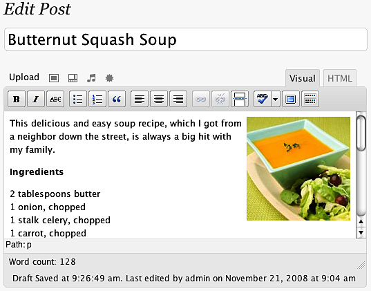
If actions speak louder than words, then in the JavaScript world, effects make actions speak louder still. With jQuery, we can easily add impact to our actions through a set of simple visual effects, and even craft our own, more sophisticated animations.


Inline CSS Modification

Before we jump into the nifty jQuery effects, a quick look at CSS is in order. One way of modifying a document’s appearance is by defining styles for classes in a separate stylesheet and then adding or removing those classes with jQuery. Typically, this is the preferred process for injecting CSS into HTML because it respects the stylesheet’s role in dealing with the presentation of a page. However, there may be times when we need to apply styles that haven’t been, or can’t easily be, defined in a stylesheet. Fortunately, jQuery offers the .css() method for such occasions.

This method acts as both a getter and a setter. To get the value of a style property, we simply pass the name of the property as a string, like .css(‘backgroundColor’). Multi-word properties can be interpreted by jQuery when hyphenated, as they are in CSS notation (background-color), or camel-cased, as they are in DOM notation (backgroundColor). For setting style properties, the .css() method comes in two flavors—one that takes a single style property and its value and one that takes a map of property-value pairs:

.css('property','value')
.css({property1: 'value1', 'property-2': 'value2'})

Experienced JavaScript developers will recognize these jQuery maps as JavaScript object literals.

Numeric values do not take quotation marks while string values do. However, when using the map notation, quotation marks are not required for property names if they are written in camel-cased DOM notation.

We use the .css() method the same way as using .addClass() —by chaining it to a selector and binding it to an event. To demonstrate this, we’ll use the style switcher example.

<div id="switcher">
<div class="label">Text Size</div>
<button id="switcher-default">Default</button>
<button id="switcher-large">Bigger</button>
<button id="switcher-small">Smaller</button>
</div>
<div class="speech">
<p>Fourscore and seven years ago our fathers brought forth
on this continent a new nation, conceived in liberty,
and dedicated to the proposition that all men are created
equal.</p>
</div>

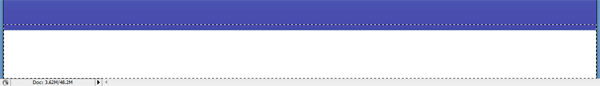
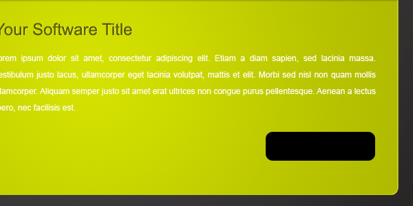
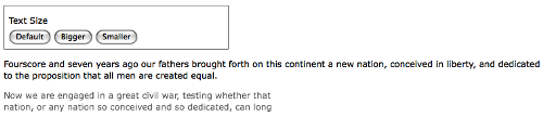
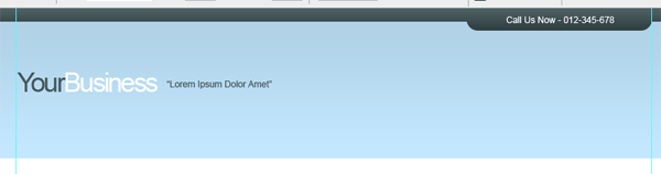
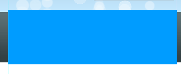
By linking to a stylesheet with a few basic style rules, the page can initially look like the following screenshot:

01

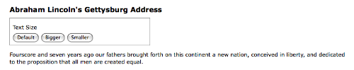
In this version of the style switcher, we’re using button elements. Clicking on the Bigger and Smaller buttons will increase or decrease the text size of div class speech, while clicking on the Default button will reset div class speech to its original text size.

If all we wanted were to change the font size a single time to a predetermined value, we could still use the .addClass() method. But let’s suppose that now we want the text to continue increasing or decreasing incrementally each time the respective button is clicked. Although it might be possible to define a separate class for each click and iterate through them, a more straightforward approach would be to compute the new text size each time by getting the current size and increasing it by a set factor (for example, 40%).

Our code will start with the $(document).ready() and $(‘#switcher-large’).click() event handlers:

$(document).ready(function() {
$('#switcher-large').click(function() {
});
});

Next, the font size can be easily discovered by using the .css() method: $(‘div.speech’).css(‘fontSize’). However, because the returned value will include a trailing ‘px’, we’ll need to strip that part in order to perform calculations with the value. Also, when we plan to use a jQuery object more than once, it’s generally a good idea to cache the selector by storing the resulting jQuery object in a variable as well.

$(document).ready(function() {
var $speech = $('div.speech');
$('#switcher-large').click(function() {
var num = parseFloat($speech.css('fontSize'), 10);
});
});

The first line inside $(document).ready() now stores a variable for “div class=”speech” itself. Notice the use of a $ in the variable name, $speech. Since $ is a legal character in JavaScript variables, we can use it as a reminder that the variable is storing a jQuery object.

Inside the .click() handler, we use parseFloat() to get the font size property’s number only. The parseFloat() function looks at a string from left to right until it encounters a non-numeric character. The string of digits is converted into a floating-point (decimal) number. For example, it would convert the string ’12′ to the number 12. In addition, it strips non-numeric trailing characters from the string, so ’12px’ becomes 12 as well. If the string begins with a non-numeric character, parseFloat() returns NaN, which stands for Not a Number. The second argument for parseFloat() allows us to ensure that the number is interpreted as base-10 instead of octal or some other representation.

All that’s left to do, if we are increasing by 40%, is to multiply num by 1.4 and then set the font size by concatenating num and ‘px’:

$(document).ready(function() {
var $speech = $('div.speech');
$('#switcher-large').click(function() {
var num = parseFloat($speech.css('fontSize'), 10 );
num *= 1.4;
$speech.css('fontSize', num + 'px');
});
});

The equation num *= 1.4 is shorthand for num = num * 1.4. We can use the same type of shorthand for the other basic mathematical operations, as well: addition, num += 1.4; subtraction, num -= 1.4; division, num /= 1.4; and modulus (division remainder), num %= 1.4.

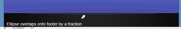
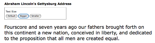
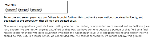
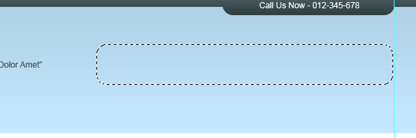
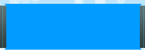
Now when a user clicks on the Bigger button, the text becomes larger. Another click, and the text becomes larger still, as shown in the following screenshot:


02

To get the Smaller button to decrease the font size, we will divide rather than multiply —num /= 1.4. Better still, we’ll combine the two into a single .click() handler on all “button” elements within

. Then, after finding the numeric value, we can either multiply or divide depending on the ID of the button that was clicked. Here is what that code looks like now:
$(document).ready(function() {
var $speech = $('div.speech');
$('#switcher button').click(function() {
var num = parseFloat( $speech.css('fontSize'), 10 );
if (this.id == 'switcher-large') {
num *= 1.4;
} else if (this.id == 'switcher-small') {
num /= 1.4;
}
$speech.css('fontSize', num + 'px);
});
});

We can access the id property of the DOM element referred to by this, which appears here inside the if and else if statements. Here, it is more efficient to use this than to create a jQuery object just to test the value of a property.

It’s also nice to have a way to return the font size to its initial value. To allow the user to do so, we can simply store the font size in a variable immediately when the DOM is ready. We can then use this value whenever the Default button is clicked. To handle this click, we could add another else if statement. However, perhaps a switch statement would be more appropriate.

$(document).ready(function() {
var $speech = $('div.speech');
var defaultSize = $speech.css('fontSize');
$('#switcher button').click(function() {
var num = parseFloat( $speech.css('fontSize'), 10 );
switch (this.id) {
case 'switcher-large':
num *= 1.4;
break;
case 'switcher-small':
num /= 1.4;
break;
default:
num = parseFloat(defaultSize, 10);
}
$speech.css('fontSize', num + 'px');
});
});

Here we’re still checking the value of this.id and changing the font size based on it, but if its value is neither ‘switcher-large’ nor ‘switcher-small’ it will default to the initial font size.

Basic Hide and Show

The basic .hide() and .show() methods, without any parameters, can be thought of as smart shorthand methods for .css(‘display’,’string’), where ‘string’ is the appropriate display value. The effect, as might be expected, is that the matched set of elements will be immediately hidden or shown, with no animation.

The .hide() method sets the inline style attribute of the matched set of elements to display:none. The smart part here is that it remembers the value of the display property—typically block or inline—before it was changed to none. Conversely, the .show() method restores the matched set of elements to whatever visible display property they had before display:none was applied.

For more information about the display property and how its values are visually represented in a web page, visit the Mozilla Developer Center at https://developer.mozilla.org/en/CSS/display/ and view examples at https://developer.mozilla.org/samples/cssref/display.html.

This feature of .show() and .hide() is especially helpful when hiding elements whose default display property is overridden in a stylesheet. For example, the li element has the property display:block by default, but we might want to change it to display:inline for a horizontal menu. Fortunately, using the .show() method on a hidden element such as one of these li tags would not merely reset it to its default display:block, because that would put the li on its own line. Instead, the element is restored to its previous display:inline state, thus preserving the horizontal design.

A quick demonstration of these two methods can be set up by adding a second paragraph and a “read more” link after the first paragraph in the example HTML:

<div id="switcher">
<div class="label">Text Size</div>
<button id="switcher-default">Default</button>
<button id="switcher-large">Bigger</button>
<button id="switcher-small">Smaller</button>
</div>
<div class="speech">
<p>Fourscore and seven years ago our fathers brought forth
on this continent a new nation, conceived in liberty,
and dedicated to the proposition that all men are
created equal.
</p>
<p>Now we are engaged in a great civil war, testing whether
that nation, or any nation so conceived and so dedicated,
can long endure. We are met on a great battlefield of
that war. We have come to dedicate a portion of that
field as a final resting-place for those who here gave
their lives that the nation might live. It is altogether
fitting and proper that we should do this. But, in a
larger sense, we cannot dedicate, we cannot consecrate,
we cannot hallow, this ground.
</p>
<a href="#" class="more">read more</a>
</div>

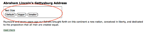
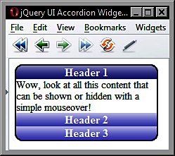
When the DOM is ready, the second paragraph is hidden:

$(document).ready(function() {
$('p:eq(1)').hide();
});

And the speech looks like the following screenshot:


03

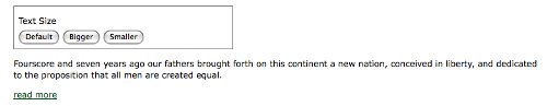
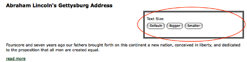
Then, when the user clicks on read more at the end of the first paragraph, that link is hidden and the second paragraph is shown:

$(document).ready(function() {
$('p:eq(1)').hide();
$('a.more').click(function() {
$('p:eq(1)').show();
$(this).hide();
return false;
});
});

Note the use of return false to keep the link from activating its default action. Now the speech looks like this:


04

The .hide() and .show() methods are quick and useful, but they aren’t very flashy. To add some flair, we can give them a speed.

Effects and Speed

When we include a speed (or, more precisely, a duration) with .show() or .hide(), it becomes animated—occurring over a specified period of time. The .hide(‘speed’) method, for example, decreases an element’s height, width, and opacity simultaneously until all three reach zero, at which point the CSS rule display:none is applied. The .show(‘speed’) method will increase the element’s height from top to bottom, width from left to right, and opacity from 0 to 1 until its contents are completely visible.

Speeding In

With any jQuery effect, we can use one of three preset speeds: ‘slow’, ‘normal’, and ‘fast’. Using .show(‘slow’) makes the show effect complete in .6 seconds, .show(‘normal’) in .4 seconds, and .show(‘fast’) in .2 seconds. For even greater precision we can specify a number of milliseconds, for example .show(850). Unlike the speed names, the numbers are not wrapped in quotation marks.

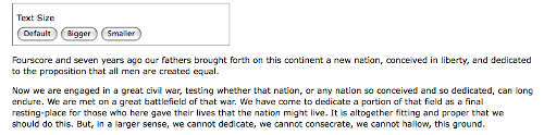
Let’s include a speed in our example when showing the second paragraph of Lincoln’s Gettysburg Address:

$(document).ready(function() {
$('p:eq(1)').hide();
$('a.more').click(function() {
$('p:eq(1)').show('slow');
$(this).hide();
return false;
});
});

When we capture the paragraph’s appearance at roughly halfway through the effect, we see something like the following:


05

Fading In and Fading Out

While the animated .show() and .hide() methods are certainly flashy, they may at times be too much of a good thing. Fortunately, jQuery offers a couple other pre-built animations for a more subtle effect. For example, to have the whole paragraph appear just by gradually increasing the opacity, we can use .fadeIn(‘slow’) instead:

$(document).ready(function() {
$('p:eq(1)').hide();
$('a.more').click(function() {
$('p:eq(1)').fadeIn('slow');
$(this).hide();
return false;
});
});

This time when we capture the paragraph’s appearance halfway, it’s seen as:


06

The difference here is that the .fadeIn() effect starts by setting the dimensions of the paragraph so that the contents can simply fade into it. To gradually decrease the opacity we can use .fadeOut().

Compound Effects

Sometimes we have a need to toggle the visibility of elements, rather than displaying them once as we did in the previous example. Toggling can be achieved by first checking the visibility of the matched elements and then attaching the appropriate method. Using the fade effects again, we can modify the example script to look like this:

$(document).ready(function() {
var $firstPara = $('p:eq(1)');
$firstPara.hide();
$('a.more').click(function() {
if ($firstPara.is(':hidden')) {
$firstPara.fadeIn('slow');
$(this).text('read less');
} else {
$firstPara.fadeOut('slow');
$(this).text('read more');
}
return false;
});
});

As we did earlier in the article, we’re caching our selector here to avoid repeated DOM traversal. Notice, too, that we’re no longer hiding the clicked link; instead, we’re changing the its text.

Using an if else statement is a perfectly reasonable way to toggle elements’ visibility. But with jQuery’s compound effects we can leave the conditionals out of it (although, in this example, we still need one for the link text). jQuery provides a .toggle() method, which acts like .show() and .hide(), and like them, can be used with a speed argument or without. The other compound method is .slideToggle(), which shows or hides elements by gradually increasing or decreasing their height. Here is what the script looks like when we use the .slideToggle() method:

$(document).ready(function() {
var $firstPara = $('p:eq(1)');
$firstPara.hide();
$('a.more').click(function() {
$firstPara.slideToggle('slow');
var $link = $(this);
if ( $link.text() == "read more" ) {
$link.text('read less');
} else {
$link.text('read more');
}
return false;
});
});

This time $(this) would have been repeated, so we’re storing it in the $link variable for performance and readability. Also, the conditional statement checks for the text of the link rather than the visibility of the second paragraph, since we’re only using it to change the text.

Creating Custom Animations

In addition to the pre-built effect methods, jQuery provides a powerful .animate() method that allows us to create our own custom animations with fine-grained control. The .animate() method comes in two forms. The first takes up to four arguments:

A map of style properties and values—similar to the .css() map discussed earlier in this article

An optional speed—which can be one of the preset strings or a number of milliseconds

An optional easing type—an advanced option

An optional callback function—which will be discussed later in this article

All together, the four arguments look like this:

.animate({property1: 'value1', property2: 'value2'},
speed, easing, function() {
alert('The animation is finished.');
}
);

The second form takes two arguments, a map of properties and a map of options.

Your ads will be inserted here by

AdSense Now!.

Please go to the plugin admin page to paste your ad code.

.animate({properties}, {options})

In effect, the second argument wraps up the second through fourth arguments of the first form into another map, and adds two more options to the mix. When we adjust the line breaks for readability, the second form looks like this:

.animate({
property1: 'value1',
property2: 'value2'
}, {
duration: 'value',
easing: 'value',
complete: function() {
alert('The animation is finished.');
},
queue: boolean,
step: callback
});

For now we’ll use the first form of the .animate() method, but we’ll return to the second form later in the article when we discuss queuing effects.

Toggling The Fade

When we discussed compound effects, did you notice that not all methods have a corresponding method for toggling? That’s right: while the sliding methods include .slideToggle(), there is no corresponding .fadeToggle() to go along with .fadeIn() and .fadeOut()! The good news is that we can use the .animate() method to easily make our own toggling fade animation. Here we’ll replace the .slideToggle() line of the previous example with our custom animation:

$(document).ready(function() {
$('p:eq(1)').hide();
$('a.more').click(function() {
$('p:eq(1)').animate({opacity: 'toggle'}, 'slow');
var $link = $(this);
if ( $link.text() == "read more" ) {
$link.text('read less');
} else {
$link.text('read more');
}
return false;
});
});

As the example illustrates, the .animate() method provides convenient shorthand values for CSS properties — ‘show’, ‘hide’, and ‘toggle’ — to ease the way when the shorthand methods aren’t quite right for the particular task.

animating Multiple Properties

With the .animate() method, we can modify any combination of properties simultaneously. For example, to create a simultaneous sliding and fading effect when toggling the second paragraph, we simply add the height property-value pair to .animate()’s properties map:

$(document).ready(function() {
$('p:eq(1)').hide();
$('a.more').click(function() {
$('p:eq(1)').animate({
opacity: 'toggle',
height: 'toggle'
},
'slow');
var $link = $(this);
if ( $link.text() == "read more" ) {
$link.text('read less');
} else {
$link.text('read more');
}
return false;
});
});

Additionally, we have not only the style properties used for the shorthand effect methods at our disposal, but also other properties such as: left, top, fontSize, margin, padding, and borderWidth. Recall the script to change the text size of the speech paragraphs. We can animate the increase or decrease in size by simply substituting the .animate() method for the .css() method:

$(document).ready(function() {
var $speech = $('div.speech');
var defaultSize = $speech.css('fontSize');
$('#switcher button').click(function() {
var num = parseFloat( $speech.css('fontSize'), 10 );
switch (this.id) {
case 'switcher-large':
num *= 1.4;
break;
case 'switcher-small':
num /= 1.4;
break;
default:
num = parseFloat(defaultSize, 10);
}
$speech.animate({fontSize: num + 'px'},
'slow');
});
});

The extra properties allow us to create much more complex effects, too. We can, for example, move an item from the left side of the page to the right while increasing its height by 20 pixels and changing its border width to 5 pixels.

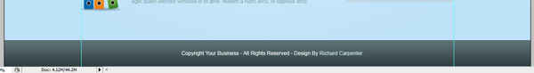
So, let’s do that with the “div id=”switcher” box. Here is what it looks like before we animate it:


07

With a flexible-width layout, we need to compute the distance that the box needs to travel before it lines up at the right side of the page. Assuming that the paragraph’s width is 100%, we can subtract the Text Size box’s width from the paragraph’s width. While jQuery’s .width() method would usually come in handy for such calculations, it doesn’t factor in the width of the right and left padding or the right and left border. As of jQuery version 1.2.6, though we also have the .outerWidth() method at our disposal. This is what we’ll use here, to avoid having to add padding and border widths as well. For the sake of this example, we’ll trigger the animation by clicking the Text Size label, just above the buttons. Here is what the code should look like:

$(document).ready(function() {
$('div.label').click(function() {
var paraWidth = $('div.speech p').outerWidth();
var $switcher = $(this).parent();
var switcherWidth = $switcher.outerWidth();
$switcher.animate({left: paraWidth - switcherWidth,
height: '+=20px', borderWidth: '5px'}, 'slow');
});
});

Note that the height property has += before the pixel value. This expression, introduced in jQuery 1.2, indicates a relative value. So, instead of animating the height to 20 pixels, the height is animated to 20 pixels greater than the current height.

Although this code successfully increases the height of the “div” and widens its border, at the moment the left position cannot be changed. We still need to enable changing its position in the CSS.

Positioning With CSS

When working with .animate(), it’s important to keep in mind the limitations that CSS imposes on the elements that we wish to change. For example, adjusting the left property will have no effect on the matching elements unless those elements have their CSS position set to relative or absolute. The default CSS position for all block-level elements is static, which accurately describes how those elements will remain if we try to move them without first changing their position value.

For more information on absolute and relative positioning, see Joe Gillespie’s article, Absolutely Relative at: http://www.wpdfd.com/issues/78/absolutely_relative/
A peek at our stylesheet shows that we have now set div id switcher to be relatively positioned:

 #switcher { position: relative; }

With the CSS taken into account, the result of clicking on Text Size, when the animation has completed, will look like this:

08

Simultaneous Versus Queued Effects

The .animate() method, as we’ve just discovered, is very useful for creating simultaneous effects in a particular set of elements. There may be times, however, when we want to queue our effects, having them occur one after the other.

Working With A Single Set Of Elements

When applying multiple effects to the same set of elements, queuing is easily achieved by chaining those effects. To demonstrate this queuing, we’ll again move the Text Size box to the right, increase its height and increase its border width. This time, however, we perform the three effects sequentially, simply by placing each in its own .animate() method and chaining the three together:

$(document).ready(function() {
$('div.label').click(function() {
var paraWidth = $('div.speech p').outerWidth();
var $switcher = $(this).parent();
var switcherWidth = $switcher.outerWidth();
$switcher
.animate({left: paraWidth - switcherWidth},
'slow')
.animate({height: '+=20px'}, 'slow')
.animate({borderWidth: '5px'}, 'slow');
});
});

Chaining permits us to keep all three .animate() methods on the same line, but here we have indented them and put each on its own line for greater readability.

We can queue any of the jQuery effect methods, not just .animate(), by chaining them. We can, for example, queue effects on div id switcher in the following order:

Fade its opacity to .5 with .fadeTo().

Move it to the right with .animate().

Fade it back in to full opacity with .fadeTo().

Hide it with .slideUp().

Show it once more with .slideDown().

All we need to do is chain the effects in the same order in our code:

$(document).ready(function() {
$('div.label').click(function() {
var paraWidth = $('div.speech p').outerWidth();
var $switcher = $(this).parent();
var switcherWidth = $switcher.outerWidth();
$switcher
.fadeTo('fast',0.5)
.animate({
'left': paraWidth - switcherWidth
}, 'slow')
.fadeTo('slow',1.0)
.slideUp('slow')
.slideDown('slow');
});
});

But what if we want to move the div to the right at the same time as it fades to half opacity? If the two animations were occurring at the same speed, we could simply combine them into a single .animate() method. But in this example, the fade is using the ‘fast’ speed while the move to the right is using the ‘slow’ speed. Here is where the second form of the .animate() method comes in handy:

$(document).ready(function() {
$('div.label').click(function() {
var paraWidth = $('div.speech p').outerWidth();
var $switcher = $(this).parent();
var switcherWidth = $switcher.outerWidth();
$switcher
.fadeTo('fast',0.5)
.animate({
'left': paraWidth - switcherWidth
}, {duration: 'slow', queue: false})
.fadeTo('slow',1.0)
.slideUp('slow')
.slideDown('slow');
});
});

The second argument, an options map, provides the queue option, which when set to false makes the animation start simultaneously with the previous one.

One final observation about queuing effects on a single set of elements is that queuing does not automatically apply to other, non-effect methods such as .css(). So let’s suppose we wanted to change the background color of “div id=”switcher” to red after the .slideUp() but before the slideDown(). We could try doing it like this:

$(document).ready(function() {
$('div.label').click(function() {
var paraWidth = $('div.speech p').outerWidth();
var $switcher = $(this).parent();
var switcherWidth = $switcher.outerWidth();
$switcher
.fadeTo('fast',0.5)
.animate({
'left' paraWidth - switcherWidth
}, 'slow')
.fadeTo('slow',1.0)
.slideUp('slow')
.css('backgroundColor','#f00')
.slideDown('slow');
});
});

However, even though the background-changing code is placed at the correct position in the chain, it occurs immediately upon the click.

One way we can add non-effect methods to the queue is to use the appropriately named .queue() method. Here is what it would look like in our example:

$(document).ready(function() {
$('div.label').click(function() {
var paraWidth = $('div.speech p').outerWidth();
var $switcher = $(this).parent();
var switcherWidth = $switcher.outerWidth();
$switcher
.fadeTo('fast',0.5)
.animate({
'left': paraWidth - switcherWidth
}, 'slow')
.fadeTo('slow',1.0)
.slideUp('slow')
.queue(function() {
$switcher
.css('backgroundColor', '#f00')
.dequeue();
})
.slideDown('slow');
});
});

When given a callback function, as it is here, the .queue() method adds the function to the queue of effects for the matched elements. Within the function, we set the background color to red and then add the corollary .dequeue() method. Including this .dequeue() method allows the animation queue to pick up where it left off and complete the chain with the following .slideDown(‘slow’) line. If we hadn’t used .dequeue(), the animation would have stopped.

More information and examples for .queue() and .dequeue() are available at http://docs.jquery.com/Effects.

We’ll discover another way to queue non-effect methods as we examine effects with multiple sets of elements.

Working With Multiple Sets Of Elements

Unlike with a single set of elements, when we apply effects to different sets, they occur at virtually the same time. To see these simultaneous effects in action, we’ll slide one paragraph down while sliding another paragraph up. First, we’ll add the remaining portion of the Gettysburg Address to the HTML, dividing it into two separate paragraphs:

<div id="switcher">
<div class="label">Text Size</div>
<button id="switcher-default">Default</button>
<button id="switcher-large">Bigger</button>
<button id="switcher-small">Smaller</button>
</div>
<div class="speech">
<p>Fourscore and seven years ago our fathers brought forth
on this continent a new nation, conceived in liberty, and
dedicated to the proposition that all men are created
equal.
</p>
<p>Now we are engaged in a great civil war, testing whether
that nation, or any nation so conceived and so dedicated,
can long endure. We are met on a great battlefield of
that war. We have come to dedicate a portion of that
field as a final resting-place for those who here gave
their lives that the nation might live. It is altogether
fitting and proper that we should do this. But, in a
larger sense, we cannot dedicate, we cannot consecrate,
we cannot hallow, this ground.
</p>
<a href="#" class="more">read more</a>
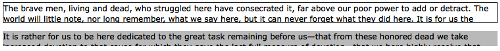
<p>The brave men, living and dead, who struggled
here have consecrated it, far above our poor
power to add or detract. The world will little
note, nor long remember, what we say here, but it
can never forget what they did here. It is for us
the living, rather, to be dedicated here to the
unfinished work which they who fought here have
thus far so nobly advanced.
</p>
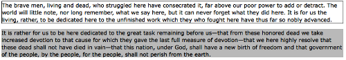
<p>It is rather for us to be here dedicated to the
great task remaining before us—that from
these honored dead we take increased devotion to
that cause for which they gave the last full
measure of devotion—that we here highly
resolve that these dead shall not have died in
vain—that this nation, under God, shall
have a new birth of freedom and that government
of the people, by the people, for the people,
shall not perish from the earth.
</p>
</div>

Next, to help us see what’s happening during the effect, we’ll give the third paragraph a 1-pixel border and the fourth paragraph a gray background. We’ll also hide the fourth paragraph when the DOM is ready:

$(document).ready(function() {
$('p:eq(2)').css('border', '1px solid #333');
$('p:eq(3)').css('backgroundColor', '#ccc').hide();
});

Finally, we’ll add the .click() method to the third paragraph so that when it is clicked, the third paragraph will slide up (and out of view), while the fourth paragraph slides down (and into view):

$(document).ready(function() {
$('p:eq(2)')
.css('border', '1px solid #333')
.click(function() {
$(this).slideUp('slow')
.next().slideDown('slow');
});
$('p:eq(3)').css('backgroundColor', '#ccc').hide();
});

A screenshot of these two effects in mid-slide confirms that they do, indeed, occur virtually simultaneously:


The third paragraph, which started visible, is halfway through sliding up at the same time as the fourth paragraph, which started hidden, is halfway through sliding down.

Callbacks

In order to allow queuing effects on different elements, jQuery provides a callback function for each effect method. As we have seen with event handlers and with the .queue() method, callbacks are simply functions passed as method arguments. In the case of effects, they appear as the last argument of the method.

If we use a callback to queue the two slide effects, we can have the fourth paragraph slide down before the third paragraph slides up. Let’s first look at how to set up the .slideDown() method with the callback:

$(document).ready(function() {
$('p:eq(2)')
.css('border', '1px solid #333')
.click(function() {
$(this).next().slideDown('slow',function() {
// code here executes after 3rd paragraph's
// slide down has ended
});
});
$('p:eq(3)').css('backgroundColor', '#ccc').hide();
});

We do need to be careful here, however, about what is actually going to slide up. The context has changed for $(this) because the callback is inside the .slideDown() method. Here, $(this) is no longer the third paragraph, as it was at the point of the .click() method; rather, since the .slideDown() method is attached to $(this).next(), everything within that method now sees $(this) as the next sibling, or the fourth paragraph. Therefore, if we put $(this).slideUp(‘slow’) inside the callback, we would end up hiding the same paragraph that we had just made visible.

A simple way to keep the reference of $(this) stable is to store it in a variable right away within the .click() method, like var $thirdPara = $(this).

Now $thirdPara will refer to the third paragraph, both outside and inside the callback. Here is what the code looks like using our new variable:

$(document).ready(function() {
var $thirdPara = $('p:eq(2)');
$thirdPara
.css('border', '1px solid #333')
.click(function() {
$(this).next().slideDown('slow',function() {
$thirdPara.slideUp('slow');
});
});
$('p:eq(3)').css('backgroundColor', '#ccc').hide();
});

Using $thirdPara inside the .slideDown() callback relies on the properties of closures.

This time a snapshot halfway through the effects will reveal that both the third and the fourth paragraphs are visible; the fourth has finished sliding down and the third is about to begin sliding up:


10

Now that we’ve discussed callbacks, we can return to the code from earlier in this article in which we queued a background-color change near the end of a series of effects. Instead of using the .queue() method, as we did earlier, we can simply use a callback function:

$(document).ready(function() {
$('div.label').click(function() {
var paraWidth = $('div.speech p').outerWidth();
var $switcher = $(this).parent();
var switcherWidth = $switcher.outerWidth();
$switcher
.fadeTo('slow',0.5)
.animate({
'left': paraWidth - switcherWidth
}, 'slow')
.fadeTo('slow',1.0)
.slideUp('slow', function() {
$switcher
.css('backgroundColor', '#f00');
})
.slideDown('slow');
});
});

Here again, the background color of div id switcher changes to red after it slides up, and before it slides back down.

In a Nutshell

With all the variations to consider when applying effects, it can become difficult to remember whether the effects will occur simultaneously or sequentially. A brief outline might help:

Effects on a single set of elements are:
– simultaneous when applied as multiple properties in a single .animate() method.
– queued when applied in a chain of methods, unless the queue option is set to false.

Effects on multiple sets of elements are:
– simultaneous by default
– queued when applied within the callback of another effect or within the callback of the .queue() method

Summary

By using effect methods that we have explored in this article, we should now be able to incrementally increase and decrease text size by using either the .css() or the .animate() method. We should also be able to apply various effects to gradually hide and show page elements in different ways and also to animate elements, simultaneously or sequentially, in a number of ways.


Your ads will be inserted here by

AdSense Now!.

Please go to the plugin admin page to paste your ad code.

Cool Wallpapers, Tutorials & Resources

Your ads will be inserted here by

AdSense Now!.

Please go to the plugin admin page to paste your ad code.

Small round-up of some cool wallpapers from around the internet, article also includes some resources and tutorials to get you started in creating your own wallpapers.


Wallpapers

Wallpaper01

Wallpaper02

Wallpaper03

Wallpaper04


Wallpaper06

Wallpaper07

Wallpaper08

Wallpaper09

Wallpaper10

Wallpaper11

12

Wallpaper13

Wallpaper14

Wallpaper15

Wallpaper16

Your ads will be inserted here by

AdSense Now!.

Please go to the plugin admin page to paste your ad code.

Wallpaper17

Wallpaper18

Creating Smoke

Tutorial01

Futuristic Orb

Tutorial02

Green Planet

Tutorial03

Iphone Light Beams

Tutorial04

Leopard’s Aurora Borealis wallpaper in GIMP

Tutorial05

Team Fortress Wallpaper

Tutorial06

Leopard Starburst effect in Photoshop

Tutorial07

Funky Style Wallpaper

Tutorial08

Car Wallpaper Tutorial

Tutorial09

Create Awesome Music Wallpaper

Tutorial10

Knight Rider Inspired Wallpaper

Tutorial11

Dynamic Recessed Watercolor Typography in Photoshop

Tutorial12

Futuristic Wallpaper

Tutorial13

Create a Spectacular Grass Text Effect in Photoshop

Tutorial14

Vista Orb Wallpaper

Tutorial15


Enjoy

Your ads will be inserted here by

AdSense Now!.

Please go to the plugin admin page to paste your ad code.

Vector Style Earth

Your ads will be inserted here by

AdSense Now!.

Please go to the plugin admin page to paste your ad code.

Good evening everybody, in this tutorial il be showing you how to create a simple vector earth from scratch. The PSD file is available free to download.


Creating a New Document

Were going to start off with a canvas size of 600 x 600 pixels for the purpose of this tutorial, feel free to make your canvas much bigger if you require the image in a bigger size, the results should be the same.

Step1

The Background

For the background il be using something relivantly simple, fill your background layer with a dark blue color the color code i used is #081122. Were now going to add some minor noise, go to “filter > noise > add noise”, use the settings below.

Step2

You should have something like this.

Step3

Creating The Globe

Select the circle tool or the elliptical marquee tool and create a circle covering most of the canvas. TIP: Holding the shift key whilst dragging will ensure the circle is the right aspect ratio.

Step4

Dont fill your circle just yet, first select the gradient tool with a radial gradient. Set your foreground color to #439abf and your background color to #033e76, drag the radial gradient from the top right corner of the circle down diagonally towards the bottom left.

Step5

You should have something like this.

Step6

Now add these layer styles to your globe.

Step7

Step8

You should now have something like this.

Step9

Creating The Islands

Select the pen tool and randomly create the points that make up your first of two islands.

Step10

Once you’ve closed your last anchor point right click inside the island with the pen tool and go to “fill path”.

Step11

You should have something like this.

Your ads will be inserted here by

AdSense Now!.

Please go to the plugin admin page to paste your ad code.

Step12

We now need to cut into the island so it wraps inside our globe. Click your globe layer whilst holding down the CTRL key. This should load a selection around your globe, select your island layer while the selection is active. Now go to “select > inverse” and hit the delete key.

Step13

Now add these layer styles to your top island.

Step14

Step15

You should have something like this.

Step16

Using the pen tool once again create another island inside the island you just created, fill the inner island with the color #f5b47a.

Step17

Creating The Second Island

Using the same methods listed above and create another island somewhere on your globe. When adding the island layer styles leave off the drop shadow.

Step18

Adding Smaller Islands

Using the pen tool create some smaller islands dotted around the globe. The islands at the top fill with a darker shade of blue, the small islands at the bottom fill with a lighter shade of blue. Finally set the small islands layer opacity to about 20%.

Step19

Creating The Globe Shines

Select your globe layer whilst holding down the CTRL key, this should load a selection around your globe. Create a new layer above everything and fill the selection with the color white.

Step20

Using the elliptical marquee tool make a selection like the image below.

Step21

Once you’ve made the selection hit the delete key. Now set the layers opacity to 2%.

Step22

Repeat the steps above a couple of times, ive done it 4 times, 2 shines at the bottom and 2 at the top.

The Finished Result

The finished result looks something like this.

Finished Result

Many thanks for reading, il look forward to your comments.

License and Attribution

The PSD file is licensed under the Creative Commons license and can be used for personal purposes ONLY. No attribution is needed but it is always appreciated.

Your ads will be inserted here by

AdSense Now!.

Please go to the plugin admin page to paste your ad code.

Competition: HandHeld – Entrys (closed)

Your ads will be inserted here by

AdSense Now!.

Please go to the plugin admin page to paste your ad code.

Do you fancy being the next bill gates????, Do you fancy being the next creator of an upcoming handheld computer???? You might be…. this month hv-designs kicks off the first serious competition.


About The Contest

You’ve just spent the last 4-6 years of your life studying for a degree in advanced computer technologies/science, one of the big computer giants have now hired you to create the next big computer craze.

Your objective….. too come up with an all new handheld games console that will be best of the best and beat the rest. Failure is not an option.!

Tutorials

Drawing Microsofts XBOX 360

Drawing Microsofts XBOX 360

Creating a Realistic Gameboy

Creating a Realistic Gameboy

Xbox Logo

Xbox Logo

Creating a Nintendo DS

Creating a Nintendo DS

Creating a Playstation 3

Creating a Playstation 3

Creating a Nintendo Wii

Creating a Nintendo Wii

Inspiration

Xbox Handheld Concept

Xbox Handheld Concept

PSP2 Concept

Your ads will be inserted here by

AdSense Now!.

Please go to the plugin admin page to paste your ad code.

PSP2 Concept

PSP Phone

PSP Phone

Nintendo DS Redesign Concept

Nintendo_DS_Redesign_Concept_by_laserbeams

How To Enter

To enter the competition, contestants must submit designs into the HV-Designs Flickr Group. (located in the sidebar). Be sure to follow these guidelines

– All entries must be tagged with the word “handheld.”
– Submit a JPG image that is 800 pixels wide or larger.
– Include in the description of your Flickr entry any stock or source images you have used including URLs to those images. (always credit your sources).

What Do We Win?

First Place Prizes:

– Free PSD to HTML Conversion Service From SB-Designs (valued at GBP £80)
– Any One Book Chosen From Packt Publishing (valued at GBP £22.49+)
– 15 Free PSD Files From The HV-Designs Shop (valued at GBP £30)

Second Place Prizes:

– Free PSD to HTML Conversion Service From SB-Designs (valued at GBP £80)
– 5 Free PSD Files From The HV-Designs Shop (valued at GBP £10)

Third Place Prizes:

– Any 5 Items From The HV-Designs Shop

Terms and Conditions

– Entries must be submitted before OR on 31/08/2009.
– Entries into the competition must be entirely your work.
– All stocks used must be credited with a working URL. (triple check your allowed to use the image)
– No prize can be redeemed for cash.
– If you live outside europe or USA the book from packt publishing will be substituted as a digital E-Book.

Sponsors

handheld14

competition closed02

competition closed01

Your ads will be inserted here by

AdSense Now!.

Please go to the plugin admin page to paste your ad code.

Portfolio Layout #11

Your ads will be inserted here by

AdSense Now!.

Please go to the plugin admin page to paste your ad code.

Hello everybody welcome to another tutorial by hv-designs, in this tutorial il show you how to create a colorful yet elegant portfolio layout.


Creating Your Document

Create a new document 1200 x 1200 pixels with any color background.

Step1

Creating The Background

Duplicate your background layer then add these layer styles.

Step2

Step3

With your duplicated layer selected press CTRL + T to go into free transform mode, go to the bottom middle anchor point and drag it up about 100 pixels.

Step4

Creating The Footer

Underneath your duplicated background layer create a new layer called footer, select the rectangular marquee tool and make a selection covering the area which is now visible from where we resized the background.

portfolio layout 11 step5

Fill the selection with any color. Select the colors #0b0b0b and #222222 then with the gradient tool using a radial gradient, drag from the center towards either the left or the right of the canvas.

Step6

Create another new layer this time above your footer layer, select the elliptical marquee tool and make a selection like the image below.

Step7

Fill the selection with the color black (#000000). Now apply a guassian blur by going to “filter > blur > guassian blur”, use the settings below.

Step8

Set the layers opacity to 75% finally you should have something like this.

Step9

Creating The Title

Using the type tool add your website title and slogan too the top of the layout.

Step10

Im using a “Helvetica” style font using the settings below.

Step11

Creating The Navigation Bar

For our navigation were going to use the rounded rectangle tool, the radius of the rounded rectangle can be changed at the very top under the default menu bar. Change the radius to 10px.

Step12

Drag out the navigation shape next to your website title, fill the rounded rectangle with any color.

Step13

Add these layer styles to your navigation bar.

portfolio layout 11 step11

Step15

Once you’ve added the layer styles add your navigation links.

Step16

In between each navigation link add a separator using two 1px lines next to each other.

Step17

Make a selection around half of the navigation, fill the selection with the color white.

Step18

Keep the layer selected in which your white rectangle is on, click your navigation layer whilst holding down the CTRL key, this will load a selection around the navigation. Go to “select > inverse” then hit the delete key, set the layers opacity to 8%.

Step19

Creating The Featured Area

In the same way you created the separator lines for the navigation bar, do the same and create one for the featured area.

Step20

Using the rectangular marquee tool create a selection along side the two 1px lines, make sure the selection is the same height as the two lines.

Step21

While the selection is active select your background layer then go to “edit > copy merged”, on a new layer above everything else go to “edit > paste” if the selection is still be active (which it should) the background will be pasted in the same place it was copied from. Create a new layer above the copied background piece, keep the selection active then select the gradient tool with radial gradient. The gradient colors should be set to white – transparent.

Your ads will be inserted here by

AdSense Now!.

Please go to the plugin admin page to paste your ad code.

Step22

Drag the gradient over the background piece on the new blank layer, drag it from the right towards the left. Add a layer mask once your done then drag a linear gradient from the left to right. Make sure the gradient is reset to the default colors. You should have something like this.

Step23

Underneath the background piece layer that we copied, create another layer, using the elliptical marquee tool create a small ellipse.

Step24

Fill the selection with the color black then using the guassian blur filter, blur it by about 2-3px. Set the layers opacity to 75%, then remove any excess shadow from the top and bottom of the two 1px lines. Your looking for this effect.

Step25

Finally if your top and bottom parts don’t blend in like mine do then add a layer mask to the shadow and two 1px lines, drag a reflected gradient from the middle of the elements upwards, for this to work properly you need to set your foreground to white and background to black.

Creating The Featured Buttons

Using the rectangular marquee tool create 4 rectangular buttons, slot each one into the featured area, make sure all the layers are underneath the featured area layers that we created a few steps ago.

Step26

For the first button add these layer styles.

Step27

Step28

Step29

Step30

For the rest of the buttons add these layer styles

Step27

Step28

Step31

Step30

Creating The Featured Image

Next to the featured buttons on the left create a black rectangle by using the rectangular marquee tool.

Step32

Once you’ve made the rectangle go to “edit > transform > warp”. When the warp option is selected there should be a button at the top which says “custom” change this to “bulge”.

Step33

Once bulge is selected you’ll be able to change the amount the rectangle bulges out by. Change the bend to 15.

Step34

Press the enter key to apply the changes. Load the selection around the bulged rectangle by either clicking its layer whilst holding down the CTRL key or by going to “select > load selection”. Once you’ve loaded the selection go to “select > modify > contract”, contract the selection by 15px. Once the contraction has been applied hit the delete key and apply this outer glow.

Step35

You should have something like this.

Step36

Finally add your featured image inside the featured image frame, to the right of the featured image part add your featured content text.

Step37

Directly underneath your featured image, using the elliptical marquee tool make a selection like the image below.

Step38

Fill the selection with black then add a guassian blur of about 2-3pixels, finally set the opacity to around 45% Your end result should be something like this.

Step39

The Content Area

The hardest part of the layout has been completed, the content area is a little too easy as its just text. Using a combination of white and black text, black for headings and white for paragraphs assemble something like the image below. The icons are from a free set on smashing magazine.

Step40

Dont forget to add your footer text in the footer area.

Step41

The Finished Layout

Finished

Thanks for reading, looking forward to your comments.


Enjoy

Your ads will be inserted here by

AdSense Now!.

Please go to the plugin admin page to paste your ad code.

Dual Windows With Photoshop

Your ads will be inserted here by

AdSense Now!.

Please go to the plugin admin page to paste your ad code.

In this quick article i’l be showing you how to maximize your work space when working on more than one piece of artwork within photoshop.


If your the kind of person who likes spending time retouching photo’s or creating wacky photo manipulations you will know how annoying it is when you have to keep zooming in and out to check on your progress.

Wouldn’t it be nice if you could work on one photo zoomed in at 500%, yet still see the result at 100%. Well you actually can, and il show you how.

Open Up Your Document

In photoshop i’ve opened up an image of charlize theron (just for this example).

Step1

Duplicating The Window

Now we have our image open lets duplicate the window, to do this we need to go to “window” in the menu bar.

Step2

Go to “arrange” then at the bottom click “new window for “file name here”.

Step3

Providing your document window is not maximized you should have two windows. If it is maximized just restore it down.

Step4

Tiling The Document Window

Your ads will be inserted here by

AdSense Now!.

Please go to the plugin admin page to paste your ad code.

If you head back into the “window” options under the arrange tab you have two options for tiling the document windows, horizontally and vertically.

Step5

Tiling Vertically

If you click “tile vertically” your windows will be displayed like this.

Step6

Tiling Horizontally

If you click “tile horizontally” your windows will be displayed like this.

Step7

Free Too Zoom

Each window can be zoomed and edited differently but the overall result will be applied to whole image. For example if i were to change her eye color.

Step8

The changes are made in the top window and its updated in the bottom window, notice the zoom levels of each window. If you would like the zoom level to be the same in both windows you can simply go to “window > arrange > match zoom level”.

Step9

You can also match the windows location by going to “window > arrange > match location”, there is also an option to do both at the same time by clicking “match zoom and location”.

Step10

Additional Notes

For those using photoshop CS4 i do believe there may be more options to choose from and more views to choose from, more than likely any photoshop version under cs3 will be the same as this article.

Your ads will be inserted here by

AdSense Now!.

Please go to the plugin admin page to paste your ad code.

Cheat Sheets You Shouldn’t Be Without

Your ads will be inserted here by

AdSense Now!.

Please go to the plugin admin page to paste your ad code.

8 Cheat sheets you shouldn’t be without…


Adobe Photoshop CS2


Adobe Photoshop CS3


Adobe Photoshop CS4


Adobe Illustrator CS4

Your ads will be inserted here by

AdSense Now!.

Please go to the plugin admin page to paste your ad code.


Gimp


Ruby On Rails


HTML


CSS


Have you wrote a cheat sheet?? or know any more cheat sheets we should add to this post feel free to let us know in the comments.

Your ads will be inserted here by

AdSense Now!.

Please go to the plugin admin page to paste your ad code.

14 Tutorials Inspired By Games

Your ads will be inserted here by

AdSense Now!.

Please go to the plugin admin page to paste your ad code.

In this small round-up ive listed 14 top tutorials inspired by gaming or games in general, including console creation, layouts and effects.


Far Cry 2: Inspired Sun Set

Far Cry 2: Inspired Sun Set

God Of War: Cracked Text

God Of War: Cracked Text

PSP: Creation

PSP: Creation

Nintendo DS Lite: Creation

Nintendo DS Lite: Creation

PC Game Box Design

PC Game Box Design

Gaming Layout #1

Gaming Layout #1

Game Boy: Creation

Your ads will be inserted here by

AdSense Now!.

Please go to the plugin admin page to paste your ad code.

Game Boy: Creation

Bioshock Digital Painting

Bioshock Digital Painting

Retro Game Cartridge Design

Retro Game Cartridge Design

Surface Texture Painting

Surface Texture Painting

Gaming Layout #2

Gaming Layout #2

Creating Buildings

Creating Buildings

Building A Pixel City

Building A Pixel City

Iphone Interface Design

Iphone Interface Design

Enjoy

Your ads will be inserted here by

AdSense Now!.

Please go to the plugin admin page to paste your ad code.

Software Layout #4

Your ads will be inserted here by

AdSense Now!.

Please go to the plugin admin page to paste your ad code.

Hello welcome to tutorial 216 by hv-designs, in this tutorial il show you how to create a sleek looking software layout, currently the 4th software layout in our database.


Setting Up Our Canvas

Open up photoshop and create a new document, the dimensions should be 1200 x 1200 pixels.

Step1

The background can be any color as we’ll be changing it in the next step.

Creating Our Background

Set your forground color to #585858 and your background color to #282425. Select the gradient tool with a radial gradient.

Step2

Once you’ve selected your radial gradient drag out the gradient starting from the top middle part of the canvas dragging down towards the middle of the canvas.

Step3

Creating The Website Title

Using the colors white #ffffff and the color green #d7e400 add your website title and slogan.

Step4

The font i used and settings are located in the screenshot below.

Step5

On the right side of the title add your simple support toll free number.

Step6

The layer styles used for the free toll number are as follows.

Step7

Step8

Step9

The text should now be transformed into something like below..

Step10

Creating The Navigation

Select the rounded rectangle tool with a radius of 10px.

Step11

Drag out a rectangle underneath your website title, fill the rectangle with any color.

Step12

Zoom into one of the bottom corners of the rounded rectangle, select the rectangular marquee tool and create a selection cornering off the bottom corner.

Step13

Fill the selection on the same layer then do the same to the other bottom corner. The end result should be something like this.

Step14

Now add these layer styles to your navigation.

Step15

Step16

Step31

Step18

You should have something like this.

Step19

Adding The Navigation Links

Add your navigation links over the top of your navigation bar using the type tool. Ive opted for a simple arial font for the navigation text.

Step20

Once you’ve added the text add these layer styles.

Step21

Step22

Creating The Software Summary Box

With the rounded rectangle tool on a layer underneath your navigation layer create a big rectangle. The rectangle itself should be the same width of the navigation and the top corners should be hidden underneath the navigation.

Step23

Now you’ve created the rectangle select the gradient tool with a radial gradient. Using the colors #d3df00 and #b4c00a add a radial gradient over your rectangle in the same way we did our background.

Your ads will be inserted here by

AdSense Now!.

Please go to the plugin admin page to paste your ad code.

Step24

Now add this stroke layer style to complete this step.

Step25

Software Summary Box Content

On the left side of the software summary box add an image of your software or a logo. As i dont have any software to feature ive used a report icon from smashing magazines free icon set.

Step26

Next to the icon add a title with a paragraph.

Step27

To the title add these layer styles.

Step21

Step22

Creating The Try Now Button

Using the rounded rectangle tool still with a radius of 10px, create a small rectangle, Fill the rectangle with any color.

Step28

Now add these layer styles to your button.

Step29

Step30

Step31

Step32

Add your button text then add these layer styles.

Step21

Step22

You should have something like this.

Step33

Creating The Content Area

Using the rounded rectangle tool create a big rectangle underneath the summary box. The box should be the same width.

Step34

Add these layer styles to your big rectangle.

Step35

Step36

Creating The Sidebar

Using the rectangular marquee tool make a selection the same height as the content area and any width.

Step37

Once you’ve made the selection fill the selection with any color then add the same gradient overlay as the content area.

Step35

Now add this drop shadow.

Step38

You should have something like this.

Step39

With the rectangular marquee tool again create a black square which covers the sidebar area. The layer should be underneath the other rectangle layer which contains the drop shadow which makes up the sidebar.

Step40

Set the black rectangles layer opacity to 4%. This just adds a darker shade to the sidebar area.

The Content

Your layout is now ready for its content. Using a combination of headers and paragraphs to build up your content area. Ive included some icons from “wefunction” just to spruce it up abit.

Step41

The Footer

For this design i opted for a simple text footer.

Step42

The Finished Layout

Finished


Enjoy

Your ads will be inserted here by

AdSense Now!.

Please go to the plugin admin page to paste your ad code.

3D Space Image Gallery

Your ads will be inserted here by

AdSense Now!.

Please go to the plugin admin page to paste your ad code.

Another tutorial released by richard carpenter (ME) over at six revisions. Check It Out.


Your ads will be inserted here by

AdSense Now!.

Please go to the plugin admin page to paste your ad code.

View Tutorial | Download PSD

Comments and feedback welcome.

Your ads will be inserted here by

AdSense Now!.

Please go to the plugin admin page to paste your ad code.