Your ads will be inserted here by
AdSense Now!.
Please go to the plugin admin page to paste your ad code.
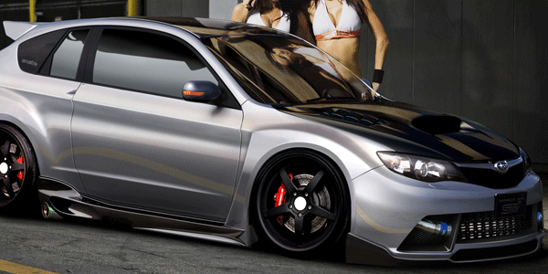
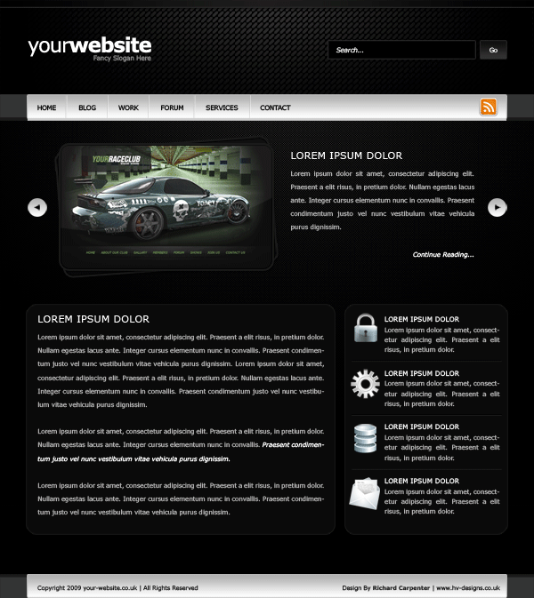
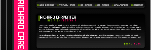
Good evening welcome to another tutorial by the hv team, in todays tutorial il be showing you how to slice and dice the dark layout #2 PSD into a working template.
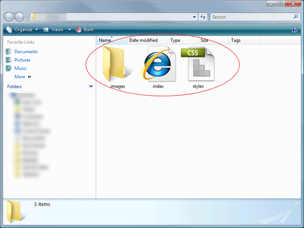
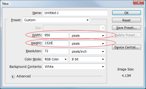
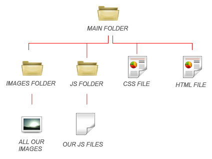
Right lets get started, the first thing you need to do is create a new folder on your desktop called dark layout, inside this folder you need three more folders “images”, “js” and “styles”. Inside the “styles” folder create two blank CSS files “style.css” and “ie.css”, then in the main folder create your blank HTML file “index.html”.

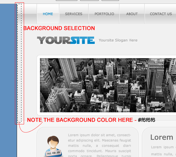
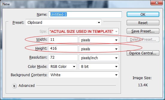
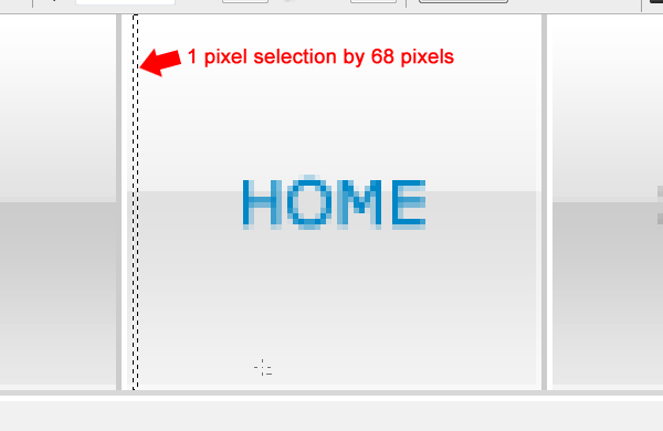
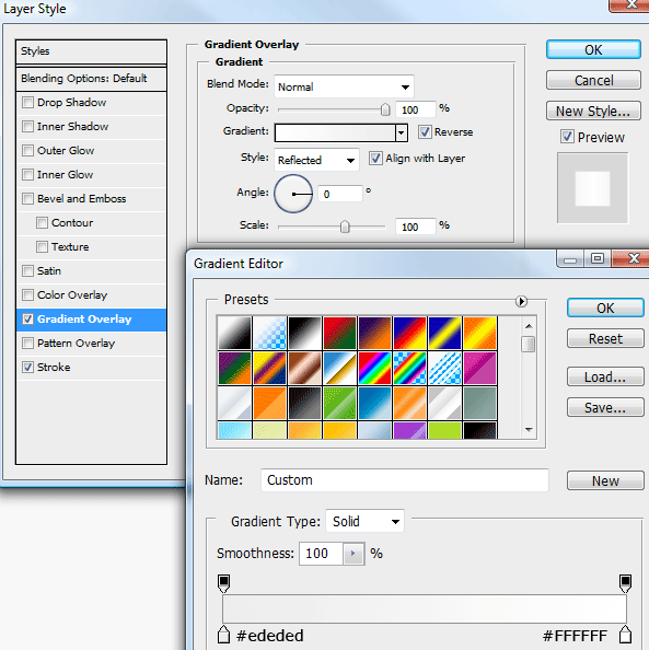
The “js” folder will remain empty untill we come to our jquery jflow slider towards the end of the tutorial. The next part we need to tackle are our image slices, the first slice your going to need to make is for our background. (all images are .png files on a transparent backgrounds).

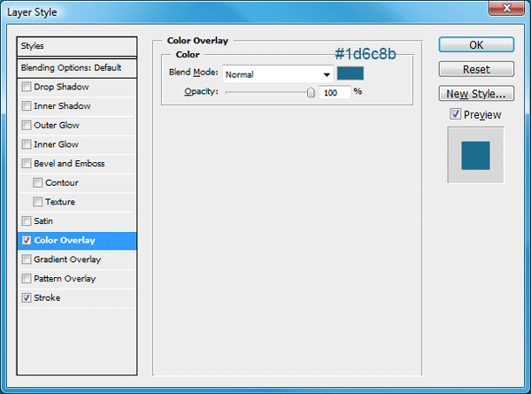
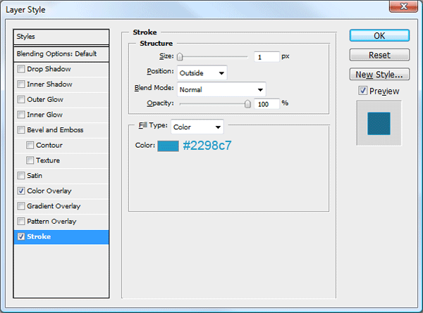
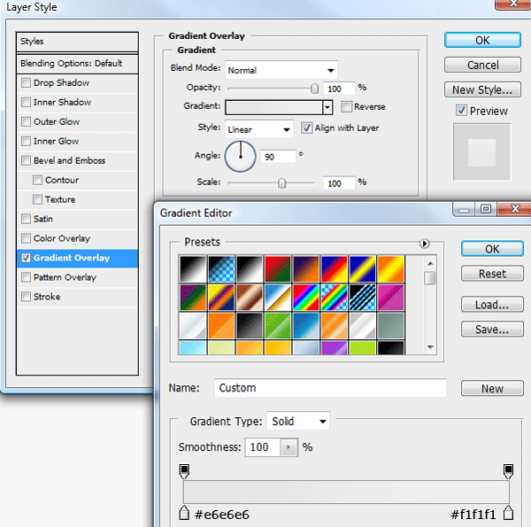
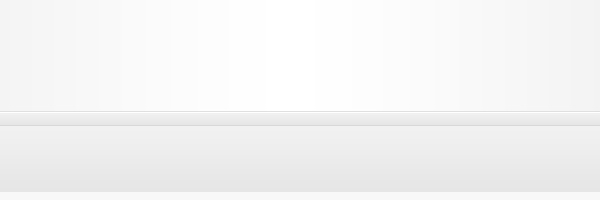
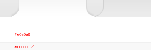
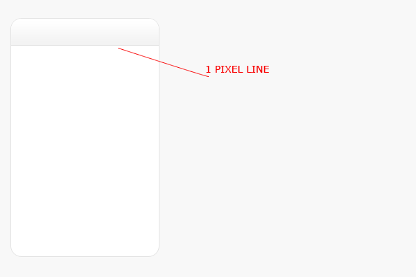
You dont need to slice a big part of the bits that will be repeated, you can use as little as a 1 pixel wide slice. Save the first slice as “bg.png”. The next slice is for our metal looking navigation bar, again the slice doesnt have to be massive as it will be repeated when we code our css.

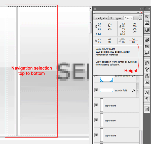
Also on our navigation bar we have our little seperators, your also going to need to slice one of these into a seperate image.

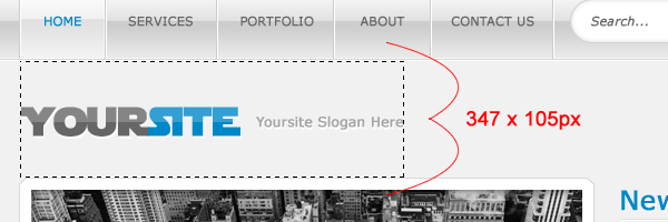
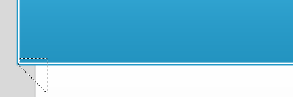
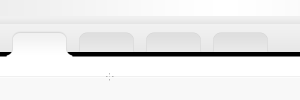
Hide all your header elements in your layers pallette than make a selection around the whole of your header pattern, save the file as header_bg.png.

We also have a pattern background in our featured area, hide all your featured elements and make a selection around your featured background, ideally the selection needs to end when the pattern disapears eles you will get unexpected lines in the background.

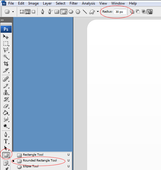
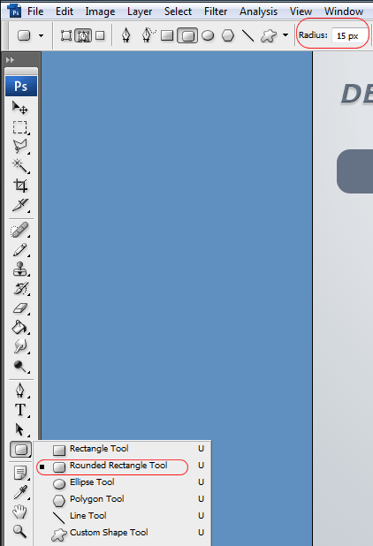
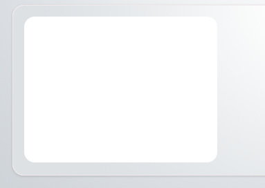
If i wanted the content boxes to be rounded across all browser types id slice up our content boxes, but this time im not going to bother, instead il be rounding them off using CSS, the only trouble is some browsers do no support the border-radius style yet. So people using firefox, mozilla and safari will benifit from the rounded corners but everybody eles who isnt using them browser types will get square boxes.
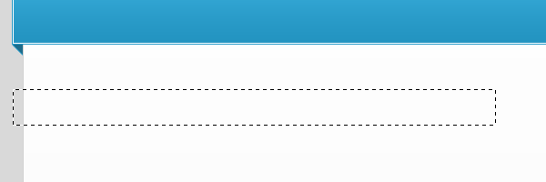
The next slices we need to make are for our footer, we need to make two slices, the actual footer and the repeated background. We’ll start with the background that needs to be repeated.

Then our actual footer box.

Thats all the background slices taken care off we now need to start slicing some of the additional elements like our search submit button, our icons and our featured arrows. We’ll start with our search submit button.

Our RSS button.

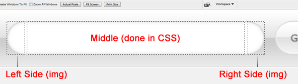
We also need to slice both left and right arrow buttons on our featured slider.

Our actual featured image for our featured slider. It might be a good idea to note the size of your background selection you made on the featured background mine was about 300px in height so really your featured images shouldnt exceed 300px in height.

Now for our individual icons, try and keep the selection as tight as you can get it, also to make life easier make sure there icons are all the same width which means you may need to resize some by a traction or two. All mine are 39px wide.

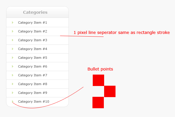
Also in ouor sidebar content box inbetween our list items we have a divider seperating each item, you will also need to slice that, dont slice it all you just need a fraction of it as it will be repeated horizontally via css when we code it.

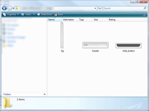
You should now have 17 images in your image folder, here’s a screenshot of my images folder.

Dark Layout #2: Sitebuild
Good evening welcome to another tutorial by the hv team, in todays tutorial il be showing you how to slice and dice the dark layout #2 PSD into a working template.
Right lets get started, the first thing you need to do is create a new folder on your desktop called dark layout, inside this folder you need three more folders “images”, “js” and “styles”. Inside the “styles” folder create two blank CSS files “style.css” and “ie.css”, then in the main folder create your blank HTML file “index.html”.

The “js” folder will remain empty untill we come to our jquery jflow slider towards the end of the tutorial. The next part we need to tackle are our image slices, the first slice your going to need to make is for our background. (all images are .png files on a transparent backgrounds).

You dont need to slice a big part of the bits that will be repeated, you can use as little as a 1 pixel wide slice. Save the first slice as “bg.png”. The next slice is for our metal looking navigation bar, again the slice doesnt have to be massive as it will be repeated when we code our css.

Also on our navigation bar we have our little seperators, your also going to need to slice one of these into a seperate image.

Hide all your header elements in your layers pallette than make a selection around the whole of your header pattern, save the file as header_bg.png.

We also have a pattern background in our featured area, hide all your featured elements and make a selection around your featured background, ideally the selection needs to end when the pattern disapears eles you will get unexpected lines in the background.

If i wanted the content boxes to be rounded across all browser types id slice up our content boxes, but this time im not going to bother, instead il be rounding them off using CSS, the only trouble is some browsers do no support the border-radius style yet. So people using firefox, mozilla and safari will benifit from the rounded corners but everybody eles who isnt using them browser types will get square boxes.
The next slices we need to make are for our footer, we need to make two slices, the actual footer and the repeated background. We’ll start with the background that needs to be repeated.

Then our actual footer box.

Thats all the background slices taken care off we now need to start slicing some of the additional elements like our search submit button, our icons and our featured arrows. We’ll start with our search submit button.

Our RSS button.

We also need to slice both left and right arrow buttons on our featured slider.

Our actual featured image for our featured slider. It might be a good idea to note the size of your background selection you made on the featured background mine was about 300px in height so really your featured images shouldnt exceed 300px in height.

Now for our individual icons, try and keep the selection as tight as you can get it, also to make life easier make sure there icons are all the same width which means you may need to resize some by a traction or two. All mine are 39px wide.
Your ads will be inserted here by
AdSense Now!.
Please go to the plugin admin page to paste your ad code.

Also in ouor sidebar content box inbetween our list items we have a divider seperating each item, you will also need to slice that, dont slice it all you just need a fraction of it as it will be repeated horizontally via css when we code it.

You should now have 17 images in your image folder, here’s a screenshot of my images folder.

We can now start coding our layout, open up your html file and both css files into your code editor il be using dreamweaver. In the head of your html file link your stylesheet style.css, for the ie.css file we need to use some special code which looks like this.
|
1
2
3
4
5
6
7
8
9
10
11
12
13
14
15
16
|
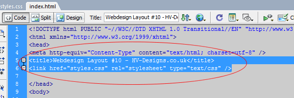
<!DOCTYPE html PUBLIC "-//W3C//DTD XHTML 1.0 Transitional//EN" "http://www.w3.org/TR/xhtml1/DTD/xhtml1-transitional.dtd">
<html xmlns="http://www.w3.org/1999/xhtml">
<head>
<meta http-equiv="Content-Type" content="text/html; charset=utf-8" />
<title>HV-Designs.co.uk - Dark Layout #2 PSD Sitebuild</title>
<link href="styles/style.css" rel="stylesheet" type="text/css" />
</head>
<body>
</body>
</html>
|
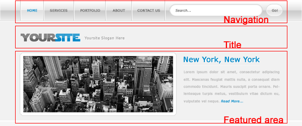
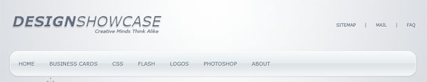
We can now begin to start mocking up our layout we’ll start with our header, logo, search and navigation.

The code looks like this.
|
1
2
3
4
5
6
7
8
9
10
11
12
13
14
15
16
|
<div id="container">
<div id="header">
<div id="logo">
</div>
<div id="search">
</div>
</div>
<div id="navigation">
</div>
</div>
|
Our css looks like this, please refer to the commented code next to each style.
|
1
2
3
4
5
6
7
8
9
10
11
12
13
14
15
16
17
18
19
20
21
22
23
24
25
26
27
28
29
30
31
32
33
34
35
36
37
38
39
40
41
42
43
44
45
46
47
48
49
50
51
52
53
54
55
|
* {
margin: 0px;
padding: 0px;
}
body {
color: #bababa;
font-family: Verdana, Arial, Helvetica, sans-serif;
background-image: url(../images/bg.png);
background-repeat: repeat-x;
background-color: #000000;
}
#container {
width: 950px;
margin-top: 13px;
margin-right: auto;
margin-left: auto;
}
#header {
float: left;
height: 155px;
width: 950px;
background-image: url(../images/header_bg.png);
background-repeat: no-repeat;
}
#logo {
float: left;
margin-top: 45px;
}
#search {
float: right;
margin-top: 55px;
}
#navigation {
float: left;
height: 45px;
width: 950px;
background-image: url(../images/nav_bg.png);
background-repeat: repeat-x;
}
|
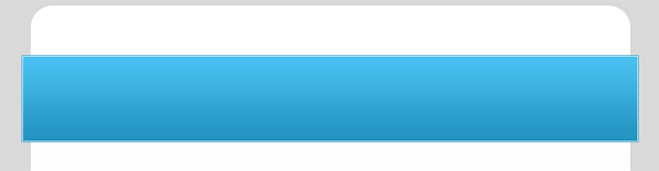
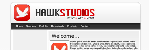
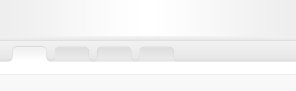
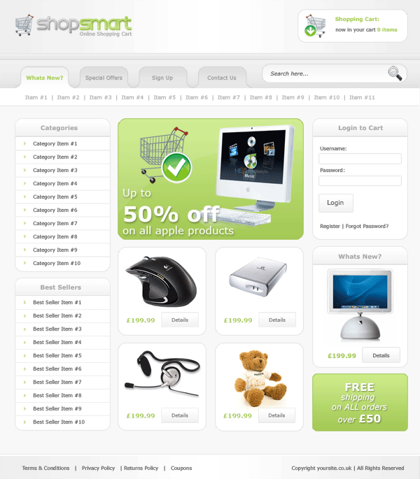
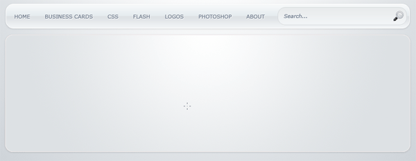
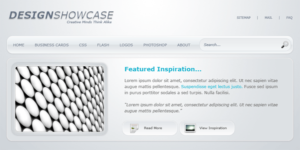
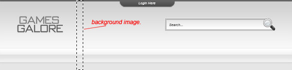
When tested in your browser you should have something like this.


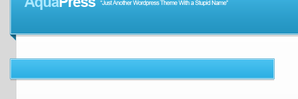
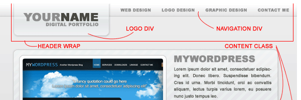
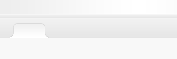
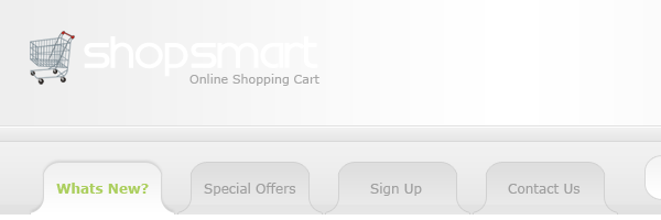
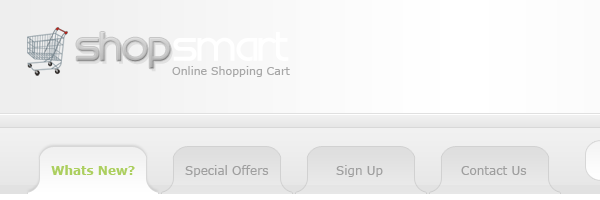
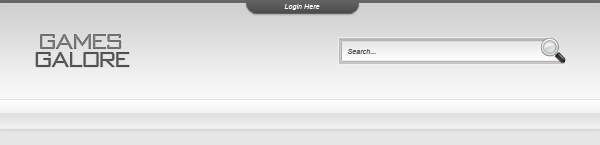
Now lets begin to add some of the elements to our header. We’ll start with our website title and slogan. Inside your logo div add a simple h1 tag with your website title, because on our PSD file one of the words are in bold we need to add a span tag with a class of bold to the word we want in bold. Underneath our h1 tag add a simple p tag with a class of slogan then your slogan inbetween. The code looks like this.
|
1
2
3
4
|
<div id="logo">
<h1>your<span class="bold">website</span></h1>
<p class="slogan">fancy slogan here</p>
</div>
|
We can now style these tags using our css. Add these styles to your stylesheet.
|
1
2
3
4
5
6
7
8
9
10
11
12
13
14
15
|
h1 {
font-size: 36px;
color: #FFFFFF;
font-weight: normal;
letter-spacing: -3px;
}
.slogan {
text-align: right;
text-transform: capitalize;
}
.bold {
font-weight: bold;
}
|
You should now have a your website title and slogan nicely presented on your template.

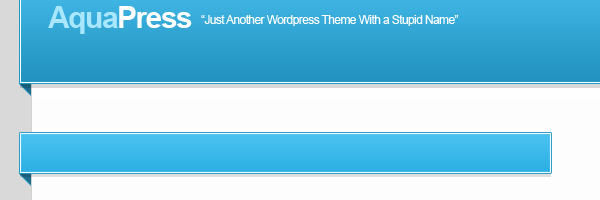
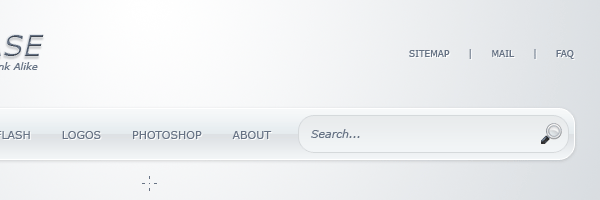
Lets start building our search form, please note the search has to actually be connected up for it work, im just demonstrating the styling side. Inside your search div add a simple form with just a text field and submit button. On your submit button you’ll need to change the input type to “image” then add an addition attribute called “src” with the url to the button. Once you’ve done that add a class of search-field to the search field and a class of “search-btn” to the submit button, the code looks like this.
|
1
2
3
4
5
|
<div id="search">
<form action="" method="get">
<input type="text" class="search-field" value="Search..." size="35" /><input type="image" class="search-btn" value="Go" src="images/search_btn.png" />
</form>
</div>
|
The css for our search field and button are.
|
1
2
3
4
5
6
7
8
9
10
11
12
|
.search-field {
font-style: italic;
color: #FFFFFF;
border: 1px solid #2a2a2a;
background-color: #000000;
padding: 7px;
margin-right: 10px;
}
.search-btn {
vertical-align: top;
}
|
You should now have something like this.

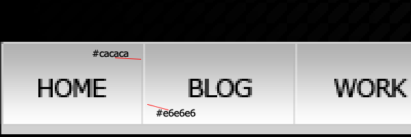
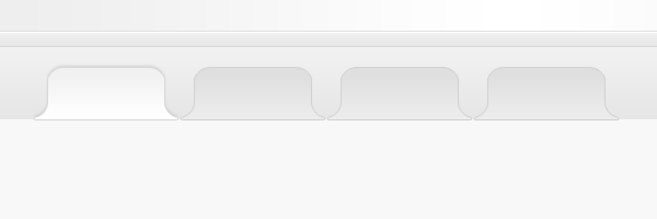
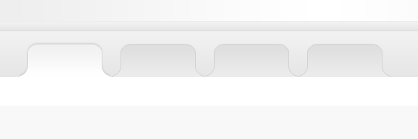
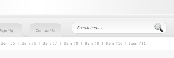
Now for our navigation bar, we’ll start with a simple list creating each item in the list a block element. Each list item will also have our little seperator image after each link.
|
1
2
3
4
5
6
7
8
9
10
|
<div id="navigation">
<ul class="nav-links">
<li><a href="#">home</a></li>
<li><a href="#">blog</a></li>
<li><a href="#">work</a></li>
<li><a href="#">forum</a></li>
<li><a href="#">services</a></li>
<li><a href="#">contact</a></li>
</ul>
</div>
|
Here’s the css for our navigation.
|
1
2
3
4
5
6
7
8
9
10
11
12
13
14
15
16
17
18
19
20
21
22
23
24
|
.nav-links li {
list-style-type: none;
float: left;
text-align: center;
letter-spacing: -1px;
background-image: url(../images/seperator.png);
background-repeat: no-repeat;
background-position: right;
}
.nav-links li a {
text-decoration: none;
color: #000000;
text-transform: uppercase;
font-size: 12px;
display: block;
height: 29px;
width: 100px;
padding-top: 15px;
}
.nav-links li a:hover {
color: #666666;
}
|
Also on our navigation in our PSD file we had a little rss icon on the right of the navigation, we can create that the same we did our navigation above.
|
1
2
3
4
|
<ul class="rss">
<li><a href="#"><img src="images/rss_icon.png" alt="Subscribe Via RSS" /></a></li>
</ul>
</div>
|
The css for our rss icon is similar too.
|
1
2
3
4
5
6
7
8
9
10
|
.rss li {
list-style-type: none;
float: right;
margin-right: 10px;
margin-top: 5px;
}
.rss li img {
border: none;
}
|
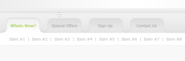
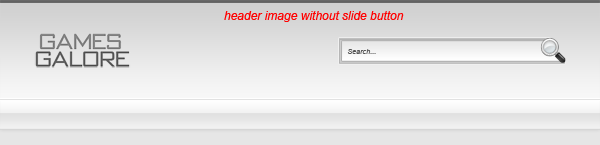
You should now have something like this.

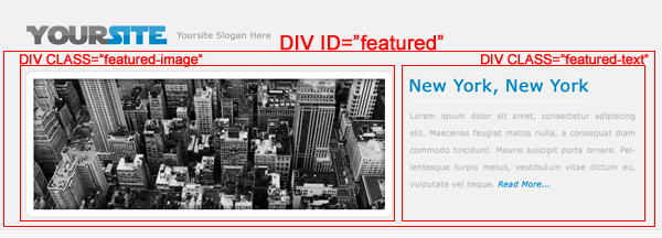
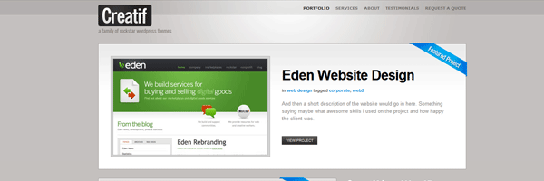
Thats the header part of our website done, lets move onto our featured area. We’ll mock the featured area up like this.

The code looks like this.
|
1
2
3
4
5
6
7
8
9
10
11
12
13
14
15
16
|
<div id="featured-area">
<div class="featured-control-left">
</div>
<div class="featured-content">
<div class="featured-text">
</div>
</div>
<div class="featured-control-right">
</div>
</div>
|
The css for the code above looks like this.
|
1
2
3
4
5
6
7
8
9
10
11
12
13
14
15
16
17
18
19
20
21
22
23
24
25
26
27
28
29
30
31
32
33
34
35
|
#featured-area {
background-repeat: no-repeat;
background-image: url(../images/content_bg.png);
float: left;
width: 950px;
margin-bottom: 20px;
}
.featured-control-left {
float: left;
height: 170px;
width: 33px;
padding-top: 130px;
}
.featured-text {
float: right;
width: 425px;
height: 260px;
padding-top: 40px;
padding-right: 20px;
}
.featured-content {
float: left;
height: 300px;
width: 884px;
}
.featured-control-right {
float: right;
height: 170px;
width: 33px;
padding-top: 130px;
}
|
You should now have some solid foundations for your featured area, lets insert some of our graphic elements. Inside the div’s featured-control-right and featured-control-left insert your arrow icons.
|
1
2
3
4
5
6
7
8
9
10
11
12
13
14
15
16
17
18
|
<div id="featured-area">
<div class="featured-control-left">
<img src="images/left_arrow.png" alt="Slide Left" />
</div>
<div class="featured-content">
<div class="featured-text">
</div>
</div>
<div class="featured-control-right">
<img src="images/right_arrow.png" alt="Slide Right" />
</div>
</div>
|
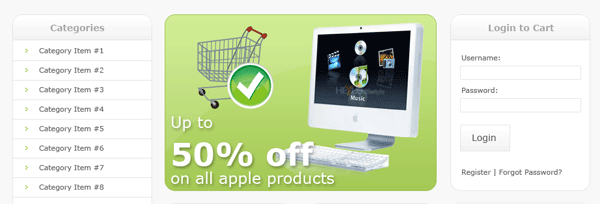
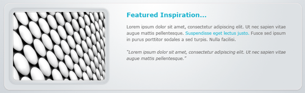
Underneath the class “featured-content” insert your featured image. Insde the class “featured-text” add a h2 tag with a header then add a paragraph wrapped in a p tag.
|
1
2
3
4
5
6
7
8
9
10
11
12
13
14
15
16
17
18
19
20
21
22
23
|
<div id="featured-area">
<div class="featured-control-left">
<img src="images/left_arrow.png" alt="Slide Left" />
</div>
<div class="featured-content">
<img src="images/featured_image01.png" alt="Featured Image 01" />
<div class="featured-text">
<h2>lorem ipsum dolor</h2>
<p>Lorem ipsum dolor sit amet, consectetur adipiscing elit. Praesent a elit risus, in pretium dolor. Nullam egestas lacus ante. Integer cursus elementum nunc in convallis. Praesent condimentum justo vel nunc vestibulum vitae vehicula purus dignissim. Integer cursus elementum nunc in convallis. Praesent condimentum justo vel nunc vestibulum vitae vehicula purus dignissim.</p>
</div>
</div>
<div class="featured-control-right">
<img src="images/right_arrow.png" alt="Slide Right" />
</div>
</div>
|
You now need to add some addtional styles in your style sheet, because we’ve added an image into the featured area we need to make sure that no browser adds a border to it, we also need to style our h2 tag.
|
1
2
3
4
5
6
7
8
9
10
11
|
h2 {
color: #FFFFFF;
text-transform: uppercase;
font-size: 18px;
}
.featured-content img {
margin-left: 20px;
margin-right: 20px;
float: left;
}
|
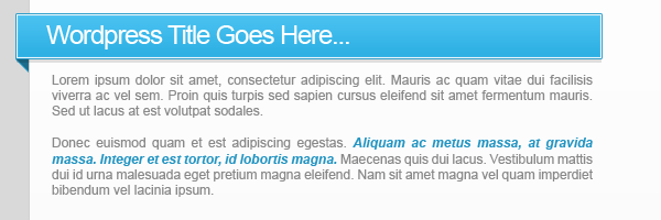
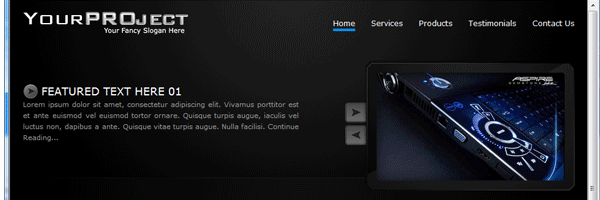
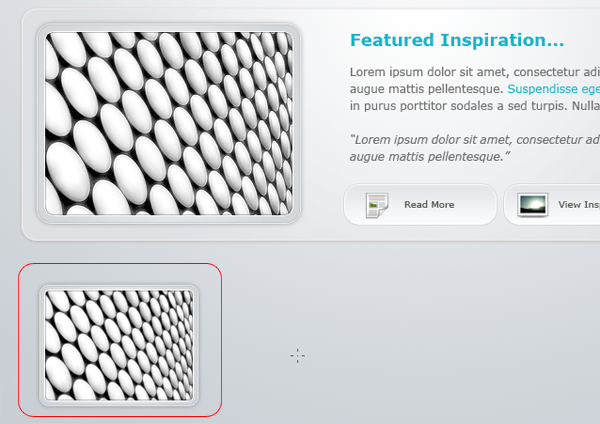
Your featured area should now look something like this.

We’ll add our jquery slider towards the end of the tutorial. The wireframe for our content boxes is really easy, we just create two classes “left-content” and “right-content”.
|
1
2
3
4
5
|
<div class="left-content">
</div>
<div class="right-content">
</div>
|
The styles for these classes are as follows.
|
1
2
3
4
5
6
7
8
9
10
11
12
13
14
15
16
17
18
19
20
21
22
23
|
.left-content {
float: left;
width: 560px;
-moz-border-radius: 15px;
-webkit-border-radius: 15px;
background-color: #0a0a0a;
border: 1px solid #181818;
padding: 20px;
}
.right-content {
float: right;
width: 290px;
-moz-border-radius: 15px;
-webkit-border-radius: 15px;
background-color: #0a0a0a;
border: 1px solid #181818;
padding: 20px;
}
|
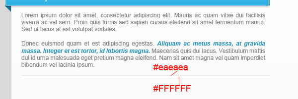
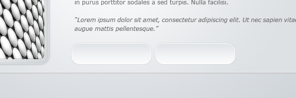
Included in the styles above are the css styles for border-radius which makes the corners on your content boxes round, as stated in the comments it only applys to Mozilla/Firefox and Safari 3 users ONLY every other browser will see square corners. Inside our left-content box were just going to add some simple paragraphs with a h2 tag.
|
1
2
3
4
5
6
7
8
|
<div class="left-content">
<h2>lorem ipsum dolor</h2>
<p>Lorem ipsum dolor sit amet, consectetur adipiscing elit. Praesent a elit risus, in pretium dolor. Nullam egestas lacus ante. Integer cursus elementum nunc in convallis. Praesent condimentum justo vel nunc vestibulum vitae vehicula purus dignissim. Integer cursus elementum nunc in convallis. Praesent condimentum justo vel nunc vestibulum vitae vehicula purus dignissim.</p>
<p>Lorem ipsum dolor sit amet, consectetur adipiscing elit. Praesent a elit risus, in pretium dolor. Nullam egestas lacus ante. Integer cursus elementum nunc in convallis. Praesent condimentum justo vel nunc vestibulum vitae vehicula purus dignissim. Integer cursus elementum nunc in convallis. Praesent condimentum justo vel nunc vestibulum vitae vehicula purus dignissim.</p>
<p>Lorem ipsum dolor sit amet, consectetur adipiscing elit. Praesent a elit risus, in pretium dolor. Nullam egestas lacus ante. Integer cursus elementum nunc in convallis. Praesent condimentum justo vel nunc vestibulum vitae vehicula purus dignissim. Integer cursus elementum nunc in convallis. Praesent condimentum justo vel nunc vestibulum vitae vehicula purus dignissim.</p>
</div>
|
Our h2 tag is already styled in the style sheet but our p tags aren’t so add these simple styles in your style sheet.
|
1
2
3
4
5
6
7
|
p {
font-size: 12px;
line-height: 22px;
text-align: justify;
margin: 5px 0 10px;
padding: 0;
}
|
Our right content box looks tricky to really it isnt, for our right-content box we just create a simple list, each list item will have its very own class, the code looks like this.
|
1
2
3
4
5
6
7
8
9
10
11
12
13
14
15
16
17
18
19
20
21
22
23
24
25
26
27
|
<div class="right-content">
<ul class="right-content-list">
<li class="lock">
<h3>lorem ipsum dolor</h3>
<p>Lorem ipsum dolor sit amet, consectetur adipiscing elit. Praesent a elit risus, in pretium dolor. Nullam egestas lacus ante.</p>
</li>
<li class="cog">
<h3>lorem ipsum dolor</h3>
<p>Lorem ipsum dolor sit amet, consectetur adipiscing elit. Praesent a elit risus, in pretium dolor. Nullam egestas lacus ante.</p>
</li>
<li class="coins">
<h3>lorem ipsum dolor</h3>
<p>Lorem ipsum dolor sit amet, consectetur adipiscing elit. Praesent a elit risus, in pretium dolor. Nullam egestas lacus ante.</p>
</li>
<li class="mail">
<h3>lorem ipsum dolor</h3>
<p>Lorem ipsum dolor sit amet, consectetur adipiscing elit. Praesent a elit risus, in pretium dolor. Nullam egestas lacus ante.</p>
</li>
</ul>
</div>
|
We then style out list as normal but with a few extra styles for our list classes.
|
1
2
3
4
5
6
7
8
9
10
11
12
13
14
15
16
17
18
19
20
21
22
23
24
25
26
27
28
29
30
31
32
33
34
35
36
37
38
39
40
|
.right-content-list li {
list-style-type: none;
}
.right-content-list li p {
font-size: 11px;
line-height: 18px;
background-image: url(../images/divider.png);
background-repeat: repeat-x;
background-position: bottom;
padding-bottom: 15px;
}
li.lock {
background-image: url(../images/lock_icon.png);
background-repeat: no-repeat;
background-position: left top;
padding-left: 50px;
}
li.cog {
background-image: url(../images/cog_icon.png);
background-repeat: no-repeat;
background-position: left top;
padding-left: 50px;
}
li.coins {
background-image: url(../images/coins_icon.png);
background-repeat: no-repeat;
background-position: left top;
padding-left: 50px;
}
li.mail {
background-image: url(../images/mail_icon.png);
background-repeat: no-repeat;
background-position: left top;
padding-left: 50px;
}
|
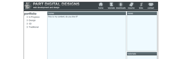
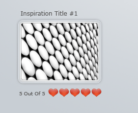
Test your template in your browser and you should have something like this.

Now for our footer, we want our footer to span across the browser just like our background/navigation does, to do this we need create our footer outside the container div.
|
1
2
3
4
5
6
7
8
9
10
11
12
|
</div>
<div id="footer">
<div id="footer-content">
<P>copyright © yoursite.com | all rights reserved | design & coded by <a href="http://www.richard-carpenter.co.uk">richard carpenter</a></P>
</div>
</div>
</body>
</html>
|
The footer div is the background that will repeat across the browser, the footer-content div will be where our footer content goes. The css looks like this.
|
1
2
3
4
5
6
7
8
9
10
11
12
13
14
15
16
17
18
19
20
21
22
23
24
25
|
#footer {
background-image: url(../images/footer_bg.png);
background-repeat: repeat-x;
clear: both;
height: 82px;
background-position: bottom;
}
#footer-content {
background-image: url(../images/footer_bg2.png);
background-repeat: repeat-x;
height: 82px;
width: 950px;
margin: auto;
background-position: bottom;
}
#footer-content p {
text-transform: capitalize;
color: #000000;
padding-top: 50px;
padding-left: 20px;
}
|
Your template should now be complete, there’s just some styles id recommend adding to get you started. We need to style our hyper links, h3 and h4 tags just incase you use them.
|
1
2
3
4
5
6
7
8
9
10
11
12
13
14
15
16
17
18
19
20
21
22
23
24
25
26
27
28
29
|
a:link {
color: #333333;
text-decoration: none;
}
a:visited {
text-decoration: none;
color: #333333;
}
a:hover {
text-decoration: underline;
color: #666666;
}
a:active {
text-decoration: none;
color: #333333;
}
h3 {
color: #FFFFFF;
text-transform: uppercase;
font-size: 14px;
font-weight: normal;
}
h4 {
color: #FFFFFF;
text-transform: uppercase;
font-size: 11px;
}
|
There are also some styles you need to add to the “ie.css” file, the styles listed below are just minor fixes for items that dont quite lineup.
|
1
2
3
4
5
6
7
8
9
10
11
12
13
|
.search-btn {
margin-top: 1px;
}
#footer-content p {
padding-top: 45px;
}
|
Were now going to intergrate the jflow plugin for jquery on our featured area. The featured once done should slide across to any other items you wish to add in there. The first we need to do is download jflow and the jquery libary file, please note im using the jquery libary 1.2.6 NOT the new one as i had trouble with the latest libary. Link the files in the head of your document.
|
1
2
3
4
5
6
7
8
9
10
11
12
|
<head>
<meta http-equiv="Content-Type" content="text/html; charset=utf-8" />
<title>HV-Designs.co.uk - Dark Layout #2 PSD Sitebuild</title>
<link href="styles/style.css" rel="stylesheet" type="text/css" />
<script src="js/jquery-1.2.6.pack.js" type="text/javascript"></script>
<script src="js/jquery.flow.1.1.min.js" type="text/javascript"></script>
</head>
|
Also inside the head section add this bit of javascript.
|
1
2
3
4
5
6
7
8
9
|
<script type="text/javascript">
$(function() {
$("div#controller").jFlow({
slides: "#slides",
width: "950px",
height: "300px"
});
});
</script>
|
The width and height should be set to the dimensions of the featured area, you will also notice the div “slides” you will need to ad this div into your featured area. Above the featured-area div add the jflow controller code.
|
1
2
3
4
5
|
<div id="controller" class="hidden">
<span class="jFlowControl">No 1</span>
<span class="jFlowControl">No 2</span>
<span class="jFlowControl">No 3</span>
</div>
|
In your style sheet we need to an additional style which will hide our 2nd and third slides.
|
1
2
3
|
.hidden {
display: none;
}
|
Underneath our featured-area div add a div id of slides then add an empty div.
|
1
2
3
4
5
|
<div id="featured-area">
<div id="slides">
<div>
|
Dont forget to close the div at the bottom. Now everything inbetwwen the blank div and the end of the blank div will slide, for the slide to actually work though you need 3 slides in total. Make sure the 2nd and third slides all start and end with a blank div. I find it best just copy everything from the blank div to the closing blank div then edit the content accordingly.
For the buttons to work on the featured area you need to add the jflow classes to the buttons.
|
1
2
3
4
5
6
7
|
<div class="featured-control-left">
<img src="images/left_arrow.png" class="jFlowPrev" alt="Slide Left" />
</div>
<div class="featured-control-right">
<img src="images/right_arrow.png" class="jFlowNext" alt="Slide Right" />
</div>
|
You can see a live work demo by clicking the button below.
Thats it hope you enjoyed this tutorial, any questions just give me a shout, dont forget to subscribe via rss and twitter, your help and support is much appreciated.
Your ads will be inserted here by
AdSense Now!.
Please go to the plugin admin page to paste your ad code.


 24 Votes, Rating: 4.63


