Load my car sales layout into photoshop (if you haven’t got the layout already made, go here to make it). Once opened in photoshop we will need to assess what were going to need. The layout im using is pretty easy and most of it can be done in css. We will start with the header, select your desired cutting tool and cut out your header, paste it to a new document. Now when i pasted it to a new document i noticed the size 850×151. To make things easyier for ourselfs goto “image > image size” and resize your image.
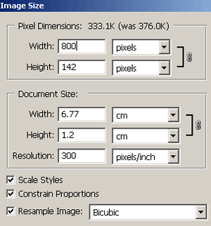
Pleae note that the height maybe different depending on where you cut it from, but the width should be the same. Save your header image to a folder called images on your desktop. Now for some coding, open up notepad, then open up dreamweaver. When dreamweaver has loaded select “new HTML”.
Now click the “code tab” at the top right corner of dremweaver you will be presented with this.
<!DOCTYPE html PUBLIC “-//W3C//DTD XHTML 1.0 Transitional//EN” “http://www.w3.org/TR/xhtml1/DTD/xhtml1-transitional.dtd”>
<html xmlns=”http://www.w3.org/1999/xhtml”>
<head>
<meta http-equiv=”Content-Type” content=”text/html; charset=iso-8859-1″ />
<title>Untitled Document</title>
</head>
<body>
</body>
</html>
In the body tag type,
<div id=”container”>
<div id=”header”></div>
</div>
Note the words container & header, “container” is a box if you will that contains the content, and the” header” being the header. Now step into notepad and type this.
#container {
width: 900px;
margin-top: 0;
margin-right: auto;
margin-bottom: 0;
margin-left: auto;
}
The code above basically means the container has a width of 900 pixels, no margin at the top, no margin at the bottom and left and right are set as auto meaning that the margin either side will be the same as each other making the container appear in the center of the page. Now goto “file > save as” and save as styles.css (make sure you include the .css). save to your desktop.
Back in dreamweaver under the <title> tag write,
<link rel=”stylesheet” href=”styles.css” mce_href=”styles.css” type=”text/css” />
This means that the HTML file will link to an external style sheet. Your html code should look like this
<!DOCTYPE html PUBLIC “-//W3C//DTD XHTML 1.0 Transitional//EN” “http://www.w3.org/TR/xhtml1/DTD/xhtml1-transitional.dtd”>
<html xmlns=”http://www.w3.org/1999/xhtml”>
<head>
<meta http-equiv=”Content-Type” content=”text/html; charset=iso-8859-1″ />
<title>Untitled Document</title>
<link rel=”stylesheet” href=”test.css” mce_href=”test.css” type=”text/css” />
</head>
<body>
<div id=”container”>
<div id=”header”> </div>
</div>
</body>
</html>
Now head back over to notepad where your CSS style sheet is and type,
#container #header {
background-image: url(images/header.gif);
height: 143px;
width: 900px;
background-repeat: no-repeat;
background-position: center;
}
This means the header within the container has a background image pointing too images/header.gif, with a height of 143pixels and a width of 900pixels. The background wont repeat itself and will be centered on the page. As you can see most of the css is self explanatory.
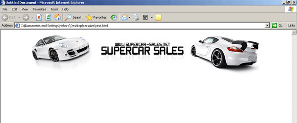
Now if you save your css file again “ctrl + s” and save your HTML file as index.html (save to desktop). Open the index.html file into your browser it should look like this.
Revert back to dreamweaver and under your header id type,
<div id=”nav”>
<ul>
<li><a href=”http://www.yoursite.com/contact.html” mce_href=”http://www.yoursite.com/contact.html”>Contact</a></li>
<li><a href=”http://www.yoursite.com/about.html” mce_href=”http://www.yoursite.com/about.html”>About</a></li>
<li><a href=”http://www.yoursite.com/services.html” mce_href=”http://www.yoursite.com/services.html”>Services</a></li>
<li><a href=”http://www.yoursite.com/news.html” mce_href=”http://www.yoursite.com/news.html”>News</a></li>
<li><a href=”http://www.yoursite.com/home.html” mce_href=”http://www.yoursite.com/home.html”>Home</a></li>
</ul>
</div>
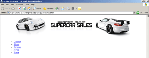
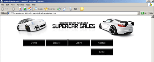
We have created a id called nav which will be our navigation and the text that will be displayed will be contact, about, services, news and home and they will point to the relative destinations. If we view our site in our browser it is displayed like this.
Notice the blue links, now if we head back over to notepad to our css file and type,
#nav {
width:50em;
}
This mean the navigation will have a width of 50em (em: a relative value that refers to the height of the capital “m”)
#nav ul {
list-style: none;
padding: 0;
margin: 0;
width: 700px;
}
This means that the list element will have a list-style of none which basically means the text will be displayed inline with each other opposed to in a list, the elements have no padding, no margin and the width is 700px.
Now underneath that type,
#nav li {
float: right;
margin-top: 0;
margin-right: 0.15em;
margin-bottom: 10px;
margin-left: 0.15em;
}
This means the nav list items are floated to the right (float: forces the element to “float” outside of its natural position in the containing box), the rest should be self explantory. Now type,
#nav li a {
height: 3em;
line-height: 3em;
float: left;
width: 9em;
display: block;
border: 1px solid #000000;
color: #fff;
text-decoration: none;
text-align: center;
background-image: url(images/nav.gif);
background-repeat: repeat-x;
background-position: left center;
background-color: #FFFFFF;
}
Ok the height is self explantory, the line height controls the total distance from the top of the tallest element in one line to the top of the tallest element in the line immediately above or below the line, the border will have a 1 pixel solid border in the color 000000 which is black, color means the text color which is set at white. Now “background-image: url(images/nav.gif);” Is important, this will be the background on our button which we have to make in a second. also note background-reapeat, this means the background will be repeated along the X axis. Now to make our button background open up your PSD layout, zoom in on the navigation and make a selection like this.
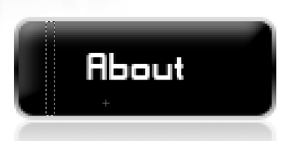
Copy and paste the selection to a new document, the goto “file > save for the web” save it into your images folder. Once you have saved the image save your .css file and html file. Open your html file in your browser it should lool like this.
The navigation doesnt quite look right due to the fact we havent set our default font and size. Go back to your HTML code and between the <head> </head> tages type,
<style type=”text/css”>
<!–
body,td,th {
font-family: Arial, Helvetica, sans-serif;
font-size: 12px;
color: #000000;
}
body {
margin-left: 0px;
margin-top: 0px;
margin-right: 0px;
margin-bottom: 0px;
}
–>
</style>
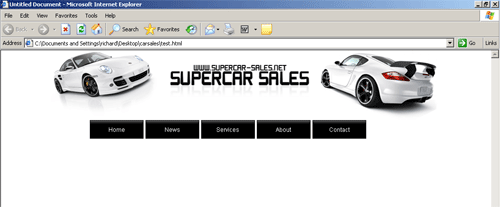
This means we are settin a rule for the actual html file so that all our text will be fontsize 12 in the color black in arial, helvetica or sans-serif. The margins mean that the start of our document will be right at the top of the screen or right at the side of our screen etc… Save your html file and view it in your browser, it should now look like this.
Thats our navigation sorted now we can concentrate on our content and footer. If we look at our PSD there are a few things to note. 1. The dotted dividers 2. Amount of colums needed 3. The position of our foooter. The dotted dividers will be easy to do, we have 3 coloums to do so we’ll do them 1st. Goto into the code of your html file, under our navigation code type,
<div id=”leftbar”>leftbar</div>
<div id=”content”>content</div>
<div id=”rightbar”>rightbar</div>
This will be our 3 colum layout. Head over to your .css file and under your nav elements type,
#content {
float: left;
width: 444px;
border-right-width: 1px;
border-right-style: dotted;
border-right-color: #000000;
padding-top: 5px;
padding-right: 2px;
padding-bottom: 1px;
padding-left: 2px;
border-left-width: 1px;
border-left-style: dotted;
border-left-color: #000000;
margin: 10px;
}
This means we have made a box 444pixels wide with a 1 pixel black dotted border to the left and right. It also has padding to the top, bottom, left and right. The box will also be floated to the left of our site. Now type this for our left colum,
#leftbar {
float: left;
width: 200px;
margin-right: 10px;
margin-top: 10px;
margin-bottom: 10px;
border-right-width: 1px;
border-right-style: dotted;
border-right-color: #000000;
padding-top: 5px;
padding-right: 2px;
padding-bottom: 1px;
padding-left: 2px;
}
Now for the left colum, we set the float to left, the box will be 200pixels wide with a dotted black border to the right only. Padding is the same as our content box. Now for our last colum,
#rightbar {
float: right;
width: 200px;
margin-left: 10px;
margin-top: 10px;
margin-bottom: 10px;
border-left-width: 1px;
border-left-style: dotted;
border-left-color: #000000;
padding-top: 5px;
padding-right: 2px;
padding-bottom: 1px;
padding-left: 2px;
}
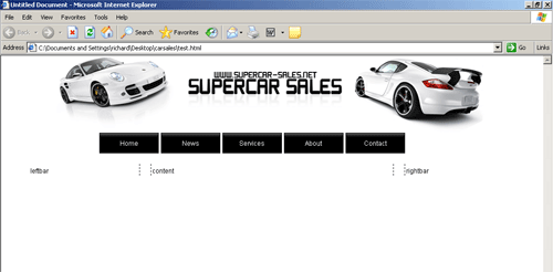
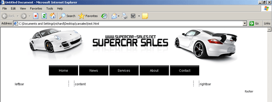
Now we want our right colum on the right so we float it to the right, the width, padding and margins are all the same as the other 2 colums, only thing to change is our dotted border which is now on our left. If we view our site in our browser now we should have this (dont forget to save).
Last but not least its time to do our footer. First thing to do is create our ID in our html file so head over to our html code and type,
<div id=”footer”><div id=”footer-content”>footer</div>
Now goto your .css file and type,
#footer {
clear: both;
margin: 0;
padding: 0;
font: normal .95em/1.5em ‘Trebuchet MS’, Tahoma, Arial, sans-serif;
text-align: right;
}
#footer-content {
margin: 0 auto;
padding-left: 15px;
}
#footer-content a {
text-decoration: none;
color: #000000;
}
#footer-content a:hover {
text-decoration: underline;
color: #333;
}
Right now let me explain, the clear property controls the flow of text improving text wrap, the rest should be pretty easy to understand.
Now here is how the site looks in my browser.
All’s you have to do now is input your content. Here is a live working version (see link below)
CLICK HERE TO LAUNCH LIVE VERSION