Pop-Up CSS Navigation Pt.2
Your ads will be inserted here by
AdSense Now!.
Please go to the plugin admin page to paste your ad code.
In this tutorial i’l be walking you through the process of converting the “Pop-Up Navigation” into a fully functional CSS navigation.
Creating The Navigation In Photoshop
If you haven’t already created the navigation you can do so by following “Part 1” of the tutorial “HERE“.
Creating The HTML Markup
Start a new HTML file inside your favorite HTML editor then save it right away inside a new folder on your desktop. Save the HTML file as “index.html”, create a blank CSS file also saving it right away inside the same folder as your HTML file. Save the CSS file as “style.css”.

Inside your HTML document, within the “HEAD” tag link your stylesheet using the normal method.
|
1
|
<link href="style.css" rel="stylesheet" type="text/css" /> |
Inside the “BODY” tag of your HTML document create an empty DIV called “Container”.
|
1
2
|
<div id="container"></div><!--container ends--> |
The “Container” DIV will be the main DIV in which everything will sit inside.
Creating The Navigation Markup
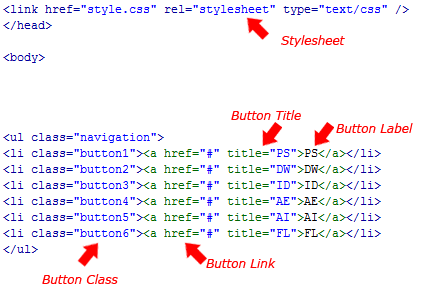
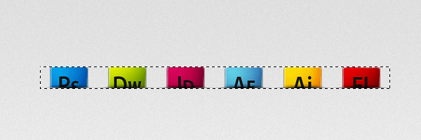
Start off your navigation markup with an unordered list “UL”, the unordered list should have a class of “Navigation”.
|
1
2
3
4
5
6
|
<div id="container"><ul class="navigation"</ul></div><!--container ends--> |
Inside the unordered list add 6 list items each with there own class. For the purpose of this tutorial i’ve gave each list a class of button1, button2, button3 etc…
|
1
2
3
4
5
6
7
8
9
10
11
|
<div id="container"><ul class="navigation"<li class="button1"><a href="#" title="PS">PS</a></li><li class="button2"><a href="#" title="DW">DW</a></li><li class="button3"><a href="#" title="ID">ID</a></li><li class="button4"><a href="#" title="AE">AE</a></li><li class="button5"><a href="#" title="AI">AI</a></li><li class="button6"><a href="#" title="FL">FL</a></li></ul></div><!--container ends--> |
Slicing Our Navigation At Normal State
Open your PSD file in photoshop, open up the layers palette, if it isn’t already open you can open it by pressing “F7″. Inside the layers palette locate your background snippet for each button.
Once you’ve located each background snippet highlight them by clicking each individual layer whilst holding down the “CTRL” key on the keyboard.
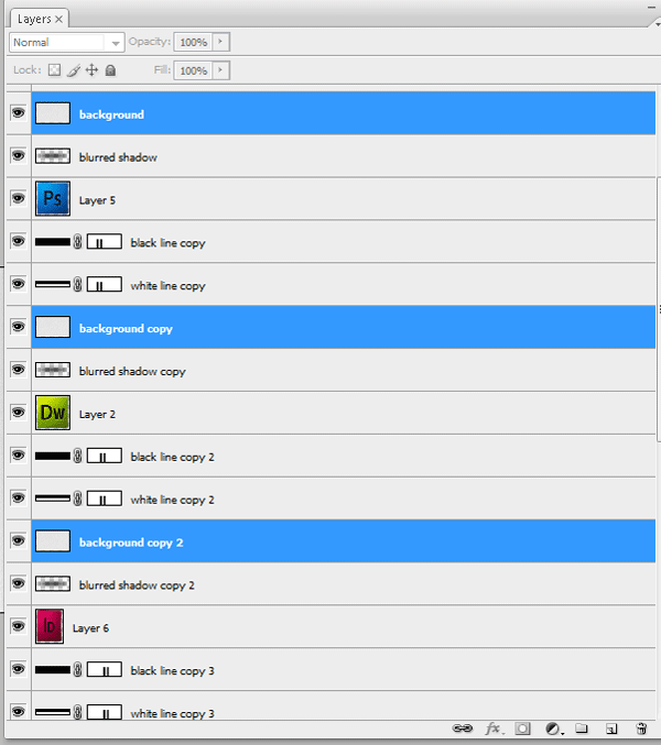
When you’ve highlighted the background snippets go to “Layer > Merge Layers”. All the background snippet layers should be merged into one layer. Re-label the layer “Background Snippets” then drag the single layer right down to the bottom of the stack above your locked background layer.
Now highlight all your icon layers using the same method “CTRL + CLICK”. Merge the icons into one layer then drag them down to the bottom of the stack below your “Background Snippets” layer.
You now need to select all your shadow layers and merge them into one single layer. Drag the single shadow layer underneath your “background Snippets” layer. Finally do the same for your lines layers. (Note the order of the stack)

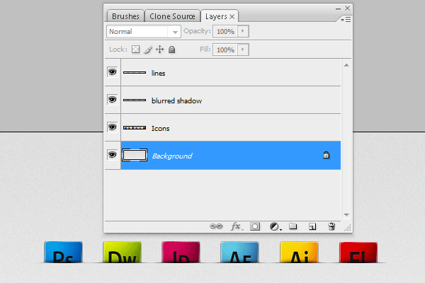
Were now going to cut into the icons so we can get rid of our background snippets layer, doing this will make it easier to save the navigation image as a sprite.
Make a selection around your background snippets. You can do this quickly by holding down the “CTRL” key and clicking the little thumbnail in the layers window OR, select the background snippet layer and go to “Select > Load Selection”.
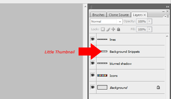
Once you’ve loaded the selection around your background snippets select each other layer apart from the “Lines Layer” and “Background Layer” and hit the delete key. Finally delete the Background Snippets Layer”.
Save your PSD file, then open up your hover state PSD file.
Slicing Our Navigation At Hover State
Repeat all the steps explained above only this time do them on the hover state PSD file.

Creating The Sprite
Re-open your normal state PSD file, select the rectangular marquee tool then make a selection around your navigation. Be sure to include the lines underneath each icon.
Once the selection has been made hide the background layer and go to “Edit > Copy Merged”.
Create a new document by going to “File > New” then press ok (The dimensions of the selection should automatically be entered into the new document box). In the new document go to “Edit > Paste, your selection should now be pasted into the new document.
We now need to increase the canvas size to double the height of the navigation. Go to “Image > Canvas Size” in the box that opens pin the canvas to the top then increase the height to double the size.

Open up your hover state PSD file, repeat the steps above then paste the navigation onto your new document canvas. Place the hover state navigation underneath the normal state navigation leaving no gap in between.
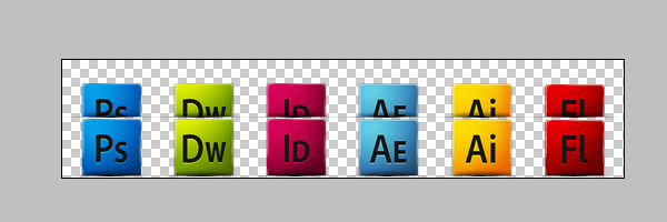
Save the image as “Navigation.PNG” inside the same folder as your HTML file. If you wish to use your PSD background you will also need to make a slice over your background saving it as a separate PNG file.
Bringing It Together With CSS
Inside your CSS file start by styling the “BODY” and “CONTAINER”.
|
1
2
3
4
5
6
7
8
9
10
11
12
13
14
15
|
body {padding: 0px;background-image: url(bg.png);background-repeat: repeat-x;background-color: #ECEBEC;margin-top: 20px;margin-right: 0px;margin-bottom: 0px;margin-left: 0px;}#container {margin: auto;width: 600px;} |
In the “BODY” tag start off by setting all padding and margins to 0px apart from the top margin, we’ll add 20px of top margin which will push the navigation down from the top of our browser. Finally if your using your background from the PSD file then you’ll need to add the background as your body background image.
For the container DIV we simply set a margins to auto which will center our container, we can also set a fixed width for our container, 600px should be sufficient for the size of our navigation.
The next set of styles are for our navigation.
|
1
2
3
4
5
|
.navigation li {float: left;display: block;list-style-type: none;} |
We’ll start with our navigation unordered list, simply float it left, display each list item as a block then remove the bullets points by setting the list style to none.
|
1
2
3
4
5
6
|
.navigation li a {height: 53px;width: 89px;text-indent: -9999px;display: block;} |
For our buttons links we set a fixed width and height. The width should be the same width as the buttons, if your buttons are different sized then it might be best to make sure they are all the same width. If you can’t make them the same width then you’ll have to set the fixed width in the classes button1, button2, button3 etc…
The fixed height should be the same height as your navigation. Don’t make the mistake of measuring the sprite.PNG image as you only need the height of one navigation not two.
Finally set the text indent to -9999px which will move the button labels off the page out of view.
|
1
2
3
4
5
6
7
8
9
10
11
12
13
14
15
16
17
18
19
20
21
22
23
24
25
26
27
28
29
30
31
32
33
34
35
|
li.button1 {background-image: url(navigation.png);background-repeat: no-repeat;background-position: left top;}li.button2 {background-image: url(navigation.png);background-repeat: no-repeat;background-position: -89px top;}li.button3 {background-image: url(navigation.png);background-repeat: no-repeat;background-position: -166px top;}li.button4 {background-image: url(navigation.png);background-repeat: no-repeat;background-position: -249px top;}li.button5 {background-image: url(navigation.png);background-repeat: no-repeat;background-position: -334px top;}li.button6 {background-image: url(navigation.png);background-repeat: no-repeat;background-position: right top;} |
For each button class you need to set your navigation image as the background then using the background position property adjust the background position to show each button on the image.
If you wish you can merge some of the styles as they share the same property’s, if you wish to merge your styles then place the class on the same line separated with a comma. Here’s the same code for the classes but merged.
|
1
2
3
4
5
6
7
8
9
10
11
12
13
14
15
16
17
18
19
20
21
22
23
24
25
26
27
28
|
li.button1, li.button2, li.button3, li.button4, li.button5, li.button 6 {background-image: url(navigation.png);background-repeat: no-repeat;}li.button1 {background-position: left top;}li.button2 {background-position: -89px top;}li.button3 {background-position: -166px top;}li.button4 {background-position: -249px top;}li.button5 {background-position: -334px top;}li.button6 {background-position: right top;} |
The Hover CSS
The code for the hover state of the buttons are pretty much the same as the default state of the navigation, the only difference is the background position is set to bottom instead of top.
|
1
2
3
4
5
6
7
8
9
10
11
12
13
14
15
16
17
18
19
20
21
22
23
24
25
26
27
28
29
30
31
32
33
34
35
|
li.button1 a:hover {background-image: url(navigation.png);background-repeat: no-repeat;background-position: left bottom;}li.button2 a:hover {background-image: url(navigation.png);background-repeat: no-repeat;background-position: -89px bottom;}li.button3 a:hover {background-image: url(navigation.png);background-repeat: no-repeat;background-position: -166px bottom;}li.button4 a:hover {background-image: url(navigation.png);background-repeat: no-repeat;background-position: -249px bottom;}li.button5 a:hover {background-image: url(navigation.png);background-repeat: no-repeat;background-position: -334px bottom;}li.button6 a:hover {background-image: url(navigation.png);background-repeat: no-repeat;background-position: right bottom;} |
Save your files and give it a whirl in your browser. You can view the live demo by clicking the button below.
Thanks for reading i’ll look forward to your comments.
Your ads will be inserted here by
AdSense Now!.
Please go to the plugin admin page to paste your ad code.