CREATING OUR LAYOUT:
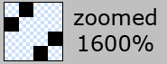
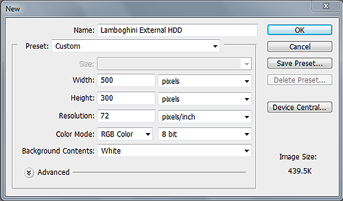
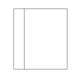
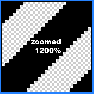
Firstly open up photoshop and create a new document 900 x 845 pixels, fill your background layer with the color white if it isnt already. For our background i also want to add some stripes to it so create a new document 4 x 4 pixels with a transparent background. Zoom in 1600%, select the “pencil” tool and a 1 pixel brush, create 4 squares like this.
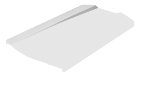
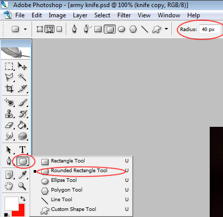
Now goto “edit > define pattern” label your pattern lines or anything you see fit. close that document and revert back to your first document that you made. Create a new layer above your background layer and label it “background lines” select the paint bucket tool at the top under the menu change forground to pattern. Select your pattern from the list and fill your background with the line pattern, set layer opacity to 10%. Now im going to start designing the general layout of our site starting from the bottom and working my way up. Create a new layer labelled footer. Select the rounded rectangle tool with a radius of 20px draw out your footer, select the rectangle tool and cut off the top.

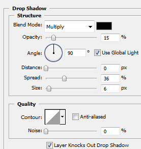
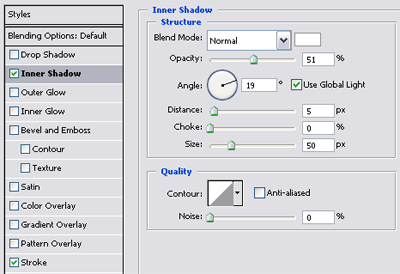
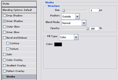
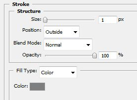
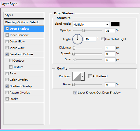
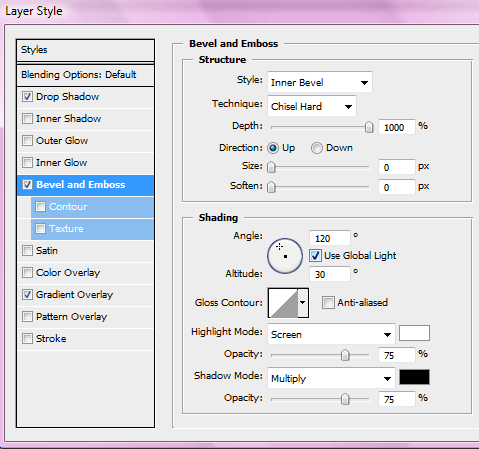
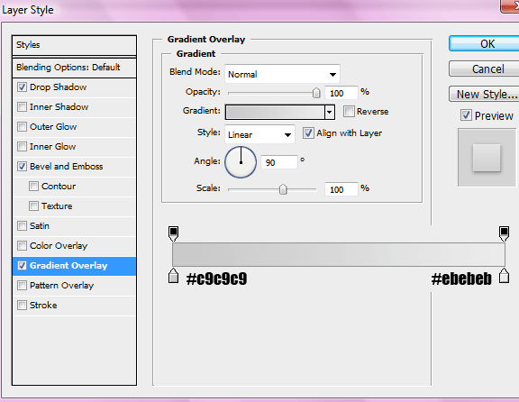
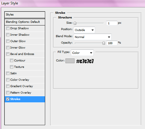
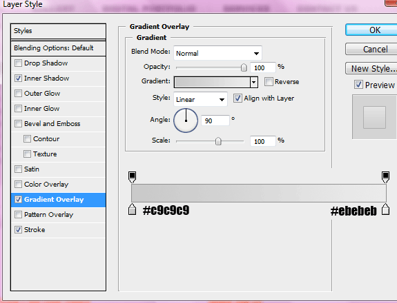
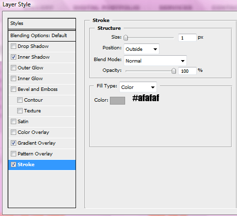
The layer styles for the footer are.
Create a new layer and label it content, select the rectangle tool and draw out our content area, fill with the color white and apply the same stroke as we did in the footer.
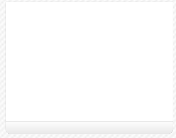
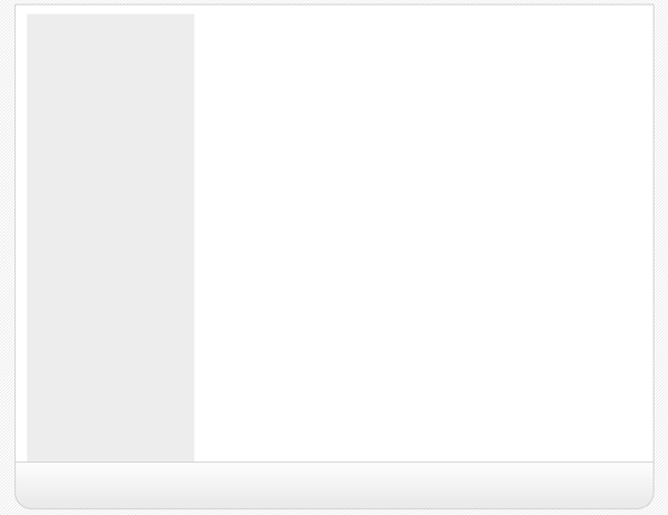
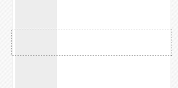
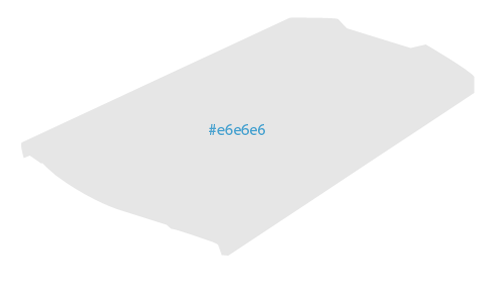
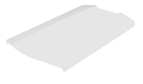
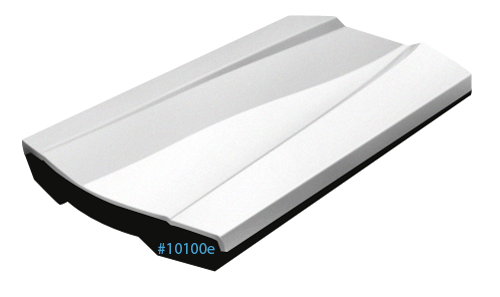
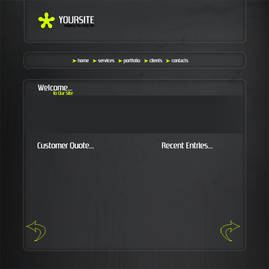
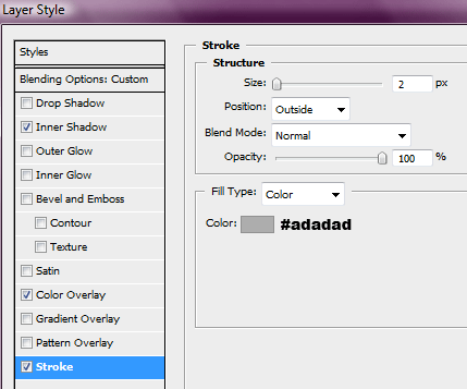
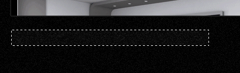
Create a new layer above your content layer labelled sidebar select the color #e2e2e2 and create a rectangle like the image below.
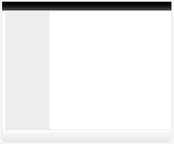
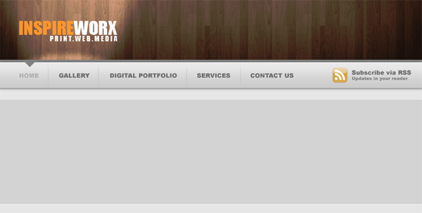
Now create yet another layer labelled navigation, select the rectangle tool and create a rectangle above your sidebar and content area, have the bottom of the navigation touch the top of our grey sidebar.
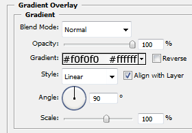
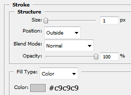
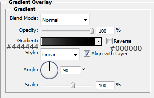
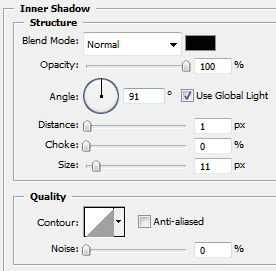
The layer styles for the navigation are.
Create a new layer above your navigation labelled navigation shine. On this layer create a rectangle the same width as our navigation but half the size of the width, fill with white and set opacity to 10% this will give the navigation a shiney effect.

Now create another layer labelled header, create the header the same way as we did the footer but make it a little bit bigger, head also uses the same layer styles.

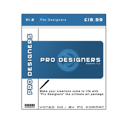
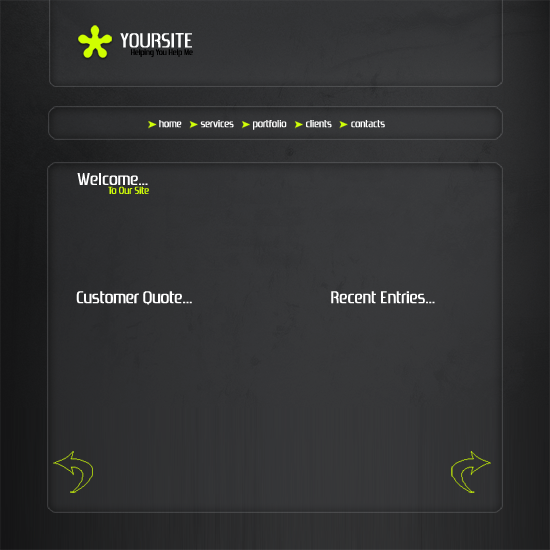
Now select the type tool and add your website title, navigation text and footer text, ive also labelled the grey sidebar box saying links here, you can leave that blank if you wish as the links will be added using html & css.
Now add your website logo, i just created a quick one using adobe’s custom shapes, obvisouly you can take more time to develop your own logo.

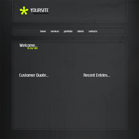
Now add some example content so we no what our layout will sort of look like, but most of it will be done using css and html which you will see in a moment.

SLICING AND PREPING IMAGES:
Now our website is created we need to slice and prep our images ready to be used in our website, now your going to have to bare with it as your site may be a few pixels wider or higher than mine unless you have downloaded the PSD.
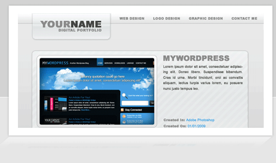
Firstly we’l start with the header, hide ALL layers in your psd file except the header layer(s) create a new blank layer above your header then goto “layer > merge visable” this will then merge our layers corrosponding to our header but keep all the layer styles intact, eles everything goes abit mental. Copy and paste your header, logo etc… which should now be all on one layer to a new document. Under the header layer on your new document add your white background and your stripes, simply by filling with the bucket tool and creating a new layer and filling with your pattern, remember you pattern layer should have a opacity of 10% just like in the psd. Now i want to add a drop shadow to the header so the layout doesnt look flat onto the background when its viewed on the internet. So add this drop shadow to your header.
Your header in your new document should look like this.

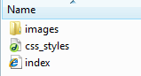
Now goto your desktop create a folder called “website” open the folder website and create another folder called “images” save the header as “header.jpg” within the “website images folder” by going to “file > save as” in adobe photoshop. Thats our header done now for our navigation. Our header was 790pixels wide which also included the space around the header for the drop shadow, so our naviagtion should be the same, but without the space at the top and bottom as we only want the drop shadow around the outside of our layout. Following the steps above copy and paste your navigation to a new document, add your stipey background and drop shadow like we did with the header. Heres my navigation.

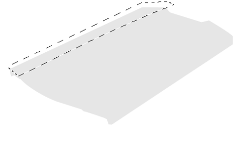
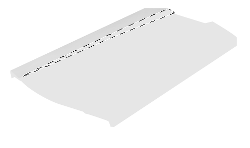
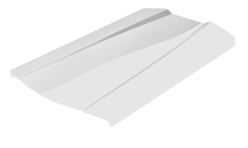
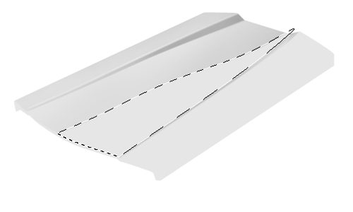
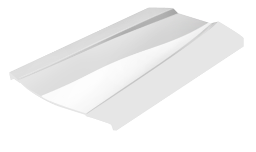
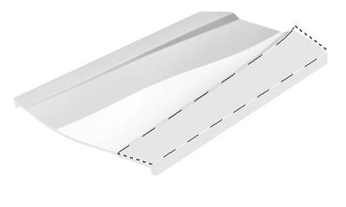
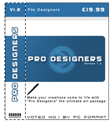
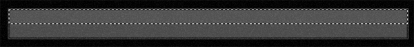
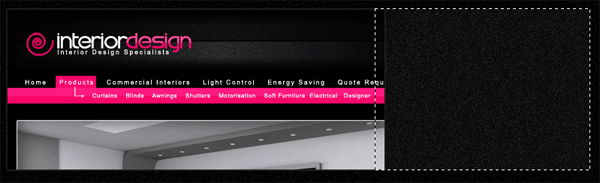
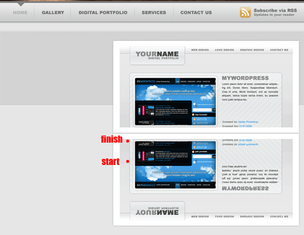
The content will be done in the same way but we dont need all of it, just a section of it as we can repeat it over and over using CSS. Make a selection like this.
Copy and paste to a new document also note that the selection is also 790pixels wide. Once pasted to a new document we need to add our white 7 stripey background again plus the drop shadow. Heres how mine looks.

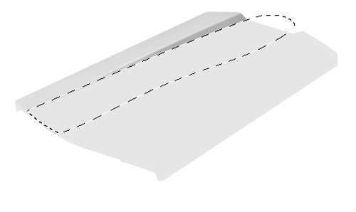
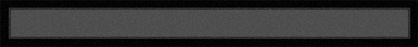
Notice how small my snippet is, mine is only actually 20pixel high as it will be repeated anyway. Now do the same with the footer.

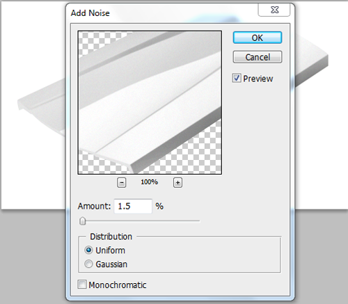
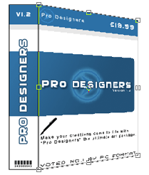
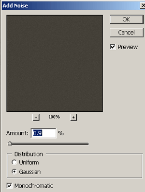
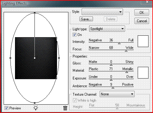
One last thing, as we want the stripey background we also need to create our background to do this make a screen shot of your psd layout and make a selection 21x21pixels of the background save it as gif in your images folder, or save the small image below.

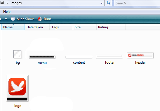
Thats all the images we need. You should have something like this in your images folder.
CODING OUR LAYOUT:
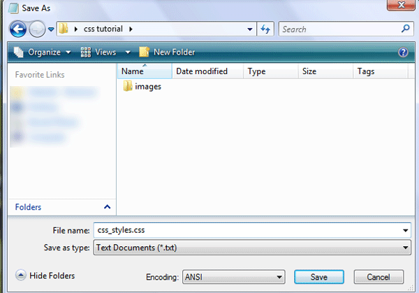
Goto your website folder then open notepad, once you have opened notepad just goto “file > save as” then save as a blank css document (see image below).
Now open dreamweaver and create a blank HTML page. Click the code button to see the source code of our blank html. Save your html file as index.html in the same directory as your css file.
Firstly lets add all our information which will include our doctype, author details, meta tags and linking of our css file.
<!DOCTYPE html PUBLIC "-//W3C//DTD XHTML 1.0 Strict//EN" "http://www.w3.org/TR/xhtml1/DTD/xhtml1-strict.dtd"> <html xmlns="http://www.w3.org/1999/xhtml" xml:lang="en" lang="en"> <head> <meta name="Description" content="Hawk studios, print web &amp;amp; media" /> <meta name="Keywords" content="your, keywords" /> <meta http-equiv="Content-Type" content="text/html; charset=iso-8859-1" /> <meta name="Distribution" content="Global" /> <meta name="Author" content="richard carpenter - [email protected]" /> <meta name="Robots" content="index,follow" /> <link rel="stylesheet" href="css_styles.css" mce_href="css_styles.css" type="text/css" /> <title>HAWK STUDIOS | Print . Web . Media</title> </head>
You can pretty much see what some of the things mean, the main two id like to point out you are the stylesheet link and the title, the title being whats displayed in the browser window and the without the stylesheet the layout will look abit of a mess. Now the lets get on with marking up our “divs” for our layout, we’l have 5 main divs “header, naviagtion, content, sidebar and footer”. We mark these out like so.
<body> <!-- wrap starts here --> <div id="wrap"> <div id="header"> <!--HEADER INFO WILL GO HERE --> </div> <div id="menu"> <!--NAVIAGTION HERE --> </div> <!-- content-wrap starts here --> <div id="content-wrap"> <div id="main"> <!--MAIN CONTENT HERE --> </div> <div id="sidebar"> <!--SIDE BAR LINKS HERE --> </div> <!-- content-wrap ends here --> </div> <div id="footer"> <!--FOOTER HERE --> </div> <!-- wrap ends here --> </div> </body> </html>
The arrows are comment codes i cant stress enough how important it is to have these as it will tell us where everything goes. A comment code is basically a snippet of text that can be added to a html document but the browser doesnt render it, there for being invisable when viewed in a browser, you’l only see it when you view the source code. Theres 1 or 2 divs i havent mentioned yet that you might see and thats the wrap and content-wrap divs, these will be styles to keep the layout in the middle of our browser which we’ll get too in a moment. If you view your website now in the browser you wont see nothing even thou you’ve added buckets of code already not untill you’ve added the styles in the css style sheet. Goto “file > open” and open your blank style sheet, the first things we will style will be our websites background image, set the font type and size.
/******************************************** HTML ELEMENTS ********************************************/ /* top elements */ * { margin: 0; padding: 0; outline: 0; } /*sets no padding or margin around the body of our document*/ body { background-color: #fff; /*website background color (white)*/ background-image: url(images/bg.gif); /*sets the background image, in our case the stripey background*/ background-repeat: repeat; /*repeats our background over and over*/ color: #333333; /*sets our text color for our website*/ margin: 15px 0; /*sets no padding and a 15px margin around the body of our document*/ font-family: Verdana, Tahoma, arial, sans-serif; /*sets the font family for our website*/ font-size: 70%; /*sets the font size in %, you can also use 12px or 14px etc... px stands for pixels*/ line-height: 1.5em; /*sets the height between each line of text.*/ }
The first thing that most people style is the body. The body is the element that defines the documents’ body. It contains all the contents of the document (like text, images, colors, graphics, etc.). Next lets style our website layout starting with the header and our wrap which looks like this.
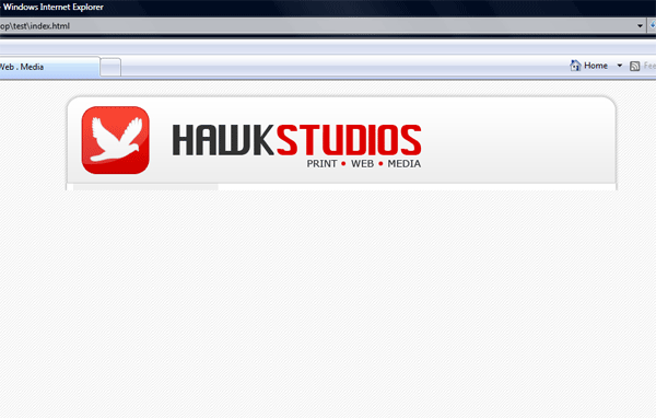
/******************************************** WEBSITE LAYOUT ********************************************/ #wrap { width: 790px; /*width of our wrap*/ background: #CCC url(images/content.jpg) repeat-y center top; /*sets our background color to white and uses our content.jpg as a background, the background is also repeated along the Y axis*/ margin: 0 auto; /*center our margin to auto will center our website*/ text-align: left; /*aligns our text to the left*/ } #content-wrap { clear: both; /*The clear property sets the sides of an element where other floating elements are not allowed.*/ width: 760px; /*width of our wrap*/ margin: 5px auto; /*sets our top margin at 5 pixels and the rest to auto*/ padding: 0; /*sets 0 padding*/ } #header { position: relative; /*An element with position: relative moves an element relative to its normal position, so "left:20" adds 20 pixels to the element's LEFT position*/ height: 131px; /*sets our header height, this should be the same as our header image*/ background: #caced1 url(images/header.jpg) no-repeat center top; /*sets a background behind our header and sets our header image onto the page*/ padding: 0; /*no padding is needed*/ }
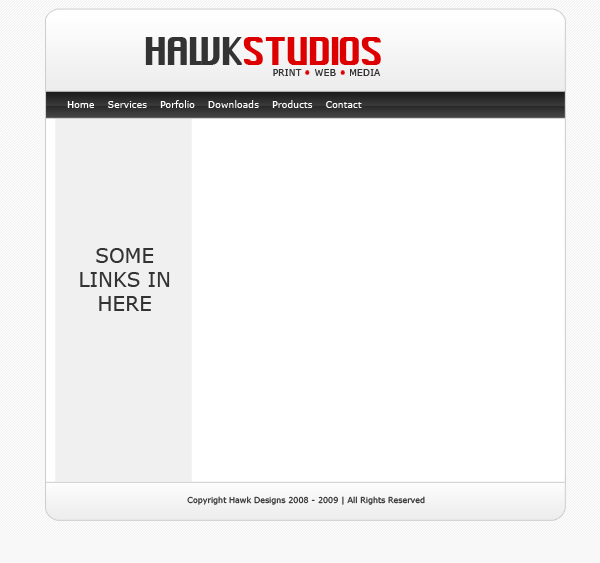
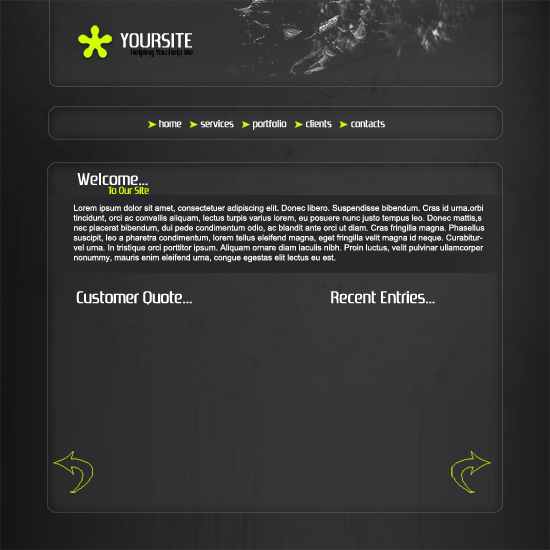
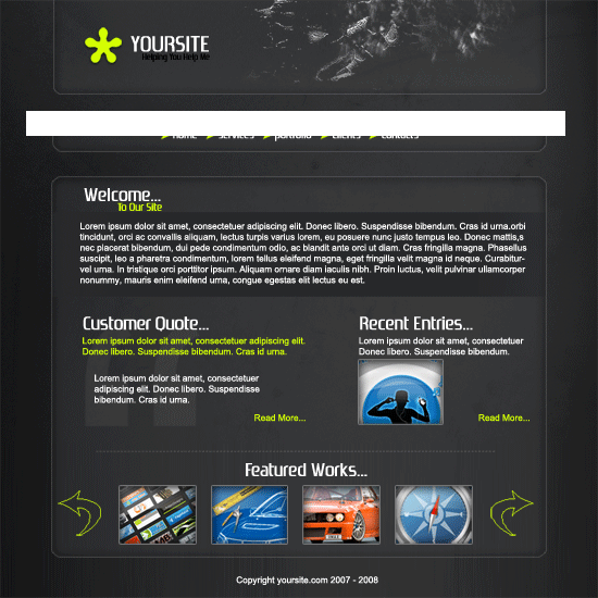
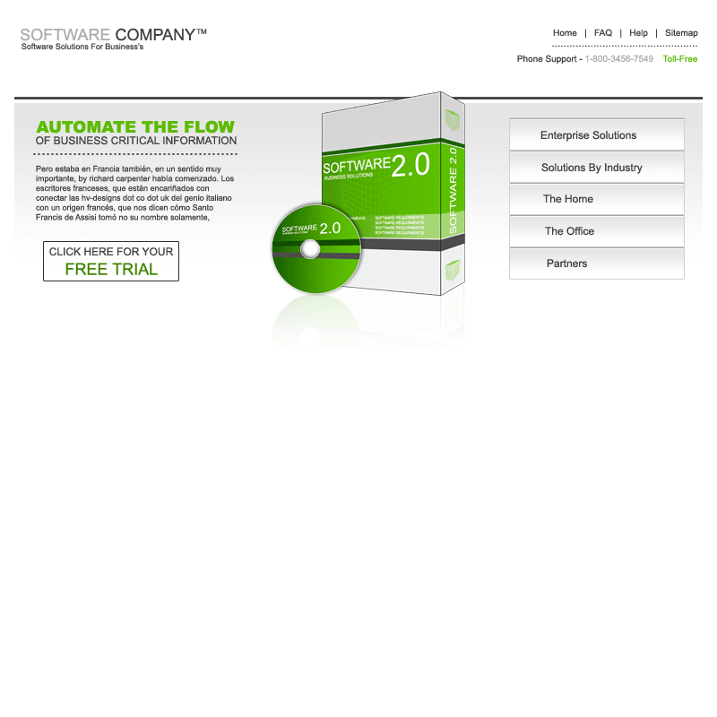
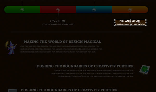
If you view your website now it should look like this.
The next part to style is our navigation.
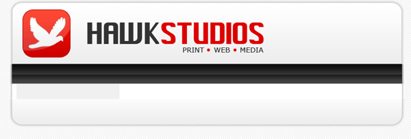
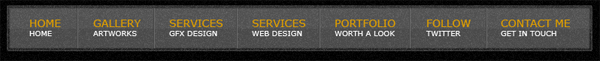
/******************************************** WEBSITE NAVIAGTION ********************************************/ #menu { clear: both; /*No floating elements allowed on either the left or the right side*/ margin: 0 auto; /*Margins*/ padding: 0; /*Padding*/ background: #81C524 url(images/menu.jpg) no-repeat; /*Our menu background*/ height: 40px; /*The height of the menu */ width: 790px; /*The width of the menu */ font-family: Verdana, Arial, Helvetica, sans-serif; /*The font family*/ font-size: 14px; /*The font size*/ line-height: 40px; /*The line-height property sets the distance between lines.*/ } #menu ul { float: left; /*Floats our menu to the left*/ list-style: none; margin:0; padding: 0 0 0 20px; } #menu ul li { display: inline; /*The element will be displayed as an inline element, with no line break before or after the element*/ } #menu ul li a { display: block; float: left; padding: 0 12px; color: #fff; /*Font color*/ text-decoration: none; } #menu ul li a:hover { color: #E00000; /*Mouseover hover color*/ }
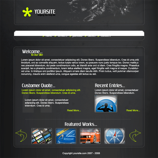
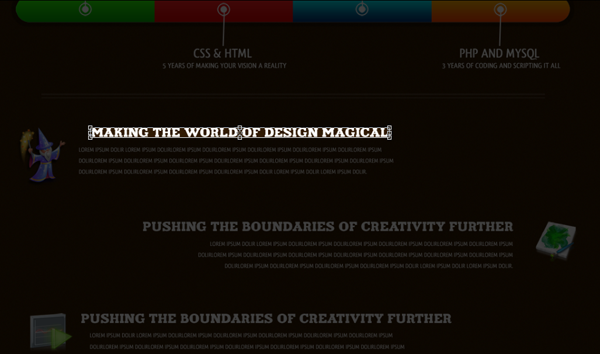
If you view your website now, you will see you have your naviagtion.

Now its time to add our sidebar, content and footer styles.
/******************************************** MAIN COLUMN ********************************************/ #main { float: right; /*floats our main content area to the right*/ width: 555px; /*gives our content area a width of 555pixels*/ margin: 0; padding: 20px 0 0 0; display: inline; } #main h2 { padding: 0; margin-bottom: 0; color: #333333; font-family: Verdana, Arial, Helvetica, sans-serif; font-size: 180%; font-style: normal; font-weight: bold; } #main h2 a { color: #2666c3; text-decoration: none; } #main p, #main h1, #main h2, #main h3, #main ol, #main ul, #main blockquote, #main table, #main form { margin-left: 25px; margin-right: 20px; } /******************************************** SIDEBAR ********************************************/ #sidebar { float: left; width: 195px; padding: 0; color: #333333; margin-top: 5px; margin-right: 0; margin-bottom: 0; margin-left: 0; } #sidebar h2 { margin: 15px 5px 10px 5px; font: bold 1.4em 'Trebuchet MS', Tahoma, Sans-serif; color: #333333; } #sidebar p { margin-left: 5px; } #sidebar ul.sidemenu { list-style: none; text-align: left; margin: 7px 10px 8px 0; padding: 0; text-decoration: none; border-top: 1px solid #A9D4EF; } #sidebar ul.sidemenu li { list-style: none; padding: 4px 0 4px 5px; margin: 0 2px; color: #333333; border-bottom: 1px solid #D2E8F7; } * html body #sidebar ul.sidemenu li { height: 1%; } #sidebar ul.sidemenu li a { text-decoration: none; color: #FF0000; } #sidebar ul.sidemenu li a:hover { color: #333; } #sidebar ul.sidemenu ul { margin: 0 0 0 5px; padding: 0; } #sidebar ul.sidemenu ul li { border: none; } /******************************************** FOOTER ********************************************/ #footer { color: #333333; background: #caced1 url(images/footer.jpg) no-repeat center top; clear: both; width: 790px; height: 57px; text-align: center; font-size: 90%; } #footer p { padding: 10px 0; margin: 0; } #footer a { color: #FF0000; text-decoration: none; } /* alignment classes */ .float-left { float: left; } .float-right { float: right; } .align-left { text-align: left; } .align-right { text-align: right; } /* display and additional classes */ .clear { clear: both; }
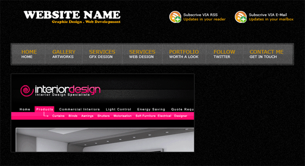
Your website should now look like this.
Now we need to add our content, so save your CSS file and goto the code veiw for your HTML file find the lines “naviagtion”
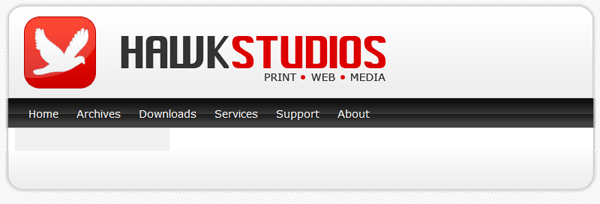
<!-- navigation --> <div id="menu"> <ul> <li><a href="index.html">Home</a></li> <li><a href="index.html">Archives</a></li> <li><a href="index.html">Downloads</a></li> <li><a href="index.html">Services</a></li> <li><a href="index.html">Support</a></li> <li><a href="index.html">About</a></li> </ul> </div>
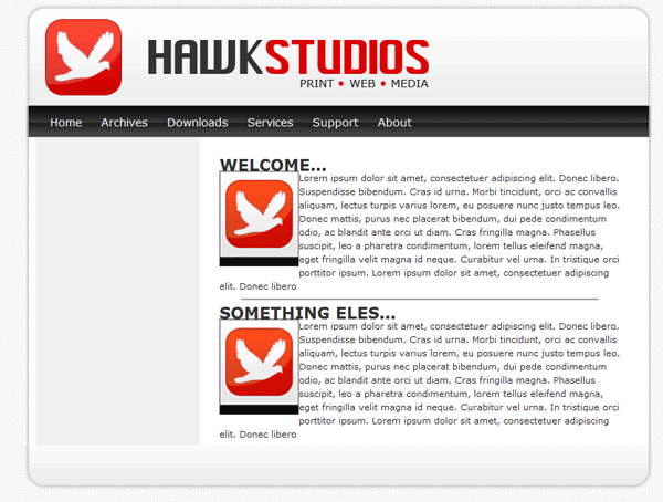
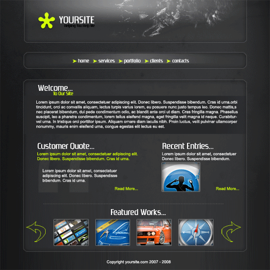
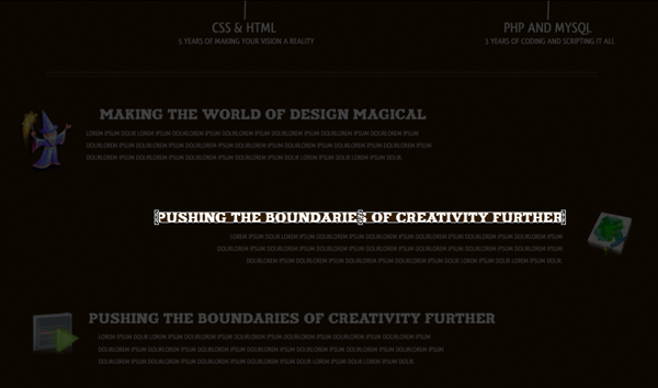
This bit of code will add the text links “home, archives, downloads, services, support and about” to our navigation. All links point to index.html, this can be changed to what ever address you need to point them to E.G. http://www.hv-designs.co.uk. Your website when viewed in the browser should look like this.
Now find the lines “MAIN CONTENT HERE” and add
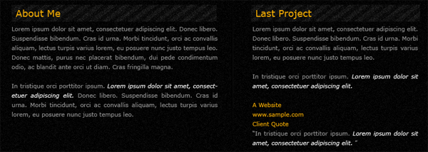
<div id="main"> <h2>WELCOME...</h2> <p><img src="images/logo.jpg" width="100" height="120" class="float-left" /> Lorem ipsum dolor sit amet, consectetuer adipiscing elit. Donec libero. Suspendisse bibendum. Cras id urna. Morbi tincidunt, orci ac convallis aliquam, lectus turpis varius lorem, eu posuere nunc justo tempus leo. Donec mattis, purus nec placerat bibendum, dui pede condimentum odio, ac blandit ante orci ut diam. Cras fringilla magna. Phasellus suscipit, leo a pharetra condimentum, lorem tellus eleifend magna, eget fringilla velit magna id neque. Curabitur vel urna. In tristique orci porttitor ipsum. Lorem ipsum dolor sit amet, consectetuer adipiscing elit. Donec libero<br /> </p> <hr align="center" width="450" noshade="noshade" /> <h2>SOMETHING ELES...</h2> <p><img src="images/logo.jpg" width="100" height="120" class="float-left" /> Lorem ipsum dolor sit amet, consectetuer adipiscing elit. Donec libero. Suspendisse bibendum. Cras id urna. Morbi tincidunt, orci ac convallis aliquam, lectus turpis varius lorem, eu posuere nunc justo tempus leo. Donec mattis, purus nec placerat bibendum, dui pede condimentum odio, ac blandit ante orci ut diam. Cras fringilla magna. Phasellus suscipit, leo a pharetra condimentum, lorem tellus eleifend magna, eget fringilla velit magna id neque. Curabitur vel urna. In tristique orci porttitor ipsum. Lorem ipsum dolor sit amet, consectetuer adipiscing elit. Donec libero</p> </div>
Now this bit of code has a couple of things
1) H2 tages which are header tags
2) P tages which are paragraph tags
3) its has an image which is an image of our logo, the image also has a class float left meaning our text will wrap around our image.
4) HR tag which is a horizontal ruler.
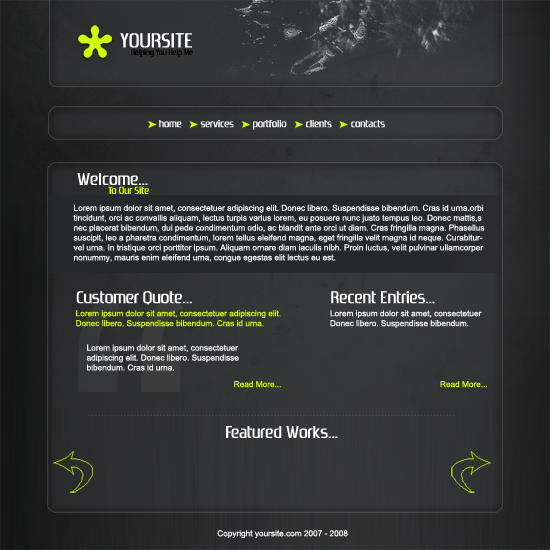
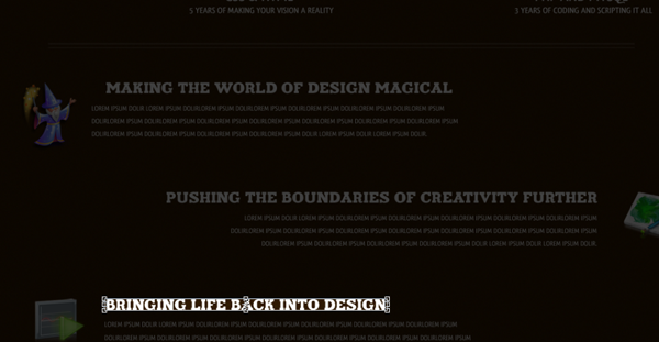
If you view your site now it should look like this.
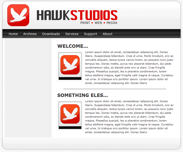
You can see from the image above that we need to set our H2 tags in our style sheet and we need to add some styling to our images so everything is no so cramped up. We do this by adding this into our stylesheet.
/******************************************** WEBSITE LINKS ********************************************/ a, a:visited { text-decoration: none; background: inherit; color: #FB9233; } a:hover { text-decoration: underline; background: inherit; color: #93C600; } /******************************************** WEBSITE TEXT HEADERS ********************************************/ h1, h2, h3 { font-family: 'Trebuchet MS', Tahoma, Sans-serif; } h1 { font-size: 180%; font-weight: normal; color: #555; } h2 { font-size: 160%; color: #88ac0b; font-weight: normal; } h3 { font-size: 135%; color: #666666; } /******************************************** WEBSITE IMAGES ********************************************/ img { background: #fff; border: 1px solid #E5E5E5; padding: 5px; } img.float-right { margin: 5px 0px 10px 10px; } img.float-left { margin: 5px 10px 10px 0px; } h1, h2, h3, p { margin: 10px 15px; padding: 0; } ul, ol { margin: 5px 15px; padding: 0 25px; }
You can now see in the image below we have padding around our title and image.
Now we need to add some content to our sidebar, so find “SIDE BAR LINKS HERE” and add the following code.
<!-- sidebar here --> <div id="sidebar"> <h2>AFFILIATES...</h2> <p>Become an affiliate with hawk studios. Contact us at [email protected] </p> <h2>LINKS...</h2> <ul class="sidemenu"> <li><a href="index.html">Home</a></li> <li><a href="http://www.pixel2life.com">Pixel2life</a></li> <li><a href="http://www.hv-designs.co.uk">HV-Designs</a></li> <li><a href="http://www.sb-designs.co.uk">SB-Designs</a></li> </ul> </div>
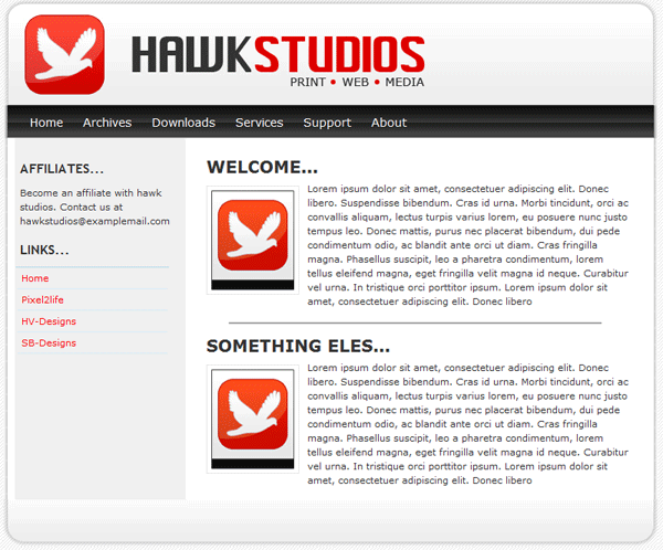
Our sidebar is not that different from our navigation apart from our list goes down instead of across. Our sidebar now looks like this.
All that is left is to add our footer text which isnt alot of code.
<!--footer starts here--> <div id="footer"> <p>2008 - 2009 &amp;amp;copy; <strong>Your Company</strong> | Design by: <a href="http://www.hv-designs.co.uk">HV-Designs</a> | All Rights Reserved </p> </div>
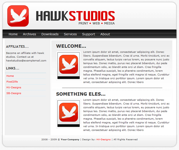
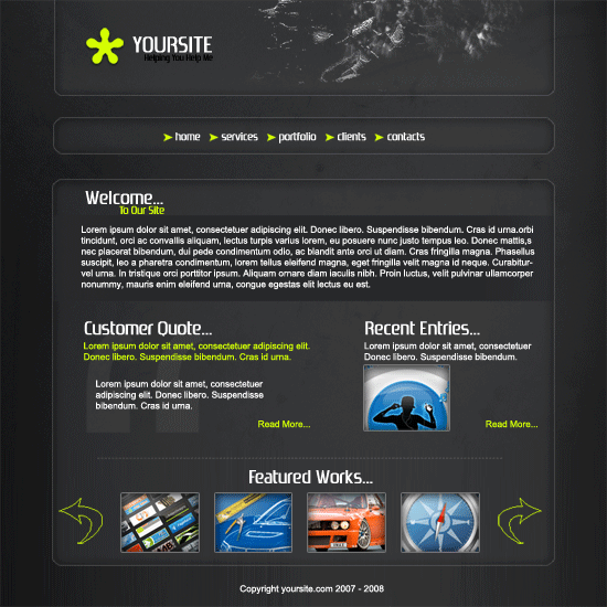
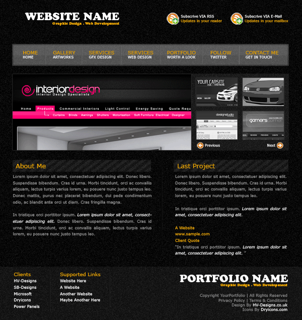
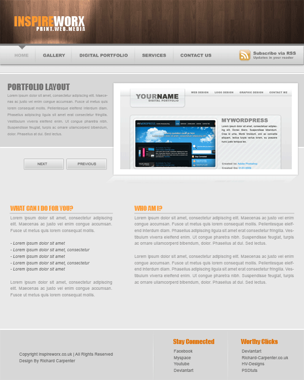
Your website should now be finished, if you click your “design” tab within dreamweaver you should be able to see your website and add more text and images live as you go along. Your finished website should look like this.


 9a.png
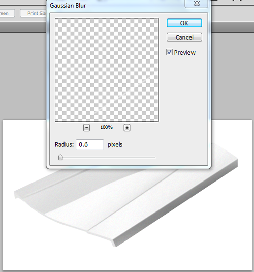


