Get Polka Collaboration App Review
Today I want to share a review with you guys about what I predict as the next big application in web design, Get Polka. A few weeks back I was contacted by the creators of Get Polka asking if I had heard of the application and if I had wanted to do a review of the application. I am always looking to review and beta test multiple applications to see what is happening in the design world, so naturally I jumped at the chance to review another application. When I started the beta version of Get Polka it immediately grabbed my attention, so I began to take greater notice of the application and research its competitors. What I found out about the competitors, and what I gained from the application in the short time I used it, made me want to share this review with our readers so you guys can take advantage of this before it takes off. So let’s begin the review.
The Website
The first thing that you notice about the application is its website. When talking about an application’s website it is basically one big landing page. The application has a very limited time to grab your attention to make you want to read more into it. I think that Get Polka did a very good job on their landing page for what you see.
Right away you see the logo, a feedback bar, and the menu. Now, while this does catch your eye I feel like they fall a little short on getting their product in the spotlight right away. While the giant image will make you want to scroll down just to see what it is a picture of you are not scrolling down to actually learn about the application. If I was to re-design the home page I would place the image off to the right or left with some information on whatever side the image wasn’t on to really explain the application and show it off all ‘above the fold’.
Outside of that issue I think the website itself is very well designed. I love the subtle background and think it fits well with the whole application concept. I don’t like that it fades out into just a mono color background. I would love to see it repeated throughout the entire website, but that is my design opinion rather than an actual falling out regarding the website. The jQuery on the website is done really well and I love the natural scrolling motion and the separation of the different areas. All in all, however, the website is very well done and serves its purpose.
The Dashboard
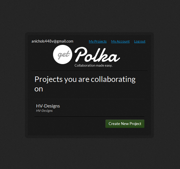
Get Polka has a very simple sign in process that requires you to simply enter your email address and some bits of information like your name. I love the simple sign up form and then it immediately takes you to your dashboard, where you can begin using the application.
The design aspect of the application is very well done. From the log-in screen all the way into the project you are collaborating on the UI remains the same.
I really like the simplicity of the layout as it doesn’t clutter with unnecessary information and gets straight to the point. The first, and pretty much only, thing that you see when in your dashboard is the projects you are collaborating on. I do feel that they could use more of the screen for the application and maybe put in some thumbnails of the project instead of just the name, but those are all things that can come as the application grows and are aesthetic issues as opposed to usability issues.
Projects
Once you get into your projects area of your dashboard you can see a thumbnail of each design in the project. My project that I used for this review was the re-design of HV-Designs. As I was going through and testing I uploaded each individual page that was designed for the new design. The screenshot below only shows one page, but you can add as many different pages as you need per project
Now, here is where one of my main usability issues with the dashboard comes into play. When you click the Get Polka logo it should, based on UX principles, take you back to the home page of the dashboard as opposed to the home page of the website. I am sure this is something simple that my friends over at Get Polka will have already taken care of and fixed by the time this review comes out.
Uploading Files
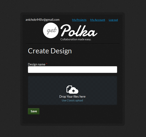
Now we come to my favorite area of the dashboard. The creators over at Get Polka want to simplify your collaboration experience as much as possible, so they do something that I have rarely seen done in an application. The offer a drag and drop service that allows you to drag over your image as opposed to going through the upload steps and finding the right file. While that may not seem like very much work when reading it for someone like me that has literally thousands of files on my computer and hundreds of folders just on my desktop alone that can take more time than I want to dedicate. At first the drag and drop was just as much of a hastle if I was creating older projects, but as I create projects I am currently working on I already have their folder open anyway so I simple shrink screens, drag, drop, and it is uploading and I am ready to rock and roll with sharing.
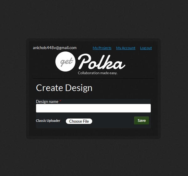
Of course they do not limit to only a drag and drop service. You can choose to use a standard upload service if that is what you are more comfortable with. Either way you go you retain the same look and feel as the remainder of the dashboard.
The Application
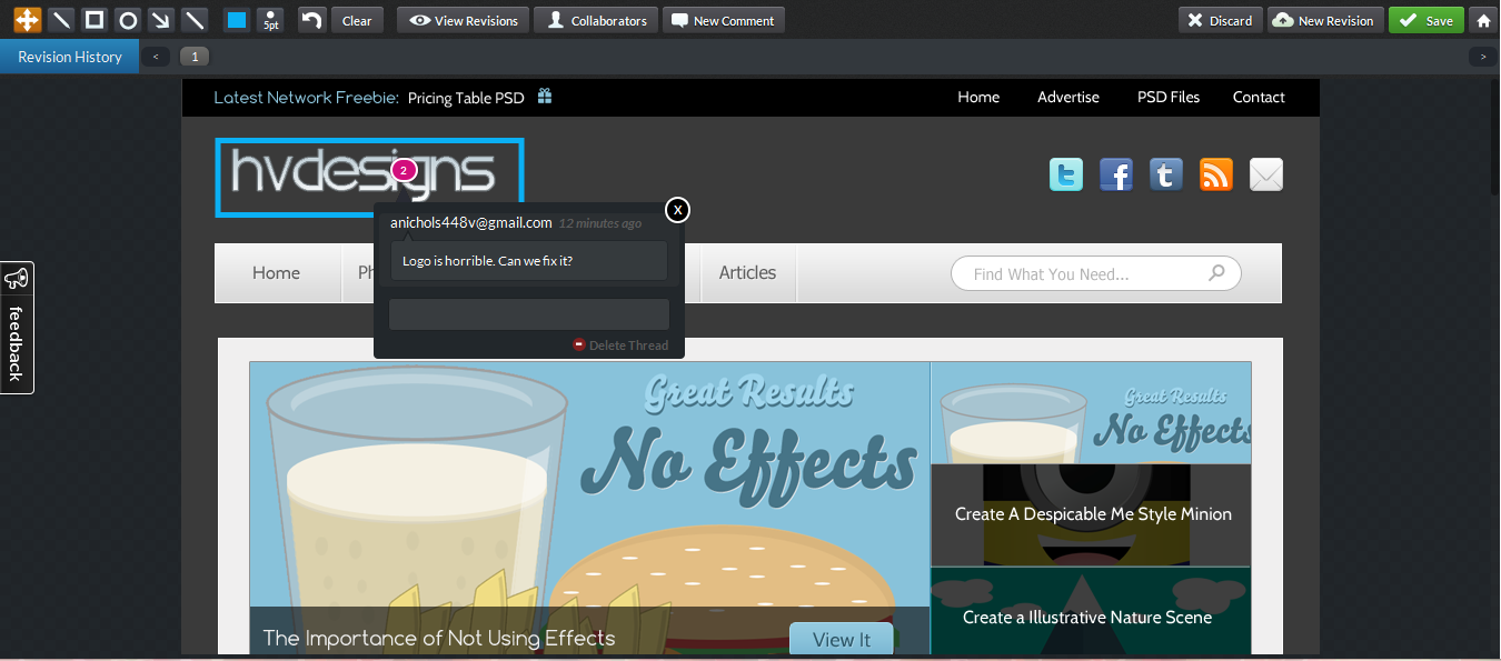
Now we get to the application itself. The application offers so many different options that I am only going to skim through them and show you what they look like. When you guys get into the application you will see just what I mean. So, let’s start with one of the biggest things in the application that make it what it is; the comments. GP offers an amazing comment system and each comment starts its own thread, with its own number. As you delve deeper into the application, with more collaborators, you can hide and view layers/comments based on the individual collaborator. The commenting system was very well done and is definitely a big plus for the application. My only issue right now with the comment system is that the comments do not update in real time, meaning if two people are in there at the same time they will have to close the design and re-open it to see what the other person posted. It’s still a new program to me so I don’t know how often people with be in there are the same time, but I have used it for my last client and during the testing and two people were in there together more often than not. I am curious to see if this is still an issue as I begin using the full version and incorporating it into all my clients.
The next thing to talk about, which I already kind of touched on, is the collaborators. The choice to put each collaborator on what is, essentially , their own layer was a very good choice. This way you can see what each individual person is saying about the design, as well as seeing what everyone is saying about a certain area. When dealing with clients this helps, especially when you are working with a committee that has to decide on the website.
Now you can add other collaborators as well, which was a great option. I do not believe that there is a limit to the number of people you can collaborate on a project with, so go to your heart’s desire. The other great thing is that you add collaborators based on project and not based on design, so you are saving yourself some time. I do hope that they add the ability to add people strictly by design in the future. I know when I work with some clients there are people that I only want to be able to see one page of the design at the moment, or a different version of the page with a watermark when it comes to rough drafts. All in all though the entire application is very well done and can only get better as new versions are released.
I want to give a big shout out to Ajay Mathew, the co-creator of Get Polka and the man that reached out to me to review this design. Thanks for all the hard work Ajay and the entire team! Keep it up and we will keep using the project and watching it grow exponentially!
Visit the Site!
Be Part Of The Community!
Become part of the hv-designs community.
Subscribe Via RSS or Follow Us On Twitter.







3 Responses to “Get Polka Collaboration App Review”