Your ads will be inserted here by
AdSense Now!.
Please go to the plugin admin page to paste your ad code.
CREATING OUR LAYOUT:
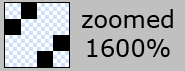
Firstly open up photoshop and create a new document 900 x 845 pixels, fill your background layer with the color white if it isnt already. For our background i also want to add some stripes to it so create a new document 4 x 4 pixels with a transparent background. Zoom in 1600%, select the “pencil” tool and a 1 pixel brush, create 4 squares like this.
Now goto “edit > define pattern” label your pattern lines or anything you see fit. close that document and revert back to your first document that you made. Create a new layer above your background layer and label it “background lines” select the paint bucket tool at the top under the menu change forground to pattern. Select your pattern from the list and fill your background with the line pattern, set layer opacity to 10%. Now im going to start designing the general layout of our site starting from the bottom and working my way up. Create a new layer labelled footer. Select the rounded rectangle tool with a radius of 20px draw out your footer, select the rectangle tool and cut off the top.

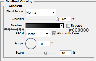
The layer styles for the footer are.
Create a new layer and label it content, select the rectangle tool and draw out our content area, fill with the color white and apply the same stroke as we did in the footer.

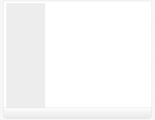
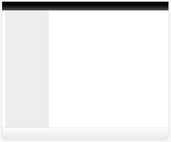
Create a new layer above your content layer labelled sidebar select the color #e2e2e2 and create a rectangle like the image below.
Now create yet another layer labelled navigation, select the rectangle tool and create a rectangle above your sidebar and content area, have the bottom of the navigation touch the top of our grey sidebar.
The layer styles for the navigation are.
Create a new layer above your navigation labelled navigation shine. On this layer create a rectangle the same width as our navigation but half the size of the width, fill with white and set opacity to 10% this will give the navigation a shiney effect.
![]()
Now create another layer labelled header, create the header the same way as we did the footer but make it a little bit bigger, head also uses the same layer styles.

Now select the type tool and add your website title, navigation text and footer text, ive also labelled the grey sidebar box saying links here, you can leave that blank if you wish as the links will be added using html & css.
Now add your website logo, i just created a quick one using adobe’s custom shapes, obvisouly you can take more time to develop your own logo.

Now add some example content so we no what our layout will sort of look like, but most of it will be done using css and html which you will see in a moment.
SLICING AND PREPING IMAGES:
Now our website is created we need to slice and prep our images ready to be used in our website, now your going to have to bare with it as your site may be a few pixels wider or higher than mine unless you have downloaded the PSD.
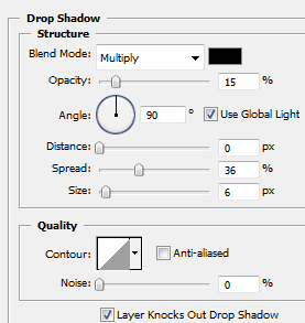
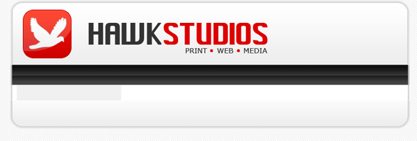
Firstly we’l start with the header, hide ALL layers in your psd file except the header layer(s) create a new blank layer above your header then goto “layer > merge visable” this will then merge our layers corrosponding to our header but keep all the layer styles intact, eles everything goes abit mental. Copy and paste your header, logo etc… which should now be all on one layer to a new document. Under the header layer on your new document add your white background and your stripes, simply by filling with the bucket tool and creating a new layer and filling with your pattern, remember you pattern layer should have a opacity of 10% just like in the psd. Now i want to add a drop shadow to the header so the layout doesnt look flat onto the background when its viewed on the internet. So add this drop shadow to your header.
Your header in your new document should look like this.

Now goto your desktop create a folder called “website” open the folder website and create another folder called “images” save the header as “header.jpg” within the “website images folder” by going to “file > save as” in adobe photoshop. Thats our header done now for our navigation. Our header was 790pixels wide which also included the space around the header for the drop shadow, so our naviagtion should be the same, but without the space at the top and bottom as we only want the drop shadow around the outside of our layout. Following the steps above copy and paste your navigation to a new document, add your stipey background and drop shadow like we did with the header. Heres my navigation.
![]()
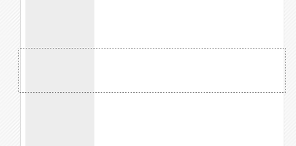
The content will be done in the same way but we dont need all of it, just a section of it as we can repeat it over and over using CSS. Make a selection like this.
Copy and paste to a new document also note that the selection is also 790pixels wide. Once pasted to a new document we need to add our white 7 stripey background again plus the drop shadow. Heres how mine looks.
![]()
Notice how small my snippet is, mine is only actually 20pixel high as it will be repeated anyway. Now do the same with the footer.
![]()
One last thing, as we want the stripey background we also need to create our background to do this make a screen shot of your psd layout and make a selection 21x21pixels of the background save it as gif in your images folder, or save the small image below.
![]()
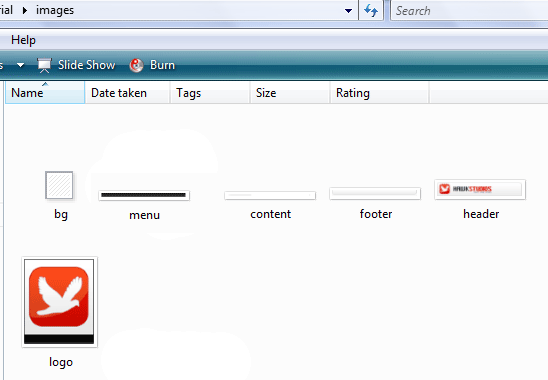
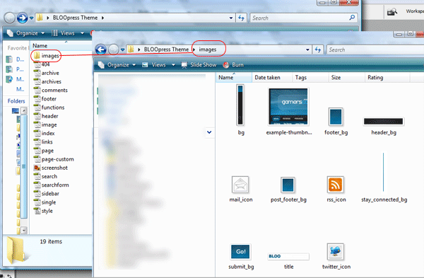
Thats all the images we need. You should have something like this in your images folder.
Your ads will be inserted here by
AdSense Now!.
Please go to the plugin admin page to paste your ad code.
CODING OUR LAYOUT:
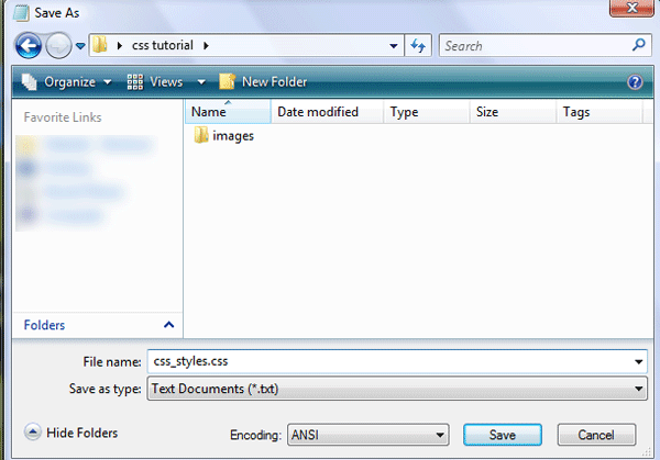
Goto your website folder then open notepad, once you have opened notepad just goto “file > save as” then save as a blank css document (see image below).
Now open dreamweaver and create a blank HTML page. Click the code button to see the source code of our blank html. Save your html file as index.html in the same directory as your css file.
Firstly lets add all our information which will include our doctype, author details, meta tags and linking of our css file.
<!DOCTYPE html PUBLIC "-//W3C//DTD XHTML 1.0 Strict//EN" "http://www.w3.org/TR/xhtml1/DTD/xhtml1-strict.dtd"> <html xmlns="http://www.w3.org/1999/xhtml" xml:lang="en" lang="en"> <head> <meta name="Description" content="Hawk studios, print web &amp;amp; media" /> <meta name="Keywords" content="your, keywords" /> <meta http-equiv="Content-Type" content="text/html; charset=iso-8859-1" /> <meta name="Distribution" content="Global" /> <meta name="Author" content="richard carpenter - [email protected]" /> <meta name="Robots" content="index,follow" /> <link rel="stylesheet" href="css_styles.css" mce_href="css_styles.css" type="text/css" /> <title>HAWK STUDIOS | Print . Web . Media</title> </head>
You can pretty much see what some of the things mean, the main two id like to point out you are the stylesheet link and the title, the title being whats displayed in the browser window and the without the stylesheet the layout will look abit of a mess. Now the lets get on with marking up our “divs” for our layout, we’l have 5 main divs “header, naviagtion, content, sidebar and footer”. We mark these out like so.
<body> <!-- wrap starts here --> <div id="wrap"> <div id="header"> <!--HEADER INFO WILL GO HERE --> </div> <div id="menu"> <!--NAVIAGTION HERE --> </div> <!-- content-wrap starts here --> <div id="content-wrap"> <div id="main"> <!--MAIN CONTENT HERE --> </div> <div id="sidebar"> <!--SIDE BAR LINKS HERE --> </div> <!-- content-wrap ends here --> </div> <div id="footer"> <!--FOOTER HERE --> </div> <!-- wrap ends here --> </div> </body> </html>
The arrows are comment codes i cant stress enough how important it is to have these as it will tell us where everything goes. A comment code is basically a snippet of text that can be added to a html document but the browser doesnt render it, there for being invisable when viewed in a browser, you’l only see it when you view the source code. Theres 1 or 2 divs i havent mentioned yet that you might see and thats the wrap and content-wrap divs, these will be styles to keep the layout in the middle of our browser which we’ll get too in a moment. If you view your website now in the browser you wont see nothing even thou you’ve added buckets of code already not untill you’ve added the styles in the css style sheet. Goto “file > open” and open your blank style sheet, the first things we will style will be our websites background image, set the font type and size.
/******************************************** HTML ELEMENTS ********************************************/ /* top elements */ * { margin: 0; padding: 0; outline: 0; } /*sets no padding or margin around the body of our document*/ body { background-color: #fff; /*website background color (white)*/ background-image: url(images/bg.gif); /*sets the background image, in our case the stripey background*/ background-repeat: repeat; /*repeats our background over and over*/ color: #333333; /*sets our text color for our website*/ margin: 15px 0; /*sets no padding and a 15px margin around the body of our document*/ font-family: Verdana, Tahoma, arial, sans-serif; /*sets the font family for our website*/ font-size: 70%; /*sets the font size in %, you can also use 12px or 14px etc... px stands for pixels*/ line-height: 1.5em; /*sets the height between each line of text.*/ }
The first thing that most people style is the body. The body is the element that defines the documents’ body. It contains all the contents of the document (like text, images, colors, graphics, etc.). Next lets style our website layout starting with the header and our wrap which looks like this.
/******************************************** WEBSITE LAYOUT ********************************************/ #wrap { width: 790px; /*width of our wrap*/ background: #CCC url(images/content.jpg) repeat-y center top; /*sets our background color to white and uses our content.jpg as a background, the background is also repeated along the Y axis*/ margin: 0 auto; /*center our margin to auto will center our website*/ text-align: left; /*aligns our text to the left*/ } #content-wrap { clear: both; /*The clear property sets the sides of an element where other floating elements are not allowed.*/ width: 760px; /*width of our wrap*/ margin: 5px auto; /*sets our top margin at 5 pixels and the rest to auto*/ padding: 0; /*sets 0 padding*/ } #header { position: relative; /*An element with position: relative moves an element relative to its normal position, so "left:20" adds 20 pixels to the element's LEFT position*/ height: 131px; /*sets our header height, this should be the same as our header image*/ background: #caced1 url(images/header.jpg) no-repeat center top; /*sets a background behind our header and sets our header image onto the page*/ padding: 0; /*no padding is needed*/ }
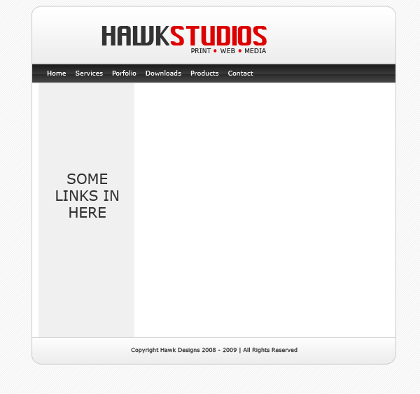
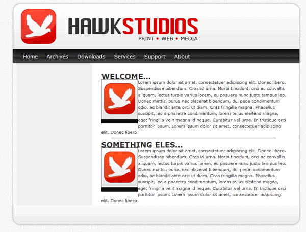
If you view your website now it should look like this.
The next part to style is our navigation.
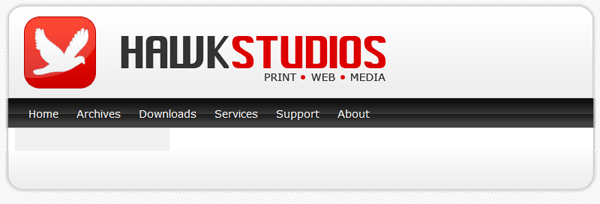
/******************************************** WEBSITE NAVIAGTION ********************************************/ #menu { clear: both; /*No floating elements allowed on either the left or the right side*/ margin: 0 auto; /*Margins*/ padding: 0; /*Padding*/ background: #81C524 url(images/menu.jpg) no-repeat; /*Our menu background*/ height: 40px; /*The height of the menu */ width: 790px; /*The width of the menu */ font-family: Verdana, Arial, Helvetica, sans-serif; /*The font family*/ font-size: 14px; /*The font size*/ line-height: 40px; /*The line-height property sets the distance between lines.*/ } #menu ul { float: left; /*Floats our menu to the left*/ list-style: none; margin:0; padding: 0 0 0 20px; } #menu ul li { display: inline; /*The element will be displayed as an inline element, with no line break before or after the element*/ } #menu ul li a { display: block; float: left; padding: 0 12px; color: #fff; /*Font color*/ text-decoration: none; } #menu ul li a:hover { color: #E00000; /*Mouseover hover color*/ }
If you view your website now, you will see you have your naviagtion.

Now its time to add our sidebar, content and footer styles.
/******************************************** MAIN COLUMN ********************************************/ #main { float: right; /*floats our main content area to the right*/ width: 555px; /*gives our content area a width of 555pixels*/ margin: 0; padding: 20px 0 0 0; display: inline; } #main h2 { padding: 0; margin-bottom: 0; color: #333333; font-family: Verdana, Arial, Helvetica, sans-serif; font-size: 180%; font-style: normal; font-weight: bold; } #main h2 a { color: #2666c3; text-decoration: none; } #main p, #main h1, #main h2, #main h3, #main ol, #main ul, #main blockquote, #main table, #main form { margin-left: 25px; margin-right: 20px; } /******************************************** SIDEBAR ********************************************/ #sidebar { float: left; width: 195px; padding: 0; color: #333333; margin-top: 5px; margin-right: 0; margin-bottom: 0; margin-left: 0; } #sidebar h2 { margin: 15px 5px 10px 5px; font: bold 1.4em 'Trebuchet MS', Tahoma, Sans-serif; color: #333333; } #sidebar p { margin-left: 5px; } #sidebar ul.sidemenu { list-style: none; text-align: left; margin: 7px 10px 8px 0; padding: 0; text-decoration: none; border-top: 1px solid #A9D4EF; } #sidebar ul.sidemenu li { list-style: none; padding: 4px 0 4px 5px; margin: 0 2px; color: #333333; border-bottom: 1px solid #D2E8F7; } * html body #sidebar ul.sidemenu li { height: 1%; } #sidebar ul.sidemenu li a { text-decoration: none; color: #FF0000; } #sidebar ul.sidemenu li a:hover { color: #333; } #sidebar ul.sidemenu ul { margin: 0 0 0 5px; padding: 0; } #sidebar ul.sidemenu ul li { border: none; } /******************************************** FOOTER ********************************************/ #footer { color: #333333; background: #caced1 url(images/footer.jpg) no-repeat center top; clear: both; width: 790px; height: 57px; text-align: center; font-size: 90%; } #footer p { padding: 10px 0; margin: 0; } #footer a { color: #FF0000; text-decoration: none; } /* alignment classes */ .float-left { float: left; } .float-right { float: right; } .align-left { text-align: left; } .align-right { text-align: right; } /* display and additional classes */ .clear { clear: both; }
Your website should now look like this.
Now we need to add our content, so save your CSS file and goto the code veiw for your HTML file find the lines “naviagtion”
<!-- navigation --> <div id="menu"> <ul> <li><a href="index.html">Home</a></li> <li><a href="index.html">Archives</a></li> <li><a href="index.html">Downloads</a></li> <li><a href="index.html">Services</a></li> <li><a href="index.html">Support</a></li> <li><a href="index.html">About</a></li> </ul> </div>
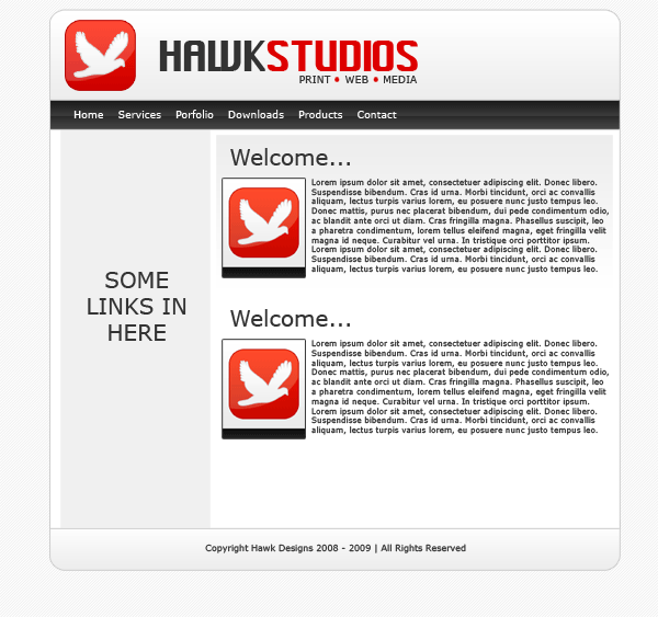
This bit of code will add the text links “home, archives, downloads, services, support and about” to our navigation. All links point to index.html, this can be changed to what ever address you need to point them to E.G. http://www.hv-designs.co.uk. Your website when viewed in the browser should look like this.
Now find the lines “MAIN CONTENT HERE” and add
<div id="main"> <h2>WELCOME...</h2> <p><img src="images/logo.jpg" width="100" height="120" class="float-left" /> Lorem ipsum dolor sit amet, consectetuer adipiscing elit. Donec libero. Suspendisse bibendum. Cras id urna. Morbi tincidunt, orci ac convallis aliquam, lectus turpis varius lorem, eu posuere nunc justo tempus leo. Donec mattis, purus nec placerat bibendum, dui pede condimentum odio, ac blandit ante orci ut diam. Cras fringilla magna. Phasellus suscipit, leo a pharetra condimentum, lorem tellus eleifend magna, eget fringilla velit magna id neque. Curabitur vel urna. In tristique orci porttitor ipsum. Lorem ipsum dolor sit amet, consectetuer adipiscing elit. Donec libero<br /> </p> <hr align="center" width="450" noshade="noshade" /> <h2>SOMETHING ELES...</h2> <p><img src="images/logo.jpg" width="100" height="120" class="float-left" /> Lorem ipsum dolor sit amet, consectetuer adipiscing elit. Donec libero. Suspendisse bibendum. Cras id urna. Morbi tincidunt, orci ac convallis aliquam, lectus turpis varius lorem, eu posuere nunc justo tempus leo. Donec mattis, purus nec placerat bibendum, dui pede condimentum odio, ac blandit ante orci ut diam. Cras fringilla magna. Phasellus suscipit, leo a pharetra condimentum, lorem tellus eleifend magna, eget fringilla velit magna id neque. Curabitur vel urna. In tristique orci porttitor ipsum. Lorem ipsum dolor sit amet, consectetuer adipiscing elit. Donec libero</p> </div>
Now this bit of code has a couple of things
1) H2 tages which are header tags
2) P tages which are paragraph tags
3) its has an image which is an image of our logo, the image also has a class float left meaning our text will wrap around our image.
4) HR tag which is a horizontal ruler.
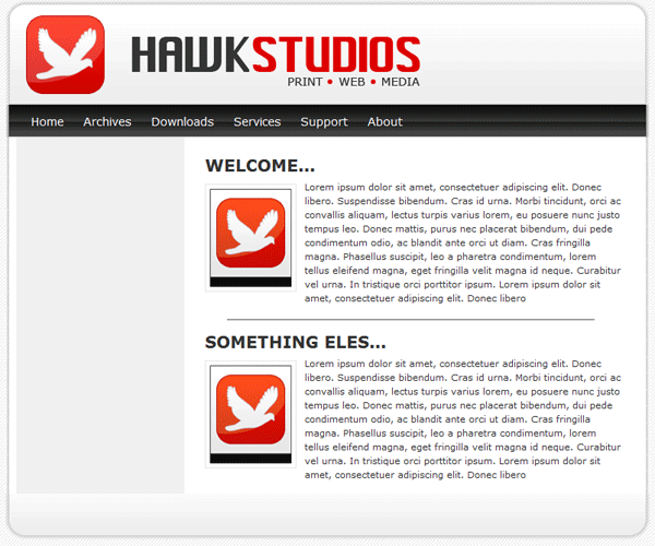
If you view your site now it should look like this.
You can see from the image above that we need to set our H2 tags in our style sheet and we need to add some styling to our images so everything is no so cramped up. We do this by adding this into our stylesheet.
/******************************************** WEBSITE LINKS ********************************************/ a, a:visited { text-decoration: none; background: inherit; color: #FB9233; } a:hover { text-decoration: underline; background: inherit; color: #93C600; } /******************************************** WEBSITE TEXT HEADERS ********************************************/ h1, h2, h3 { font-family: 'Trebuchet MS', Tahoma, Sans-serif; } h1 { font-size: 180%; font-weight: normal; color: #555; } h2 { font-size: 160%; color: #88ac0b; font-weight: normal; } h3 { font-size: 135%; color: #666666; } /******************************************** WEBSITE IMAGES ********************************************/ img { background: #fff; border: 1px solid #E5E5E5; padding: 5px; } img.float-right { margin: 5px 0px 10px 10px; } img.float-left { margin: 5px 10px 10px 0px; } h1, h2, h3, p { margin: 10px 15px; padding: 0; } ul, ol { margin: 5px 15px; padding: 0 25px; }
You can now see in the image below we have padding around our title and image.
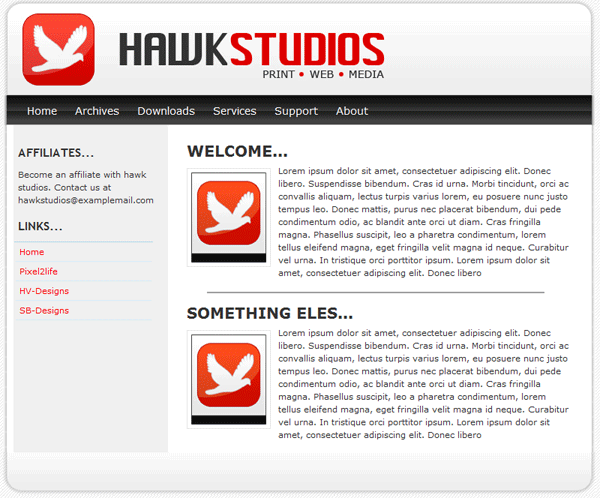
Now we need to add some content to our sidebar, so find “SIDE BAR LINKS HERE” and add the following code.
<!-- sidebar here --> <div id="sidebar"> <h2>AFFILIATES...</h2> <p>Become an affiliate with hawk studios. Contact us at [email protected] </p> <h2>LINKS...</h2> <ul class="sidemenu"> <li><a href="index.html">Home</a></li> <li><a href="http://www.pixel2life.com">Pixel2life</a></li> <li><a href="http://www.hv-designs.co.uk">HV-Designs</a></li> <li><a href="http://www.sb-designs.co.uk">SB-Designs</a></li> </ul> </div>
Our sidebar is not that different from our navigation apart from our list goes down instead of across. Our sidebar now looks like this.
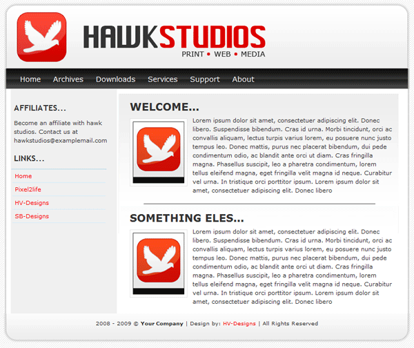
All that is left is to add our footer text which isnt alot of code.
<!--footer starts here--> <div id="footer"> <p>2008 - 2009 &amp;amp;copy; <strong>Your Company</strong> | Design by: <a href="http://www.hv-designs.co.uk">HV-Designs</a> | All Rights Reserved </p> </div>
Your website should now be finished, if you click your “design” tab within dreamweaver you should be able to see your website and add more text and images live as you go along. Your finished website should look like this.
Your ads will be inserted here by
AdSense Now!.
Please go to the plugin admin page to paste your ad code.
Your ads will be inserted here by
AdSense Now!.
Please go to the plugin admin page to paste your ad code.
Hello welcome to part 3 of the BLOOpress wordpress theme. Today we’ll be converting our CSS template into a working wordpress theme.
PREPARATION
Before we go ahead and start ripping away at PHP code we need to do abit of preparation work. The very first thing to do is download a program called “XAMPP”, this program will allow you to use your P.C as a server. I find its the best way to develop a website as you dont need to be connected to the internet, neither do you use any bandwidth uploading and editing files. You can use your own server if you wish. Il be using XAMPP for this tutorial so assuming you have XAMPP installed and setup to run wordpress, download the “starkers theme” by elliot jay stocks. Place your starkers theme inside your wordpress theme’s directory, then rename it too “BLOOpress Theme”. Delete the folder “style” and its contents as they arn’t needed. Create a new folder called “images” inside your themes folder, then copy all your image files from your CSS template then paste them inside the images folder in your themes folder.
Open up the “style.CSS” file from within the theme directory, you should be presented with some code which looks like this.
/* Theme Name: Starkers Theme URI: http://elliotjaystocks.com Description: The totally nude WordPress theme. Phwoar! (Based on the famous <a href="http://binarybonsai.com/kubrick/">Kubrick</a> by <a href="http://binarybonsai.com/">Michael Heilemann</a>) Version: 2 (WP2.6.2) Author: Elliot Jay Stocks Author URI: http://elliotjaystocks.com Tags: starkers, naked, clean, basic */ @import "style/css/reset.css"; @import "style/css/typography.css"; @import "style/css/layout.css";
The first chunk of code is very important,its not just abit of code telling you who designed the theme. Its actually what makes the theme recognisable to wordpress. We dont actually need all of the code, i like to use a nice stripped back look. Go ahead and change the details to suit your theme. You can also remove the 3 imported style sheets as we’ve already deleted them. My code now looks like this.
/* Theme Name: BLOOpress Theme URI: http://www.bloopress.co.uk Description: Just another wordpress theme by hv-designs Version: 1 (WP2.6.2) Author: Richard Carpenter */
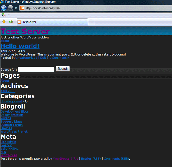
After you’ve edited the code we need to copy all our CSS styles from our CSS template’s style sheet and paste them inside the theme’s “style.CSS” file. Save your themes’s style sheet and activate the theme in wordpress, view your theme in your browser, you should be presented with something like this.
MODIFYING THE HEADER.PHP FILE
Open up header.PHP from the theme directory, you should be presented with a bunch of code similar to an ordinary HTML file only with a bit of PHP thrown in. The first chunk of code we can edit is the code between the TITLE tag.
<title> <?php if (is_home()) { echo bloginfo('name'); } elseif (is_404()) { echo '404 Not Found'; } elseif (is_category()) { echo 'Category:'; wp_title(''); } elseif (is_search()) { echo 'Search Results'; } elseif ( is_day() || is_month() || is_year() ) { echo 'Archives:'; wp_title(''); } else { echo wp_title(''); } ?> </title>
You can remove all the PHP from within the TITLE tag, replace the code with a simple title for your theme.
<title>BLOOpress "just another wordpress blog"</title>
The next thing we need to do is locate this chunk of text right at the bottom of the PHP file.
<h1><a href="<?php echo get_option('home'); ?>/"><?php bloginfo('name'); ?></a></h1> <p><?php bloginfo('description'); ?></p> <ul> <?php wp_list_pages('title_li='); ?> </ul>
All of this code can be removed as its not needed. The last tag at the bottom of the PHP file should be an opening “BODY TAG”. All the code we’ll be adding in a moment will go underneath the “body” tag. Open up your CSS template, locate all the code to do with the header, so we need to select our opening container DIV, the top nav, the header, the search box, the logo and the second nav.
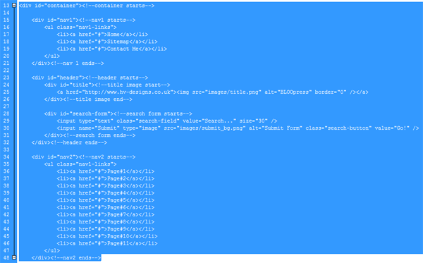
Copy all the hightlighted code and paste into your header.PHP file underneath the body tag. Once you’ve pasted the code save your .PHP file and check the theme in your browser, heres mine.
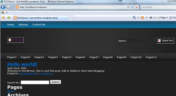
When you check your theme in your browser take note of the missing images, you should have two images that dont load up, the logo and the search button. The reason why they dont show up is because direct linking to images within the wordpress themes folder doesnt work its blocked by the htaccess file. The only way to get the images to load up is to either place the files in a directory outside the wordpress installation OR use some PHP code which looks like this.
<img src="<?php bloginfo('template_directory'); ?>/images/title.png" border="0" alt="BLOOpress" />
So in the header.PHP file inside the title DIV, you need to change the img src to the code above. It should looks something like this.
<div id="title"><!--title image start--> <a href="http://www.hv-designs.co.uk"><img src="<?php bloginfo('template_directory'); ?>/images/title.png" border="0" alt="BLOOpress" /></a> </div><!--title image end-->
As for the search form we need to get rid of it and replace with a wordpress search form. The one we put on was just an example. Remove the example search fields from within the “search-from” DIV.
<div id="search-form"><!--search form starts--> </div><!--search form ends-->
If you open up the “index.PHP” file and locate the following code.
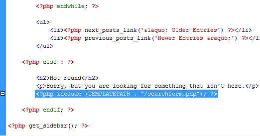
The code highlighted in the image above is a PHP include, which basically displays a PHP file within the PHP file but the file is seperated from the rest of the file…. hope that makes sense. Copy the code from the index.PHP file and paste it between our “search-form” DIV.
<div id="search-form"><!--search form starts--> <?php include (TEMPLATEPATH . "/searchform.php"); ?> </div><!--search form ends-->
Now we need to alter our PHP file “searchform.php”. Go ahead and open up the file in dreamweaver. You should be presented with a simple form structure some what similar to the one we had before.
<form method="get" id="searchform" action="<?php bloginfo('url'); ?>/"> <label class="hidden" for="s"><?php _e('Search for:'); ?></label> <input type="text" value="<?php the_search_query(); ?>" name="s" id="s" /> <input type="submit" id="searchsubmit" value="Search" /> </form>
The first thing we can do is remove line 2, the label class.
<form method="get" id="searchform" action="<?php bloginfo('url'); ?>/"> <input type="text" value="<?php the_search_query(); ?>" name="s" id="s" /> <input type="submit" id="searchsubmit" value="Search" /> </form>
Now we can start adding our personnal touches, in the first input type remove the bit of php from within the value attribute and replace with “Search…”. Then on the 2nd input type change the “value” attribute from search to “go!”.
<form method="get" id="searchform" action="<?php bloginfo('url'); ?>/"> <input type="text" value="Search..." name="s" id="s" /> <input type="submit" id="searchsubmit" value="Go!" /> </form>
Now add your classes, remember in our CSS template we had two styles one for the button and one for the text field.
<form method="get" id="searchform" action="<?php bloginfo('url'); ?>/"> <input type="text" value="Search..." name="s" id="s" class="search-field"/> <input type="submit" id="searchsubmit" class="search-button" value="Go!" /> </form>
We now need to replace our submit button with our picture button to do that we need change our 2nd input type from type to name. Then add another attribute called “type=image”. Next to the “type=image” attribute we need to add our image SRC.
<form method="get" id="searchform" action="<?php bloginfo('url'); ?>/"> <input type="text" value="Search..." name="s" id="s" class="search-field"/> <input name="submit" type="image" src="<?php bloginfo('template_directory'); ?>/images/submit_bg.png" alt="Submit Form" id="searchsubmit" class="search-button" value="Go!" /> </form>
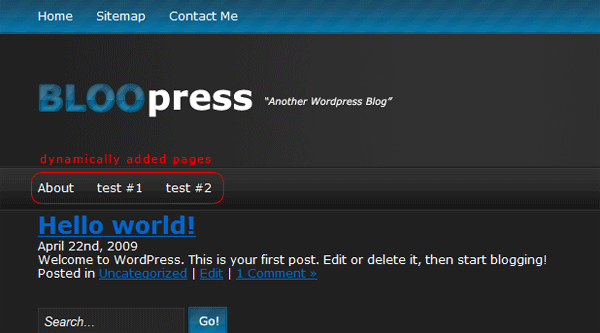
Save your header.PHP file and searchform.PHP file and test your theme in your browser. The search should be fully functional and look the same as our CSS template. Now you need to edit the links in the top navigation to point to where you need to.
<div id="nav1"><!--nav1 starts--> <ul class="nav1-links"> <li><a href="http://www.hv-designs.co.uk">Home</a></li> <li><a href="http://www.hv-designs.co.uk">Sitemap</a></li> <li><a href="http://www.hv-designs.co.uk">Contact Me</a></li> </ul> </div><!--nav 1 ends-->
Our second navigation is for our wordpress pages which will involve some PHP but if you want to you can add static links to other pages around the web, just use a setup similar to nav#1. To make the 2nd navigation use dynamic wordpress pages you first need to clear all the text we stuck in there when we coded our CSS template. Just leave one empty list.
<div id="nav2"><!--nav2 starts--> <ul class="nav1-links"> <li></li> </ul> </div><!--nav2 ends-->
We now need to use a chunk of PHP code to display our pages, the PHP code will get the pages from within wordpress and display each page as our CSS template did. Inbetween the LI tag add this code.
<div id="nav2"><!--nav2 starts--> <ul class="nav1-links"> <li><?php wp_list_pages('title_li='); ?></li> </ul> </div><!--nav2 ends-->
Thats it the header.PHP file is complete.
MODIFYING THE INDEX.PHP FILE
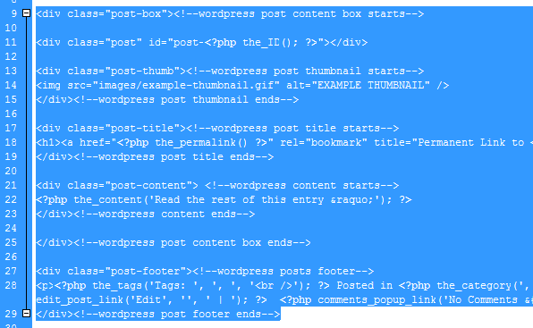
Our next file to modfiy is the index.PHP file, this file relates to the main page of the document, its the first page everyone see’s upon entering your blog. The bit we’ll be modifying now is the post loop, to get more of an idea on how the code works and how it relates to live post check the image below.
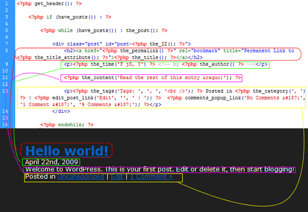
The code above is the part we’ll be editing now, like i said its known as the wordpress loop, everytime you make a post the same code is used over and over. Open up your CSS template and locate our example post. Our post started with an opening DIV of left-content, so copy the first DIV of left-content and paste it under the PHP code “get header”. Our post starts with “post-box” paste our class of post-box underneath the PHP code “have posts”. Add your left-content ending DIV right at the bottom of the file above the “get sidebar” PHP code.
<?php get_header(); ?> <div id="left-content"><!--left content starts--> <?php if (have_posts()) : ?> <?php while (have_posts()) : the_post(); ?> <div class="post-box"><!--wordpress post content box starts-->
Underneath our post loop add the ending DIV for left-content.
<div class="post-box"><!--wordpress post content box starts--> <div class="post" id="post-<?php the_ID(); ?>"> <h2><a href="<?php the_permalink() ?>" rel="bookmark" title="Permanent Link to <?php the_title_attribute(); ?>"><?php the_title(); ?></a></h2> <p><?php the_time('F jS, Y') ?> <!-- by <?php the_author() ?> --></p> <?php the_content('Read the rest of this entry &amp;raquo;'); ?> <p><?php the_tags('Tags: ', ', ', '<br />'); ?> Posted in <?php the_category(', ') ?> | <?php edit_post_link('Edit', '', ' | '); ?> <?php comments_popup_link('No Comments &amp;#187;', '1 Comment &amp;#187;', '% Comments &amp;#187;'); ?></p> </div>
The next part generally involves moving chunks of code around, copy and pasting our DIV’s from our CSS template over to our post loop. We’ll start from the top and work our way down. There is a floating ending DIV above our ending left-content DIV, this needs to be moved up to the begining of our post loop.
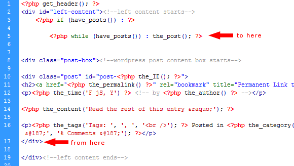
In the loop there is a H2 tag, which is our post title, change the H2 tag to a H1 tag. Then wrap the H1 tag in our post title class from our CSS template. Above the post-title class add our post-thumb class.
<?php get_header(); ?> <div id="left-content"><!--left content starts--> <?php if (have_posts()) : ?> <?php while (have_posts()) : the_post(); ?> <div class="post-box"><!--wordpress post content box starts--> <div class="post" id="post-<?php the_ID(); ?>"></div> <div class="post-thumb"><!--wordpress post thumbnail starts--> <img src="images/example-thumbnail.gif" alt="EXAMPLE THUMBNAIL" /> </div><!--wordpress post thumbnail ends--> <div class="post-title"><!--wordpress post title starts--> <h1><a href="<?php the_permalink() ?>" rel="bookmark" title="Permanent Link to <?php the_title_attribute(); ?>"><?php the_title(); ?></a></h1> </div><!--wordpress post title ends-->
Underneath our post-title class we need to add our post-content class, inside the post-content class you need to add the PHP code for our wordpress content, you can refer back to the post loop image i created ealier.
<div class="post-content"> <!--wordpress content starts--> <?php the_content('Read the rest of this entry &amp;raquo;'); ?> </div><!--wordpress content ends-->
Underneath our post-content class we need to add our ending content box DIV then add our footer class. Inside our footer class we need to add the remaining code which is the PHP code for the author, time & date and number of comments. Try and keep the whole thing nice and tidy if you can. The new post loop looks like this.
<div class="post-box"><!--wordpress post content box starts--> <div class="post" id="post-<?php the_ID(); ?>"></div> <div class="post-thumb"><!--wordpress post thumbnail starts--> <img src="images/example-thumbnail.gif" alt="EXAMPLE THUMBNAIL" /> </div><!--wordpress post thumbnail ends--> <div class="post-title"><!--wordpress post title starts--> <h1><a href="<?php the_permalink() ?>" rel="bookmark" title="Permanent Link to <?php the_title_attribute(); ?>"><?php the_title(); ?></a></h1> </div><!--wordpress post title ends--> <div class="post-content"> <!--wordpress content starts--> <?php the_content('Read the rest of this entry &amp;raquo;'); ?> </div><!--wordpress content ends--> </div><!--wordpress post content box ends--> <div class="post-footer"><!--wordpress posts footer--> <p><?php the_tags('Tags: ', ', ', '<br />'); ?> Posted in <?php the_category(', ') ?> | <?php the_time('F jS, Y') ?> <!-- by <?php the_author() ?> --> |<?php edit_post_link('Edit', '', ' | '); ?> <?php comments_popup_link('No Comments »', '1 Comment »', '% Comments »'); ?></p> </div><!--wordpress post footer ends-->
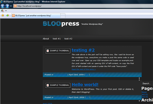
Save your file and test your theme in your browser, mine looks like this. The posts display how we want them to, ignore all the rest, it will loook quite messy still as were yet to add code to the other files.
Your ads will be inserted here by
AdSense Now!.
Please go to the plugin admin page to paste your ad code.
Thats it for our index.PHP file for now, we’ll come back later and sort out our thumbnail for our posts, as at the minute it still contains our example image, we might also have to do some minor fixes, but we’ll see how it goes.
MODIFYING THE SIDEBAR.PHP FILE
Once you’ve opened up your sidebar.PHP file highlight everything from LINE 4 to LINE 43, and hit the delete key as the code isn’t needed.
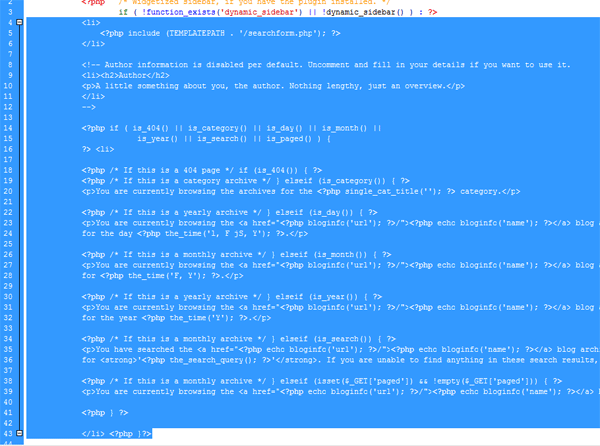
Once you’ve done that copy and paste over all your sidebar code from the CSS template.
<?php /* Widgetized sidebar, if you have the plugin installed. */ if ( !function_exists('dynamic_sidebar') || !dynamic_sidebar() ) : ?> <div id="right-content"><!--sidebar starts--> <div id="stay-connected"><!--stay connected box starts--> <h1>Stay Connected...</h1> <div class="sc-icon"><!--RSS icon--> <a href="#"><img src="<?php bloginfo('template_directory'); ?>/images/rss_icon.png" border="0" alt="RSS" /></a> </div><!--RSS icon ends--> <div class="icon-text"><!--RSS icon text--> <p class="subscribe">Subscribe via RSS</p> <p class="subscribe2">Updates in your reader</p> </div><!--RSS icon text ends--> <div class="sc-icon"><!--TWITTER icon--> <a href="#"><img src="<?php bloginfo('template_directory'); ?>/images/twitter_icon.png" border="0" alt="TWITTER" /></a> </div><!--TWITTER icon ends--> <div class="icon-text"><!--TWITTER icon text--> <p class="subscribe">Subscribe via twitter</p> <p class="subscribe2">Updates on your twitter</p> </div><!--TWITTER icon text ends--> <div class="sc-icon"><!--EMAIL icon--> <a href="#"><img src="<?php bloginfo('template_directory'); ?>/images/mail_icon.png" border="0" alt="EMAIL" /></a> </div> <!--EMAIL icon ends--> <div class="icon-text"><!--EMAIL icon text--> <p class="subscribe">Subscribe via email</p> <p class="subscribe2">Updates in your mailbox</p> </div><!--EMAIL icon text ends--> </div><!--stay connected box ends--> <ul> <?php wp_list_pages('title_li=<h2>Pages</h2>' ); ?> <li><h2>Archives</h2> <ul> <?php wp_get_archives('type=monthly'); ?> </ul> </li> <?php wp_list_categories('show_count=1&amp;title_li=<h2>Categories</h2>'); ?> <?php /* If this is the frontpage */ if ( is_home() || is_page() ) { ?> <?php wp_list_bookmarks(); ?> <li> <h2>Meta</h2> <ul> <?php wp_register(); ?> <li><?php wp_loginout(); ?></li> <li><a href="http://validator.w3.org/check/referer" title="This page validates as XHTML 1.0 Transitional">Valid <abbr title="eXtensible HyperText Markup Language">XHTML</abbr></a></li> <li><a href="http://gmpg.org/xfn/"><abbr title="XHTML Friends Network">XFN</abbr></a></li> <li><a href="http://wordpress.org/" title="Powered by WordPress, state-of-the-art semantic personal publishing platform.">WordPress</a></li> <?php wp_meta(); ?> </ul> </li> <?php } ?> <?php endif; ?> </ul> </div><!--sidebar ends--> </div><!--container ends-->
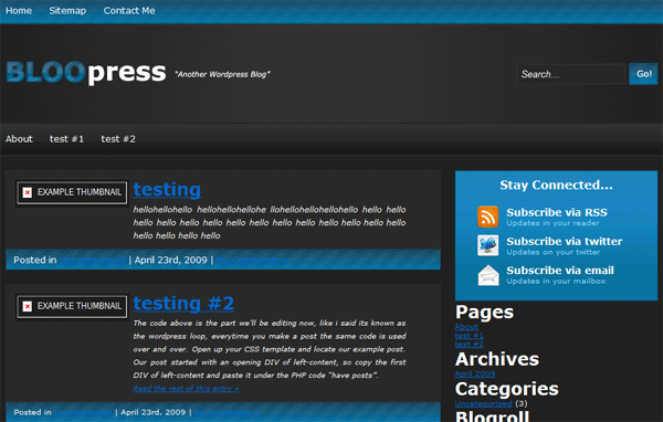
Once you’ve pasted in your code you’ll need update your image paths on your icons with PHP, just like we did our blog title image and search submit button. You’ll also need to link your icons to the relivant source, I.E twitter, rss etc… Save your sidebar.PHP file and check your theme in your browser.
MODIFYING THE FOOTER.PHP FILE
Open up footer.PHP, select all the code and hit the delete key. Open your CSS template and copy all the code for the footer.
Paste all your footer code into your footer.PHP file. Save the file then test your theme inside your browser. We’ve now modified some of the main files for our theme, its now time to make a start on some of the other files.
MODIFYING THE SEARCH.PHP FILE
The search.PHP file is the file which is called when a search is made, the search.PHP file provides you with the search results, the file is structure pretty much the same as the index.PHP file, which will make things easier to edit. Open up your search.PHP file, underneath the first line of PHP code (get header) add your opening DIV of left-content.
<?php get_header(); ?> <div id="left-content"><!--left content starts-->
Scroll down right to the bottom of your file, just above the get sidebar PHP code add your ending left-content DIV.
</div><!--left content ends--> <?php get_sidebar(); ?> <?php get_footer(); ?>
Head over to your index.PHP file, highlight and copy your post loop to the clipboard.
Highlight the post loop inside the search.PHP file and hit delete.
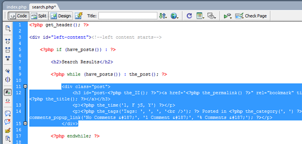
Paste in your code from the index.PHP file. Save your work and test out the search function on your theme, providing you have some posts you should see your search results display somet what similar to the index.PHP file.
MODIFYING THE PAGE.PHP FILE
The page.PHP file relates to actual pages that you have on your blog. The pages will also be displayed the same as the index.PHP file but instead of being loads of seperate boxes imagine it as one big post box. Inside your page.PHP file you need to add again the left-content DIV, place the opening DIV underneath the first big PHP (get header) and the ending DIV above the get sidebar bit of PHP code.
<?php get_header(); ?> <div id="left-content"><!--left content starts--> <?php if (have_posts()) : while (have_posts()) : the_post(); ?> <div class="post" id="post-<?php the_ID(); ?>"> <h2><?php the_title(); ?></h2> <?php the_content('<p class="serif">Read the rest of this page »</p>'); ?> <?php wp_link_pages(array('before' => '<p><strong>Pages:</strong> ', 'after' => '</p>', 'next_or_number' => 'number')); ?> </div> <?php endwhile; endif; ?> <?php edit_post_link('Edit this entry.', '<p>', '</p>'); ?> </div><!--left content ends--> <?php get_sidebar(); ?> <?php get_footer(); ?>
Underneath the DIV CLASS “post” you need to add our “post-box” class.
<?php get_header(); ?> <div id="left-content"><!--left content starts--> <?php if (have_posts()) : while (have_posts()) : the_post(); ?> <div class="post" id="post-<?php the_ID(); ?>"> <div class="post-box"><!--wordpress post content box starts--> <?php the_content('<p class="serif">Read the rest of this page &amp;raquo;</p>'); ?> <?php wp_link_pages(array('before' => '<p><strong>Pages:</strong> ', 'after' => '</p>', 'next_or_number' => 'number')); ?> </div> <?php endwhile; endif; ?>
Underneath the PHP endwhile; endif we need to add our closing post-box DIV. Then simply add our post-fooer class. Inbetween our post footer class add the PHP edit_post_link. The page.PHP file should something like this.
<?php get_header(); ?> <div id="left-content"><!--left content starts--> <?php if (have_posts()) : while (have_posts()) : the_post(); ?> <div class="post" id="post-<?php the_ID(); ?>"> <div class="post-box"><!--wordpress post content box starts--> <?php the_content('<p class="serif">Read the rest of this page &amp;raquo;</p>'); ?> <?php wp_link_pages(array('before' => '<p><strong>Pages:</strong> ', 'after' => '</p>', 'next_or_number' => 'number')); ?> </div> <?php endwhile; endif; ?> </div><!--wordpress post content box ends--> <div class="post-footer"><!--wordpress posts footer--> <?php edit_post_link('Edit this entry.', '<p>', '</p>'); ?> </div><!--wordpress post footer ends--> </div><!--left content ends--> <?php get_sidebar(); ?> <?php get_footer(); ?>
If you have any pages on your blog, save your work and try them out.
MODIFYING THE ARCHIVE.PHP FILE
The archive page again is styled in pretty much the same way as the index.PHP file. We start by adding our content-left class underneath our get header PHP code, then ending it above the get sidebar PHP code. We then have to locate the post loop, add our post-box class underneath the “have posts PHP”.
<?php get_header(); ?> <div id="left-content"><!--left content starts--> <?php if (have_posts()) : ?> <?php $post = $posts[0]; // Hack. Set $post so that the_date() works. ?> <?php /* If this is a category archive */ if (is_category()) { ?> <h2>Archive for the ‘<?php single_cat_title(); ?>’ Category</h2> <?php /* If this is a tag archive */ } elseif( is_tag() ) { ?> <h2>Posts Tagged ‘<?php single_tag_title(); ?>’</h2> <?php /* If this is a daily archive */ } elseif (is_day()) { ?> <h2>Archive for <?php the_time('F jS, Y'); ?></h2> <?php /* If this is a monthly archive */ } elseif (is_month()) { ?> <h2>Archive for <?php the_time('F, Y'); ?></h2> <?php /* If this is a yearly archive */ } elseif (is_year()) { ?> <h2>Archive for <?php the_time('Y'); ?></h2> <?php /* If this is an author archive */ } elseif (is_author()) { ?> <h2>Author Archive</h2> <?php /* If this is a paged archive */ } elseif (isset($_GET['paged']) && !empty($_GET['paged'])) { ?> <h2>Blog Archives</h2> <?php } ?> <?php while (have_posts()) : the_post(); ?> <div class="post-box"><!--wordpress post content box starts-->
Underneath the PHP_the_content tag we need to close our post-box DIV.
<?php while (have_posts()) : the_post(); ?> <div class="post-box"><!--wordpress post content box starts--> <h3 id="post-<?php the_ID(); ?>"><a href="<?php the_permalink() ?>" rel="bookmark" title="Permanent Link to <?php the_title_attribute(); ?>"><?php the_title(); ?></a></h3> <p><?php the_time('l, F jS, Y') ?></p> <?php the_content() ?> </div><!--wordpress post content box ends-->
Then underneath our post-box ending DIV we need to start our post-footer class, inside our post footer class we use the META data from the post loop. Then underneath our P tag with the the PHP code for “the_time” add a BR tag. Doing this will space out the post abit so it isnt all muggled together.
<?php while (have_posts()) : the_post(); ?> <div class="post-box"><!--wordpress post content box starts--> <h3 id="post-<?php the_ID(); ?>"><a href="<?php the_permalink() ?>" rel="bookmark" title="Permanent Link to <?php the_title_attribute(); ?>"><?php the_title(); ?></a></h3> <p><?php the_time('l, F jS, Y') ?></p> <br /> <?php the_content() ?> </div><!--wordpress post content box ends--> <div class="post-footer"><!--wordpress posts footer--> <p><?php the_tags('Tags: ', ', ', '<br />'); ?> Posted in <?php the_category(', ') ?> | <?php edit_post_link('Edit', '', ' | '); ?> <?php comments_popup_link('No Comments &amp;#187;', '1 Comment &amp;#187;', '% Comments &amp;#187;'); ?></p> </div><!--wordpress post footer ends-->
MODIFYING THE SINGE.PHP & COMMENTS.PHP FILE
These two files ive left untill last because they are the most fiddly especially the comments.PHP file. We’ll start with the sing.PHP file as this wont take too long to do, this file is for out posts, once you click on a post it loads this file. We modify the single.PHP file in the same way we did our other files, we need to add our left content DIV at the top underneath our get header PHP code, then we need to end it at the bottom of the file above the get footer PHP code. If you want the sidebar to be in with the single.PHP file then you need to add the get sidebar PHP tag.
<?php get_header(); ?> <div id="left-content"><!--left content starts-->
</div><!--left content ends--> <?php get_sidebar(); ?> <?php get_footer(); ?>
We’ll then begin to add our post CSS styles from our style sheet again, this part will be similar to the the page.PHP file we edited earlier. Under the PHP code have posts add our psot-box class then underneath the PHP code the_content add your closing DIV.
<?php get_header(); ?> <div id="left-content"><!--left content starts--> <?php if (have_posts()) : while (have_posts()) : the_post(); ?> <div class="post-box"><!--wordpress post content box starts--> <div class="post" id="post-<?php the_ID(); ?>"> <h2><?php the_title(); ?></h2> <?php the_content('<p>Read the rest of this entry »</p>'); ?> </div><!--wordpress post content box ends-->
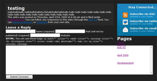
The single.PHP file is complete, move onto your comments.PHP file. If you take alook at one of your posts, you’ll see what a mess the comments area is in.
The first we can do to tidy it up abit is shorten the big text area and add some spaceing between each form field. We’ll start with the big text box, scroll right down to the bottom and locate the form field. The part of code you want to look for is…
<textarea name="comment" id="comment" cols="100%" rows="10" tabindex="4"></textarea>
Take note of the “cols attribute” see how it says 100% we need to change that to 72. So the code now becomes.
<textarea name="comment" id="comment" cols="72" rows="10" tabindex="4"></textarea>
To align each of the text boxes, underneath each other add opening & closing P Tags either end of the code. After the last P tag add a BR tag.
<p><input type="text" name="author" id="author" value="<?php echo $comment_author; ?>" size="22" tabindex="1" <?php if ($req) echo "aria-required='true'"; ?> /> <label for="author">Name <?php if ($req) echo "(required)"; ?></label></p> <p><input type="text" name="email" id="email" value="<?php echo $comment_author_email; ?>" size="22" tabindex="2" <?php if ($req) echo "aria-required='true'"; ?> /> <label for="email">Mail (will not be published) <?php if ($req) echo "(required)"; ?></label></p> <p><input type="text" name="url" id="url" value="<?php echo $comment_author_url; ?>" size="22" tabindex="3" /> <label for="url">Website</label></p><br />
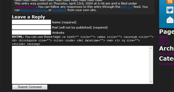
Your comments area should now look something like this.
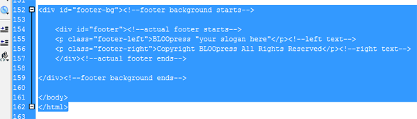
The footer could do with being pushed down alittle, open up your style sheet and add “margin-top: 40px;” to the #footer-bg DIV. Now were going to add some styling to our actual comments, your going to need to add new styles to your style sheet but we’ll try and use the ones all ready made. Add these styles into your style sheet.
.float-right { float:right; } ul, ol { list-style:none; }
Begin to add some of your styles to the comments loop. Im going to style each comment to look like one of our wordpress posts.
<!-- You can start editing here. --> <?php if ($comments) : ?> <h3 id="comments"><?php comments_number('No Responses', 'One Response', '% Responses' );?> to &amp;#8220;<?php the_title(); ?>&amp;#8221;</h3> <ol> <?php foreach ($comments as $comment) : ?> <div class="post-box"><!--wordpress post content box starts--> <p <?php echo $oddcomment; ?>id="comment-<?php comment_ID() ?>"> <div class="float-right"><?php echo get_avatar( $comment, 72 ); ?></div> <h2><?php comment_author_link() ?></h2> <?php if ($comment->comment_approved == '0') : ?> <br /> <p>Your comment is awaiting moderation.</p> <br /> <?php endif; ?> <?php comment_text() ?> </p> </div><!--wordpress post content box ends--> <div class="post-footer"><!--wordpress posts footer--> <p><a href="#comment-<?php comment_ID() ?>" title=""><?php comment_date('F jS, Y') ?> at <?php comment_time() ?></a> <?php edit_comment_link('edit','&amp;nbsp;&amp;nbsp;',''); ?></p> </div><!--wordpress post footer ends-->
Change post-box from post-box to post-box2 and change post-footer to post-footer2. Now paste these styles into your style sheet.
.post-box2 { background-color: #292929; /*adds a background color to our post box*/ border: 1px solid #2f2f2f; /*gives our box a 1px border*/ padding: 10px; /*adss 10px padding all the way around our box*/ float: left; /*floats our box left inside "left-content div*/ width: 578px; /*gives our box a width of 580px*/ margin-top: 10px; } .post-footer2 { border: 1px solid #0c5b7d; /*adss 10px padding all the way around our box*/ float: left; /*floats our box left inside "left-content div*/ width: 578px; /*gives our box a width of 580px*/ background-image: url(images/post_footer_bg.png); /*adds background image*/ background-repeat: repeat-x; /*repeats background horizontally*/ height: 20px; /*gives our class a height of 20px*/ padding-top: 6px; /*adss 6px padding to the top*/ padding-right: 10px; /*adds 10 px padding to the right*/ padding-left: 10px; /*adds 10px padding to the left*/ margin-bottom: 5px; /*adds a 20px margin between each post*/ }
While your in your style sheet you can also paste in these styles.
a:link { color: #FFFFFF; text-decoration: none; } a:visited { text-decoration: none; color: #FFFFFF; } a:hover { text-decoration: none; color: #0099FF; } h1,h2,h3,h4 { color: #0c78a8; } .post-title h1 a{ color: #0c78a8; /*h1 tag text color*/ } .post-box2 p { margin: 5px 0 10px; } #left-content p{ margin: 5px 0 10px; }
Should clean some of our bad link colors up and some spacing issues. Now finally re-open your sidebar.PHP file, locate all H2 tags and replace with H4 tags. Re-open your index.PHP file and locate your example thumbnail.
<div class="post-thumb"><!--wordpress post thumbnail starts--> <img src="images/example-thumbnail.gif" alt="EXAMPLE THUMBNAIL" /> </div><!--wordpress post thumbnail ends-->
Delete your exampple thumbnail and replace with this.
<div class="post-thumb"><!--wordpress post thumbnail starts--> <a href="<?php $values = get_post_custom_values("url"); echo $values[0]; ?>" title="<?php the_title(); ?>"> <img src=" <?php $values = get_post_custom_values("image"); echo $values[0]; ?>" alt="<?php the_title(); ?>" /></a> </div><!--wordpress post thumbnail ends-->
This will now allow you to insert you thumbnail and link for the thumbnail through the custom fields part within creating a wordpress post. You should now have something you can use for your own website, dont get me wrong this theme isnt 5 stars, but should learn you some basics on getting started with wordpress.
Thats all from me, hope you’ve enjoy this LONG tutorial. Im sorry some things are abit short and sweet but ive had such little time to get this one out and live. Feel free to ask any questions il be happy to help you in any way i can.
Your ads will be inserted here by
AdSense Now!.
Please go to the plugin admin page to paste your ad code.
Your ads will be inserted here by
AdSense Now!.
Please go to the plugin admin page to paste your ad code.
The Cisco Certified Network Professional certification or the CCNP validates an employee’s ability to implement, plan, troubleshoot and plan with specialists on creating advanced solutions for its customers. Typically an employee obtains their CCNP after acquiring at least one year of hands on experience in the field of networking. These employees are ready to travel on to the next step in advancing their skills. Those who accomplish this status have shown that they possess the skills required to perform such roles as a network technician, or a systems or network engineer.
There are three professional level exams candidates will need to complete order to obtain their CCNP Cisco Certification.
•642-902 ROUTE
Your ads will be inserted here by
AdSense Now!.
Please go to the plugin admin page to paste your ad code.
•642-813 SWITCH
•642-832 TSHOOT
You can prepare for these exams at tests live, where you will find all the information and materials you need to pass.
Interestingly enough, the CCNP certification was listed as number 9 on the list of highest earning technical certifications. The average salary was penned around $84,161. By equipping yourself with a CCNP certification, you are putting yourself on the fast track to managing some of today’s most complex business networks, optimizing infrastructure, working with core technologies and keeping application secure and efficient.
Your ads will be inserted here by
AdSense Now!.
Please go to the plugin admin page to paste your ad code.
Your ads will be inserted here by
AdSense Now!.
Please go to the plugin admin page to paste your ad code.
Today I want to share a review with you guys about what I predict as the next big application in web design, Get Polka. A few weeks back I was contacted by the creators of Get Polka asking if I had heard of the application and if I had wanted to do a review of the application. I am always looking to review and beta test multiple applications to see what is happening in the design world, so naturally I jumped at the chance to review another application. When I started the beta version of Get Polka it immediately grabbed my attention, so I began to take greater notice of the application and research its competitors. What I found out about the competitors, and what I gained from the application in the short time I used it, made me want to share this review with our readers so you guys can take advantage of this before it takes off. So let’s begin the review.
The Website
The first thing that you notice about the application is its website. When talking about an application’s website it is basically one big landing page. The application has a very limited time to grab your attention to make you want to read more into it. I think that Get Polka did a very good job on their landing page for what you see.


Right away you see the logo, a feedback bar, and the menu. Now, while this does catch your eye I feel like they fall a little short on getting their product in the spotlight right away. While the giant image will make you want to scroll down just to see what it is a picture of you are not scrolling down to actually learn about the application. If I was to re-design the home page I would place the image off to the right or left with some information on whatever side the image wasn’t on to really explain the application and show it off all ‘above the fold’.
Outside of that issue I think the website itself is very well designed. I love the subtle background and think it fits well with the whole application concept. I don’t like that it fades out into just a mono color background. I would love to see it repeated throughout the entire website, but that is my design opinion rather than an actual falling out regarding the website. The jQuery on the website is done really well and I love the natural scrolling motion and the separation of the different areas. All in all, however, the website is very well done and serves its purpose.
The Dashboard
Get Polka has a very simple sign in process that requires you to simply enter your email address and some bits of information like your name. I love the simple sign up form and then it immediately takes you to your dashboard, where you can begin using the application.
The design aspect of the application is very well done. From the log-in screen all the way into the project you are collaborating on the UI remains the same.

I really like the simplicity of the layout as it doesn’t clutter with unnecessary information and gets straight to the point. The first, and pretty much only, thing that you see when in your dashboard is the projects you are collaborating on. I do feel that they could use more of the screen for the application and maybe put in some thumbnails of the project instead of just the name, but those are all things that can come as the application grows and are aesthetic issues as opposed to usability issues.

Projects
Once you get into your projects area of your dashboard you can see a thumbnail of each design in the project. My project that I used for this review was the re-design of HV-Designs. As I was going through and testing I uploaded each individual page that was designed for the new design. The screenshot below only shows one page, but you can add as many different pages as you need per project
Your ads will be inserted here by
AdSense Now!.
Please go to the plugin admin page to paste your ad code.
. 
Now, here is where one of my main usability issues with the dashboard comes into play. When you click the Get Polka logo it should, based on UX principles, take you back to the home page of the dashboard as opposed to the home page of the website. I am sure this is something simple that my friends over at Get Polka will have already taken care of and fixed by the time this review comes out.
Uploading Files
Now we come to my favorite area of the dashboard. The creators over at Get Polka want to simplify your collaboration experience as much as possible, so they do something that I have rarely seen done in an application. The offer a drag and drop service that allows you to drag over your image as opposed to going through the upload steps and finding the right file. While that may not seem like very much work when reading it for someone like me that has literally thousands of files on my computer and hundreds of folders just on my desktop alone that can take more time than I want to dedicate. At first the drag and drop was just as much of a hastle if I was creating older projects, but as I create projects I am currently working on I already have their folder open anyway so I simple shrink screens, drag, drop, and it is uploading and I am ready to rock and roll with sharing.

Of course they do not limit to only a drag and drop service. You can choose to use a standard upload service if that is what you are more comfortable with. Either way you go you retain the same look and feel as the remainder of the dashboard.

The Application
Now we get to the application itself. The application offers so many different options that I am only going to skim through them and show you what they look like. When you guys get into the application you will see just what I mean. So, let’s start with one of the biggest things in the application that make it what it is; the comments. GP offers an amazing comment system and each comment starts its own thread, with its own number. As you delve deeper into the application, with more collaborators, you can hide and view layers/comments based on the individual collaborator. The commenting system was very well done and is definitely a big plus for the application. My only issue right now with the comment system is that the comments do not update in real time, meaning if two people are in there at the same time they will have to close the design and re-open it to see what the other person posted. It’s still a new program to me so I don’t know how often people with be in there are the same time, but I have used it for my last client and during the testing and two people were in there together more often than not. I am curious to see if this is still an issue as I begin using the full version and incorporating it into all my clients.

The next thing to talk about, which I already kind of touched on, is the collaborators. The choice to put each collaborator on what is, essentially , their own layer was a very good choice. This way you can see what each individual person is saying about the design, as well as seeing what everyone is saying about a certain area. When dealing with clients this helps, especially when you are working with a committee that has to decide on the website.

Now you can add other collaborators as well, which was a great option. I do not believe that there is a limit to the number of people you can collaborate on a project with, so go to your heart’s desire. The other great thing is that you add collaborators based on project and not based on design, so you are saving yourself some time. I do hope that they add the ability to add people strictly by design in the future. I know when I work with some clients there are people that I only want to be able to see one page of the design at the moment, or a different version of the page with a watermark when it comes to rough drafts. All in all though the entire application is very well done and can only get better as new versions are released.

I want to give a big shout out to Ajay Mathew, the co-creator of Get Polka and the man that reached out to me to review this design. Thanks for all the hard work Ajay and the entire team! Keep it up and we will keep using the project and watching it grow exponentially!
Visit the Site!
Your ads will be inserted here by
AdSense Now!.
Please go to the plugin admin page to paste your ad code.
Your ads will be inserted here by
AdSense Now!.
Please go to the plugin admin page to paste your ad code.
I was given the chance by Vectorpack.net to download and review the amazing bundle they have available. For the small price tag on the bundle you get some amazing vector works and an awesome WordPress theme. If you have the extra $37 and want to grab a great bundle be sure to check out the review, what comes in the pack, and then pick it up!
Mega Design Bundle 3 from Vectorpack.net Available for only $37!
As they are aware for your need of great design resources, the guys at Vectorpack.net have created a new Mega Design Bundle which contains over 900 design elements and which is available, for a limited period of time, for only $37, although its real value is that of $550. This great Mega Design Bundle is a collection of all the elements a designer needs in his everyday work, from vectors to PS brushes, from abstract backgrounds to seamless patterns, from web elements to textures and wordpress themes. Check out this Mega Design Bundle and buy now all these incredible resources which are available now for only $37!
As these design elements come from Vectorpack.net, you can be sure to expect top notch quality!
If you are to purchase this Mega Design Bundle, you are to get the following elements:
– 210 PS brushes
– 396 vector elements
Your ads will be inserted here by
AdSense Now!.
Please go to the plugin admin page to paste your ad code.
– 162 web elements
– 66 abstract backgrounds
– 70 seamless patterns
– 30 textures
– 1 wordpress theme
Moreover, you are to get an extended license for these products, and you will get your download immediately after you buy the Mega Bundle. Remember that this is a limited offer, which will be available for you only till the 18th of March. So make sure to purchase this great deal today in order for you not to miss these incredible design elements!
As you already know it, Vectorpack.net makes such incredible deals every once in a while, so, if you don’t want to miss the next Mega Design Bundle, make sure to subscribe to their newsletter!
Some of What’s Included

Download the Bundle Today!
Your ads will be inserted here by
AdSense Now!.
Please go to the plugin admin page to paste your ad code.
Your ads will be inserted here by
AdSense Now!.
Please go to the plugin admin page to paste your ad code.
Lately I have been working with a lot of smaller businesses, and I have noticed one simple trend with them. As a professional designer I take very few brand new businesses as clients, by personal preference, but I do deal with a lot of re-designs. The main thing that I have noticed with my latest few clients is that their designer did not stress the importance of Social Media in today’s world. Real life experience is the root of ninety percent of my articles/tutorials.
So what is the importance of Social Media Marketing? It is not necessarily an important aspect of a web presence, as much as it is a necessity of your web presence.
It’s Your First Impression
It used to be that your store front was a person’s first impression of your business. Then it graduated to your website being your first impression, and now we have graduated once again to Social Media being your first impression to much of the internet. That’s not to say your website isn’t vital, because it is still the most vital aspect to a web presence, but your social media presence is becoming just as important.

Facebook, Twitter, Zerply, LinkedIn, and a million other social media sites are visited every single day by millions of people. If your friend had a bad experience at Taco Bell you are going to hear about it first via Facebook or Twitter. Knowing that, as a business would you rather be able to talk about that person’s experience or hear about it days down the road when you start losing business.
Now, naturally as a web designer we want what is best for our clients, right? Well, I wouldn’t say we want what is best for them all the time, but we have reputations to uphold. The whole reason your client wanted the website was to build their business, and the more success that they have the more success you will have.
How to Tell Your Clients
I can guarantee that you will get that one client at some point that will want to harass you about adding a Facebook or Twitter. You will get the standard, “That’s too much work” or “we don’t have time” and you have to know how to combat those. You need examples, both professionally and personally, to give your clients on the importance of social media.
Your ads will be inserted here by
AdSense Now!.
Please go to the plugin admin page to paste your ad code.

If social media was not that important then why would you see such a big presence by companies like Pepsi, Coke, McDonalds, and even Wal-Mart? Your clients may come back with the fact that they are huge companies and can afford to hire a team dedicated to Social Media, and that may be slightly true. You need to explain to them though that these big companies realize that Social Media is the key to gaining new customers, and the only way to do that is to give them a reason. You can also explain to your clients that these businesses are big enough that if it wasn’t an essential part of business in today’s world why would the big companies waste their time?
Utilizing Social Media for Your Client
Outside the obvious Twitter and Facebook buttons for the website you are designing, how else can you utilize Social Media? First you need you explain to your client that they must offer potential clients a reason to follow their pages. Once you have done that you must incorporate that into your pages and into the various designs. Having a Facebook and Twitter page is great, but you really want them to stand out.

Once the design is completed you will want to explain to your client how to utilize their Social Media. While Facebook and Twitter are great places to spread the word about your business people are also following you to get some interaction, especially if you are a smaller business. It is essential that you explain to your client that if they only have time to make two posts a week that one of those be interacting with those that follow/like their page.
Personalization of a Facebook or Twitter page will take it to that next level and show customers that you really do care and that you are a real entity instead of just some business wanting their money.

Conclusion
With the importance of Social Media moving forward in the day it is essential that you make sure your clients understand this. What are some tips and tricks that you guys use for your clients to show them how essential Social Media is?
Your ads will be inserted here by
AdSense Now!.
Please go to the plugin admin page to paste your ad code.
Your ads will be inserted here by
AdSense Now!.
Please go to the plugin admin page to paste your ad code.
The results of our hosting giveaway are in! I want to first thank all the entrants for their participation and we will be setting up more giveaways to thank you guys for your support! So, now to what you really care about, the WINNER!
Your ads will be inserted here by
AdSense Now!.
Please go to the plugin admin page to paste your ad code.
The winner of our giveaway is Lawrence777. We have replied to your tweet. To claim your prize please send us an email to the admin email on the contact page so we can get you the details of your hosting account! Congratulations again, and be sure to keep watching the site for more excellent tutorials and big giveaways.
Your ads will be inserted here by
AdSense Now!.
Please go to the plugin admin page to paste your ad code.
Your ads will be inserted here by
AdSense Now!.
Please go to the plugin admin page to paste your ad code.
Zyma.com one of the fastest growing hosting companies in the UK have partnered with hv-?designs.co.uk to give-?away 5 lucky winners a web hosting account completely FREE for one whole year! Zyma’s customer base covers over 80 different countries in four different continents, and their unlimited web hosting package is one of the most comprehensive around. This is a give-?away you simply don’t want to miss.
Hosting Account Features:
• Unlimited Web space
• Unlimited Traffic
• Unlimited Email Accounts
• Unlimited SQL Databases
• Unlimited FTP Accounts
• 99.9% Uptime Guarantee
• Free CDN Service
• Free Google Vouchers
• Free Transfer & Setup
• Free Tech Support
• cPanel Web Hosting
• Fantastico De Luxe
• Softaculous Premium
• Attracta SEO tools via cPanel
How To Enter
Entering the contest is incredibly easy. All you have to do is post a comment explaining why you want to win the hosting account and what you would use it for. Of course the winner’s will be announced here and on Twitter, so your best bet would be to follow us on twitter and like us on facebook as well.
Your ads will be inserted here by
AdSense Now!.
Please go to the plugin admin page to paste your ad code.
You can also follow us on Twitter and tweet out, “I just entered @hvdesigns hosting giveaway! You should enter to: http://bit.ly/wMmTl1 ” and receive another entry to the contest.
Your third and final entry can come from liking us on Facebook and posting on our wall about your favorite tutorial.
The contest will run from 2/10/2012 to 2/17/2012, with winners being announced on 2/20/2012.
Your ads will be inserted here by
AdSense Now!.
Please go to the plugin admin page to paste your ad code.
Your ads will be inserted here by
AdSense Now!.
Please go to the plugin admin page to paste your ad code.
Alright guys, I know that you would love to see another tutorial, and believe me we have plenty for you, but I wanted to take some time out to discuss something very important in the design industry that seems to be lacking lately. I know that part of this is our fault as we have not released a tutorial to date stressing the importance of not using too many effects. Our tutorials are design to teach you the ins and outs of Photoshop yes, but we are also here as a guiding hand for you to make your way into the design industry, and that doesn’t always mean to blow out special effects.
Recently on Dribbble there was an excellent No Effects Challenge posted by the amazing Jonathan Ogden (who we are going to reach out to and see about getting a tutorial from his awesomeness) that really inspired this post. Each and every shot in the challenge was, obviously, created without using any layer styles or effects in Photoshop, just standard graphic talent. They are all amazing, amazing shots, but what is the point of them? Why have the layer styles if you aren’t going to use them? The importance and reason are both one and the same in their answer, because it’s important.
I am not by any means saying that we should just give up effects all together, but I am saying that it is VITAL to practice without them. I find that whenever I am strugling for inspiration on a design or wondering what Typography will look good on this poster, that if I just step back from the effects and put everything into an almost matte like look, that it flows together nicely. Let’s take a look at a few areas that can really benefit from using little to no effects.
Typography
Typography is one of the most important aspects of any design, if not the most important. You can have an excellent looking website, but if the typography sucks that’s all people are going to notice. Believe me on this because typography has to be the weakest aspect to my design and it really sets me back sometimes. Honestly, without the great people over on Dribbble and Forrst I would be lost in the dark when it comes to typography, but the best advice I ever got was to just step back from the effects and play on font and placement only, before bringing any of the layer styles into anything.
Here are a few of my favorite Typographic images from the no effect challenge:

A Very Simple Sports Style Typographic With No Effects

Free Binder Cover by Brad Blackman

Your ads will be inserted here by
AdSense Now!.
Please go to the plugin admin page to paste your ad code.
Berlin Likes Fancy by Julie Ann Horvath
Those are, without a doubt, my top three typographic elements from the No Effect Challenge. Every single submission has been awesome and they just keep building and getting better. If you want to submit a typographic to the No Element Challenge and are a member of Dribbble post it up and let us know in the comments. If you are not a member of Dribbble then post it in our Flickr group so we can see the awesomeness.
Random Elements
Throughout the main challenge there were so many inspiring posts but not really a category to fit them in but I still wanted to show off the most inspiring no effect elements from the challenge, in my opinion.

No Effects Turntable by Alpis Design


I chose those three as my most inspirational because it just goes to show you how versatile design really is and that you can use less effects and still come out with an amazing design, whether all together or just as an element in the design. All three of the above designs can stand on their own as excellent designs or be placed into a project at any point, but most importantly you can then take the basis of what you created, add some effects, and bring your design to the next level, if that is what is required.
Conclusion
Be sure to check out and follow the design contest as I am sure it will continue to grow and post. I hope that what we talked about today helps you guys with any inspirational/technical issues that you might be having. I am interested in hearing what you guys have to say about the subject and seeing some of your no effect work.
Your ads will be inserted here by
AdSense Now!.
Please go to the plugin admin page to paste your ad code.
Your ads will be inserted here by
AdSense Now!.
Please go to the plugin admin page to paste your ad code.
Today we usher in a new year, the start of 2012! This year is filled with superstitions of world ending tragedies and new beginnings. For us, at least, we are focusing on the new beginnings portion of this year. This year we have so many plans for you guys and have a new tutorial set up, a new shop, a new design, and plenty more to come this year.
We are going to be revitalizing our Freebies site, Friday Freebies, and making sure that each Friday you will receive a brand new PSD file, for free. You will see a whole new design for the HV-Network, as well as a new addition to our network (details to be released later).
Your ads will be inserted here by
AdSense Now!.
Please go to the plugin admin page to paste your ad code.

While we finalize details for the new design of the network be sure to check out many of our excellent tutorials, our many freebies, and the many premium items we have available from the shop.
Let’s ring in the new year with a brand new wallpaper, specifically for you guys.
Your ads will be inserted here by
AdSense Now!.
Please go to the plugin admin page to paste your ad code.