All posts by admin

page-14-

Your ads will be inserted here by

AdSense Now!.

Please go to the plugin admin page to paste your ad code.

Your ads will be inserted here by

AdSense Now!.

Please go to the plugin admin page to paste your ad code.

Your ads will be inserted here by

AdSense Now!.

Please go to the plugin admin page to paste your ad code.

2008-06-03-3d-mp3-player-

Your ads will be inserted here by

AdSense Now!.

Please go to the plugin admin page to paste your ad code.

Create a new document 600×440 with a background of your choice, select the “rounded rectangle tool” with a radius of 20px.

Draw out your mp3 player shape fill with the color black. Now goto “edit > transform > distort” OR “edit > transform > perspective” OR use a combination of both and transform your shape into something like this.

Label your layer “top”, duplicate this layer and drag the duplicated layer below the “top layer” label the duplicated layer “middle shine” and move it down once using the down arrow key on the keyboard. (ive colored mine in yellow just for your benifit we’ll be adding layer styles later.)

Now while the “middle shine” layer is selected hold down alt on your keyboard and press the down arrow key on the keyboard 15 times, everytime you click the down arrow a new layer is created and moved down. Merge all your 15 duplicated layers together as one, lable this layer “middle. (showed in green on the image below)

Do the same again but only do it 12 times and label this layer “bottom” (showed in grey on the image below)

You should have something like this. Althou it does help if you change the colors so you can see what goes where.

So to recap then we should have 4 layers top, middle shine, middle and bottom. Starting from the bottom upwards we shall add our layer styles. On the layer “bottom” add these layer styles.

Add these layer styles to the “middle” layer.

Add this layer styles to your “middle shine” layer.

And finally add these layer styles to your “top” layer.

You should end up with something like this.

Now on a seperate layer called “display LCD” create your lcd screen.

Make sure your screen is all on one layer, once done ctrl – click your layer to make a selection, then press ctrl-c to copy your lcd to the clipboard. Now create a new layer above your “top layer”, leave this blank for now, just goto “filter > vanishing point” Once vanishing point has loaded up the 1st thing we need to do is create a plane select the plain tool or press “c” just make 4 points like this.

Your ads will be inserted here by

AdSense Now!.

Please go to the plugin admin page to paste your ad code.

Now press “ctrl – V” to paste your lcd screen into the vanishing point, drag your lcd screen over your plane that you made in the previous step. You may also resize it a little bit by clicking the transform tool (T). Once you think its ok press enter. You’l be left with this.

The edges of out LCD screen are abit jaggy so cut around it using your prefered cutting tool, just cut 1 pixel off all the way around.

You should be left with this.

Now add these layer styles.

You should have something like this.

Now create a logo for your mp3 player, create it the same way you did your LCD screen, once created goto vanishing point, your plane should still be intact.

Now make a selection like this.

Fill with the color white and set opacity to 20%.

Also add a line, created by the pen tool, just use the color black, this will act as our crease for the lid.

Now select the rectangle tool and create a yellow rectangle to act as a button, copy it, then goto into vanishing point and setup a new grid.

Paste your button the same way as we did the LCD screen. Press enter when done, now add these layer styles to your button.

You should have a final image like this.

Your ads will be inserted here by

AdSense Now!.

Please go to the plugin admin page to paste your ad code.

Portfolio Layout 4: The Code

Your ads will be inserted here by

AdSense Now!.

Please go to the plugin admin page to paste your ad code.

Hello there, in this tutorial il show you the code behind my portfolio layout #4.

Firstly your going to have to re-create the layout using this tutorial here, or just download the PSD. Once you have it design in photoshop we need to slice it up but 1st lets create our directory structure. Create a new folder on your desktop called “portfolio layout” then inside that folder create two more folders one called “css” and another called “images”.

Now we have our directory structure we can begin to slice it up, we dont need all the elements in the layout, believe it or not we will only be using chunks of the design. To create precise selections select the rectangular marquee tool and change to fixed width.

The first slice we need to make is for our background, if you PSD is the same as mine the lines pattern will be on a seperate layer, we need to merge these togther as one, so merge the lines pattern layer with your background layer. Select the rectangular marquee tool enter the values 8 pixels in width and 800 pixels in height.

Copy and paste the selection to a document of its own. save the file as “bg.png” in the “images folder”. The next slice we need to make is the logo on the side. Enter the values 128 pixels x 800 pixels.

Hide all the layers in the PSD (including background layer) apart from the logo elements, Merge all the logo elements toegther into one layer. Copy and paste to a document of its own with a transparent background save as “logo.png” in the “images folder”. The next slice is going to be the navigation, HIDE all layers apart from the navigation elements, you can hide the text on the navigation also as this wont be needed. Create a selection 666 pixels x 64 pixels on the navigation.

Copy and paste to a document of its own with a transparent background save as “nav.png” in the “images folder”. The next part will be our content box, we only need to make one set of images as the 3 content boxes will re-use the images. For the content boxes we need to make 4 images top, side, bottom and the middle area. Remember to always copy and paste to a new document with a transparent background.

With all your images saved you should have something like this.

Your ads will be inserted here by

AdSense Now!.

Please go to the plugin admin page to paste your ad code.

Now for the coding, Open a blank text file using notepad then save it as “layout.css” in the “css folder”. Start a new blank HTML file in dreamweaver, also open up your blank CSS file. In your HTML document link your style sheet.

 <link rel="stylesheet" type="text/css" href="css/layout.css" /> 

Under the BODY tag lets map out our divs/class which we will refer to the stylesheet later. Please refer to comment code for notes.

 <body>  <!-- MAIN CONTAINER --> <div id="content"> <!-- MAIN CONTAINER END -->  <!-- BIG LOGO/HEADER ON THE LEFT --> <div id="logo"> <img src="images/logo.png" boder="0" /> </div> <!-- BIG LOGO/HEADER ON THE LEFT END -->  <!-- ALL THE CONTENT ON THE RIGHT --> <div id="rightcontent"> <!-- ALL THE CONTENT ON THE RIGHT END -->  <!-- NAVIGATION --> <div id="nav"> <ul class="menu"> <li>>>.<a href="#">Web designs</a></li> <li>>>.<a href="#">virtual cars</a></li> <li>>>.<a href="#">3D Images </a></li> <li>>>.<a href="#">2d images </a></li> <li>>>.<a href="#">wallpapers</a></li> <li>>>.<a href="#">contact</a></li> </ul> </div> <!-- NAVIGATION END -->  <!-- 1ST CONTENT BOX --> <div id="textheader"></div> <div id="texttop"> <div id="textcontent"> <h1>&amp;amp;amp;amp;nbsp;</h1> </div> <div class="clear"></div></div> <div id="textfooter"></div> <!-- 1ST CONTENT BOX END -->  <div class="clear"></div>  <!-- 2ND CONTENT BOX --> <div id="textheader"></div> <div id="texttop"> <div id="textcontent"> <h1>&amp;amp;amp;amp;nbsp;</h1> </div> <div class="clear"></div></div> <div id="textfooter"></div> <!-- 2ND CONTENT BOX END -->  <div class="clear"></div>  <!-- 3RD CONTENT BOX --> <div id="textheader"></div> <div id="texttop"> <div id="textcontent"> <h1>&amp;amp;amp;amp;nbsp;</h1> </div> <div class="clear"></div></div> <div id="textfooter"></div> <!-- 3RD CONTENT BOX END -->  <div class="clear"></div>  </div>  <div class="clear"></div>  </div>  </body> </html> 

Now that we have our layout mapped out. Lets start with the CSS. Lets set the whole document to have 0 padding and 0 margin this will ensure that the side header/logo will start and finish at the very top of our browser.

 *{ 	padding:0; 	margin:0; } 

Now lets set the styles for the body of the document.

 body{ 	background:url(../images/bg.png) repeat-x #000000; 	font-family:Verdana, Arial, Helvetica, sans-serif; 	font-size: 11px; 	color: white; } 

Were going to want to add some styles for our headers.

 h1, h2 { 	font-family: Verdana, Arial, Helvetica, sans-serif; 	color: #ABABAB; 	text-transform: uppercase; } h1 { 	font-size: 18px; 	letter-spacing: 0px; 	color: #FFFFFF; 	font-family: Verdana, Arial, Helvetica, sans-serif; 	text-transform: uppercase; 	padding-top: 0px; 	padding-right: 0px; 	padding-bottom: 0px; 	padding-left: 5px; 	border-left-width: 4px; 	border-left-style: solid; 	border-left-color: #98cd01; } h2 { 	font-size: 14px; 	letter-spacing: 2px; 	font-family: Verdana, Arial, Helvetica, sans-serif; 	text-transform: uppercase; 	padding-top: 0px; 	padding-right: 0px; 	padding-bottom: 0px; 	padding-left: 5px; 	font-weight: normal; 	border-left-width: 4px; 	border-left-style: solid; 	border-left-color: #98cd01; } 

The styles for our logo background and the main container.

 #content{ 	width:900px; 	padding:0; 	margin-top: 0; 	margin-right: auto; 	margin-bottom: 0; 	margin-left: auto; }  #logo{ 	width:180px; 	background:url(../images/logobg.png) repeat-y; 	position:fixed; 	top:0; 	bottom:0; 	float:left; 	padding:0; 	margin:0; } 

The div for all our content which is on the right (navigation and content boxes.)

 #rightcontent{ 	padding:0; 	margin:0; 	width:650px; 	float:right; } 

Our navigation styles.

 #nav{ 	background:url(../images/nav.png) no-repeat; 	padding:28px 0 0 0; 	margin:0; 	width:666px; 	height:36px; 	clear:both; 	text-align:center; 	font-size:10px; 	text-transform:uppercase; 	color:#98cd01; 	font-weight:bold; } 

Our content box styles.

 #textheader{ 	background:url(../images/textheader.png) no-repeat; 	padding:0; 	margin:0; 	width:666px; 	height:22px; 	clear:both; }  #texttop{ 	background:url(../images/textcontenttop.png) repeat-y top; 	padding:0; 	margin:0; 	width:666px; 	clear:both; }  #textcontent{ 	background:url(../images/textcontent.png) no-repeat bottom; 	padding:0 15px 0 15px; 	margin:0; 	width:636px; 	clear:both; 	min-height:172px; }  #textfooter{ 	background:url(../images/textfooter.png) no-repeat; 	padding:0; 	margin:0; 	width:666px; 	height:30px; 	clear:both; } 

The styling for text within our content box and also our clears.

 .menu ul{ 	padding:0; 	margin:0; }  .menu li{ 	padding:0 5px; 	margin:0; 	display:inline; }  .menu li a{ 	padding:0; 	margin:0; 	color:white; 	text-decoration:none; }  .menu li a:hover{ 	padding:0; 	margin:0; 	color:#FF066D; 	text-decoration:none; }  p{ 	margin:0; 	z-index:200000; 	padding-top: 5px; 	padding-right: 0; 	padding-bottom: 5px; 	padding-left: 0; }  /* Clears */  .clear{ 	clear:both; } 

Your ads will be inserted here by

AdSense Now!.

Please go to the plugin admin page to paste your ad code.

Software Layout #2 Tutorial

Your ads will be inserted here by

AdSense Now!.

Please go to the plugin admin page to paste your ad code.


Create a new document 810×610 pixels with a white background. Select your “rectangular marquee tool” and draw out a rectangle about 800pixels wide leaving two 5 pixel gaps either side. Place at the top of your canvas. Fill with a gradient using two shades of light blue.

Add a “2 pixel stroke” using the color #3b6a9a. Holding “ctrl” on the keyboard click on your rectangle layer, then make a new layer above it. Fill with a pattern of your choice, if you dont know how to make patterns i suggest you do my custom patterns tutorial. Fill your header with your pattern and add a layer mask so it blends in at the top. Heres how my header looks at this stage.

Now lets add some text, grab your type tool and type your slogan and site title.

CLICK HERE TO SEE THE RESULT SO FAR.

Now lets add some buttons, select the “rounded rectangle tool” and draw a small rectangle fill with any color as this will change in a minute.

Add these layer styles to your button.

Your button should now look like this.

Duplicate your button as many times as needed, label them and place under your header like so.

Now hide all your layers apart from your buttons, then goto “layer > merge visable” UNHIDE everything, then select your buttons layer which should all be on one now layer now they’be been merged. Duplicate them then goto “edit > transform > flip vertical”, place your buttons just underneath the original ones creating a mirror image. Add a layer mask to your mirrored buttons and set opacity to about 50%. You should have something like this.

CLICK HERE TO SEE THE RESULT SO FAR.

Your ads will be inserted here by

AdSense Now!.

Please go to the plugin admin page to paste your ad code.

Select the “rectangular marquee tool” and draw a rectangle in the middle of the canvas, fill with a light grey and add a 2 pixel dark grey stroke to it.

Select the pen tool and create a shape like below.

Add the following layer styles to your shape.

Your shape should now look like this.

Duplicate your shape you created previously and change the “gradient overlay” to a diferent set of colors. im going to use orange.

Place the shapes next to each other like the above image. Select the “ellipitcal marquee tool” and add two orbs to your shapes.

Make two rectangles at the bottom of your shape, add the same layer styles as your shapes but change the “gradient overlay”.

Add your footer information at the bottom of the page using the type tool.

CLICK HERE TO SEE THE RESULT SO FAR.

Thats it all done, and with some content it can look like this.

Your ads will be inserted here by

AdSense Now!.

Please go to the plugin admin page to paste your ad code.

2009-02-17-sliding-jquery-menu-comment-page-2-

Your ads will be inserted here by

AdSense Now!.

Please go to the plugin admin page to paste your ad code.

Hi there welcome to another tutorial, in this tutorial il show you how to create a sliding menu button using jquery. You can see the effect in action over on the PSDtuts webpage in the top right hand corner.

Oh yes and before i forget you can download the source files for free using the button above.

When the button is clicked it rolls out a box full of links, when the button is clicked again it rolls back in. This can be done using jquery and in this tutorial il show you how to do it. Right lets get started, firstly lets get our button done out the way so we can then focus on the code. Open up photoshop and create a new document with your desired size of button, your button can be any size your wish. Im using a size of 182 x 32 pixels, double click your background layer and add a simple gradient overlay.

On the right hand side of your button add a little white arrow and a vertical divider. The divide consists of two colors #302f2f & #252525.

On the left side add your little icon and some text, i dont think i need to go into too much detail on the button design, as you’ll make your own to suit your own site. Heres how mine looks. (save your button image into your images folder)

Now for the exciting bit open up notepad and save a blank notepad document as styles.css, save the file into a folder called sliding menu on your desktop. Once saved close notepad, open up your folder “sliding menu” create two new folders one called js and another called images. Goto the main jquery webpage and download the jquery libary “jquery-1.3.1.min.js” rename the file to just “jquery” and stick it into the folder js. Open up dreamweaver and create a new HTML file save the file straight away inside your sliding menu folder. (filename for the HTML file doesnt matter call it what you like, sliding_menu.html might be a good idea.) Now your in dreamweaver click the code view tab.

The most import thing we need to do first is reference our javascript and css files we do this by typing this chunk of code within the “HEAD TAGS”.

 <link href="style.css" rel="stylesheet" type="text/css" /> <script type="text/javascript" src="js/jquery.js"></script> <script type="text/javascript" src="js/slider.js"></script> 

You will notice there are 3 files we have referenced styles.css, jquery.js and a third slider.js (but i havent got a slider.js file i hear you cry.) We need to create that now, open up notepad and save a blank notepad document as slider.js, save it inside your js folder. Open up your slider.js file inside dreamweaver and type out the code below.

Your ads will be inserted here by

AdSense Now!.

Please go to the plugin admin page to paste your ad code.

 $(document).ready(function () {     $('img.menu_class').click(function () { 	$('ul.the_menu').slideToggle('medium');     }); }); 

Let me explain the code above the 1st line means when the document is loaded run the function in our case the sliding menu. The next line means once an image with a class of menu_class is clicked the menu will slide which brings me down to line 3. The menu will toggle down at a medium speed. You can change the speed if you wish from slow, medium or fast. The second and third line are important as they hold key elements refering to our CSS file which is img.menu_class and ul.the_menu. We havent wrote these yet but will do when we begin to write out our menu. Head over to your HTML in the code view so we can begin to write out our menu.

 <img src="images/button.png" width="184" height="32" class="menu_class" /> <ul class="the_menu"> <li><a href="#">A Website #1</a></li> <li><a href="#">A Website #2</a></li> <li><a href="#">A Link #1</a></li> <li><a href="#">A Link #2</a></li> <li><a href="#">A Website #3</a></li> <li><a href="#">A Website #4</a></li> <li><a href="#">A Link #3</a></li> <li><a href="#">A Link #4</a></li> </ul> 

The first bit of code you see is a simple image which is our button, we specify the width and height of our button we also give it a class. The class will be the images unique anchor point for the js file which we have already wrote. The class also lets us apply any styles via css using the class .menu_class. After that we have a simple unordered list. If we take alook at our menu in our browser this is how it looks.

Open up your CSS file in dreamweaver. Lets set a few style for the main part of our document.

 body { 	font-family:Arial, Helvetica, sans-serif; 	font-size:12px; 	background-color: #333333; } 

Just some simple text and background styling is needed, set your font family and desired font size, ive also changed the background from white to a darkish grey color. The next bit of styling were going to add is for the ordered and unordered lists, were also going to apply a border to our button image, you may do your border in photoshop on the actual image but i find it best to add it using CSS as changing abit of code is easier then opening up photoshop to change it.

 ul, li { 	margin:0; 	padding:0; 	list-style:none; }  .menu_class { 	border:1px solid #1c1c1c; } 

The next bit of css styling refers to the menu that drops down once the button is clicked.

 .the_menu { 	display:none; 	width:300px; 	border: 1px solid #1c1c1c; } 

In these styles you can change the width of the open menu, mine has a width of 300px but this can be what ever you like. Ive also given it a 1px border the same as our button. The next bit of styling refers to the background color of our rolled out navigation and also the text colors, sizes and hovers.

 .the_menu li { 	background-color: #302f2f; }  .the_menu li a { 	color:#FFFFFF; 	text-decoration:none; 	padding:10px; 	display:block; }  .the_menu li a:hover { 	padding:10px; 	font-weight:bold; 	color: #F00880; } 

The_menu li is the color of the background when the navigation is rolled out, the text in the navigation links wont have any line underneath them as we have used text-decoration:none, we have also spaced out our links by adding 10px paddinig all the way around our links we also want to display the links in a block. The hover styles are pretty simple, padding the same as the last style, font weight bold = bold text and the color changed to a pinkish color. Thats it for the styles you menu should be ready to test. Heres mine.

Just a quick point on positioning, dont use div align to center or right align your button as the rollout will not be aligned up properly, if you want to align your menu button properly wrap it in its own div and position div how you see fit.

See what you can come up with, maybe add some icons to your list objects. Thanks for reading, dont forget to subscribe VIA rss and twitter.

Your ads will be inserted here by

AdSense Now!.

Please go to the plugin admin page to paste your ad code.

2007-10-01-photo-slide-tutorial-

Your ads will be inserted here by

AdSense Now!.

Please go to the plugin admin page to paste your ad code.


Start a new document 125 x 95 pixels depending on how big you want the animation window. Then open up your image you want to animate, if its a high resolution image id resize the image to about 1024 x 768 or even 800 x 600 if you prefer. “copy” your photo or what ever image your using and “paste” it into your 125 x 95 document. Then goto “file > edit in ImageReady”

Once your image/photo has loaded up in “adobe imageready” you should have a layout like this.

Now in the top window where you see the actual size of your image drag your image to your 1st starting point, this will be the image the animation plays first.

Now select frame 1 and click “duplicate current frame”.

Then click frame 2 and move your image to another part of the photo by draging it in the top window.

Then duplicate your second frame and move your image again to another part of the photo.

Your ads will be inserted here by

AdSense Now!.

Please go to the plugin admin page to paste your ad code.

Do the above steps as many times as you want depending on how many places/faces/things etc… you want the animation to look at.

Now click frame 1 then click on the “tween button”, Use settings in the below picture.

You will notice now that you have an extra 5 frames infront of frame 1 this is our tween between frame 1 and what was your frame 2. Now you need to find your frame 2 to which should be frame 7. Select frame 7 and do the same as above. This is how my time line looks.

Now if you look under your frames you should see “0 sec” this is a delay before the next image is shown, we need to set 3 delays on frames 1, 7 and 13. Click “0 sec” and change to “1.0″.

If you click the play button you can see how it plays. All thats needed now is to save as a .gif. Goto “file > save optimized as”

Heres mine.

Your ads will be inserted here by

AdSense Now!.

Please go to the plugin admin page to paste your ad code.

Coding Your 1st PSD Tutorial

Your ads will be inserted here by

AdSense Now!.

Please go to the plugin admin page to paste your ad code.


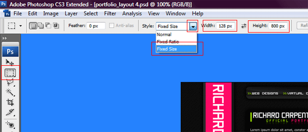
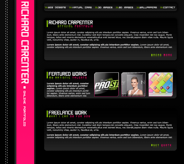
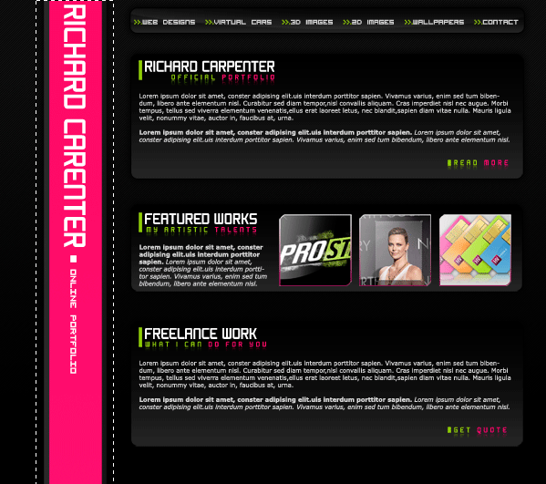
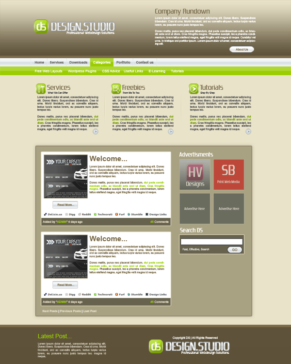
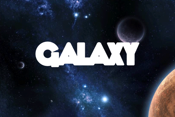
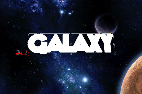
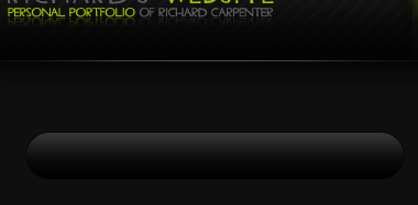
Load my car sales layout into photoshop (if you haven’t got the layout already made, go here to make it). Once opened in photoshop we will need to assess what were going to need. The layout im using is pretty easy and most of it can be done in css. We will start with the header, select your desired cutting tool and cut out your header, paste it to a new document. Now when i pasted it to a new document i noticed the size 850×151. To make things easyier for ourselfs goto “image > image size” and resize your image.

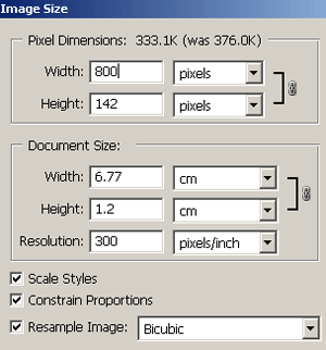
Pleae note that the height maybe different depending on where you cut it from, but the width should be the same. Save your header image to a folder called images on your desktop. Now for some coding, open up notepad, then open up dreamweaver. When dreamweaver has loaded select “new HTML”.

Now click the “code tab” at the top right corner of dremweaver you will be presented with this.

<!DOCTYPE html PUBLIC “-//W3C//DTD XHTML 1.0 Transitional//EN” “http://www.w3.org/TR/xhtml1/DTD/xhtml1-transitional.dtd”>
<html xmlns=”http://www.w3.org/1999/xhtml”>
<head>
<meta http-equiv=”Content-Type” content=”text/html; charset=iso-8859-1″ />
<title>Untitled Document</title>
</head>

<body>
</body>
</html>

In the body tag type,

<div id=”container”>
<div id=”header”></div>

</div>

Note the words container & header, “container” is a box if you will that contains the content, and the” header” being the header. Now step into notepad and type this.

#container {
width: 900px;
margin-top: 0;
margin-right: auto;
margin-bottom: 0;
margin-left: auto;
}

The code above basically means the container has a width of 900 pixels, no margin at the top, no margin at the bottom and left and right are set as auto meaning that the margin either side will be the same as each other making the container appear in the center of the page. Now goto “file > save as” and save as styles.css (make sure you include the .css). save to your desktop.

Back in dreamweaver under the <title> tag write,

<link rel=”stylesheet” href=”styles.css” mce_href=”styles.css” type=”text/css” />

This means that the HTML file will link to an external style sheet. Your html code should look like this

<!DOCTYPE html PUBLIC “-//W3C//DTD XHTML 1.0 Transitional//EN” “http://www.w3.org/TR/xhtml1/DTD/xhtml1-transitional.dtd”>
<html xmlns=”http://www.w3.org/1999/xhtml”>
<head>
<meta http-equiv=”Content-Type” content=”text/html; charset=iso-8859-1″ />
<title>Untitled Document</title>
<link rel=”stylesheet” href=”test.css” mce_href=”test.css” type=”text/css” />
</head>

<body>

<div id=”container”>
<div id=”header”> </div>

</div>

</body>
</html>

Now head back over to notepad where your CSS style sheet is and type,

#container #header {
background-image: url(images/header.gif);
height: 143px;
width: 900px;
background-repeat: no-repeat;
background-position: center;
}

This means the header within the container has a background image pointing too images/header.gif, with a height of 143pixels and a width of 900pixels. The background wont repeat itself and will be centered on the page. As you can see most of the css is self explanatory.

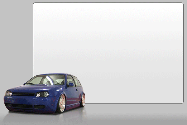
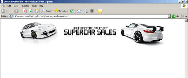
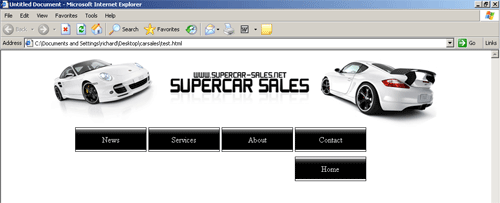
Now if you save your css file again “ctrl + s” and save your HTML file as index.html (save to desktop). Open the index.html file into your browser it should look like this.


Revert back to dreamweaver and under your header id type,

<div id=”nav”>
<ul>
<li><a href=”http://www.yoursite.com/contact.html” mce_href=”http://www.yoursite.com/contact.html”>Contact</a></li>
<li><a href=”http://www.yoursite.com/about.html” mce_href=”http://www.yoursite.com/about.html”>About</a></li>
<li><a href=”http://www.yoursite.com/services.html” mce_href=”http://www.yoursite.com/services.html”>Services</a></li>
<li><a href=”http://www.yoursite.com/news.html” mce_href=”http://www.yoursite.com/news.html”>News</a></li>
<li><a href=”http://www.yoursite.com/home.html” mce_href=”http://www.yoursite.com/home.html”>Home</a></li>
</ul>
</div>

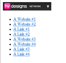
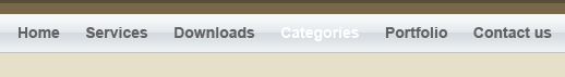
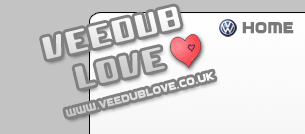
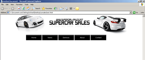
We have created a id called nav which will be our navigation and the text that will be displayed will be contact, about, services, news and home and they will point to the relative destinations. If we view our site in our browser it is displayed like this.

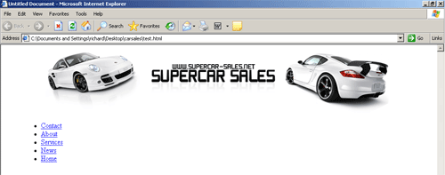
Notice the blue links, now if we head back over to notepad to our css file and type,

#nav {
width:50em;
}

This mean the navigation will have a width of 50em (em: a relative value that refers to the height of the capital “m”)

#nav ul {
list-style: none;
padding: 0;
margin: 0;
width: 700px;
}

Your ads will be inserted here by

AdSense Now!.

Please go to the plugin admin page to paste your ad code.

This means that the list element will have a list-style of none which basically means the text will be displayed inline with each other opposed to in a list, the elements have no padding, no margin and the width is 700px.

Now underneath that type,

#nav li {
float: right;
margin-top: 0;
margin-right: 0.15em;
margin-bottom: 10px;
margin-left: 0.15em;
}

This means the nav list items are floated to the right (float: forces the element to “float” outside of its natural position in the containing box), the rest should be self explantory. Now type,

#nav li a {
height: 3em;
line-height: 3em;
float: left;
width: 9em;
display: block;
border: 1px solid #000000;
color: #fff;
text-decoration: none;
text-align: center;
background-image: url(images/nav.gif);
background-repeat: repeat-x;
background-position: left center;
background-color: #FFFFFF;
}

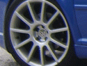
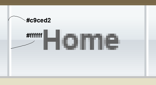
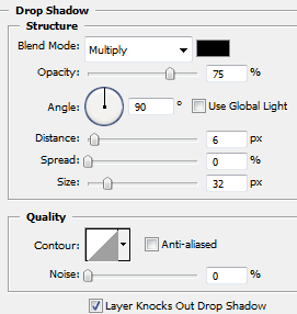
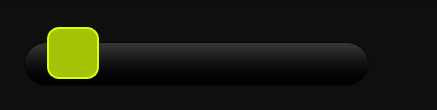
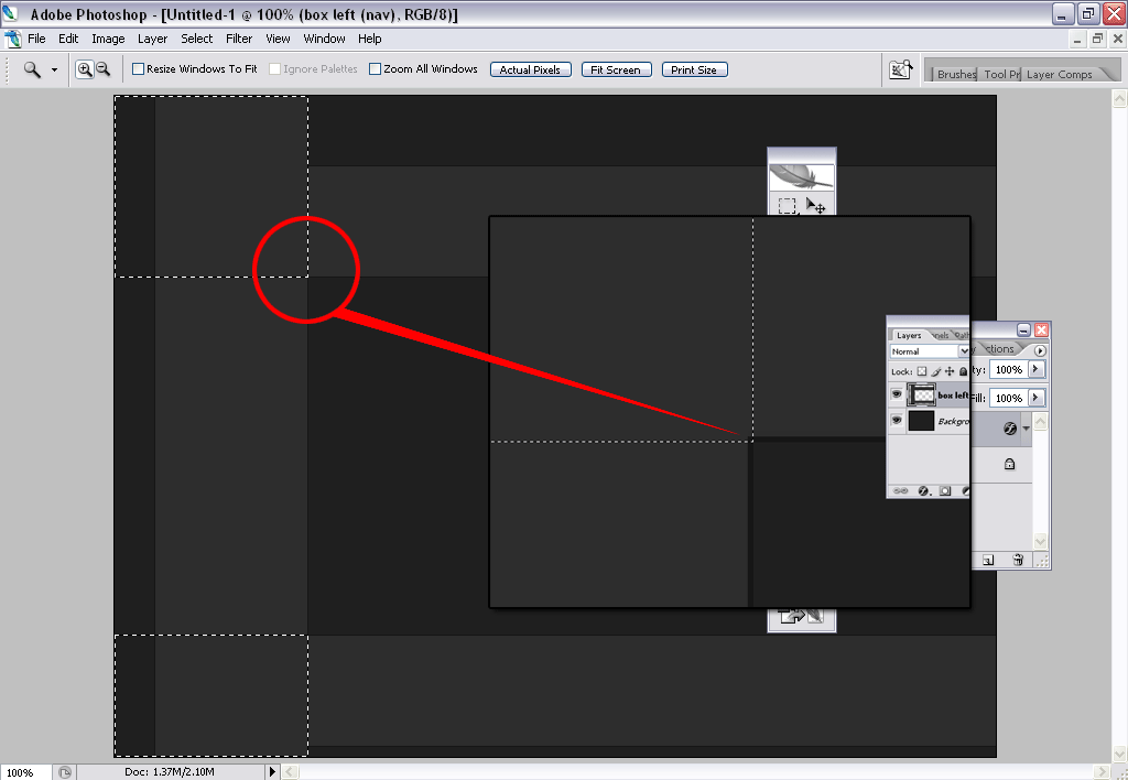
Ok the height is self explantory, the line height controls the total distance from the top of the tallest element in one line to the top of the tallest element in the line immediately above or below the line, the border will have a 1 pixel solid border in the color 000000 which is black, color means the text color which is set at white. Now “background-image: url(images/nav.gif);” Is important, this will be the background on our button which we have to make in a second. also note background-reapeat, this means the background will be repeated along the X axis. Now to make our button background open up your PSD layout, zoom in on the navigation and make a selection like this.

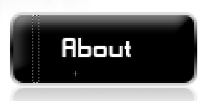
Copy and paste the selection to a new document, the goto “file > save for the web” save it into your images folder. Once you have saved the image save your .css file and html file. Open your html file in your browser it should lool like this.

The navigation doesnt quite look right due to the fact we havent set our default font and size. Go back to your HTML code and between the <head> </head> tages type,

<style type=”text/css”>
<!–
body,td,th {
font-family: Arial, Helvetica, sans-serif;
font-size: 12px;
color: #000000;
}
body {
margin-left: 0px;
margin-top: 0px;
margin-right: 0px;
margin-bottom: 0px;
}
–>
</style>

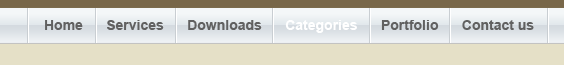
This means we are settin a rule for the actual html file so that all our text will be fontsize 12 in the color black in arial, helvetica or sans-serif. The margins mean that the start of our document will be right at the top of the screen or right at the side of our screen etc… Save your html file and view it in your browser, it should now look like this.

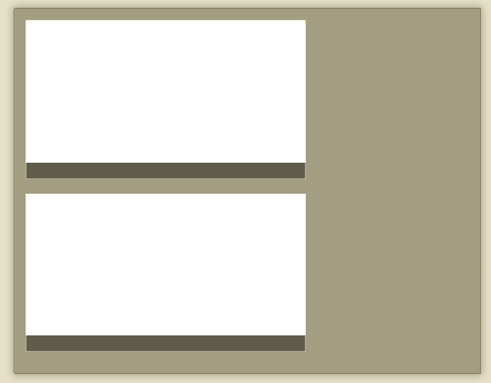
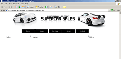
Thats our navigation sorted now we can concentrate on our content and footer. If we look at our PSD there are a few things to note. 1. The dotted dividers 2. Amount of colums needed 3. The position of our foooter. The dotted dividers will be easy to do, we have 3 coloums to do so we’ll do them 1st. Goto into the code of your html file, under our navigation code type,

<div id=”leftbar”>leftbar</div>
<div id=”content”>content</div>
<div id=”rightbar”>rightbar</div>

This will be our 3 colum layout. Head over to your .css file and under your nav elements type,

#content {
float: left;
width: 444px;
border-right-width: 1px;
border-right-style: dotted;
border-right-color: #000000;
padding-top: 5px;
padding-right: 2px;
padding-bottom: 1px;
padding-left: 2px;
border-left-width: 1px;
border-left-style: dotted;
border-left-color: #000000;
margin: 10px;
}

This means we have made a box 444pixels wide with a 1 pixel black dotted border to the left and right. It also has padding to the top, bottom, left and right. The box will also be floated to the left of our site. Now type this for our left colum,

#leftbar {
float: left;
width: 200px;
margin-right: 10px;
margin-top: 10px;
margin-bottom: 10px;
border-right-width: 1px;
border-right-style: dotted;
border-right-color: #000000;
padding-top: 5px;
padding-right: 2px;
padding-bottom: 1px;
padding-left: 2px;
}

Now for the left colum, we set the float to left, the box will be 200pixels wide with a dotted black border to the right only. Padding is the same as our content box. Now for our last colum,

#rightbar {
float: right;
width: 200px;
margin-left: 10px;
margin-top: 10px;
margin-bottom: 10px;
border-left-width: 1px;
border-left-style: dotted;
border-left-color: #000000;
padding-top: 5px;
padding-right: 2px;
padding-bottom: 1px;
padding-left: 2px;
}

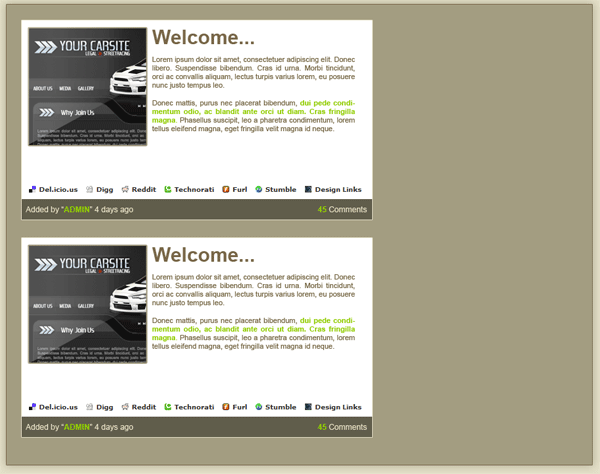
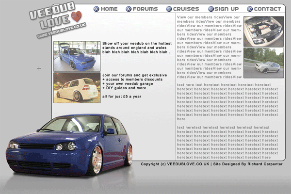
Now we want our right colum on the right so we float it to the right, the width, padding and margins are all the same as the other 2 colums, only thing to change is our dotted border which is now on our left. If we view our site in our browser now we should have this (dont forget to save).

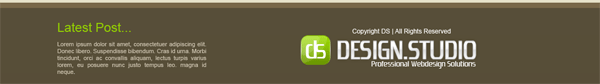
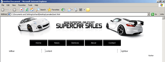
Last but not least its time to do our footer. First thing to do is create our ID in our html file so head over to our html code and type,

<div id=”footer”><div id=”footer-content”>footer</div>

Now goto your .css file and type,

#footer {
clear: both;
margin: 0;
padding: 0;
font: normal .95em/1.5em ‘Trebuchet MS’, Tahoma, Arial, sans-serif;
text-align: right;
}
#footer-content {
margin: 0 auto;
padding-left: 15px;
}
#footer-content a {
text-decoration: none;
color: #000000;
}
#footer-content a:hover {
text-decoration: underline;
color: #333;
}

Right now let me explain, the clear property controls the flow of text improving text wrap, the rest should be pretty easy to understand.

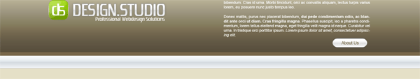
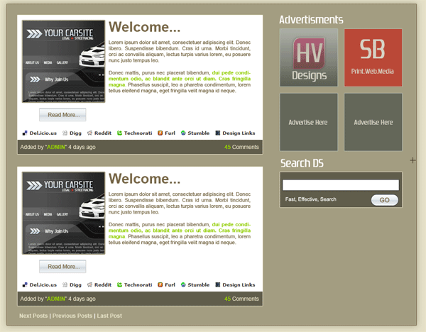
Now here is how the site looks in my browser.

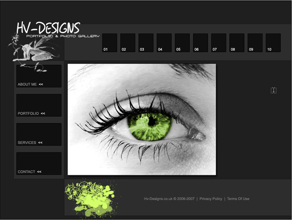
All’s you have to do now is input your content. Here is a live working version (see link below)

CLICK HERE TO LAUNCH LIVE VERSION

Your ads will be inserted here by

AdSense Now!.

Please go to the plugin admin page to paste your ad code.

Design Studio Layout Tutorial

Your ads will be inserted here by

AdSense Now!.

Please go to the plugin admin page to paste your ad code.

Create a new document 1200 x 1500, fill your background layer with the color #e9e3c9. Select the rectangular marquee tool and add a big rectangle the width of your canvas at the top. Fill with any color then add these layer styles.

You should have something like this.

Add your website title, slogan and logo to the top of your header, also to the right of your title etc… add a small brief summary about your company.

The layer styles for my title text are.

To make the logo, select the rounded rectangle tool, with a radius of 20pixels. Draw out your rectangle, fill with any color then add these layer styles.

Once you have add your layer styles add your logo in the middle.

Next select the rectangular marquee tool, draw out a smallish rectangle the width of your canvas, again fill with any color. Copy your header title text layer styles to your rectangle, disable the drop shadow. You should have something like this.

Add some navigation text. But color one of them white.

The reason why we left one of them white is because there will be 2nd navigation bar underneath. Create two 1pixel lines next to each other like this.

Your ads will be inserted here by

AdSense Now!.

Please go to the plugin admin page to paste your ad code.

Your navigation should now look like this.

Select the rectangular marquee tool and make a selection over your white bit of text, make sure the layer is behind the text. Fill with the color #9bcd00. Next make a smaller rectangle across half of the button, fill with the color white, lower the opacity to about 20%. Your button should now have a matching shine.

Using the same method add another navigation underneath, use the same color.

Now add your 2nd naviagtion text. Thats the navigation done, underneath your navigation were going to add 3 featured important posts. Using the same method for creating our site logo add 3 logos for our featured posts.

The icons were made using adobes custom shapes libary. Now add some text to represent each post, also add a divider seperating each one of the posts.

Now select the rectangular marquee tool once more and create a big box for our main content. Fill with the color #a9a282 and add a stroke using the color #7c6c4b.

Inside the big box add a further 4 boxes, which should comprise of our main post content and post content footer.

Format the boxes with text and our thumbnails to look like blog posts.

Continue to add your prefered wordpress items. I wont go into to much detail here as its mainly text and simple boxes.

Finally select the rectangular marquee tool once again and basically mirror the header, copy and paste the title, logo and slogan also add your copyright information.

Finished.

Your ads will be inserted here by

AdSense Now!.

Please go to the plugin admin page to paste your ad code.

Software Layout #3 Tutorial

Your ads will be inserted here by

AdSense Now!.

Please go to the plugin admin page to paste your ad code.

Create a new document 800×800 pixels, fill the background with the color #c4c5c0. Select the color #374254 and the rectangular marquee tool, draw a small rectangle across the canvas at the top.

Now select the rounded rectangle tool and draw a small rectangle, fill with the color #374254. Place at the top of the canvas over your blue bar.

As you can see i have a rounded edge at the bottom of my rectangle, to do this make a curve with the pen tool and delete the selection. Alternatively leave it as it is. Add your website text and slogan in your blue rectangle.

Now select the rounded rectangle again and make a box next to your header, fill with same color.

This is going to be our search box, add the word search and a white rectangle to represent the search form.

Now head over to your custom shapes and select this shape.

Make it fairly bigish as its better to resize it down than up. Fill with any color then add these layer styles to it.

Now create a new layer above your shape and make a white circle.

Now with the pen tool, make a selection like this.

Goto “select > inverse” then hit delete key on the keyboard. Set the opacity of the white cirlce to about 40-50%. Merge the 2 layers then press “CTRL + T” and rotate it slightly, You should be left with this.

Stick this shape by the search box, also adding the word go!.

Under your search box add your navigation and small divider.

Now for this bit your going to need a softwarebox, i currently already have made 2 tutorials on how to make a software box. GO HERE

Once you have made your box place it on your canvas, then duplicate it 3 times. Then add this drop shadow to all 3 of them.

Your ads will be inserted here by

AdSense Now!.

Please go to the plugin admin page to paste your ad code.

Move one of your software boxes slightly to the left away from the top one, Slightly resize it down and add a 1 pixel guassian blur to it. You should have something like this.

Do the same with the 3rd box only adding a 2 pixel guassian blur to it and resizing it down abit smaller.

Now duplicate your shape you created earlyier for your search box, duplicate it 3 times and place next to your software boxes. Also add the numbers 1-3.

Add your text giving 3 reasons why to buy your product. Also add your software title and version information.

Select the rectangular marquee tool and the color #b1bac3 and draw a box around your infortmation.

Do the same again only make a smaller rectangle under the one you just made, fill with the color #babfc2.

Now select the rounded rectangle tool and make a rectangle under your 3 reasons. Add these layer styles.

Once you have added the layer styles set the buttons opacity to 60%. Now add your download text. You should have something like this.

Select the color #cccccc and make a rectangle at the bottom of your canvas, this will be our footer.

Above our footer to the right add, some text, like testimonals, or client information.

Now create another rounded rectangle, with the same layer styles as your download button. Only this time change the colors to navy blue.

Duplicate your shape in the search box and place it over your blue rectangle.

Now add some text for your members.

Thats it all done, heres a full preview of the final product.

Your ads will be inserted here by

AdSense Now!.

Please go to the plugin admin page to paste your ad code.

1st EVER Competition (closed)

Your ads will be inserted here by

AdSense Now!.

Please go to the plugin admin page to paste your ad code.

Your ads will be inserted here by

AdSense Now!.

Please go to the plugin admin page to paste your ad code.

Your ads will be inserted here by

AdSense Now!.

Please go to the plugin admin page to paste your ad code.

Carbon Fibre Style Inset Menu

Your ads will be inserted here by

AdSense Now!.

Please go to the plugin admin page to paste your ad code.

Your ads will be inserted here by

AdSense Now!.

Please go to the plugin admin page to paste your ad code.

Your ads will be inserted here by

AdSense Now!.

Please go to the plugin admin page to paste your ad code.

p-4829

Your ads will be inserted here by

AdSense Now!.

Please go to the plugin admin page to paste your ad code.

Today I am proud to introduce another full time member of the HV-Team, Justin Lowery, who will be writing photoshop and illustrator tutorials for us. Justin has a new tutorial for us coming this next week but I wanted to start off letting our readers get to know him a little bit with this interview. Read on, ask questions, and enjoy!

Justin, thanks for taking time out of your day to answer a few questions; firstly we would like you to introduce yourself to the readers?

Sure. I’m Justin Lowery, and I’ve been working as a professional graphic designer, web designer / front-end developer, photographer, and writer for over a decade. I work with people, organizations, and companies from all over the United States and around the world. I have a tremendous passion for helping people, changing their lives, and shaping the way they view themselves and the world around them.

How do you find the creativity to keep pumping out your amazing work and tutorials?

I read obsessively. In a typical day, I consume probably a few hundred articles, and countless hundreds of images and design pieces in a constant search for inspiration, knowledge, and ideas. You need to “stay hungry, stay foolish,” as they say. Learn constantly from the work and writing of others.

Also, participating in the design community is key. I’m on Dribbble, Forrst, BeHance, Cargo Collective, Flickr, Deviant Art, and pretty much every other community I’ve ever heard of. There are some absolutely brilliant designers and artists out there, and in the communities you can find a never-ending flow of ideas and inspiration.

What would be your favorite piece of work that you have designed so far?

That’s a very hard one. I’m not sure I even have a favorite. I like my own site, because I have total design freedom with it. Also some of the 3D and motion design pieces I’ve built with Cinema 4D and AfterEffects came out pretty well. A few of my recent identity projects have really come together nicely as well. It’s nearly impossible to choose a favorite, however.

You have signed on to be a member of our HV-Team, what made you want to join the team and write tutorials?

Well, I actually went to college for education, believe it or not. I figured there really wasn’t much I could learn from going to school for design, because I literally would teach the design professors things all the time while I was there. (I actually ended up doing design and consulting work for the college before I graduated, and worked in the advertising department for two years as well.) Instead, I figured teaching was something that would never lose its value, and could be applied to nearly anything imaginable. So I took that, and graduated with a double major in secondary education with two teaching fields. I love helping people unleash their potential. Writing and teaching both accomplish that. Tutorials combine those two of my passions.

Your ads will be inserted here by

AdSense Now!.

Please go to the plugin admin page to paste your ad code.

What made you want to get into the Graphic Design business?

Well, it’s more design in itself than the business. I actually do pro-bono work all the time for charities, ministries, and other non-profits that I think have worthy causes. Design changes the way people perceive the world around them, and in turn affects people’s behavior towards these causes. If you have bad design representing your organization, people are going to think poorly of it, and that’s going to show in the way they treat it. They’ll give less, volunteer less, care less, and sometimes even ignore the organization entirely.  The end result is that these organizations don’t have the money or manpower they need to change the world, and that’s wrong. I wanted to change that. The business side of design came about as a mere necessity of life. I love design, and it happens to pay the bills, so I decided to use it do that while I work on more meaningful things in my spare time. Of course, I try to choose meaningful paid projects as well, and have been blessed with the opportunity to work with some truly incredible clientele over the years.

What would you recommend to our readers as the best way to build their career?

Do awesome work. Put your heart and soul into it. Show people. Get dramatically better at what you do. Do better work. Show more people. Rinse and repeat. Use your work to do good for others and for the world. When people see those things in you, they’ll want to work with you. People like people who have passion for what they do, and who do it well. I handle the work of a small agency as a result of this. It does work.

In a practical sense, get your work out there. Follow a ton of designers on Twitter, Dribbble, Forrst, BeHance, Cargo Collective, and Flickr. More importantly, get your work on all these sites and more. Show only your best work. It’s more important what you don’t show than what you do. Less is always more. I try to show only a dozen pieces in my portfolio at any one time. Talk about what you do. Be super passionate about it. People will want to work with you when you’re glowing with enthusiasm and energy for what you do. If you love what you do, it should show, and people will be able to see it. When you nail those things, the work will take care of itself.

And my last question; If you could work with one company and head their design department who would it be? Why?

I would most likely start my own company. I probably have too much passion for what I do to work under someone elses limitations for very long. That said, if I had to choose, hmm…that would be hard. Apple is always a good choice as companies go. I love the work they do.

Realistically, though, I doubt I’d ever work for a corporation per se. I’d much rather do something more meaningful. Perhaps something like the Red Cross or another large-scale charity organization. I really have a passion for helping people, and getting people to help each other.

If I had to choose a realistic organization that I actually have qualifications and a solid chance of working for, I’d probably work with an small to medium-sized agency that strictly services charities, ministries, and other non-profits, like churchmedia.cc or something similar. I really can’t stand the whole money-at-the-expense-of-people mindset that most companies have, so it would definitely be a non-profit-oriented agency that does truly meaningful work on a regular basis.

Well, thanks again Justin and we look forward to seeing your tutorials in the coming months!

Your ads will be inserted here by

AdSense Now!.

Please go to the plugin admin page to paste your ad code.

Archive for the ‘Coding Tutorials’ Category

Your ads will be inserted here by

AdSense Now!.

Please go to the plugin admin page to paste your ad code.

Your ads will be inserted here by

AdSense Now!.

Please go to the plugin admin page to paste your ad code.

Your ads will be inserted here by

AdSense Now!.

Please go to the plugin admin page to paste your ad code.

2007-10-02-quick-cartooning-tutorial-

Your ads will be inserted here by

AdSense Now!.

Please go to the plugin admin page to paste your ad code.


Open up your image into photoshop, duplicate your image in the layers window then goto “filter > artistic > poster edges”. Use standard settings, press ok. Then lighten the image abit by going to “image adjustments > brightness & contrast” increase the brighness by about 10-15 pixels and increase the contrast by about 25-30 pixels. (settings depends on type of image, lightness etc… you may not get the same result as mine)

Your ads will be inserted here by

AdSense Now!.

Please go to the plugin admin page to paste your ad code.

Now goto “filter > artistic > cutout”. Here you will have to play around with the settings to archeve the right effect, here are the settings i used and my final result.

If you would like a more advanced way to cartoon, i suggest you try my tracing and cartooning tutorials.

Your ads will be inserted here by

AdSense Now!.

Please go to the plugin admin page to paste your ad code.

Galaxy Style Text Effect

Your ads will be inserted here by

AdSense Now!.

Please go to the plugin admin page to paste your ad code.

Good morning fellow photoshoppers how are we today?. In this tutorial il show you how to create some galaxy type text, the inspiration behind this tutorial is “mario galaxy” on the nintendo wii.

Before we start you might want to grab the PSD file from the button above and yes its FREEE to download. Included in the zip file is a galaxy image which you can use. Ive created a new document 600×400 pixels for the purpose of this tutorial, feel free to use your own size. Drag your galaxy background image onto your canvas.

Select the type tool and type out the word “galaxy” or another word that tickles your fancy. :) The font im using is called “whoopass” which is also included in the zip file.

Make the text fairly big then right click your layer and goto “rasterize type”. Goto “edit > transform > perspective” drag one of the bottom corner anchor points outwards. Only need to drag it out a touch.

Label your layer “galaxy text”, now whilst holding down the ALT key on the keyboard hit the down arrow key 26 times, everytime the arrow key is press the text should shift down 1 pixel and create its very own layer. Once you have done it 26 times merge all the DUPLICATED LAYERS ONLY into one layer then move the layer underneath the layer “galaxy text”. Label your other layer “text underneath”. Add these layer styles to your “text underneath layer”.

You should hopefully have something like this.

Click the little thumbnail image in your layers pallette on the “text underneath” layer whilst holding down the CTRL button the keyboard, this should load a selection, whilst the selection is active create a new layer above your text underneath layer BUT underneath your “galaxy text layer”. Label the new layer stroke then goto “edit > stroke” use the settings below.

Your ads will be inserted here by

AdSense Now!.

Please go to the plugin admin page to paste your ad code.

The reason why we did a stroke this way and not through the layer styles menu is because when you apply the stroke in the layer styles menu you get alot of jaggys, using “edit > stroke” create a much more clear line. You should have something like this.

Duplicate your “galaxy text” layer and just hide it for now as we’ll use it later. Open up the galaxy image included in the zip file in a new document, copy it to the clipboard then head back over to your orginal canvas. Click your “galaxy text” layer whilst holding down the CTRL key to load the selection then goto “edit > paste into” this should then paste your galaxy image inside your text, you can freely move the image around inside the text and even resize the image.

Position the background image so its not overly busy when your happy right click the layer with your mask on and goto “apply layer mask”. Label your layer “galaxy text inside”. Remember we duplicated our plain white galaxy text a few steps ago???…. undide that layer and drag it above your “galaxy text inside” layer. Load a selection of that text using the CTRL + Click method then goto “select > modify > contract” contract the selection by 3 pixels and hit enter. When your returned back to your canvas hit the delete key.

You should have something like the image above, now add the layer style below. Rename your layer to “text top”

Inbetween your “text top” layer and your “galaxy inside text” layer create a new layer label it shine. Select the rectangular marquee tool and create a white box.

Click your “galaxy inside text layer” using the CTRL + Click method to load a selection make sure your shine layer is selected in the layers pallette then goto “select > inverse” then hit the delete key, set layer opacity on the shine layer to 10%.

Zoom in on your text, create a new layer, using the rectangular marquee tool create two 1 pixel lines next to each other, Fill the 1st one with the color #bbbfc1 and the 2nd one with the color #898b8e. Place them where the creases would be if you had 3D text.

Your finished image should look like this.

Many thanks for reading the tutorial, hope you enjoyed it. Dont forget to subscrive via twitter and our RSS feeds. You can also promote this post using the share and enjoys buttons below.

Your ads will be inserted here by

AdSense Now!.

Please go to the plugin admin page to paste your ad code.

category-articles-page-5-

Your ads will be inserted here by

AdSense Now!.

Please go to the plugin admin page to paste your ad code.

Your ads will be inserted here by

AdSense Now!.

Please go to the plugin admin page to paste your ad code.

Your ads will be inserted here by

AdSense Now!.

Please go to the plugin admin page to paste your ad code.

Car Club Layout Tutorial

Your ads will be inserted here by

AdSense Now!.

Please go to the plugin admin page to paste your ad code.


Create a new document 900×600, fill the background with a gradient using colors below.

Now create a box with the “rounded rectangle tool” this will act as our content box, also add a “1 pixel black stroke” to the rectangle and a “gradient overlay”, you should have something like this.

Now lets give it a 3d look, find a picture of a car, or a image of your choice, cut it out with the pen tool, and paste it onto your canvas resize the image to fit into the bottom left hand corner, (see image below), ive also added a reflection to the car and a shadow. If you dont no how to do reflections i suggest you do my reflection tutorial. Heres how mine looks at this stage.

Now lets create a menu, type your menu options at the top of the rectangle, space the menu options out enough to add some symbols or logos next to the text, like this.

Your ads will be inserted here by

AdSense Now!.

Please go to the plugin admin page to paste your ad code.

Now lets add our little logos, either make one your self one or go grab one from google images. im just going to use a vw badge.

Now lets add out website slogan and title, type your slogan and title at the top left corner like so.

Ive just added a few layer styles to my font type and added a picture of a heart which i also got from google images. Now lets add our content, i wont create a specific content layout for you eles you aint going to learn lol, just use your imagination and see what you can come up with, its just trial and error see what works and what doesnt, here is a quick 2 minute job of mine.


Now all thats left is just slice up your image and code it.!
View high res image here.

Your ads will be inserted here by

AdSense Now!.

Please go to the plugin admin page to paste your ad code.

p-4908

Your ads will be inserted here by

AdSense Now!.

Please go to the plugin admin page to paste your ad code.

Today I will be showing you how to create a simple coming soon page in Photoshop. We will be using Adobe Photoshop CS4 and will be using the very basic tools of Photoshop to create this tutorial.

First we start off with a new document. This document needs to be 1280 x 768 and filled with Black.


For the next step you will need to download these Fibre Styles from DeviantArt.

Now access the Blending Options of the main background layer and add the following styles.

Now we are going to create a rounded rectangle to host our information. Drag out a rectangle, with an radius of 20px, our to 1135 pixels wide by 350 pixels tall. Center the rectangle vertically and space it 35 pixels from the left of the screen.

It is now time to style our rectangle. We will be giving it a simple gradient overlay (as shown below)

Now to add our character to the Coming Soon Page. You will need to download THESE icons.

We will be using the singular green character for our coming soon page, though of course you can use any of them.

Place your green character on the screen 143 pixels from the top of the screen and 17 pixels from the right (measuring from the tentacle).

Now we need to remove the coloring between the eyes and mouth to make the character look more friendly. Use the magic lasso tool to select the purple coloring for the eyes and mouth.

Your ads will be inserted here by

AdSense Now!.

Please go to the plugin admin page to paste your ad code.

Click the delete key on your keyboard to remove the selection. Use the eraser tool to get rid of any extra coloring that was not deleted. You should have only the background of the rectangle now instead of the purple and teeth.

Now we will use the magic lasso tool again to remove the white shadow underneath our character. Select the shadow and press the delete key to remove it.

Now select your magic lasso tool again. Select the space in the eyes and mouth one more time. When you have them selected, choose the rounded rectangle layer and hit the delete key so that only the background is showing through the eyes and mouth.

Now use the eraser tool, still selecting the rounded rectangle tool, and erase the extra pars of the rectangle, below the tentacles.

Now its time to add the content. For the first part of the content we will be using the font face Cooper Black and size 72pt. For the remainder of the content we used the same font face but used a 30pt size. This is our content, which you can use, or add your own. Be sure that, if you are adding your own, you leave enough space for the sign up bar.

Now its time to add our sign up bar. We will be using the rounded rectangle again, this time with a 10px radius using White. Draw the rectangle out to be 548px wide by 63px tall. You need to space it 33 px from the left side of our black rectangle and 20px from the bottom. Now we are going to add some styling to our sign up bar. Use the following styles.

Now using the rounded rectangle again, with a 5px radius. Space it 22 pixels from our sign up bar. Drag it out to be 154px wide by 48px tall. Now lets add some styling to our sign up button. Use the following styles:

Now using the font face Eras Bold ITC, at a size of 30pt, and using black for the color. Type out the word Sign Up and center it, both horizontally and vertically, on your button.

Now, using the basis from THIS tutorial we are going to place our Social Navigation on our page to finalize the tutorial. You are dong with your photoshop document of the Coming Soon Page. You should have something like this:

Your ads will be inserted here by

AdSense Now!.

Please go to the plugin admin page to paste your ad code.

2009-01-19-jquery-fade-infade-out-

Your ads will be inserted here by

AdSense Now!.

Please go to the plugin admin page to paste your ad code.

Hi there in this tutorial il show you some simple effects you can use to spice up your websites using jquery. Your probably thinking oh no not another coding language ive got to learn.

There is an updated version of this tutorial which is alot more stable. You can view there new tutorial HERE

Dont worry its real simple to use and implement. If you really want to get stuck into jquery then nettuts have wrote a complete series on the subject SEE THIS LINK.

Firstly whats jquery? i hear you ask, well jQuery is a lightweight JavaScript library that emphasizes interaction between JavaScript and HTML.

What can i do with this code your about to give me? Basically its a fade in fade out effect. The effect fades an element to 30% on arrival of the website, then when you hover over it, it fades to 100%. The effect can be assigned to basically anything in a website wether it be an image, text, a link or even a div.

The code looks like this.

 $(document).ready(function(){ $("ELEMENT HERE").fadeTo("slow", 0.3); $("ELEMENT HERE").hover(function(){ $(this).fadeTo("slow", 1.0); },function(){ $(this).fadeTo("slow", 0.3); }); }); 

Let me explain the code above. Line 1 basically means load the javascript when the document has fully loaded, this means the javascript wont start untill the whole HTML file is loaded which includes ads also. When everything has loaded the script will run.
Line 2 means fade the element to 30%, 0.3 is 30%, at a speed of slow. Where it says “element here” that would be our ID.
Line 3 means when the mouse is hovered over “the element” fade to 1.0 at a speed of slow 1.0 equals 100% The image will then stop at 100% untill the mouse is moved off the element. Then the last bit of code means when the mouse is moved off the element fade back to 30%, 0.3 at a speed of slow.

Now im going to show you how to add this all into your website. Ive put together a small download which contains a simple example.

Extract the contents of “example_one.zip” to your desktop, inside the folder example one create a new folder called “js” Inside this folder place the jquery file which can be found here. Then create a blank notepad file and save inside the “js” folder called “custom.js” So inside the JS folder there should be 2 files. “jquery1.3.min.js” and “custom.js”. Open up the custom .js file in dreamweaver then copy and paste the jquery effect code in, then save.

Your ads will be inserted here by

AdSense Now!.

Please go to the plugin admin page to paste your ad code.

You should be all set to go, just a couple of things to take note of. If you look inside the HTML code of the example you will notice inside the HEAD tages there are some lines of javascript.

 <script type="text/javascript" src="js/jquery.js"></script> <script type="text/javascript" src="js/custom.js"></script> 

Its basically the same as linking a .CSS file only its javascript. Without this bit of HTML code jquery wont work. Make sure the filenames of the .JS files match yours, i do believe you need to change the 1st one from “jquery” to “jquery-1.3.min.js”.

Now for the effect, as i said before you can use the effect on almost anything inside of a HTML document, now we want to add the effect to the individual images we have in our example HTML file, if you look at the code in the HTML file regarding the images you will notice they have a class of “class=”latest_img”. The class is defined in the .CSS file. The class is a form of ID in which the images can be identified by. If we open up “custom.js” in dreamweaver then locate the words “ELEMENT HERE” inside two quotes, change “ELEMENT HERE” to the class which is “.latest_img” the effect will apply its self to everything with a class of “latest_img” in our case the images. Your .JS code should looke like this.

 $(document).ready(function(){ $(".latest_img").fadeTo("slow", 0.3); $(".latest_img").hover(function(){ $(this).fadeTo("slow", 1.0); },function(){ $(this).fadeTo("slow", 0.3); }); }); 

Save it, then view your HTML file in your browser. The effect should have been applyed to the single images. See Demo.

Pretty cool ah?, Now the effect doesnt stop there as you can apply it other things within an HTML document, how about applying it to some text? See Demo.

The text within my HTML document is in P tags within a div so if i apply the effect to the p tag within a certain div you get the effect above. You can also apply the effect to a whole div, which means everything in that div will fade even the div itself. See Demo.

Here are all the effects on one page.

Why dont you try and incorparate the fade in fade out effect in your designs, or just play around and see what you can come up with ;)

Thanks for reading

Your ads will be inserted here by

AdSense Now!.

Please go to the plugin admin page to paste your ad code.

category-photoshop-tutorials-page-14-

Your ads will be inserted here by

AdSense Now!.

Please go to the plugin admin page to paste your ad code.

Your ads will be inserted here by

AdSense Now!.

Please go to the plugin admin page to paste your ad code.

Your ads will be inserted here by

AdSense Now!.

Please go to the plugin admin page to paste your ad code.

Portfolio Layout #6

Your ads will be inserted here by

AdSense Now!.

Please go to the plugin admin page to paste your ad code.

Create a new document 850×850 pixels, fill your background with the color #1b1b1b. Select the rectangular marquee tool and create a box the width of the canvas, fill with the color black for now.

Add these layer styles to your rectangle.

Your rectangle should now look like this.

Add your header title using the colors #adc203 and #424242.

Now add your navigation text to the right of your text using a smallish font size.

Above your text add a small icon to represent that section, all the icons i used are from the custom shapes libary.

Add these layer styles to each of the icons.

Now draw a square over each of the icons and text. (i have done each square seperatly, the image below is just to show the widths of each square)

Once you have drawn all the squares fill them white then merge them all together, set the layer opacity to 5%. Then add a layer mask and drag a reflected gradient over the top to blend in the top and bottom edges. Your end result should look like this.

The next steps are optional, duplicate your header title text and flip vertically drag the duplicated text under it to act like a mirror then add a layer mask to produce a reflection. Also if you make a diagnol line pattern (included in PSD) then add some diagnol lines to your header.

Now select the rounded rectangle tool with a radius of 10pixels draw out a small rectangle.

Your ads will be inserted here by

AdSense Now!.

Please go to the plugin admin page to paste your ad code.

Add these layer styles.

Now using the same tool add a small square (hold shift while dragging with the mouse to produce a perfect square.)

Add these layer styles to your square.

Now duplicate your home icon and drag it into the center of your square, also add your content title. Select the elliptical marquee tool and create a white circle that overlaps your icon, ctrl + click your icon while the white circle layer is selected, goto “select > inverse” and hit the delete key set opacity to 25% and you’l be left with a simple shine over your icon. (do the same with your content title box using the polygonal lasso tool).

Now select the rectangular marquee tool and draw a rectangle underneath your icon.

Add these layer styles to your rectangle.

Finally set layer opacity to 24%. Follow the above steps for your other content boxes and footer.

Now add your content to each section.

FINISHED

Layout inspired by “carl”

Your ads will be inserted here by

AdSense Now!.

Please go to the plugin admin page to paste your ad code.

Portfolio Web Layout #1 Tutorial

Your ads will be inserted here by

AdSense Now!.

Please go to the plugin admin page to paste your ad code.

Start off with a new document size of “800×600″ change background color to “1f1f1f” make a new layer and draw a box down the left side of the page and “fill” with the color “2d2d2d” & do the same again for the top and bottom, you should have something like this. Ensure that all 3 rectangles are on seperate layers.

Double click on the layer above the background layer to open up the layer options and add a 1pixel black stroke with opacity set to 30% then click on your top layer and press “ctrl + e” which will merge your layers down press it twice so you end up with 2 layers “the layer with your boxes and the background layer”

Now zoom in abit and select the the “rectangular marquee tool” and delete the corners of each square like this. ive selected both corners by holding shift whilst drawing the 2nd box.

Once you’ve selected the corners hit the delete key, you should then be left with this.

Now create a new layer and name it numbers, then make a small box and fill with the color “101010″ then double click the numbers layer to bring up the layer options, and add a black 2 pixel stroke, also postion your box like mine.

Your ads will be inserted here by

AdSense Now!.

Please go to the plugin admin page to paste your ad code.

Now select the numbers box and duplicate it, select the duplicated layer and whilst holding “shift key” tap the right direction key 5 times, this should move it leaving a nice size gap. do this 10 times so you have 10 boxes. Once you have your 10 boxes label them 1-10 like this.

Now this time create 4 boxes to the left adding the same layer style as the numbered boxes, like this.

Also add your text labels like this.

This would also be a good time to add our site title, slogan & logo, ive also added my main gallery image and some small images, at this point you’ve got to use your imagaination and see what works well. Heres mine.

Now lets add an imformation box for our images so we can type some content about them, create another box at the side of your main gallery image and add the some layer styles, ive added the same layer styles to my information box as i did with my main gallery image which was just a 1 pixel black stroke & drop shadow so they both have the same effect, then give your box a title.

Click here to see a live version.

Your ads will be inserted here by

AdSense Now!.

Please go to the plugin admin page to paste your ad code.

page-8-

Your ads will be inserted here by

AdSense Now!.

Please go to the plugin admin page to paste your ad code.

Your ads will be inserted here by

AdSense Now!.

Please go to the plugin admin page to paste your ad code.

Your ads will be inserted here by

AdSense Now!.

Please go to the plugin admin page to paste your ad code.

Quick Cartooning Tutorial

Your ads will be inserted here by

AdSense Now!.

Please go to the plugin admin page to paste your ad code.

Your ads will be inserted here by

AdSense Now!.

Please go to the plugin admin page to paste your ad code.

Your ads will be inserted here by

AdSense Now!.

Please go to the plugin admin page to paste your ad code.

Archive for the ‘WordPress Tutorials’ Category

Your ads will be inserted here by

AdSense Now!.

Please go to the plugin admin page to paste your ad code.

Your ads will be inserted here by

AdSense Now!.

Please go to the plugin admin page to paste your ad code.

Your ads will be inserted here by

AdSense Now!.

Please go to the plugin admin page to paste your ad code.