Create an Emblem Style Logo in Photoshop
Round emblem styled logo’s seem to be cropping up all over the place at the moment, blogs, magazines, design communities such as Forrst, just to name a few. The reason why? Stating the obvious you might say but they look feakin’ sweet!
So, I thought to myself, why not create my own little emblem logo with my own style in there and share it with you guys here at HV-Designs. Here’s a look at the finished article that we will have achieved by the end of this tutorial.

About the pretty background
I’m not going to get too deep into creating the background here with you guys as I want to focus more on creating the logo itself. What I will tell you is, the colour used is that of #00b8d4 which is a nice shade of blue, with and overlayed diagonal patten to give us those nice stripes.
Getting your hands dirty
With that done and said, let’s make a start. Create a new document around 500px by 500px and using your marquee tool make a circle roughly in the center of the page and fill with a shade of grey, I’ve used #373737.
Look good eh? Well not really, no. Let’s give the circle a border of 5px, positioned inside the circle with the colour #292929.

Create a new pattern
We’ll need to create a new pattern to use as the background of our emblem, so go ahead and create a new document at 10px by 10px. Using you pencil tool set at 1px, draw a nice square pattern like so.
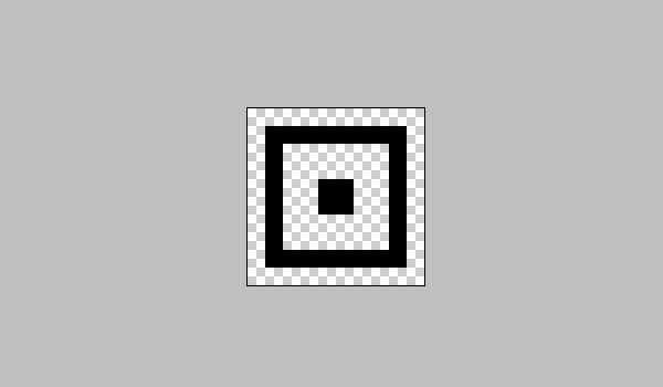
Once you have something that looks like this, we need to define this as a new pattern. So locate the toolbar and click “Edit” > “Define pattern…” and name your new pattern, square will do!
If we now go back to our document which contains the emblem logo, hold crtl & click the circle layer to highlight the contents of the layer. With the circle outlined create a new layer and locate the toolbar again and click “Edit” > “Fill..” and fill with your new pattern. Now set the opacity of the patterned layer to 25% and hold ctrl + E to merge with the emblem layer bellow.

Playing with fonts
For the “Lee Grant” part of the emblem I’ve used a sweet, bold font named Bebas Neue. Using this font, set the size to 40px and write something like your name. We’ll give this a drop shadow to give the text some depth.
Create a new layer named “line” and using the rectangular marquee tool draw a 1px high line horizontally across the logo, making sure its the same with as your text. Your logo should now look something like this.

Another sweet font I use now and then is Caviar Dreams which fits well with the style of this logo. Go ahead and grab this font, once installed, use this font and write tagline like “web designer” at the size of 19.3px and coloured white (#ffffff).

Whoo, stars!
Let’s temporarily set our logo layers to invisible so all we have is our background, select the pen tool and draw yourself a star shape like so. change your foreground colour to white and right click the star and fill selecting “Fill path”, fill the path with your foreground colour.

All we need to do now is resize the star by clicking “Edit” > “Free transform..”, and duplicating the layer 3 times, positioning 2 stars at the top and 2 stars at the bottom.

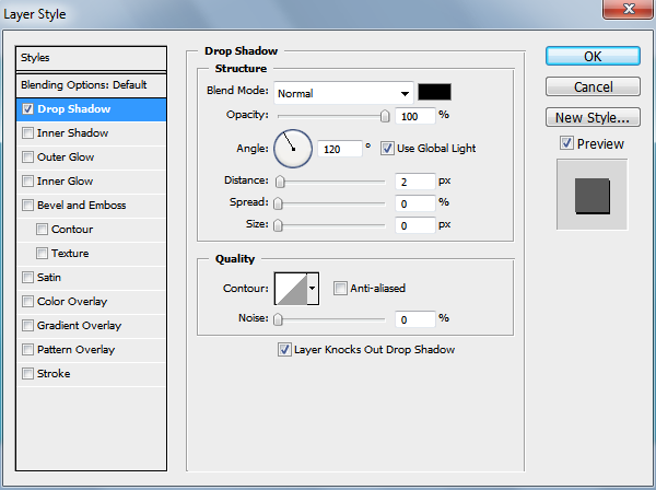
A little shadow
It’s starting to look pretty neat now, but without a shadows it’s resembling a sticker more than a logo. Let’s create a new layer named shadow and add a shadow by creating an oval shape using the rounded marquee tool, then selecting “Filter” > “Blur” > “Gaussian blur” and choose about a 5px radius.

The finale!
Look’s like you’ve made it through to the over side and hopefully you learned a thing or two. This is just my spin on creating an emblem logo, there are plenty of styles and different ways to do this, which I would love to see. So if you’ve got a cool looking emblem you’ve created or adjusted from this tutorial go ahead and post them up in the comments section.

Happy photoshopping!
Download Source
Enjoy.