Your ads will be inserted here by
AdSense Now!.
Please go to the plugin admin page to paste your ad code.
This isn’t going to be your typical tutorial in the sense that it’s not so much about technology as it is about design itself. It really doesn’t matter if you know how to use Photoshop or Illustrator if you are doing the wrong things with them. Tools are just tools, and they only ever obey their master’s bidding.
As designers, we’re tasked with crafting the very reputations of the companies, organizations, and individuals that entrust their work to us. That’s a tremendous responsibility, and one I feel most designers tend to take much, much lighter than they ever should.
When you set out to create an identity for a client, you must first understand that client and their customers or the people they work with. What makes them tick? What makes their customers tick? What factors drive the decisions and thought processes of their customers? Why are their customers buying or not buying their goods or services in the first place? To understand these things, you need to spend some time extensively interviewing your client and, if possible, his or her customers.
I cannot possibly stress enough that designing logos and identities has nothing to do with technology. People who know how to use Photoshop or Illustrator are a dime a dozen. Design has absolutely nothing to do with how proficient you are with Photoshop or Illustrator. Anyone can use a hammer. Very few can design the Empire State Building or the Statue of Liberty. Design has everything to do with being able to deeply understand the company or individual who has placed their trust in you to forge their reputation and their image. As such, it’s critical that you not treat this job lightly. Don’t read this tutorial and then go out and create an identity for a company without putting in the due diligence to become great at your craft. It takes years of dedication, discipline, experience and expertise to do that job well. For now, just focus on honing your craft and getting better at what you do. When you become great at what you do, the work will come.
Getting Started
Once you have a crystal clear picture of what type of people you’re working with, and what type of people they want to attract, you can begin the design conceptualization process. The fun part. The brainstorm.
For this stage of the project, I typically turn to paper. You may even want to take a walk, go for a run, or take a hot shower or something. You need to really think about what’s going to best express the very essence of your client in logo form, and that requires equal parts concentrated focus and creativity in the same act.
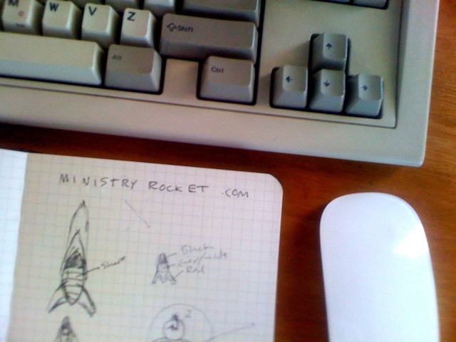
Once you have your concept, or at least the general direction you want to take your identity project in, it’s time to start sketching. Start with a pen or pencil and a notebook. I use several different Moleskine notebooks for sketching and writing down my ideas, but anything will work. You can even use a napkin, a whiteboard, or a sheet of blank printer paper. Just speed sketch anything that comes to mind. Don’t worry about the art. It’s not a competition. The goal is to express your concept as clearly and simply as possible. You’ll need to iterate through several different variations on your ideas, and for this, paper is key. If you try to do this stage on a computer, or even an iPad, you’ll focus too much on the tool and the implementation of it and nowhere near enough on what you are drawing. You need absolute freedom. You need to be able to quickly draw over top of a sketch, or scribble it out. You need to be able to quickly create ten different versions of a shape in a matter of seconds. That’s not happening on a computer screen.
My actual sketches of the Ministry Rocket Logo (please pardon the terrible iPhone photo)
If you have the opportunity to do this stage with the client present, more power to you. This is a great stage to get their feedback on what concept most closely fits the company’s goals. However, don’t feel like they need to be present by any stretch of the imagination. You may even focus a lot better without them. I know I do.
Once you have your concept whittled down, it’s time to bring it into the digital realm. For this, I typically use a scanner, but even a digital camera would work. You can even use the camera on your phone in a pinch. Keep your sketches well lit and on a flat surface if you opt to use a camera.
Once you get the sketches into the computer, import them into Illustrator, Photoshop, or any tool of your choosing. I cannot stress enough how little importance falls on the tool. I use VectorDesigner, Pixelmator, Acorn, and others all the time. I also use Photoshop and Illustrator. It really doesn’t matter. What matters is that you understand how to use your tool fluently and that you can use it with strong confidence. For the sake of illustration, I’ll be using Illustrator in this tutorial.
You do want to create your logo in a vector app (like Illustrator), as opposed to a raster app (like Photoshop). For that, Illustrator or another vector illustration app is needed. If you create your logo in Photoshop, it won’t be scaleable and editable in the same way it would be if created in a vector app. Logos, by definition, should ideally be infinitely scaleable, and able to be printed on any material in color or black or white.
With your original sketches imported, depending on the complexity of your drawings, you have two choices. You can trace over the sketches to create vector illustrated versions of them, or you can simply re-create them from scratch. For most logos, you may not even need to scan your sketches in at all. Instead, just re-create the graphic using your original sketch as a faithful guide, sitting right there on your desk. This will encourage perfection and symmetry, while trying to stay true to a tracing will often result in imperfection and asymmetry (of course, if this is the goal, then trace by all means).
What I typically do is create only half of the icon, using the pen tool, with no stroke and a fill color, if it’s a symmetrical design, and then ever so slightly overlap the two images so that the two halves are just touching with no background whatsoever visible between the two. Then, I merge the two halves using the “Merge” command in Illustrator’s “Pathfinder” palette, which creates one perfectly symmetrical shape. If it helps you, you can leave the stoke turned on while you’re drawing, and later turn it off before merging your two halves.
This is how the rocket was created.
Typefaces and Fonts
Just to clarify the terminology going in, the word “typeface” is used to describe a family of fonts. For instance, “Helvetica” is a typeface. It is not a font. Referring to it as such is improper and makes you sound like an amateur. “Helvetica Neue Ultralight Extended 23, 48PT” is a font. The “font” is the exact pairing of typeface, variant, weight, and size as used in a design.
Your ads will be inserted here by
AdSense Now!.
Please go to the plugin admin page to paste your ad code.
The typeface you choose is critical to your design. In some cases, you’ll even need to create custom lettering. However, for the sake of illustration and sanity, I’m going to stick with finished typefaces here.
It’s absolutely vital that you have a healthy library of typefaces installed and available for use in design projects. You cannot rationally expect to create great work with terrible resources. Garbage in = garbage out.
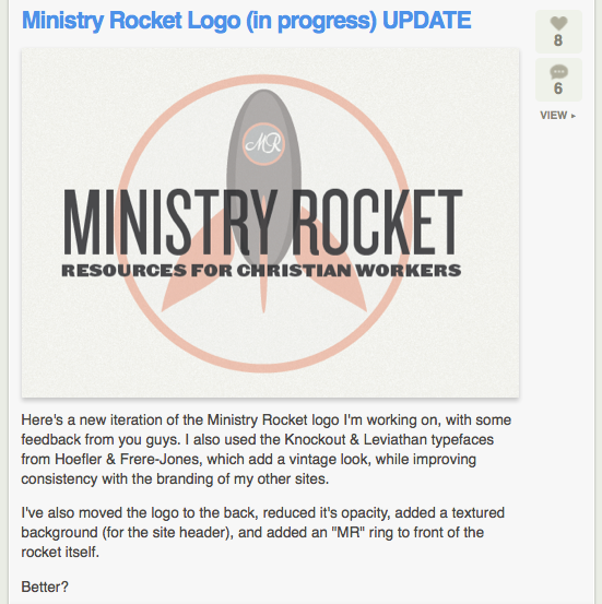
There are a number of fantastic foundries out there, producing great new typefaces every day. Many of my personal favorites come from Hoefler & Frere-Jones Foundry. The typefaces used in the Ministry Rocket logo are Knockout (Bantam Flyweight, in all caps) and Leviathan, both by HFJ.
If you’re coming up short on great typeface ideas, or if you are simply in need of some new ones and have no idea where to get started, I cannot possibly recommend Dribbble enough. Anyone can browse the work there, and many of the design pieces submitted there cite which typefaces were used in the design. You’re going to see a ton of Hoefler typefaces there, but there are a lot from other foundries, such as Linotype and others as well.
The typeface you choose should accurately reflect the nature and goals of your client. Fonts say a lot about a design. As Massimo Vignelli said, “You can say ‘I love you!’ in Helvetica, and if you want to be really fancy, you can say it in Helvetica Light. You can say, ‘I hate you!’ in Helvetica, and if you want to say it really loud, you can say it in Helvetica Bold.”
If you were designing a logo for a very conservative investment firm, and you used a really modern, slick typeface, you’d be lying. They aren’t a design firm, they are an investment firm. That should be obvious from the typeface you choose for their logo. Something like Hoefler Text or Baskerville, or even Trajan or Bank Gothic might be appropriate, but surely not Helvetica Neue Ultralight or Avant Garde.
Likewise, you should never use typefaces just because they are trendy, or because you like them. For instance, it would be inappropriate for you to use a vintage typeface for a grocery store just because you thought it looked cool. Using typefaces based sheerly on personal preference is an telltale sign of a designer who doesn’t know how to relate with his or her clients, or who lacks experience in choosing typefaces appropriately. Make those letters count!
Feedback
Yes, you can and should get feedback from your clients. But what are you to do if designing a logo on your own time? What if you’re working on something without a client at all? Or, what if you want to get feedback from skilled people, as opposed to someone who wouldn’t know good design if it hit them in the face? Great feedback is helpful in almost all situations. These are all realistic everyday problems, and fortunately there are many great solutions available.
Dribbble & Forrst
Both of these are invitation-only communities of designers. Forrst tends to be easier to get into, but if you’re already on Dribbble, more power to you. If you don’t already have an account on each of these sites, go set one up right now. I’ll wait. Got em? Great. Let’s continue. In the case of Ministry Rocket, I posted my early comps on Forrst, and was able to get incredibly valuable, precise feedback in mere minutes.

Real-world Feedback
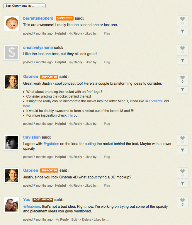
I cannot possibly tell you just how valuable this is. If you are in the middle of nowhere, in the middle of the night, sitting at your Mac, you can get feedback on a design from world-class designers from around the world in mere minutes. You’d be fairly insane not to take advantage of that fact. The design community is here for you, and they are incredibly helpful people.
After feedback.
Client Feedback
It should be your goal to create the perfect design on the first try. This whole idea of designing iterations is a sheer waste of your time and the client’s time as well. Imagine if Walmart asked their contractors to build them three versions of every store, so they could choose their favorite. That would be ridiculous. Yet, somehow, people think this is acceptable behavior in the design contracting profession. It isn’t. This isn’t 3rd grade art class. It isn’t a competition, either. It’s a problem, and there is an ideal solution. It’s your job to find the best one as efficiently as possible.
Paul Rand, one of the greatest designers of our time, who had Steve Jobs as a client, is a champion of this philosophy. When Steve Jobs asked him for three iterations of a logo, Paul told him,
“No. I will not give you three options. I will give you the best solution to your problem, and you will pay me for it whether you like it or not.”
You’d think this would have been considered rude. It wasn’t. Steve was so astonished at the Paul’s professional confidence and design prowess that he gladly accepted the solution, and the two became great lifelong friends. People want to hire someone who knows exactly what they are doing, and why they are doing it. They want someone who can take a job from inception to completion with confidence, skill and professionalism, not some amateur that they need to babysit every step of the way.
If you must use iterations for one reason or another, never give the client a bad option. I’ve tried that route before of giving the client one great choice, a less great choice, and a so-so or even bad choice, hoping they would choose the obvious best one. It doesn’t work. Clients always, without fail, choose the worst option you give them. They aren’t designers, and may even lack the taste needed to create a successful logo altogether. That’s why they hired you in the first place. You are being paid for your skill, experience, and creativity. If you fail to use these things properly, and give the client a bad choice to choose as a result, that’s on you. For this reason, give the client two or three equally fantastic designs, and suggest the best one to them, but make sure you don’t have an inferior option on the table.
Conclusion
Now that you’ve successfully learned how to draft a series of logo comps on paper, move to the digital space and create your initial versions, choose typefaces, and get feedback from other designers and clients, you have the basic elements of knowledge needed to get started. Be patient, and do great work. Constantly seek new inspiration, and above all, never lose your passion!
Your ads will be inserted here by
AdSense Now!.
Please go to the plugin admin page to paste your ad code.