Your ads will be inserted here by
AdSense Now!.
Please go to the plugin admin page to paste your ad code.
In this article by packt publishing we’ll be looking into a jQuery UI Accordion Widget. The accordion widget is another UI widget made up of a series of containers for your content, all of which are closed except for one.
Therefore, most of its content is initially hidden from view. Each container has a heading element associated with it, which is used to open the container and display the content. When you click on a heading, its content is displayed. When you click on another heading, the currently visible content is hidden while the new content is shown.
It should be noted that the height of the accordion’s container element will automatically be set so that there is room to show the tallest content panel in addition to the headers. This will vary, of course, depending on the width that you set on the widget’s container.
Accordion’s Structure
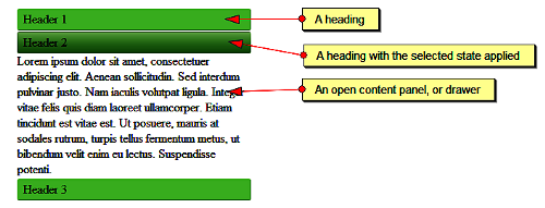
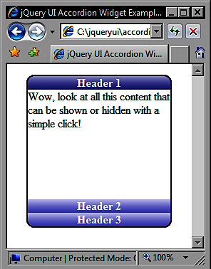
Let’s take a moment to familiarize ourselves with what an accordion is made of. Within the outer container is a series of links. These links are the headings within the accordion and each heading will have a corresponding content panel, or drawer as they are sometimes referred to, which opens when the heading is clicked. The following screenshot shows these elements as they may appear in an accordion.
It’s worth remembering that when using the accordion widget, only one content panel can be open at any one time. Let’s implement a basic accordion now. In a blank page in your text editor, create the following page.
<ul id="myAccordion"> <li> <a href="#">Header 1</a> <div>Wow, look at all this content that can be shown or hidden with a simple click!</div> </li> <li> <a href="#">Header 2</a> <div>Lorem ipsum dolor sit amet, consectetuer adipiscing elit. Aenean sollicitudin. Sed interdum pulvinar justo. Nam iaculis volutpatligula. Integer vitae felis quis diam laoreet ullamcorper. Etiam tincidunt est vitae est. Ut posuere, mauris at sodales rutrum, turpis tellus fermentum metus, ut bibendum velit enim eu lectus. Suspendisse potenti. </div> </li> <li> <a href="#">Header 3</a> <div>Donec at dolor ac metus pharetra aliquam. Suspendisse purus. Fusce tempor ultrices libero. Sed quis nunc. Pellentesque tincidunt viverra felis. Integer elit mauris, egestas ultricies, gravida vitae, feugiat a, tellus.</div> </li> </ul> <script type="text/javascript" src="jqueryui1.6rc2/jquery-1.2.6.js"></script> <script type="text/javascript" src="jqueryui1.6rc2/ui/ui.core.js"></script> <script type="text/javascript" src="jqueryui1.6rc2/ui/ui.accordion.js"></script> <script type="text/javascript"> //function to execute when doc ready $(function() { //turn specified element into an accordion $("#myAccordion").accordion(); }); </script>
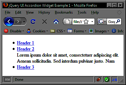
Save the file as accordion1.html in your jqueryui folder and try it out in a browser. We haven’t specified any styling at all at this stage, but as you can see from the following screenshot, it still functions exactly as intended.
Little code is required for a basic working version of the accordion widget. A simple unordered list element is the mark-up foundation which is transformed by the library into the accordion object.
The following three separate external script files are required for an accordion:
– The jQuery library itself (jquery-1.2.6.js) –
– The UI base file (ui.core.js) –
– The accordion source file (ui.accordion.js) –
The first two files are mandatory requirements of all components of the UI library. They should be linked to in the order shown here. Each widget also has its own source file, and may depend on other components as well.
The order in which these files appear is important. The jQuery library must always appear first, followed by the UI base file. After these files, any other files that the widget depends upon should appear before the widget’s own script file. The library components will not function as expected if files are not loaded in the correct order.
Finally, we use a custom “script” block to turn our “ul” element into the accordion. We can use the jQuery object shortcut $ to specify an anonymous function which will be executed as soon as the document is ready. This is analogous to using $(document).ready(function(){}) and helps to cut down on the amount of code we have to type.
Following this, we use the simple ID selector $(“#myAccordion”) to specify the element on the page we want to transform. We then use the accordion() constructor method to create the accordion
Other elements can be turned into accordions as well. All list element variants are supported including ordered lists and definition lists. You don’t even need to base the accordion on a list element at all. You can build a perfectly functional accordion using just nested “div” and “a” elements, although additional configuration will be required
In the above example, we used an empty fragment (#) as the value of the href attribute. You should note that any URLs supplied for accordion headers will not be followed when the header is clicked within the accordion when using the default implementation.
Styling The Accordion
With no styling, the accordion will take up 100% of the width of its container. Like with other widgets, we have several options for styling the accordion. We can create our own custom stylesheet to control the appearance of the accordion and its content, we can use the default or flora themes that come with the library, or we can use Theme Roller to create an extensive skin for the whole library. Let’s see how using the flora theme for the accordion will cause it to render. In accordion1.html, add the following “link” tag to the “head” of the page.
<link rel="stylesheet" type="text/css" href="jqueryui1.6rc2/themes/flora/flora.accordion.css">
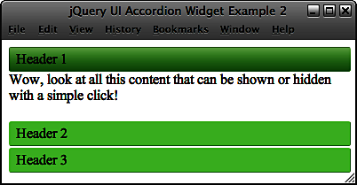
Save the new file as accordion2.html, also in the jqueryui folder, and view it again in a browser. It should appear something like this.
The accordion theme file assumes that an unordered list is being used as the basis of the widget and specifically targets “li” elements with certain style rules. We can easily create our own custom theme to style the accordion for situations where we want to use a non-list-based accordion widget, or if we simply want different colors or font styles.
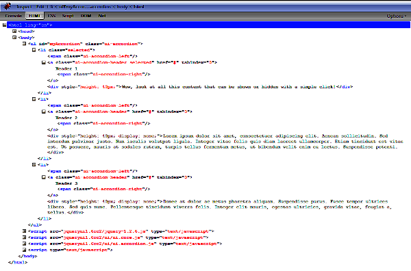
You can use the excellent Firebug plugin for Firefox, or another DOM viewer, to see the class names that are automatically added to certain elements when the accordion is generated. You can also read through an un-minified version of the source file if you really feel like it. These will be the class names that we’ll be targeting with our custom CSS.
The following screenshot shows Firebug in action.
Change accordion2.html so that it appears as follows (new code is shown in bold).
<div id="myAccordion"> <span class="corner topLeft"></span><span class="corner topRight"></span><span class="corner bottomLeft"></span><span class="corner bottomRight"></span> <div><a href="#">Header 1</a><div>Wow, look at all this content that can be shown or hidden with a simple click!</div></div> <div><a href="#">Header 2</a><div>Lorem ipsum dolor sit amet, consectetuer adipiscing elit. Aenean sollicitudin. Sed interdum pulvinar justo. Nam iaculis volutpatligula. Integer vitae felis quis diam laoreet ullamcorper. Etiam tincidunt est vitae est. Ut posuere, mauris at sodales rutrum, turpis tellus fermentum metus, ut bibendum velit enim eu lectus. Suspendisse potenti.</div></div> <div><a href="#">Header 3</a><div>Donec at dolor ac metus pharetra aliquam. Suspendisse purus. Fusce tempor ultrices libero. Sed quis nunc. Pellentesque tincidunt viverra felis. Integer elit mauris, egestas ultricies, gravida vitae, feugiat a, tellus.</div></div> </div> <script type="text/javascript" src="jqueryui1.6rc2/jquery-1.2.6.js"></script> <script type="text/javascript" src="jqueryui1.6rc2/ui/ui.core.js"></script> <script type="text/javascript" src="jqueryui1.6rc2/ui/ui.accordion.js"></script> <script type="text/javascript"> //function to execute when doc ready $(function() { //turn specified element into an accordion $("#myAccordion").accordion(); }); </script>
Save this version as accordion3.html in the jqueryui folder. The class name ui-accordion is automatically added to the accordion’s container element. Therefore, we can use this as a starting point for most of our CSS selectors. The links that form our drawer headers are given the class ui-accordion-header so we can also target this class name. In a new file, create the following stylesheet.
#myAccordion { width:200px; border:2px solid #000000; position:relative; list-style-type:none; padding-left:0; } .ui-accordion-header { text-decoration:none; font-weight:bold; color:#000000; display:block; width:100%; text-align:center; } .ui-accordion div div { font-size:90%; } .ui-accordion a { color:#ffffff; background:url(../img/accordion/header-sprite.gif) repeat-x 0px 0px; } .ui-accordion a.selected { background:url(../img/accordion/header-sprite.gif) repeat-x 0px -22px; } .ui-accordion a:hover { background:url(../img/accordion/header-sprite.gif) repeat-x 0px -44px; } /* container rounded corners */ .corner { position:absolute; width:12px; height:13px; background:url(../img/accordion/corner-sprite.gif) no-repeat; } .topLeft { top:-2px; left:-2px; background-position:0px 0px; } .topRight { top:-2px; right:-2px; background-position:0px -13px; } .bottomRight { bottom:-2px; right:-2px; background-position:0px -26px; } .bottomLeft { bottom:-2px; left:-2px; background-position:0px -39px; }
Save this file as accordionTheme.css in your styles folder and preview accordion3.html in a browser. We will need a new folder for the images we use in this and subsequent examples. Create a new folder inside the img folder and name it accordion. With just two images, and a few simple style rules, we can drastically change the default appearance of the accordion with our own custom skin as shown in the following screenshot.
Configuring The Accordion
The accordion has a range of configurable properties which allow us to easily change the default behaviour of the widget. The following table lists the available properties, their default value, and gives a brief description of their usage.
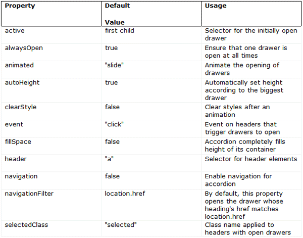
Configurable properties The configurable properties for all of the different components of jQuery UI are constantly evolving with each new release of the library. You can keep track of the latest properties by looking through the online jQuery UI API pages. Each component has its own page and can be accessed from jQuery Docs
Most of the properties are self-explanatory, and the values they accept are usually booleans, strings, or element references. Let’s put some of them to use so we can explore their functionality. Alter accordion3.html so that it appears as follows.
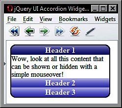
<div id="myAccordion"> <span class="corner topLeft"></span><span class="corner topRight"></span><span class="corner bottomLeft"></span><span class="corner bottomRight"></span> <div><a href="#">Header 1</a><div>Wow, look at all this content that can be shown or hidden with a simple mouseover!</div></div> <div><a href="#">Header 2</a><div>Lorem ipsum dolor sit amet, consectetuer adipiscing elit. Aenean sollicitudin. Sed interdum pulvinar justo. Nam iaculis volutpat ligula. Integer vitae felis quis diam laoreet ullamcorper. Etiam tincidunt est vitae est. Ut posuere, mauris at sodales rutrum, turpis tellus fermentum metus, ut bibendum velit enim eu lectus. Suspendisse potenti.</div></div> <div><a href="#">Header 3</a><div>Donec at dolor ac metus pharetra aliquam. Suspendisse purus. Fusce tempor ultrices libero. Sed quis nunc. Pellentesque tincidunt viverra felis. Integer elit mauris, egestas ultricies, gravida vitae, feugiat a, tellus.</div></div> </div> <script type="text/javascript" src="jqueryui1.6rc2/jquery-1.2.6.js"></script> <script type="text/javascript" src="jqueryui1.6rc2/ui/ui.core.js"></script> <script type="text/javascript" src="jqueryui1.6rc2/ui/ui.accordion.js"></script> <script type="text/javascript"> //function to execute when doc ready $(function() { //set the event property var accOpts = { event:"mouseover" } //turn specified element into an accordion $("#myAccordion").accordion(accOpts); }); </script>
First, we create a new object literal called accOpts which contains one property key and a value. We then pass this object into the accordion() constructor as an argument, and it overrides the default properties of the widget. The string we specified for the value of the event property becomes the event that triggers the activation of the drawers, making this a very useful property. Save the changes as accordion4.html.
You should note that you can also set properties using an inline object within the widget’s constructor method without creating a separate object (see accordion4Inline.html). Using the following code would be equally as effective, and would often be the preferred way for coding.
<script type="text/javascript"> //function to execute when doc ready $(function() { //turn specified element into an accordion $("#myAccordion").accordion({ event:"mouseover" }); }); </script>
We can set other properties at the same time as well. If we want to change which drawer is open by default when the accordion is rendered, as well as change the trigger event, we would supply both properties and the required values, with each pair separated by a comma. Update accordion4.html so that it appears as follows.
<div id="myAccordion"> <span class="corner topLeft"></span><span class="corner topRight"></span><span class="corner bottomLeft"></span><span class="corner bottomRight"></span> <div><a id="header1" href="#">Header 1</a><div>Wow, look at all this content that can be shown or hidden with a simple mouseover!</div></div> <div><a id="header2" href="#">Header 2</a><div>Lorem ipsum dolor sit amet, consectetuer adipiscing elit. Aenean sollicitudin. Sed interdum pulvinar justo. Nam iaculis volutpat ligula. Integer vitae felis quis diam laoreet ullamcorper. Etiam tincidunt est vitae est. Ut posuere, mauris at sodales rutrum, turpis tellus fermentum metus, ut bibendum velit enim eu lectus. Suspendisse potenti.</div></div> <div><a id="header3" href="#">Header 3</a><div>Donec at dolor ac metus pharetra aliquam. Suspendisse purus. Fusce tempor ultrices libero. Sed quis nunc. Pellentesque tincidunt viverra felis. Integer elit mauris, egestas ultricies, gravida vitae, feugiat a, tellus.</div></div> </div> <script type="text/javascript" src="jqueryui1.6rc2/jquery-1.2.6.js"></script> <script type="text/javascript" src="jqueryui1.6rc2/ui/ui.core.js"></script> <script type="text/javascript" src="jqueryui1.6rc2/ui/ui.accordion.js"></script> <script type="text/javascript"> //function to execute when doc ready $(function() { //configure accordion var accOpts = { event:"mouseover", active:"#header3" } //turn specified element into an accordion $("#myAccordion").accordion(accOpts); }); </script>
Your ads will be inserted here by
AdSense Now!.
Please go to the plugin admin page to paste your ad code.
The first change is to give our header elements id attributes in the underlying HTML in order to target them with the active property. In our object literal, we then specify the selector for the header we would like to open by default. Save the file as accordion5.html. When the page is opened, the third drawer should be displayed by default.
The other properties listed in the table at the start of this section are equally as easy to configure. Change the object literal so that it appears as follows.
//configure accordion var accOpts = { event:"mouseover", active:"#header3", alwaysOpen:false, autoHeight:false }
Save these changes as accordion6.html and view the results in a browser. First, you should find that when you first roll over a heading the drawer opens as normal, but the accordion grows or shrinks depending on how much content is in the drawer. It no longer stays at a fixed height. This can be seen in the following example.
You should also find that if you roll over a heading whose drawer is already open, the drawer will close and the accordion will shrink so that only the headers are displayed with no open drawers. Note that when using false with the alwaysOpen property, the accordion will shrink in this way regardless of whether the autoHeight property is set to true or false.
The fillSpace property, if set, will override autoHeight. You should also be aware that the clearStyle property will not work with autoHeight. One final property we should look at is the navigation property. This property is used to enable navigating to new pages from accordion headings. Change accordion6.html to this.
<div id="myAccordion"> <span class="corner topLeft"></span><span class="corner topRight"></span><span class="corner bottomLeft"></span><span class="corner bottomRight"></span> <div><a id="header1" href="#1">Header 1</a><div>Wow, look at all this content that can be shown or hidden with a simple mouseover!</div></div> <div><a id="header2" href="#2">Header 2</a><div>Lorem ipsum dolor sit amet, consectetuer adipiscing elit. Aenean sollicitudin. Sed interdum pulvinar justo. Nam iaculis volutpat ligula. Integer vitae felis quis diam laoreet ullamcorper. Etiam tincidunt est vitae est. Ut posuere, mauris at sodales rutrum, turpis tellus fermentum metus, ut bibendum velit enim eu lectus. Suspendisse potenti.</div></div> <div><a id="header3" href="#3">Header 3</a><div>Donec at dolor ac metus pharetra aliquam. Suspendisse purus. Fusce tempor ultrices libero. Sed quis nunc. Pellentesque tincidunt viverra felis. Integer elit mauris, egestas ultricies, gravida vitae, feugiat a, tellus.</div></div> </div> <script type="text/javascript" src="jqueryui1.6rc2/jquery-1.2.6.js"></script> <script type="text/javascript" src="jqueryui1.6rc2/ui/ui.core.js"></script> <script type="text/javascript" src="jqueryui1.6rc2/ui/ui.accordion.js"></script> <script type="text/javascript"> //function to execute when doc ready $(function() { //configure accordion var accOpts = { event:"mouseover", active:"#header3", alwaysOpen:false, autoHeight:false, navigation:true } //turn specified element into an accordion $("#myAccordion").accordion(accOpts); }); </script>
Save the changes as accordion7.html. When you roll over one of the headings, they will still open as normal, but if you click on one of the headings, the URL specified as the header’s href attribute will be followed.
With navigation enabled, the widget will check for a fragment identifier at the end of the URL when the page loads. If there is a fragment identifier, the accordion will open the drawer whose heading’s href attribute matches the fragment. So, if the second heading is clicked in this example, and then the page is refreshed, the second drawer of the accordion will be opened automatically. Therefore, it is important to ensure that the href attributes for each accordion header is unique to avoid conflicts in this situation.
Accordion Methodology
The accordion includes a selection of methods that allow you to control and manipulate the behavior of the widget programmatically. Some of the methods are common to each component of the library, such as the destroy method, which is used by every widget. We’ll look at each of these methods in turn.
Destruction
One method provided by the accordion is the destroy method. This method removes the accordion widget and returns the underlying mark-up to its original state. We’ll use the default properties associated with accordion instead of the ones we configured for the last few examples. In a new page in your text editor, add the following code.
<div id="myAccordion"> <span class="corner topLeft"></span><span class="corner topRight"></span><span class="corner bottomLeft"></span><span class="corner bottomRight"></span> <div><a href="#">Header 1</a><div>Wow, look at all this content that can be shown or hidden with a simple click!</div></div> <div><a href="#">Header 2</a><div>Lorem ipsum dolor sit amet, consectetuer adipiscing elit. Aenean sollicitudin. Sed interdum pulvinar justo. Nam iaculis volutpat ligula. Integer vitae felis quis diam laoreet ullamcorper. Etiam tincidunt est vitae est. Ut posuere, mauris at sodales rutrum, turpis tellus fermentum metus, ut bibendum velit enim eu lectus. Suspendisse potenti.</div></div> <div><a href="#">Header 3</a><div>Donec at dolor ac metus pharetra aliquam. Suspendisse purus. Fusce tempor ultrices libero. Sed quis nunc. Pellentesque tincidunt viverra felis. Integer elit mauris, egestas ultricies, gravida vitae, feugiat a, tellus.</div></div> </div> <button id="accordionKiller">Kill it!</button> <script type="text/javascript" src="jqueryui1.6rc2/jquery-1.2.6.js"></script> <script type="text/javascript" src="jqueryui1.6rc2/ui/ui.core.js"></script> <script type="text/javascript" src="jqueryui1.6rc2/ui/ui.accordion.js"></script> <script type="text/javascript"> //function to execute when doc ready $(function() { //turn specified element into an accordion $("#myAccordion").accordion(); //attach click hander to button $("#accordionKiller").click(function() { //destroy the accordion $("#myAccordion").accordion("destroy"); }); }); </script>
The “body” of the page contains a new “button” element, which can be used to destroy the accordion. The final “script” block also contains a new anonymous function. We use the standard jQuery library’s click() method to execute some code when the targeted “button” element is clicked.
We use the same accordian() constructor method to destroy it as we did to create it. But this time, we supply the string “destroy” as an argument. This causes the class names added by the library to be removed, the opening and closing behavior of the headers to no longer be effective, and all of the previously hidden content will be made visible.
Because we used an ID selector in our theme file to style the accordion container, this element will retain its size and borders. The roll-over effects were added by targeting the class names created by the library. As these are removed, along with the rest of the accordion’s functionality, the rollovers do not activate. Save this file as accordion8.html.
Enabling and disabling
Two very simple methods to use are enable and disable. These are just as easy to use as destroy, although they do have some subtle behavioral aspects that should be catered for in any implementation as you’ll see. Change accordion8.html to the following.
<div id="myAccordion"> <span class="corner topLeft"></span><span class="corner topRight"></span><span class="corner bottomLeft"></span><span class="corner bottomRight"></span> <div><a href="#">Header 1</a><div>Wow, look at all this content that can be shown or hidden with a simple click!</div></div> <div><a href="#">Header 2</a><div>Lorem ipsum...</div></div> <div><a href="#">Header 3</a><div>Donec at dolor...</div></div> </div> <button id="enable">Enable!</button><button id="disable">Disable!</button> <script type="text/javascript" src="jqueryui1.6rc2/jquery-1.2.6.js"></script> <script type="text/javascript" src="jqueryui1.6rc2/ui/ui.core.js"></script> <script type="text/javascript" src="jqueryui1.6rc2/ui/ui.accordion.js"></script> <script type="text/javascript"> //function to execute when doc ready $(function() { //turn specified element into an accordion $("#myAccordion").accordion(); //add click handler for enable button $("#enable").click(function() { //enable the accordion $("#myAccordion").accordion("enable"); }); //add click handler for disable button $("#disable").click(function() { //disable the accordion $("#myAccordion").accordion("disable"); }); }); </script>
We use these two methods in exactly the same way as the destroy method. Simply call accordion() with either enable or disable supplied as a string parameter. Save this file as accordion9.html and try it out.
One thing you’ll quickly notice is that when the accordion has been disabled, the rollover and selected effects are still apparent. This could be misleading as there is no visual cue that the widget has been disabled. This behavior is sure to be fixed in a later revision of the library. But for now, we can easily fix this with a little standard jQuery goodness and apply disabled states ourselves.
Another problem we have with our test page is that clicking the Enable! button while the accordion is already enabled does nothing. There is, of course, nothing for it to do. Some kind of indication that the widget is already enabled would be helpful. Let’s see how easy it is to fix these minor issues. Update the current page to this.
<div id="myAccordion"> <span class="corner topLeft"></span><span class="corner topRight"></span><span class="corner bottomLeft"></span><span class="corner bottomRight"></span> <div><a href="#">Header 1</a><div>Wow, look at all this content that can be shown or hidden with a simple click!</div></div> <div><a href="#">Header 2</a><div>Lorem ipsum...</div></div> <div><a href="#">Header 3</a><div>Donec at...</div></div> </div> <button id="enable">Enable!</button><button id="disable">Disable!</button> <script type="text/javascript" src="jqueryui1.6rc2/jquery-1.2.6.js"></script> <script type="text/javascript" src="jqueryui1.6rc2/ui/ui.core.js"></script> <script type="text/javascript" src="jqueryui1.6rc2/ui/ui.accordion.js"></script> <script type="text/javascript"> //function to execute when doc ready $(function() { //turn specified element into an accordion $("#myAccordion").accordion().addClass("enabled"); //add click handler for enable button $("#enable").click(function() { //alert if already enabled, enable and change classes if not ($("#myAccordion").hasClass("enabled")) ? alert("Accordion already enabled!") : $("#myAccordion").accordion("enable").addClass("enabled").removeClass("disabled") ; }); //add click handler for disable button $("#disable").click(function() { //alert if already disabled, disable and change classes if not ($("#myAccordion").hasClass("disabled")) ? alert("Accordion already disabled!") : $("#myAccordion").accordion("disable").addClass("disabled").removeClass("enabled") ; }); }); </script>
The new code takes care of notifying the visitor if they click the Enable! button while the accordion is already enabled, or if the Disable! button is clicked while it is already disabled, through simply adding two additional class names; enabled and disabled
We use the standard jQuery addClass() method to initially set an additional class name of enabled on the accordion’s container. A simple JavaScript ternary then looks for the presence of this class and invokes the alertif it is detected. This is done using the jQuery hasClass() method.
If the accordion is changed from enabled to disabled, the addClass(), and also the removeClass() methods are used to swap our class names appropriately. A less intrusive way for us to do this, without the need for alerts, would be to actually disable the Enable! button while the accordion is enabled and vice-versa. I’ll leave you to try this on your own.
Save this as accordion10.html. Now we can add some new styles to our stylesheet to address our new disabled class. Open accordionTheme.css in your text editor and add the following new selectors and rules after the existing ones.
/* disabled state */ .disabled a { background:url(../img/accordion/disabled.gif) repeat-x 0px 0px; cursor:default; } .disabled a.selected { background:url(../img/accordion/disabled.gif) repeat-x 0px 0px; cursor:default; } .disabled a:hover { background:url(../img/accordion/disabled.gif) repeat-x 0px 0px; cursor:default; }
Save this as accordionTheme2.css (don’t forget to update the link to the stylesheet in the “head”). Now, when the Disable! button is clicked, the new class name will pick up our grayed out headings. As we’ve specified the same background image for the selected and hover states, the accordion will not appear to respond in any way to clicks or mouse overs while disabled.
Drawer Activation
The final method exposed by accordion is the activate method. This can be used to programmatically show or hide different drawers. We can easily test this method using a text box and a new button. Change acordion10.html to this:
<div id="myAccordion"> <span class="corner topLeft"></span><span class="corner topRight"></span><span class="corner bottomLeft"></span><span class="corner bottomRight"></span> <div><a href="#">Header 1</a><div>Wow, look at all this content that can be shown or hidden with a simple click!</div></div> <div><a href="#">Header 2</a><div>Lorem ipsum... </div></div> <div><a href="#">Header 3</a><div>Donec at... </div></div> </div> <p>Choose a drawer to open</p> <input id="choice" type="text"><button id="activate">Activate</button> <script type="text/javascript" src="jqueryui1.6rc2/jquery-1.2.6.js"></script> <script type="text/javascript" src="jqueryui1.6rc2/ui/ui.core.js"></script> <script type="text/javascript" src="jqueryui1.6rc2/ui/ui.accordion.js"></script> <script type="text/javascript"> //function to execute when doc ready $(function() { //turn specified element into an accordion $("#myAccordion").accordion(); //add click handler for activate button $("#activate").click(function() { //get the value from the text box var choice = $("#choice").val(); //open the chosen drawer $("#myAccordion").accordion("activate", choice - 1); }); }); </script>
Save this file as accordion11.html. The activate method is used in the same way as the destroy method. It is passed to the accordion() constructor as an argument. Apart from supplying the string “activate”, we also need to tell the accordion which drawer to activate using a number representing the drawer’s index.
Like standard JavaScript arrays, the index numbers for the accordion drawer headings begin with zero. Therefore, to open the correct drawer, we subtract 1 from the figure entered into the text box when we call the activate method.
Summary
The accordion widget allows us to easily implement an object on the page which will show and hide different blocks of content. This is a popular, and much sought after, effect which is implemented by big players on the web today like Apple.
We first saw that the accordion widget doesn’t require any CSS at all in order to function as the behaviour without styling still works perfectly. We also looked at the flora styling, as well as the ease in which custom styles can be added.
We then moved on to look at the configurable properties that can be used with accordion. We saw that we can use these properties to change the behaviour of the widget, such as specifying an alternative heading to be open by default, whether the widget should expand to fill the height of its container, or the event that triggers the opening of a content drawer.
In addition to looking at these properties, we also saw that there are a range of methods which can be called on the accordion to make it do things programmatically. For example, we can easily specify a drawer to open, enable and disable any drawers, or even completely remove the widget and return the mark-up to its original state.
In the next and final part of this article, we will take a look at Built-in types of animation and Custom accordion events.
Liked This Article? Why Not Buy The Book
Build highly interactive web applications with ready-to-use widgets of the jQuery user interface library.

Your ads will be inserted here by
AdSense Now!.
Please go to the plugin admin page to paste your ad code.