

March 23rd, 2012 in Photoshop Tutorials by Katharine Tobal
Design an Abstract, Woody and Creative Double-Sided Card in Photoshop
 1 Votes, Rating: 5.00
Hello all! Generally everyone needs a card whether if he/she was a web designer, developer, coder, trade business professional …etc. In this tutorial you’ll learn how to design your own print-ready business cards just in some amazing and easy steps. Put in your mind to have an idea of what your final card should look like, that imagination will help you determine every little thing in what you do! Don’t forget to download the PSD file at the end of this tutorial, it’s free! Now let’s get started!
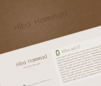
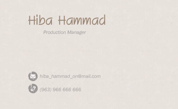
Final Result
Tutorial Details
Program: Adobe Photoshop
Version: CS5
Difficulty: Easy
Estimated Completion Time: 30 minutes
Resources you’ll need:
Used Fonts Pack (RIGAfont, Franklin Gothic Book, Segoe UI)
Used Texture (Fabric Patterns)
Setting up the Photoshop Document:
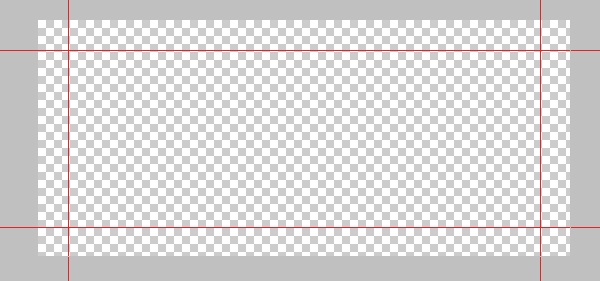
We’ll start by opining Photoshop and make a new document with the following sizes:
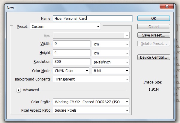
As you see, keep making the resolution 300 pixels per inch and set the color mode to 8-bit CMYK and label the document as you wish, it’s “Hiba_Personal_Card” here.
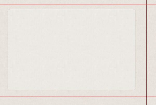
Now, set up some guides to help you placing the content by going to (View > New Guide) then make tow for vertical and tow for horizontal according to what you see in screenshots below:
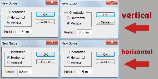
The space you’ll get between the four guides is where we’ll work on! You must let all card content locate inside this area so you can finally get more successful result.
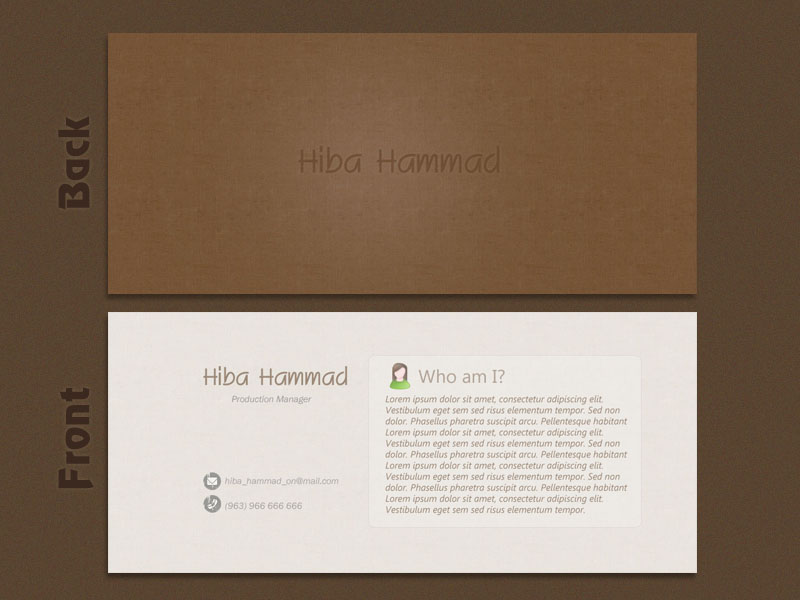
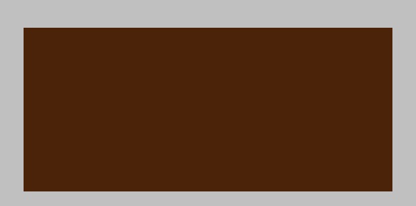
Creating the Back Side Background:
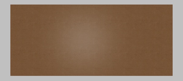
Create a new layer (go to Layer > New > Layer) and label it “Background”, select the “paint Pocket Tool” (G) then fill up the layer you’ve already create with the color: #4a2308. You may have the following result:
Now create a new layer (make sure to place it above the “background” one) and label it “Texture”, remember to download it from resources above. Use the “paint Pocket Tool” (G) and set the option “Pattern” then click to fill up the “Texture” layer with this pattern. Reduce the opacity of this layer to 40%; this is what you should get:

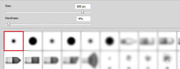
Select the “Brush Tool” (B) and the following soft round one with the size you see below:
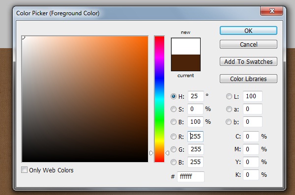
From the color palette, set color on the value of white: #ffffff.
Create a new layer, and then click (with “Brush Tool” (B)) almost at the middle of your card to get the required light, label this layer “back_light” then reduce its opacity to 20%:
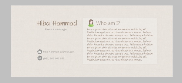
Download the “RIGAfont” font from recourses above, and then use the “Horizontal Type Tool” (T) to type your name or just any other name you want. For me, I’ll type “Hiba Hammad” as a name with the size: 14pt and color: # 614126. Here is our result:
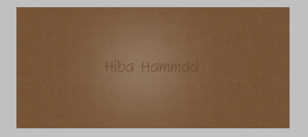
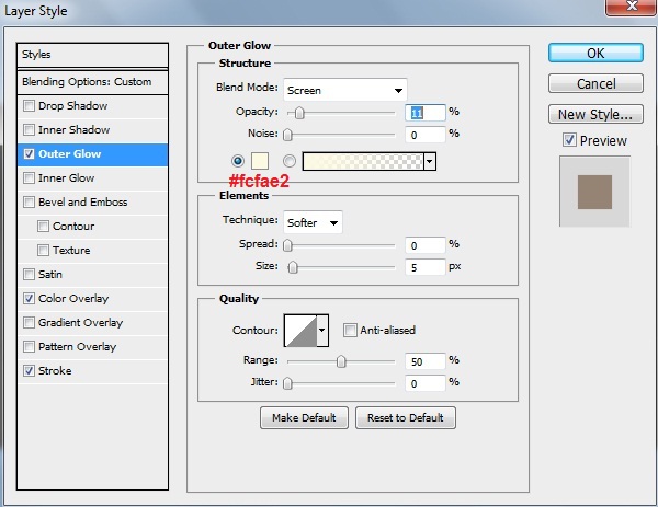
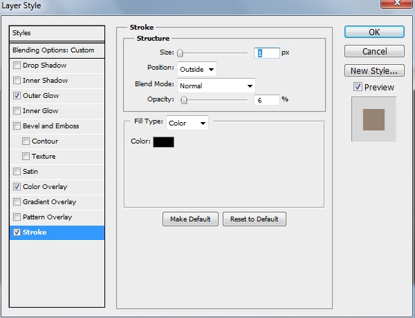
Now, apply the following “Outer Glow” and “Stroke” layer styles (Go to Layer > Layer Style):
Note: To get the downloaded font inside Photoshop, all you need to do is copy it and paste it inside the folder “Fonts” that located in “Program Files > Windows”. When you open up Photoshop you’ll find it ready at the font list. I’m sure you won’t face any problems.
Creating the Front Side Background:
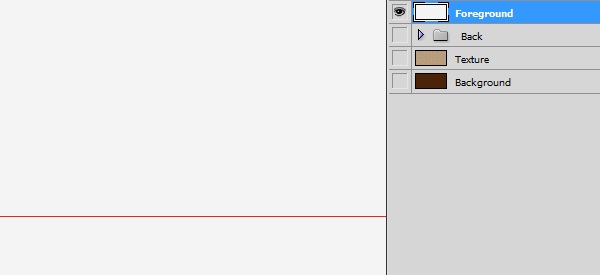
In this step, we’ll goanna design the foreground card side, and this is where we’ll add the information we want to let world know about us! Let’s start by hiding the old layers (Back side layers), you can easily do that by clicking on the eye symbol near each layer and folder, then create a new layer then label it “Foreground” just like you see here:
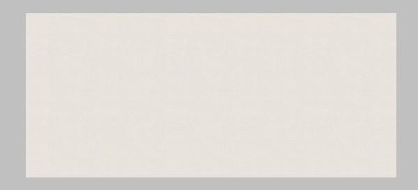
Fill up the color with the value: #f4f4f4 then use the “Paint Pocket Tool” (G) to give your layer this color, you should get a result like that:

With the same way we used to create the “Texture” layer, we’ll create a new one and label it “Texture2” then set the opacity on 20%:
Entering the Card Information:
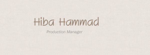
Type the name you want, as you saw I type “Hiba Hammad”, of course, using the “Horizontal Type Tool” (T) with the size: 10pt and the same layer styles settings that we applied before on “Hiba Hammad” background text layer. Now give this new text layer the opacity 56%.
You’ll get a result like that:

Use the “Horizontal Type Tool” (T) to type “Production Manager” or your own job title under the name of you/your company just like you see:
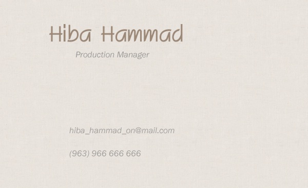
Keep selecting the “Horizontal Type Tool” (T) to type some contact info (like email, phone number … etc) by using the “Franklin Gothic Book” font (get it from resources above) and the following character settings: Size: 4pt, Weight: Italic, Anti-aliasing setting: Smooth, Color: #797979, Leading: Auto, Tracking: 0. For me, I’ll type an email and phone … You should get something like this:
Now use the Grungy Asphalt Icon Set and add the following ones to your layout at the left side of both email and phone text layers:
Creating the summary block:
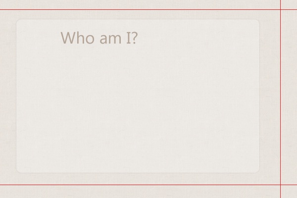
Set the color on value: #f4f4f4 then select the “Rounded Rectangle Tool” (U) with 10px radius, draw a shape like the one you see below, then give it the opacity 32%.
Use the “Horizontal Type Tool” (T) and type a text says “Who am I?” Use the “Segoe UI” font (get it from resources above) with the following character settings: Size: 8pt, Weight: Regular, Anti-aliasing setting: Smooth, Color: # 9b8876, Leading: Auto, Tracking: 0. Give this layer the opacity 70%. Here is the result:
Now, use the SEM Labs Icon Pack (get it from resources above) to add the following female PNG to your layout (you may use other PNG’s, there’s male ones too). Be sure to place it at the left top from your “Who am I?” text layer. Also set the opacity of this layer on 70%.
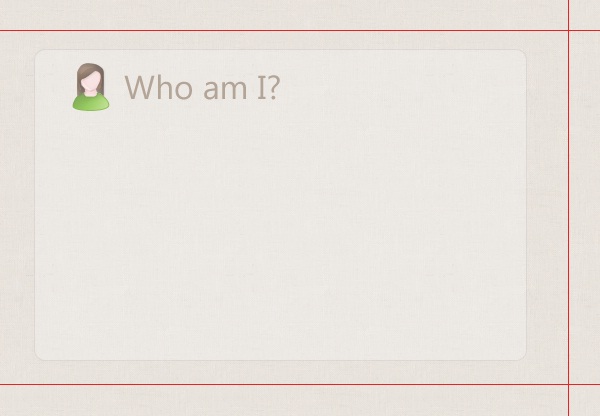
Note: you can use (Ctrl + T) to get handles around any shape (like the icon we’ve already add) and control its size as you want.
Use the “Horizontal Type Tool” (T) to make a rectangle then type short summary so you can describe yourself / your company and tell people what you can do! Use the “Segoe UI” font (get it from resources above) with the following character settings: Size: 4pt, Weight: Italic, Anti-aliasing setting: Smooth, Color: # 9b8876, Leading: Auto, Tracking: 0. Here is the result:
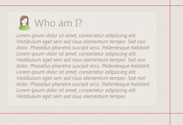
The final result for this:
Conclusion
That’s it, my friends! I hope you enjoyed this tutorial and learned something from it. Feel free to share your comments; I’ll be ready to respond to all of them!
Download Source Files
Download the free PSD for this tutorial that is licensed under the Creative Commons license. Of course, attribution is required and appreciated.
Hiba_Personal_Card (1.06 MB, ZIP)

Be Part Of The Community!
Become part of the hv-designs community.
Subscribe Via RSS or Follow Us On Twitter.


8 Responses to “Design an Abstract, Woody and Creative Double-Sided Card in Photoshop”