


January 3rd, 2012 in Photoshop Tutorials by ChristianJames
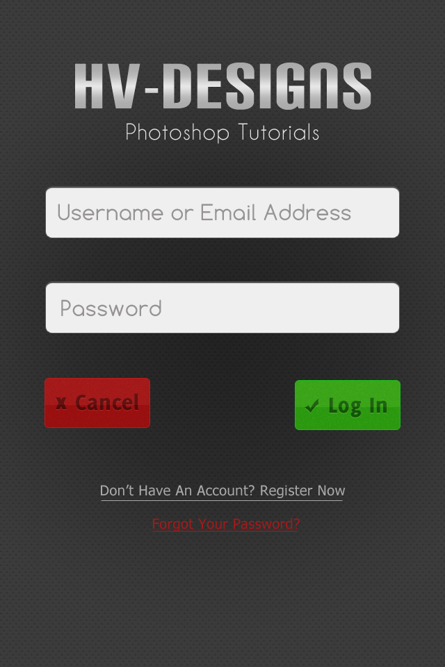
Simple App Log In Screen

 2 Votes, Rating: 4.50
Today we will be designing a simple log in screen for an iPhone/Android App. Apps are the newest rage and as a designer chances are you will be asked to design some kind of screen for an app or at least to change up the design for an app, so we decided that we will start doing more app tutorials, as well as other tutorials. Now, let’s get started…
We will be building our application screen at a 960×640 pixel resolution, but will be keeping in mind that screen size will change all the time, so we want our design to be functional as a fluid design, as well as a static design so when the app would be implemented on anything but the iPhone it is easy to bring over. Anyway, let’s get started with our design.
Open up a new document in Photoshop at 640×960 (obviously). Create a new layer and fill it with #343434 and then go download the Carbon Fibre pattern from Subtle Patterns (http://subtlepatterns.com/?p=22). Go into your layer style options and apply the CF pattern we just downloaded, changing the scale size to 55%.

Alright, now let’s start with our logo implementation. In a normal design process you will already have a completed logo ready to use on the app, but for now we are going to just be using a text filler logo with some basic metallic styling. Grab your favorite font and type out whatever you want for the logo. We are going to be using the Carbon Block Font, 110px, #e6e6e6. You will want to horizantally center the text/logo on your document and space it 110px from the top of our document. (If you are following our guide then the left and right margins are 202px)
\
Now to give it a metallic look you will want to apply the following texture, if you are following our color scheme.
Now, just underneath you will want to add your site tagline if you have one. We are using an #e6e6e6 30px Caviar Dreams for our tagline, Photoshop Tutorials.

Amazing! Now let’s begin to work on the sign in form for our log-in screen! We want to use the two main aspects of a log-in, username and password, as well as the obvious submit button and then a recover p/w option as well as a Register feature.
Because this is a mobile app I am going to diverge away from the standard label to the left or top and we will be putting the label into the actual input field. With such a limited space and the fact that users are using this on their phone you want to keep the information as readily accesible as possible.
We will start our by changing our foreground color to #efefef and grabbing our rounded rectangle tool. Set your radius to 10px and drag out a rectangle that is 510×75 pixels, horizantally center it, and space it 65px from the bottom of your site tagline or logo (If your logo is a little smaller then you may want to add some additional padding between the logo and first input area).

Now to make it look just a little bit better we are going to add in some simple styles that will give it that extra pop.


Now to add in the label. Grab your text tool and choose whatever font you want. We are using Comfortaa, a free font you can find and download at Google Fonts and is safe for Web Use, but you may want to use a safer font, such as Tahoma or Arial. Whatever font you choose pick a size that is relevant to the image below, and use #979393 for the color. Type out whatever label you want, ,such as Username or Email Address, and space it 20px from the left and vertically centered.

Now grab our two layers we just created and duplicate them to create our second input field. Space our second input box 60px from the bottom of our first one. I recommend using rulers to keep to the left and right side grid so everything remains pixel perfect.

Alright, now lets get to work on our two call to action buttons, cancel and log in. We will start work on the Cancel button, using very simple layer styles and effects to create an amazing button. Grab your rounded rectangle tool again and set the radius to 5px this time and your foreground color to #a31313. Drag out a rounded rectangle that is 150×70 pixels. Line it up with your left hand ruler and space it 65px from the bottom of our last input box.

Now to give our button a little bit of style, apply the following layers:


Now, I played around with what I wanted to do with our cancel button a lot before finally deciding. At first I wanted two small buttons with just icons in them, but it just didn’t look right on the screen. I decided that I would just go with the standard text, but again it just didn’t look right. Finally I decided to try them both and it turned out excellent.
First we are going to want to create our icon. Grab your custom shape tool, go to all shapes, and choose the x icon, easy to find as it’s the only one. Change your foreground color to #530a0a and draw out a shape that is 16px by 17px. Vertically center it and space it 15px from the left of the button.

Now we want to apply a very basic drop shadow to our icon to give it a letterpress style effect.

Now grab your text tool again and choose a very bold font. We are going to be using Delicious Heavy at 34px. Whatever font you choose should be a little bit taller than our icon and #530a0a. Center your text vertically and space it 15px from the right side of our icon.

Now apply the following layer styles:

Amazing! Our button is almost finished but we have just one more step. Change your foreground color back to #FFFFFF and grab your rectangle marquee tool. Create a new layer and make a rectangle shape around our button, about halfway down the button and fill it with white. Select the thumbnail of our button, select the inverse, and hit your delete key. Now change the opacity to 20% and you have an awesome, and finally finished, button.

Now, for our log in button all we are going to do is duplicate our layers and change some colors around. The button bg color is going to be #30a012 and the color for the icon and font is going to be #13530a. You can use whatever icon you want, but we are using the standard checkmark icon that comes with PS, same sizes as the x icon.

Looking amazing, right? We could stop there, but what about people that don’t have an account? What if you can’t remember you password? To keep with the simplistic feel of our app design we will just use simple text links, with a standard line underneath them. We are using 16px Tahoma for our font on both lines. Our first line color is #a9a9a9, same with the line underneath, and for our forgotten password line we are using #a41919.
The first line is spaced 80px from the bottom of our buttons and the password link is 25px from our register link.

There we go, we are all done with our sign-in screen. You might notice that there is a little bit of extra space at the bottom. We left that space there so if the menu key is up the design won’t interfere with the log in screen (a design we will get to later on) and also because our forms will be pushed down a little bit with validation issues, if present.
If you feel like something is missing you can always add in a button for the registration instead of a standard link or even a simple gradient on our patterned background would look nice. This is our final product:
and here is our final project with a few personalized changes.

I hope you enjoyed this tutorial and we look forward to bringing you more App Design tutorials in the near future. Let us know what you think in the comments or continue the discussion over on our Facebook Page.

Be Part Of The Community!
Become part of the hv-designs community.
Subscribe Via RSS or Follow Us On Twitter.


3 Responses to “Simple App Log In Screen”