Your ads will be inserted here by
AdSense Now!.
Please go to the plugin admin page to paste your ad code.
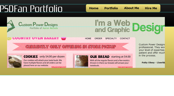
I am proud to be releasing this tutorial for the readers today! I will be walking you through the simple process of creating a minimalistic profile design in Photoshop.
Just to be clear I am using Photoshop CS5 so a few of the steps may not work exactly the same. For instance copying layer styles may not work in your version so you will have to manually add the layer styles again. This tutorial will be easily followed in any version of Photoshop though, even with a few minor changes.
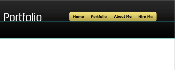
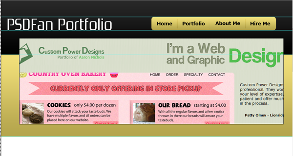
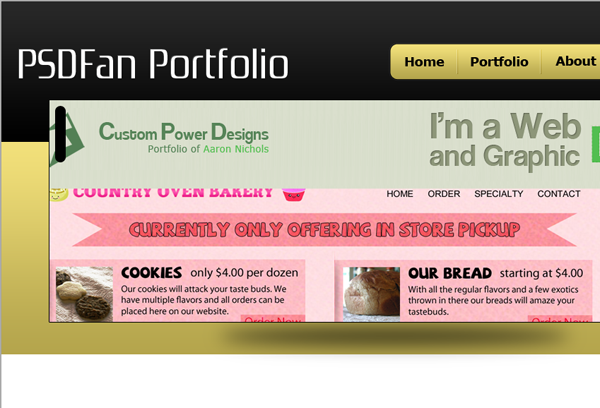
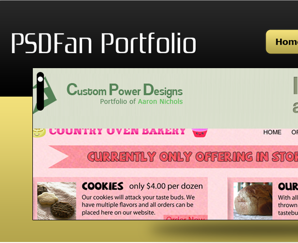
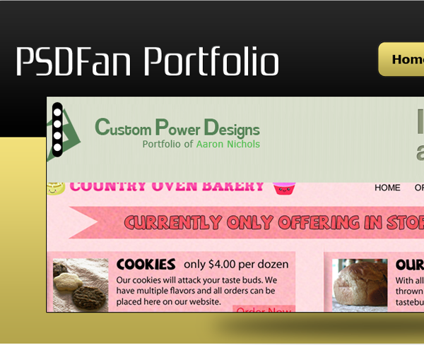
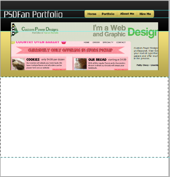
As always here is what we will be creating:

Resources
Zrnic Font: http://www.dafont.com/zrnic.font
Android Icons: http://www.androidicons.com/#free-icons
Getting Started
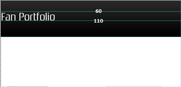
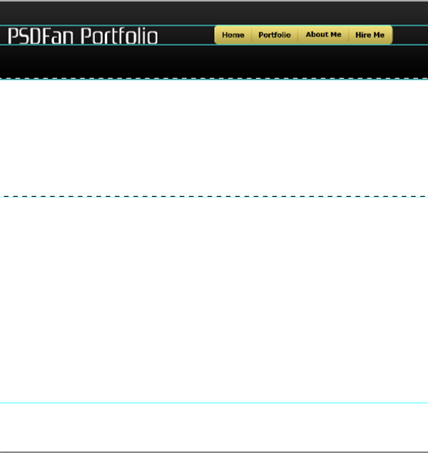
Start out by creating a new document that is 1100×1150. Now we are going to be setting up our guides for our four main areas. Set up the guides as follows: 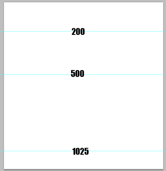
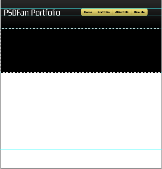
Now, we will set up our top area, and focus on the space before our first guide for a little while. Make a selection with your rectangular marquee tool that goes from the top of your document to your first guide.
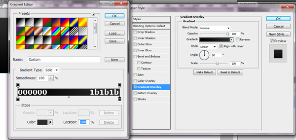
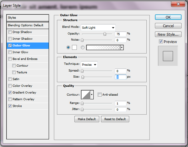
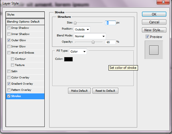
Create a new layer and fill it with black. Once you have filled it add the following layer styles:
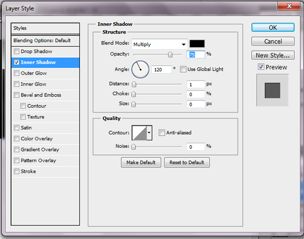
Alright, grab the font we downloaded earlier. Change your foreground color to white and type out whatever text you want to. I have my text set at 60pt, with the default settings for spacing. Now apply the following simple inner shadow:
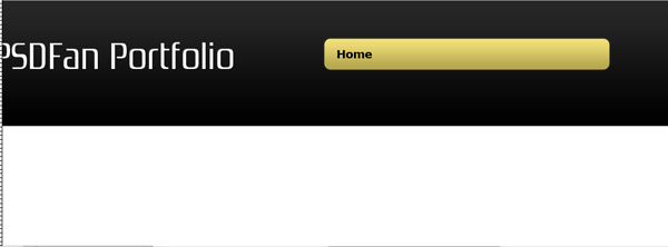
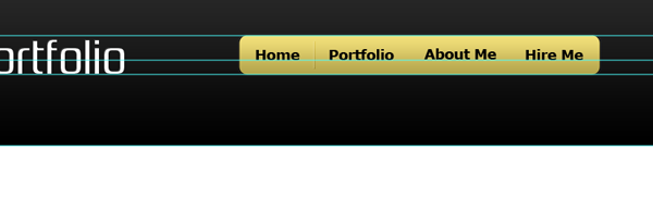
Top Menu
Alright, that’s it for our simple logo. Now we will be starting on our menu item.
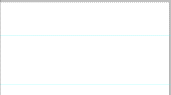
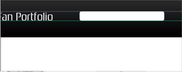
We will be setting up another quick guide for our naviagation. Use this image for your guides:
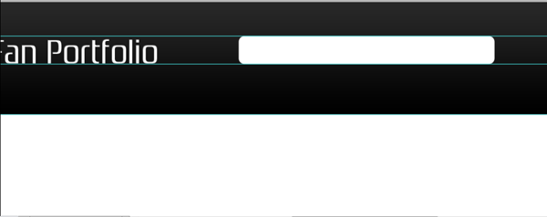
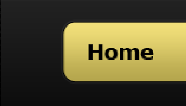
Grab your rounded rectangle tool and set its radius to 15px, with white selected as your foreground color. Drag out a rectangle that fits between our guides and that is 455px long.
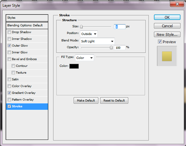
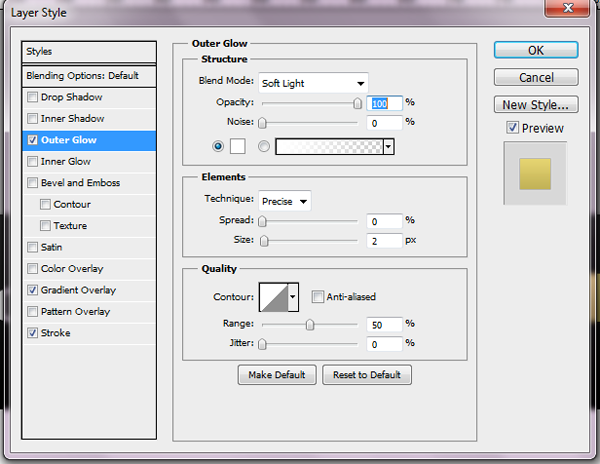
Alright, now we will give our menu some styling. Apply the following layer styles:
Alright, now we just need to add the content to our navigation. Grab your text tool again and choose Verdana Bold for your font face, black for your color, and 18px for your size. Type out whatever you want for the navigation. Space it 20px from the left of your rectangle (not including the stroke) and 18px from the top of your rectangle (again not including the stroke).
Now type out the rest of your navigation using the same font styles. Space them all 37px from each other, which will ensure that the final navigation is 20px from the right end of your rectangle.
NOTE: This is with a four button navigation menu. If you want to add more buttons just make the spacing even, ensuring that both the left and right side of your rectangle have a 20px spacing.
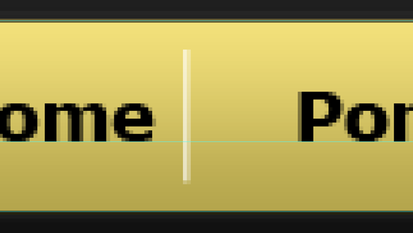
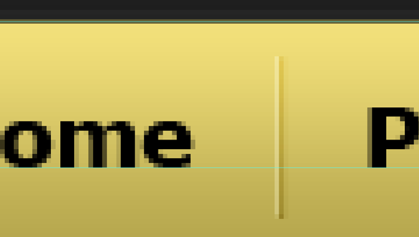
Now we need to splash up our navigation a little bit with a spacer. Zoom in to our document 985% onto your menu so we can set up our spacer. Grab your line tool, choose 1px for the weight, color white, and draw out a line that is 35px tall. Change your foreground color to black and repeat the process, drawing the line directly next to your white line. Change both blend modes to Soft Light.
You will want to center it vertically on your menu. You will also want to space it 17px from the left of your navigation (horizantal center).
Repeat the process for the remainder of your navigation.
Slider
Alright, now to set up the background for our slider. Make a selection from the first guide to the second, like this:
Now, create a new layer on top of our top background layer. Go ahead and fill it with black as we are adding layer styles.
Alright, now you will want to create another new layer at the top of our document. Grab your rectangle marquee tool and create a fixed size rectangle of 965(w)x315(h). Go ahead and fill it with a simple grey for now to make it stand out and add the following spacing.
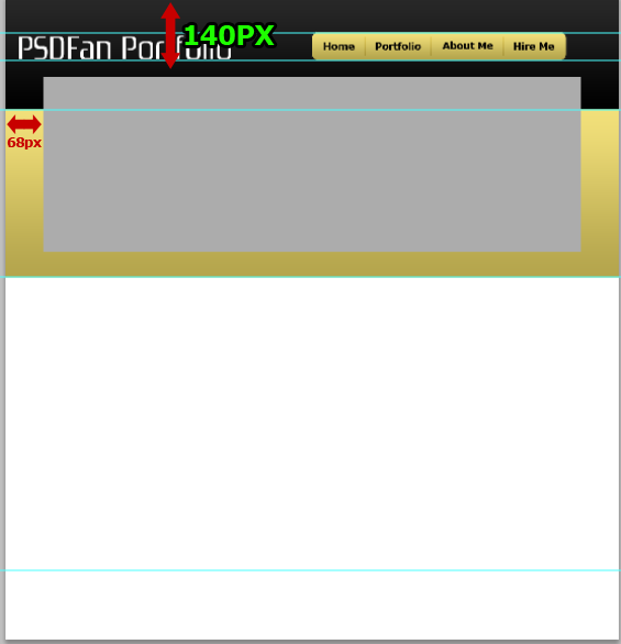
Alright, now open up an image from your portfolio that you want to use on your home page and resize it down. You can make it the same width as your box or keep it wider, depending on what you want to display.
Bring it over to our document and place it over our grey box. Click the thumbnail of our greybox while holding the CTRL key to make a selection. Right click, hit select inverse, and then hit your delete key to remove the extra.
Now, open up your layer styles and give your image a 1px black stroke.
Alright, now to create our slider navigation. Grab your rounded rectangle tool. This time change your radius to 55px and drag out a rectangle that is 15px(w)x80px(h). Black is fine for the color as we will be adding a layer style in the next step.
Now space your slider nav 10px from the top and left of our slider, not including our stroke. Rasterize your shape layer.
Change your foreground color to white. Now grab your ellipse tool and draw out a 10px perfect circle (hold the SHIFT key down to do this). Place it 9px from the top of your rounded rectangle and center it horizantally with your rectangle.
Alright, draw three more circles, exactly the same, and space them 5px from each other.
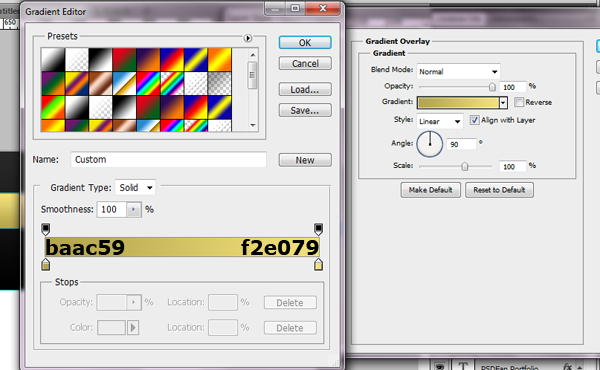
Alright, now go back to your first circle and double click the white box to change the color. Change the color to #f0de79. Now apply this inner shadow style:
Your ads will be inserted here by
AdSense Now!.
Please go to the plugin admin page to paste your ad code.

Main Content Area
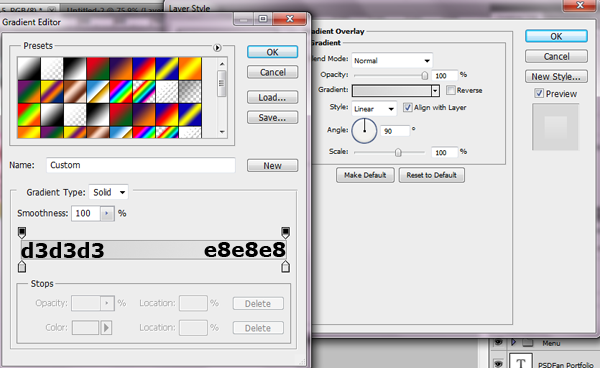
Alright, we are done with our slider. Now let’s move on to our main content area. If you have hidden your guides at any point go ahead and unhide them. Create a new layer above your slider background layer and make a selection from the bottom of your slider bg and other guide. Go ahead and fill it with white as we will add a layer style.
Now apply the following layer style to that layer.
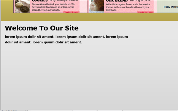
Grab your text tool and choose whatever font you want for your header and intro text. I am using the font Verdana.
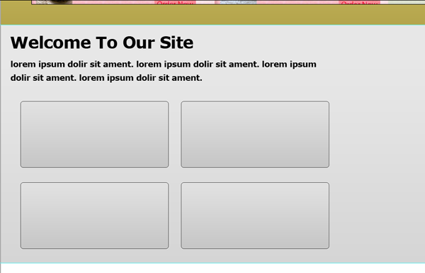
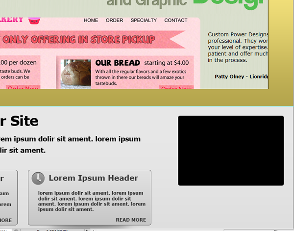
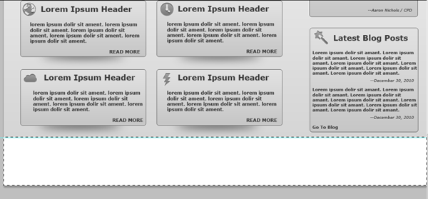
Alright, now its time to get started on our four content boxes.
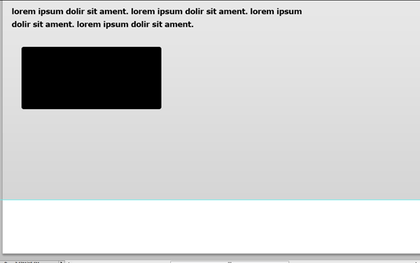
Within that group grab your rounded rectangle tool again. Change the radius to 5px and the foreground to black. Draw out a rectangle that is 325px(w)x145px(h). Space it 45px from the left of our document and 45px from the bottom of our text.
Now apply the following layer styles to our box layer:

Now duplicate your layer and space them 25px from white stroke to white stroke.
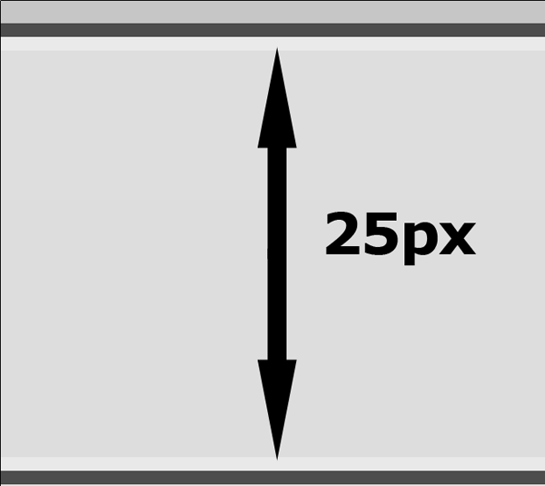
This time duplicate both your layers and space them 25px from each other.
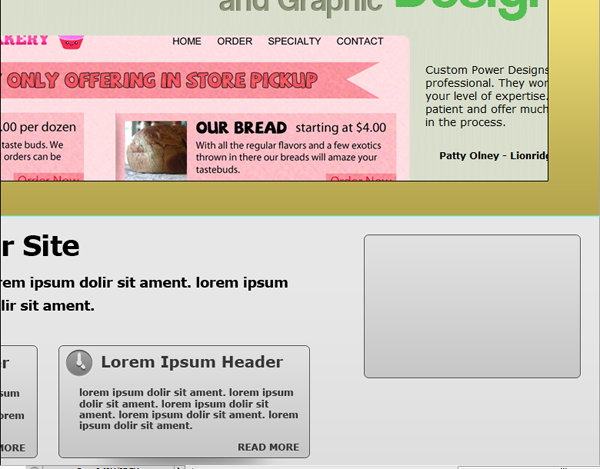
Now lets give our boxes a little depth. Grab your elliptical marquee tool. Keep your foreground set as black and create a new layer underneath your first box. Make a selection like below:
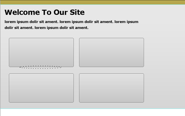
Fill the layer with black. Then go to Filter–Blur–Gaussian Blur and choose 12.5. Now, move your layer up just a little bit.
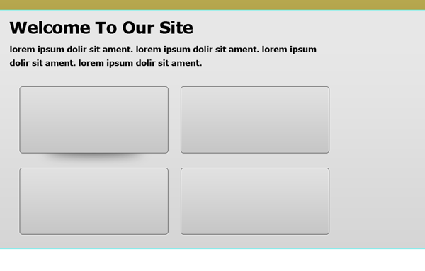
Duplicate your layer three times and space them correctly with the other four boxes.
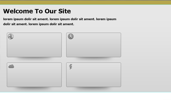
Alright, now to add the content. Open up four icons of your choosing from our Android Icon Set we downloaded earlier. Place your four icons 5px from the left of your boxes and 5px from top. Just to be clear each icon should be on a different box.
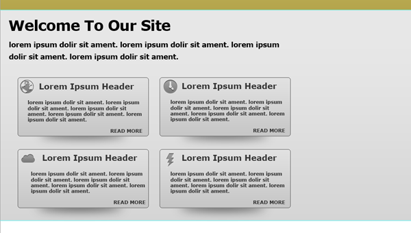
Ok, now to add your content. We will be adding a Header, our main text, and then a read more button. Here is what I used for those:
Header: Font Size 20px, Font Verdana Bold, Color #363636
Main Text: Font Size 12px, Font Verdana Bold, Color #363636
Read More: Font Size 12px, Font Verdana Bold, Color #363636, all CAPS.
Depending on your amount of content give it just a nice spacing. This is what I have for my content:
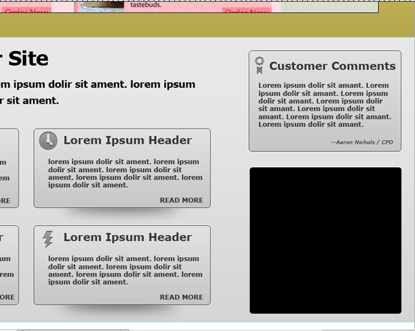
Alright, our four content boxes are done. Now time to start on our two right boxes. Our first right box will be a customer commendation box, and the second will be latest blog post.
Grab your rounded rectangle tool again and keep the radius at 5px. Draw out a rectangle that is 280px(w)x185px(h). You can leave it whatever color you want as we will be adding a layer style. Space it 25px from the right of your document and 25px from the bottom of your yellow slider bg.
Now go ahead and copy you layer styles from our four content boxes. To do this go to one of your boxes and right click. Choose copy layer styles and then right click your black box layer and go to paste layer styles.
Alright, now open up your icon set again and choose an icon that works for Customer Commendations (I am using the ribbon). You will want to keep using the 48px size. Place it on your box and space it 10px from the left and 10px from the top.

Now, add your content. We will be using the same font style and size for our headers and content as our other four boxes. The only part that changes is the name of the customer. For this I used Verdana, Italic, and a smaller size. Choose whichever size you thinks looks best.
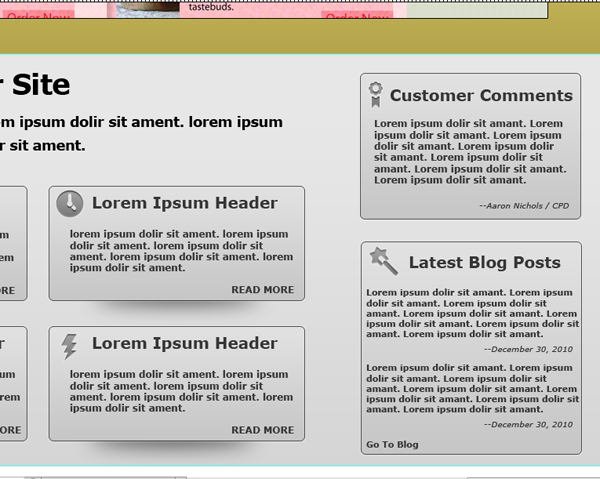
Alright, now grab your rounded rectangle tool again, keep the same radius, and draw out a rectangle that is 280px(w) x 270px(h). Space it 30px from the bottom of our last box.
Alright, repeat the process of adding our layer styles, icons, and content as we have done in the other boxes. You may need to choose a different text size depending on how many blog posts you want to display.
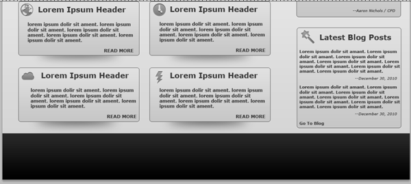
The Footer
Alright, now to the last part of our site: the footer. Make a selection from the bottom of our document to the last guide.
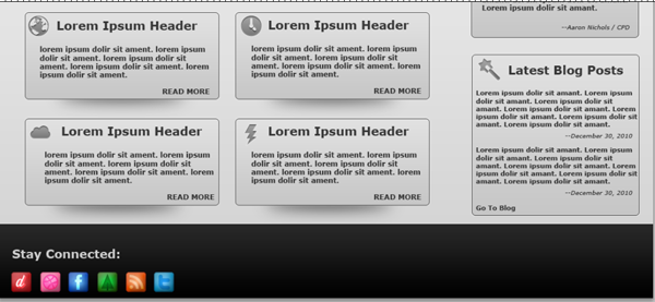
Create a new layer above your main content layer, and go ahead and fill it with black. Now, go to your logo and navigation background and copy the layer styles. Paste it on your footer.
For your footer go ahead and grab your favorite icon set and place it on the left side of the footer. I am using this glowing icon set for my footer.
Now, all that is left is to add the copyright, to the middle, and the Bottom Menu. Line everything up on a guide and you are done.
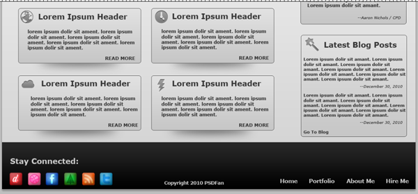
Now, that footer is pretty basic and you can do a lot more with it, but I wanted to keep the design look clean and simple. Plus, I absolutely hate those extra large footers, but that is just me.
Conclusion
As you can see using simple layer styles and shapes you can create a very nice looking portfolio website. Again I hope you have enjoyed my tutorial and I am looking forward to regularly writing new tutorials for you, the readers. You can also find more tutorials and freebies on my blog, or follow me on Twitter.
Your ads will be inserted here by
AdSense Now!.
Please go to the plugin admin page to paste your ad code.