Your ads will be inserted here by
AdSense Now!.
Please go to the plugin admin page to paste your ad code.
One of the most important aspects of business networking lies within your business card! With as many businesses that are out there today, it’s important to stand out amongst the crowd! Plain white or multi-colored cards are a thing of the past and the new dark business card designs are sure to set you apart from the competition!
In this tutorial, I am going to design up a print ready dark themed business card. Let we get in to the tutorial.
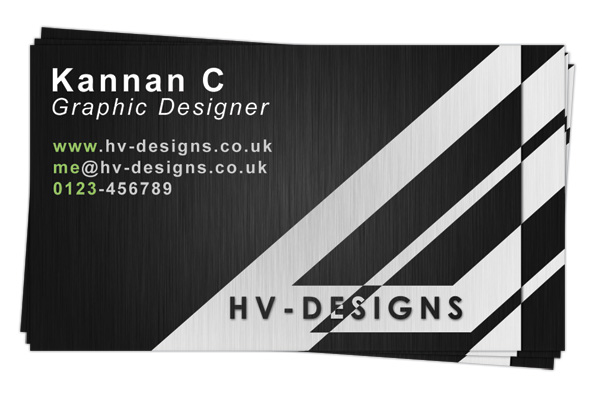
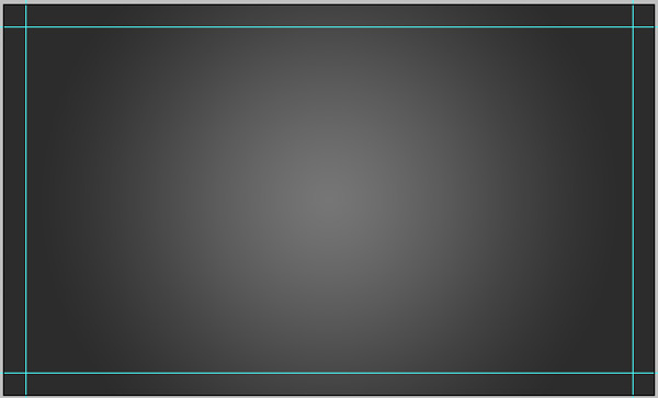
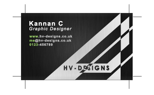
What we are going to craft
Step1
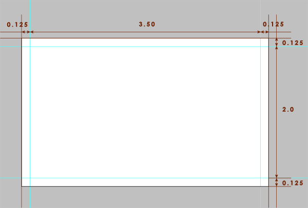
Before creating the new document, you should determine the size for your business card based on your location. According to ISO 7810 ID-1, the standard size for business card is 3.37 x 2.125 inches but in United States 3.5 x 2 inches (91mm x 55mm) is followed as standard. I will take the US standard size to make my business card design.
Step2
As we are going to print the card, we need to add some bleed area to our design. A bleed is nothing but an extra space given around the edges where our design should run on it. By doing this, we can avoid any white spaces on the edges of the printed output. I am going to use 0.125in as bleed area to the edges of our design 0.125(left) +3.5(center) + 0.125(right) and 0.125(top) + 2(middle) + 0.125(bottom).
So it is clear that we need to create a new document of size 3.75 x 2.25 inches with the settings below.
Width: 3.75in
Height: 2.25in
Resolution: 300pixels/inch
Color Mode: CMYK/8bit
Background: White
Step3
For the next step, you should add some guides to find out the bleed area.
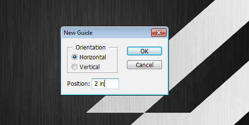
Click on view -> New Guide and create a vertical position of 0.125in.
And by repeating the above, create 3 more guides at positions 3.625in vertical, 0.125in horizontal and 2.125in horizontal.
So now we are ready to start design our business card.
Step4
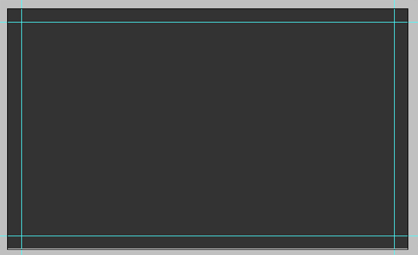
Draw a rectangle around the whole area of the document and fill it with color: #343434.
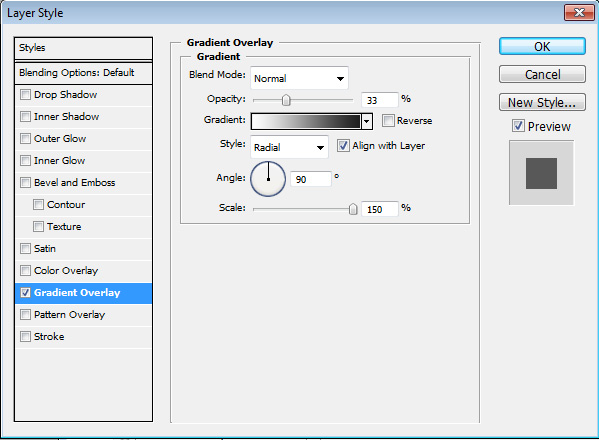
Then apply a gradient overlay over to it with the following styles
Gradient:
#ffffff and #000000
Step5
Now, duplicate the rectangle layer and name it as “Texture” or “Noise” or whatever you feel a name right for the next step. Then right click the duplicated layer and select “Clear Layer Style”. Then rasterize the same by right click it and select “Rasterize Layer”.
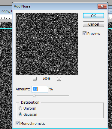
Step6
By selecting the duplicated layer, Go to Filter -> Noise -> Add Noise and set the values as below.
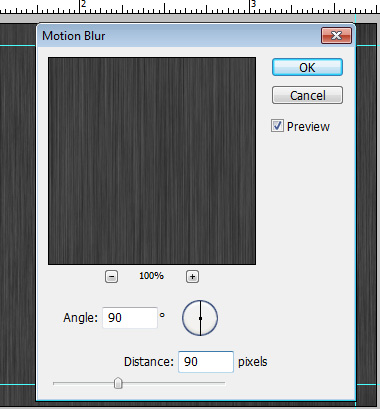
Step7
Now again, Go to Filter -> Blur -> Motion Blur and set the values as below.
Step8
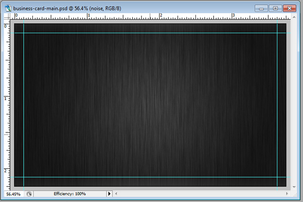
Then you need to change the blending mode to “Overlay” and reduce the opacity to 52% for the duplicated layer. So you will have the result like below.
Step9
Ok, now we need to do the triangles part. I have used four shapes in it and actually the first three shapes are not triangles but the fourth one is. Before doing this part we need to switch to RGB mode. The reason for mode switching is that with CMYK we cannot get bright color results when blending. Because I am going to use blend “Difference” to get the alternate color effects between the triangles which will don’t work with CMYK color mode. Off course, we will switch back the design to CMYK before send it to print.
So let we switch the color mode to RGB by Image -> Mode -> RGB Color
Step10
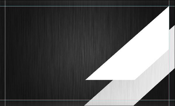
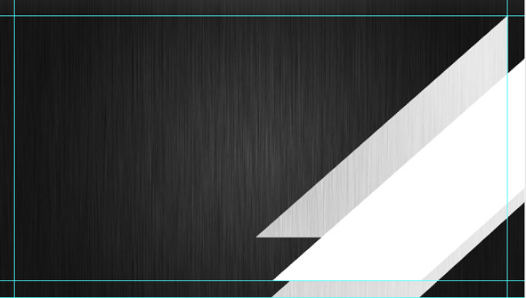
After that create a new Group and then add a new layer inside it. Using the Pen tool, draw a shape similar to below one.
Once the shape is done, fill it with white color and change the blending mode to “Difference”.
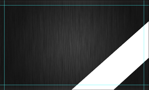
Step11
Now, draw another bar like shown below over the previous one. Note that the right top corner of the second bar should touch the meeting point of the top side and right side guides.
Change the blending mode of the second bar’s layer to “Difference” and so you will get the result like this
Step12
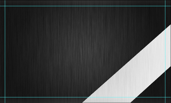
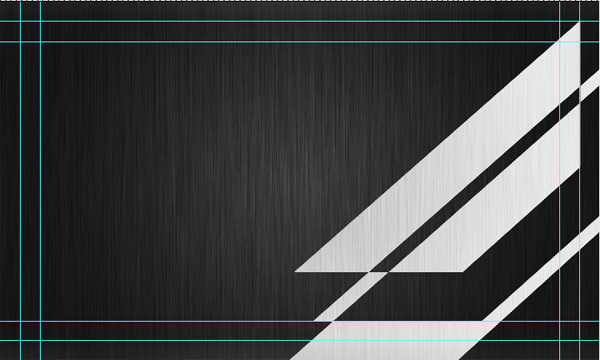
Now we need to add another guide at the bottom of the design in order to place the third bar. So add a new guide of 2in horizontal orientation.
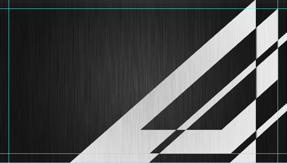
Once the guide is added, duplicate the second bar and move it downwards so the bottom face of the bar should reach the newly added guide. Once again move the bar towards right and so the right face of the bar should go to the right side end of the document.
Ensure that the layer’s blending mode is in “Difference” and thus you have the output like this
Your ads will be inserted here by
AdSense Now!.
Please go to the plugin admin page to paste your ad code.
Step13
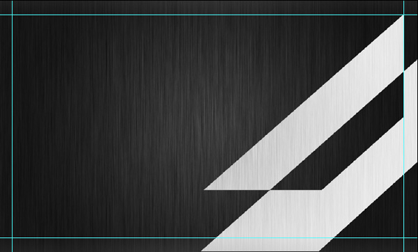
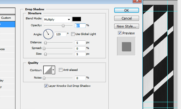
And the final shape that we need to add is the triangle. This shape should be larger than the other 3 and place it in the location just like shown below.
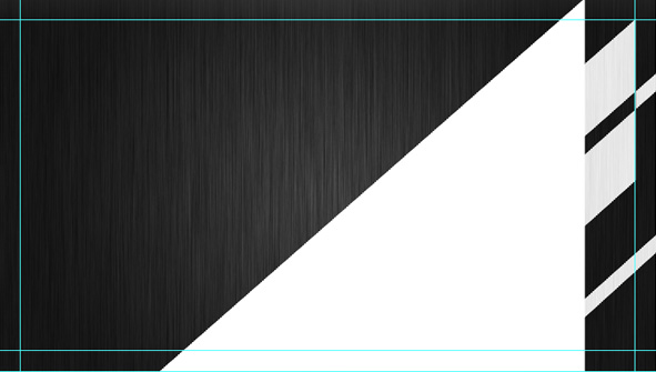
Make the blending mode to “Difference” for this layer too. Also add a drop shadow effect to the triangle shape with the settings below.
Alright, now we have the basic design ready for our business card and the next part we need to do is fill it with texts.
Step14
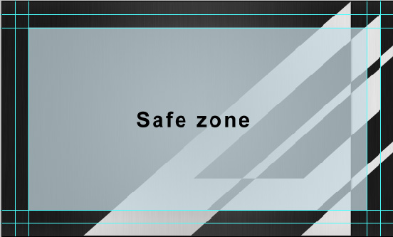
Here, I need to tell you some important guidelines regarding the placement of texts. It is always a better idea to keep the texts within a safe zone because cutting may not be ever perfect. So keeping all your texts within 0.125in distance from the bleed is a good idea and by doing so we can ensure that no texts would trim off.
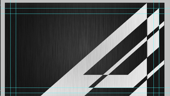
To do this, I will add another four guides inside the bleed of distance 0.125in from bleed.
Create 4 guides in the following positions
1. 0.25in vertical
2. 3.5in vertical
3. 0.25in horizontal
4. 2in horizontal (note: we have already made this guide in step12. No need to repeat. )
Step15
If you wish, you can put the texts in a new group for easier readability.
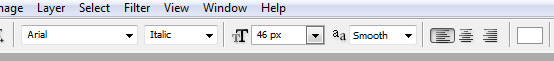
So for the next step, I have added my name and profession inside the safe zone that I mentioned above. Also apply the following size and color to the fonts.

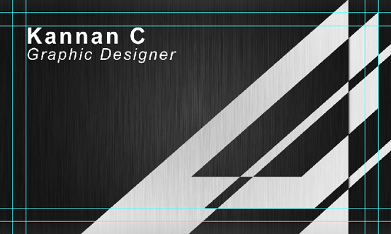
Step16
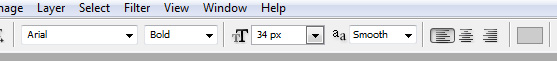
Again I have placed some more details like my email id, website address and phone number below the texts created in step15.
Ok, now apply the size and colors to the texts as shown below.

Change the color of the marked texts to #99cc66

Note: The details I have given here is just an example and isn’t my real contact information except my name. So please do not try to contact me thro’ the above details ![]()
Step17
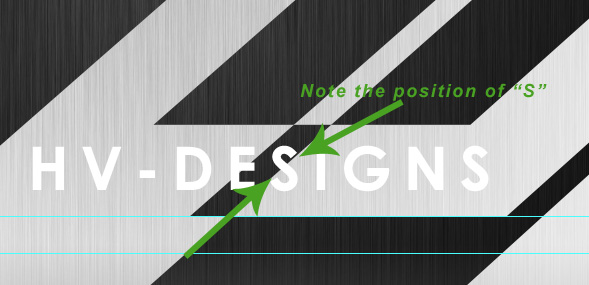
Now, I am going to add the Brand or Company name at the bottom, here I used HV-DESIGN. Apply the following styles to the text.
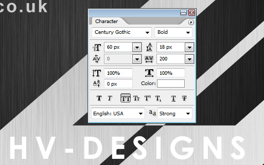
Now, in case the position of the text is not like in the image, slightly adjust the placement of the text and so the letter “S” should appear over both the inclined dark and light grey parts as shown below.
For this layer too, change the blend mode to “difference”.
After you switch the blend mode, you will notice a color change in the text because of “difference” blending.
Now apply a drop shadow effect using the below settings
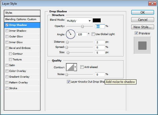
and so you will get the result like this.

Perfect! We have all done!
Step18
Hope you remember, we are still in RGB mode. Before we send it to print, we should switch the color mode back to CMYK.
So again go to Image -> Mode -> CMYK Color. It will throw a message “Flatten image before switching mode” and click on “Flatten”.
Step19
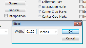
We are in the final step of creating the Corner crop marks. To do this, go to File -> Print with preview and make settings as shown.
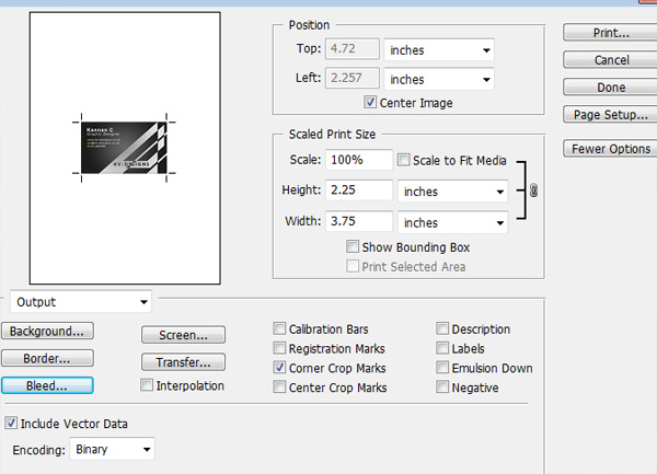
Click the Bleed button in the same pop-up and give it a bleed value of 0.125in and print it as a pdf document.
Once everything is done, you are ready to go for printing!
Hope you enjoyed my tutorial!
Your ads will be inserted here by
AdSense Now!.
Please go to the plugin admin page to paste your ad code.