Create a Recipe Web Layout
Your ads will be inserted here by
AdSense Now!.
Please go to the plugin admin page to paste your ad code.
Hi there! Most recipe sites tend to be unique in their set up. Like other user-submitted content sites, they thrive on the right content management system. Unlike most other user-submitted content sites, visitors to these sites aren’t often treated to personal insights about the recipes they seek. Personality and individuality are portrayed solely through the recipes themselves along with the pictures that accompany them. This site is designed to complement the recipes and let them shine through in all their glory.
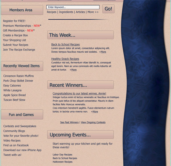
What We’ll Be Creating
Click image for full view.

Resources Used In This Tutorial
Lets Get Started
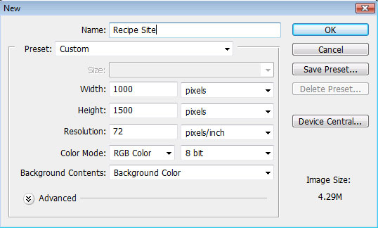
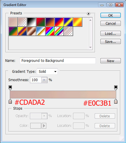
To begin, I set my background color to #E0C3B1 and then created a new file in Photoshop:
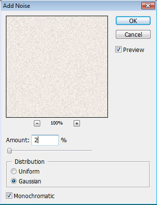
Then I added some noise to give the background a little bit of a grainy look:

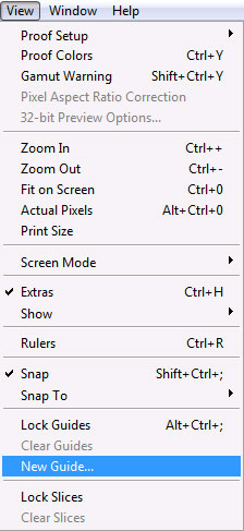
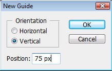
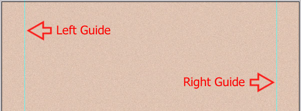
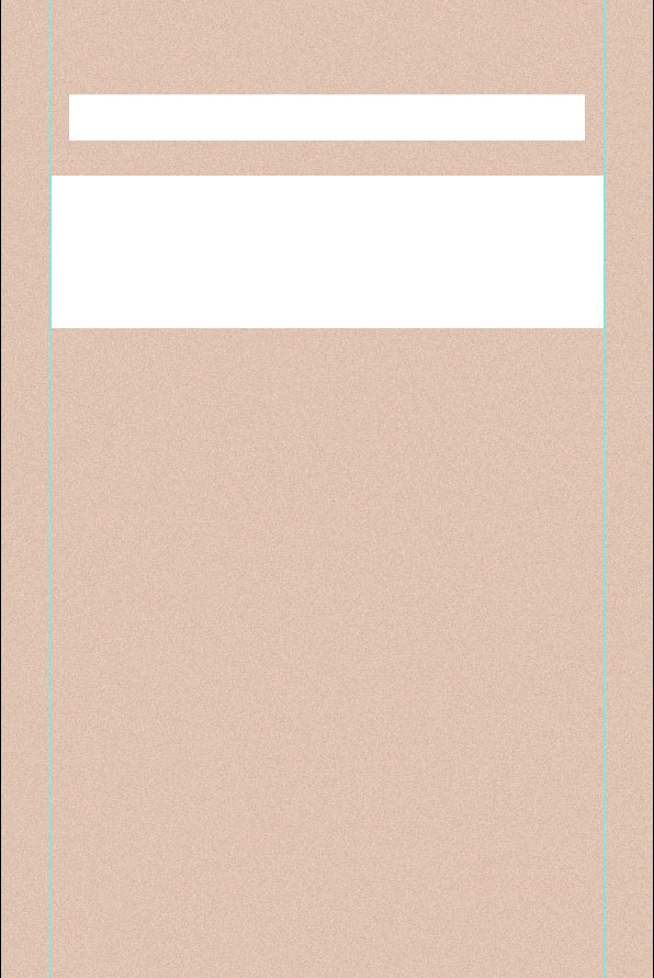
My next step was to set vertical guides to make sure that the layout stayed within the right margins:

With the guides set, you should see something like this:
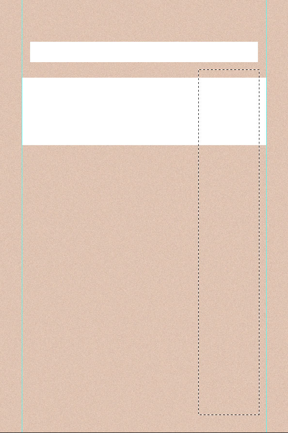
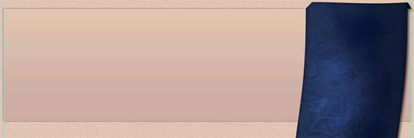
Next, I used the Rectangle Tool to create the shapes for the Navigation bar and the banner:
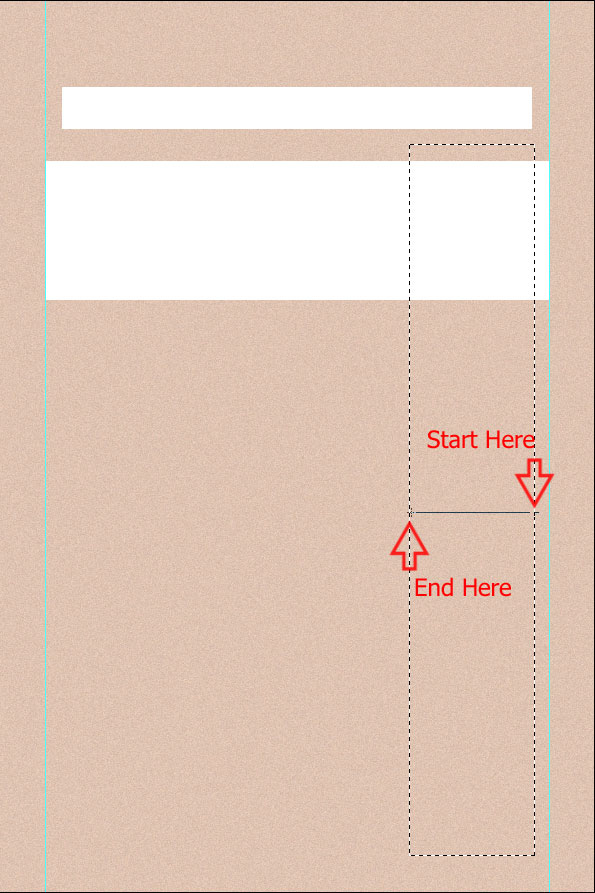
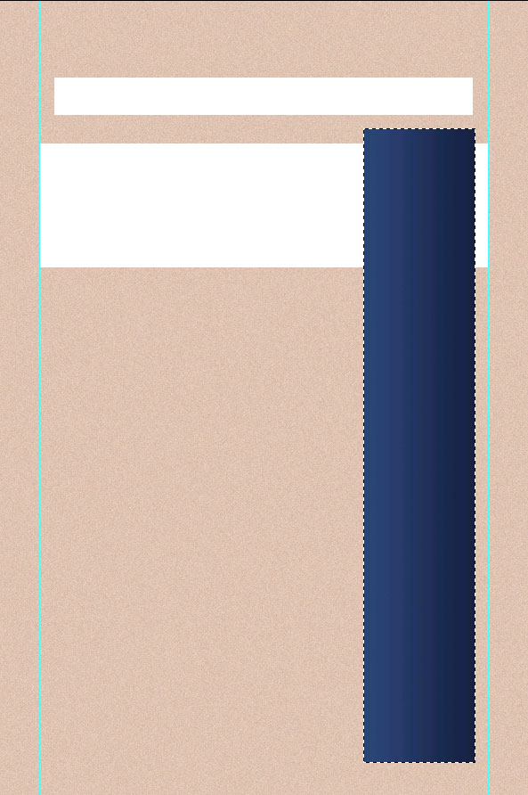
I created these first so I had a good reference for placing my ribbon – which also serves as the right sidebar. Now I started with the ribbon. On a new layer, I used the Rectangular Marque tool to make a long selection:
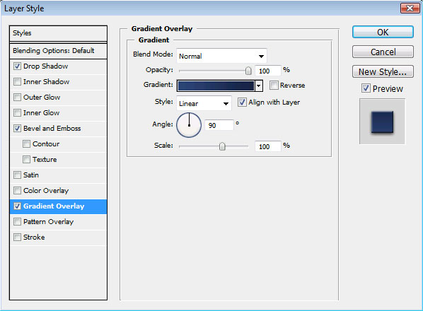
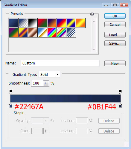
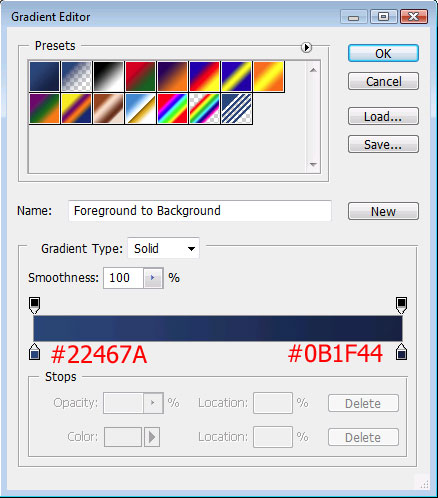
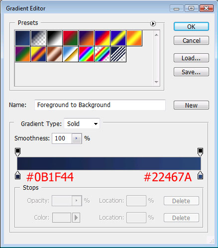
Then I set my foreground color to #22467A and my background color to #0B1F44. Using the Gradient Tool, I filled in my selection:

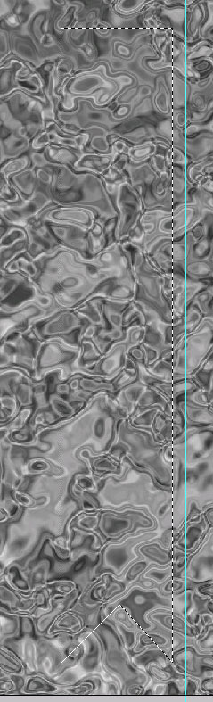
Next, I cleared my selection (CTRL D) and used the Polygonal Lasso Tool to select a new area at the bottom of my ribbon:
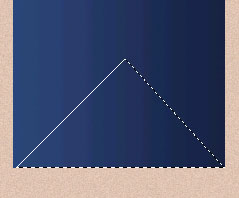
And then deleted the selected area by pressing the delete key on my keyboard:
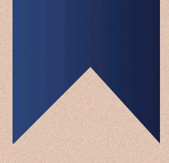
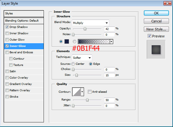
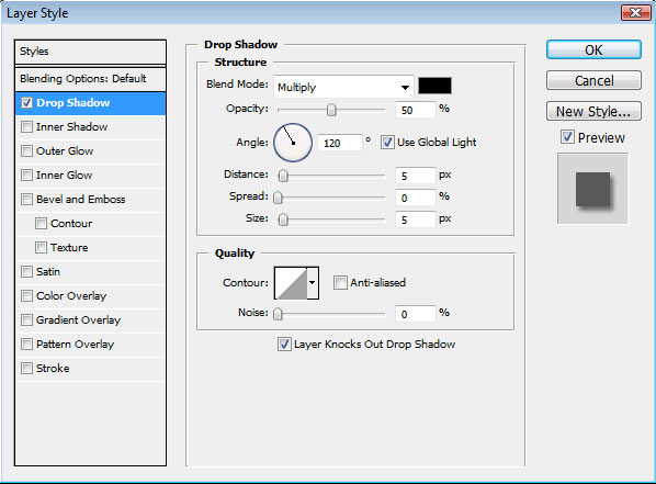
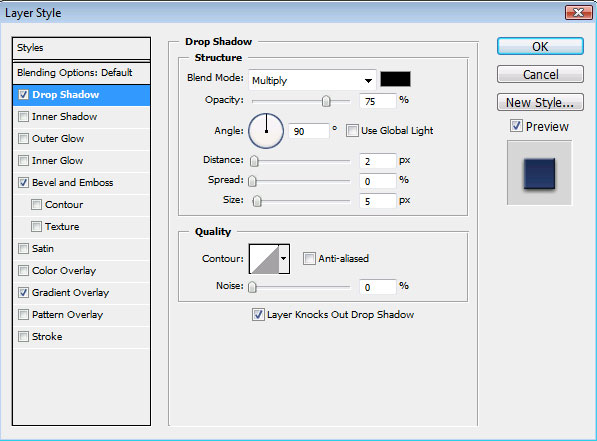
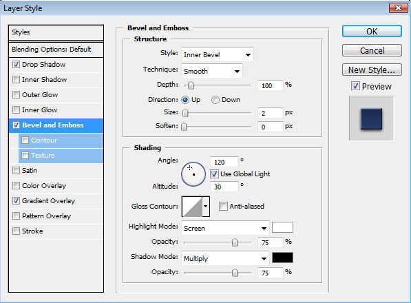
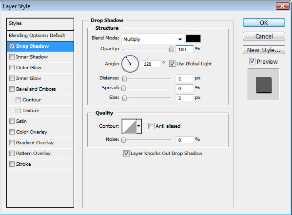
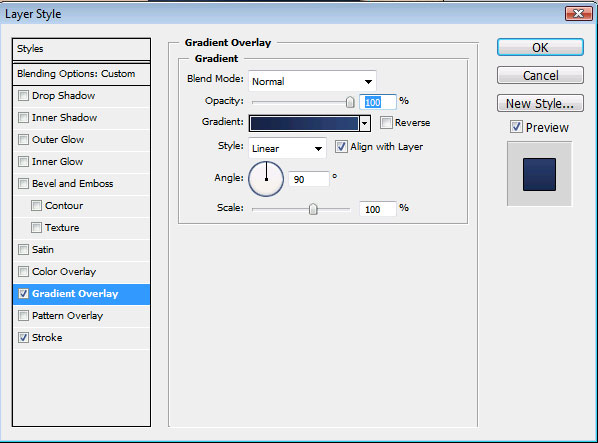
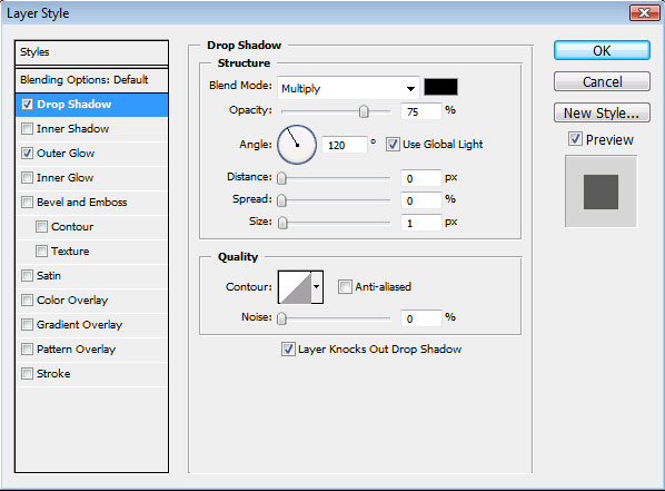
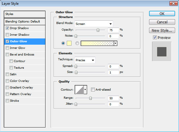
Next, I applied these layer styles to the ribbon:
For a little more added depth, I used the Burn Tool:
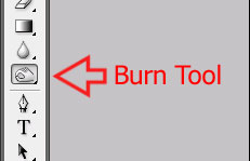
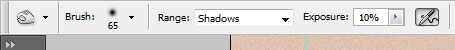
And brushed on just a few lowlights:
Then I switched over to the Color Dodge Tool:
![]()
And filled in some highlights:
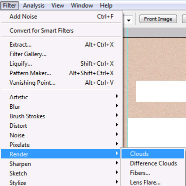
Next, I created a new layer over my ribbon and set my foreground color to white and my background color to black. Then I rendered some clouds by going to Filter > Render > Clouds:
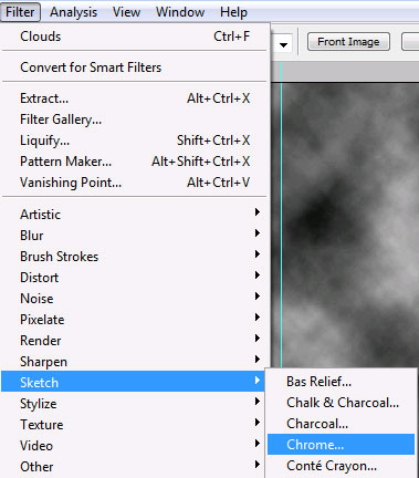
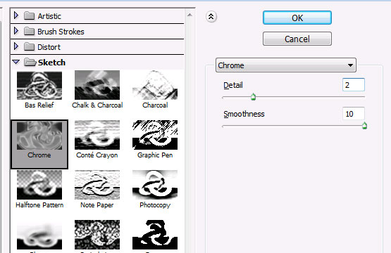
Once the clouds covered my layout, I applied the chrome effect:
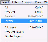
With the clouds layer still selected in my layer palate, I selected my ribbon’s pixels by holding down the CTRL key and left-clicking on the ribbon’s thumbnail:
Then I inverted this selection:
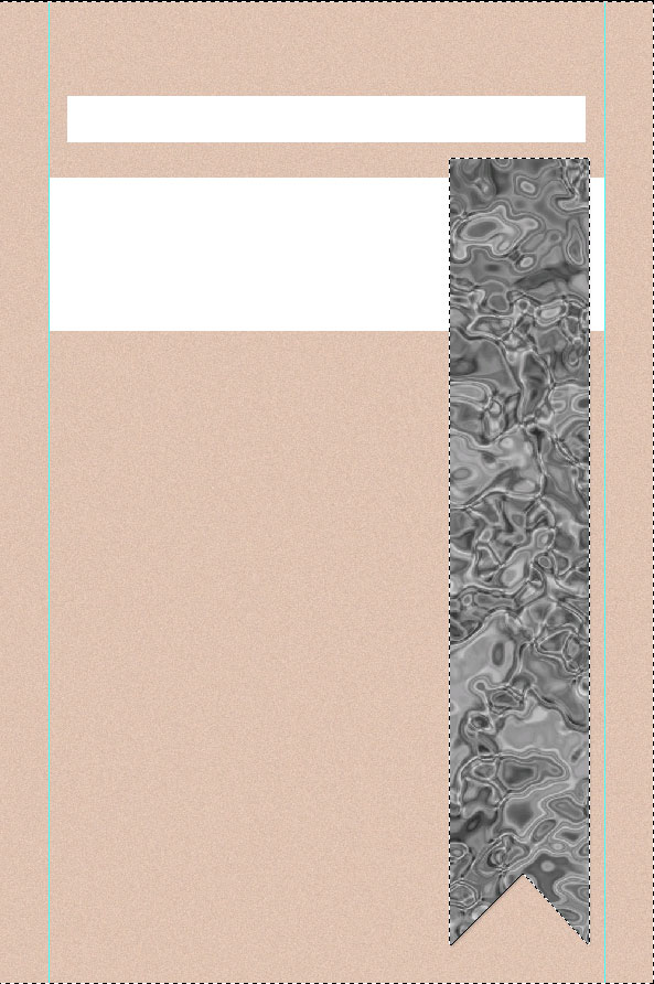
And hit the delete key on my keyboard so that my chromed clouds only cover my ribbon at this point:
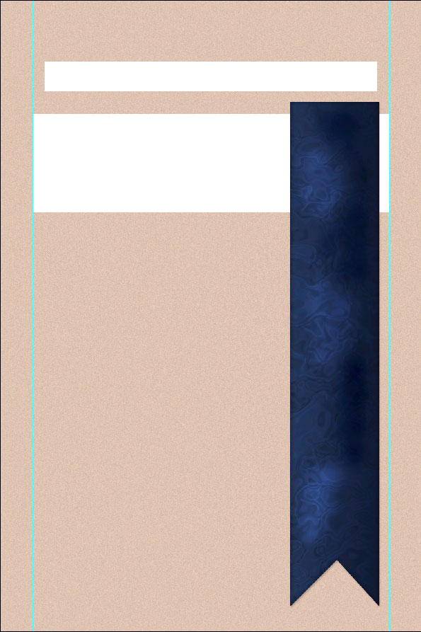
Then I set the blending options for this layer:

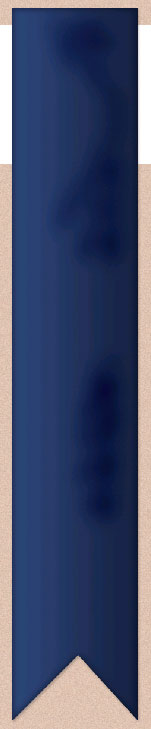
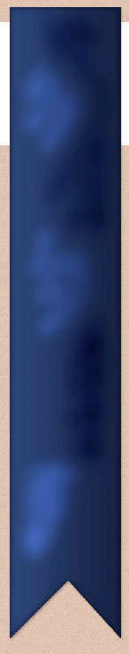
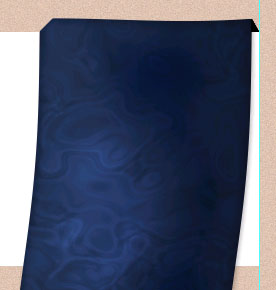
Here is how my ribbon looks so far:
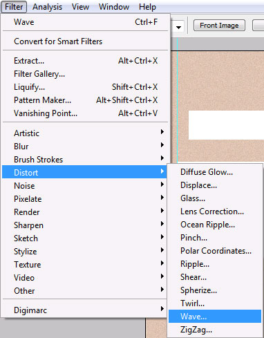
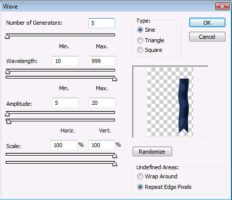
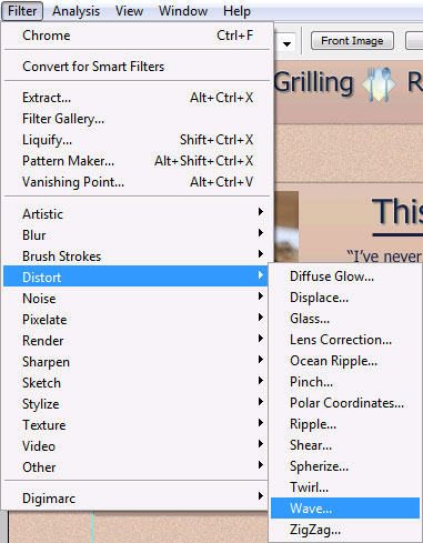
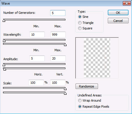
Now that the ribbon is almost complete, we’re going to warp it to add a slight wave:
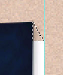
Take a moment to use the Move Tool to re-position the ribbon into a good spot, since the wave will seem to adjust the margins a bit. Then use the Polygonal Lasso Tool to make a small selection at the top left corner of the ribbon:

Once I made my selection, I hit the delete key on my keyboard to get rid of it. Then, I moved onto the top right corner. Again, using the Polygonal Lasso Tool, I made a small rectangular selection:
This selection I filled in with black, leaving the top of my ribbon looking like this:
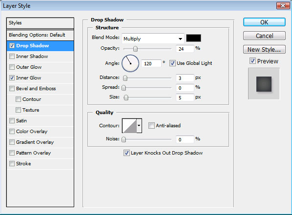
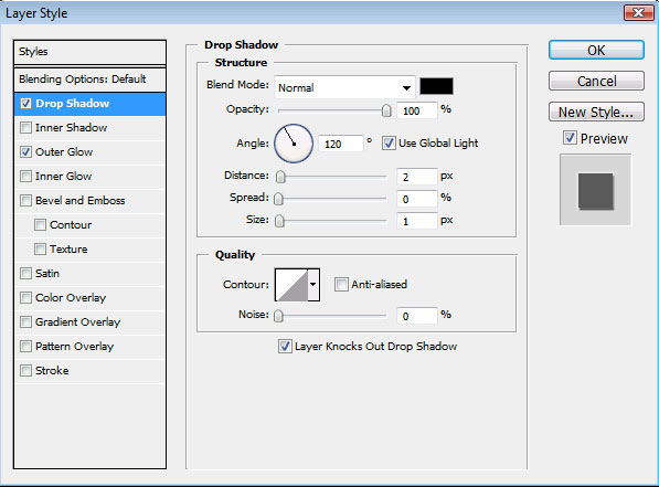
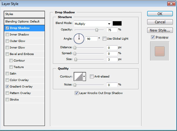
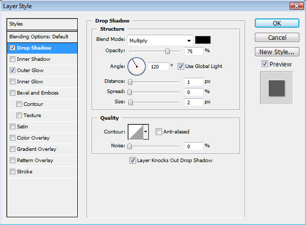
Finally, I added a drop shadow to my finished ribbon:
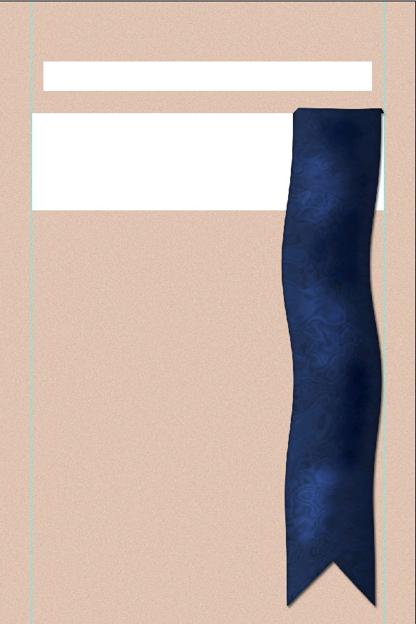
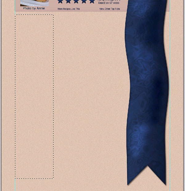
Here is how my layout looks so far with my completed ribbon:
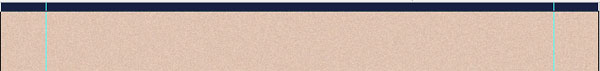
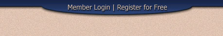
Now that the ribbon is complete, I can start adding in the other elements around it. This is a little backwards for me, since I usually like to start at the top of a layout and then work my way down. But because the ribbon on this site helps to serve as such a focal point and because of the wave effect, I wanted to make sure that it was set up first so I could fit everything else around it. So, back to the top for the login and register links. First, I used color #0B1F44 and the Rectangle Tool to create this shape along the top of my layout:
Next, I switched to the Ellipse Tool and created this shape:
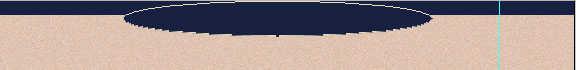
Then I used the Move Tool to place the Ellipse exactly where I wanted it to line up with the bar and merged the two layers together:

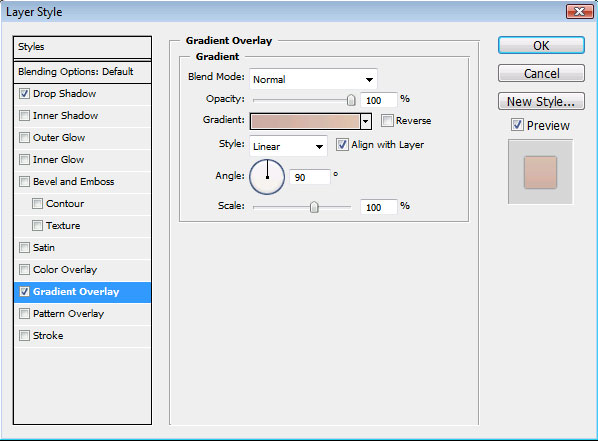
Finally, I applied these layer styles to my login bar:
Once my layer styles were applied, I used the Type Tool with color # E0C3B1 and Tahoma Font to fill in my login links and then applied this drop shadow to those links:
Here is how my login bar looks once it’s finished:
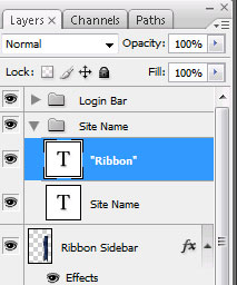
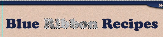
Next, I used Cooper Black Font to type in my Site Name:
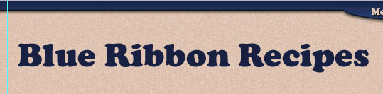
Now, I’ve actually typed the site name using two different layers:
So you’ll need to be careful to space the words “Blue” and “Recipes” correctly to fit in “Ribbon” on the new layer. It may help to use your grid to line up the words exactly.
Next, I applied the same gradient as I used on the ribbon before to the word “Ribbon”:

I then created a new layer and, using black and white, rendered clouds, chromed them, and clipped them down to the word ribbon:
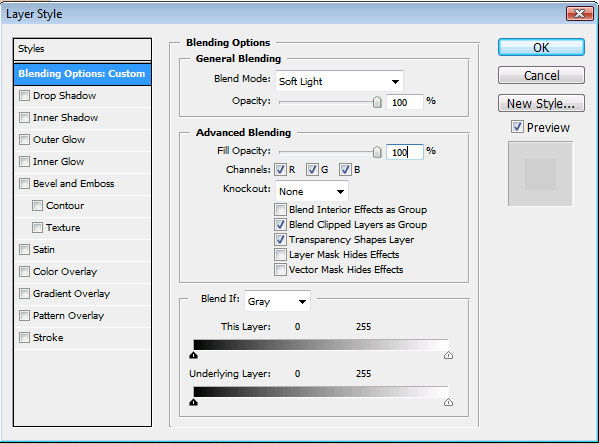
And set the chromy clouds to “Soft Light”:
Next, take some time to use the move tool and make sure that the words in the site name are exactly positioned just the way you want, then merge those layers together and apply these layer styles:
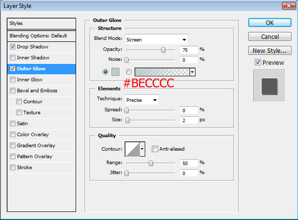
Here is how my site name turned out:
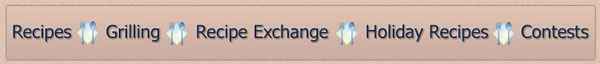
Onto the Navigation Bar. First, I applied these layer styles to my navigation bar:
I then used Tahoma Font with color #0B1F44 and filled in the primary links with my Type Tool. Once those were filled in, I applied these layer styles to my links:


For the separators, I found a silverware icon at iconspedia and downloaded the 32 pixel size; then I placed one between each link. Here is my completed navigation:
Moving onto the banner, I copied the layer styles from the Navigation bar and pasted the same layer styles to the banner shape, giving me something that looks like this:
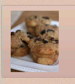
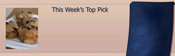
For the featured recipe picture, I used a photo of one of my all-time favorite recipes, Cinnamon Raisin Pull-Apart Muffins from Annie’s Eats. I’ve made this recipe dozens of times, and my husband has as well – they never last long in our house. Anyway – must concentrate… I sized the photo and set it into my banner:
Then I used Tahoma Font with color #0B1F44 to type in the title of the banner area. I applied the same layer styles to this title as I had to the links in the navigation bar:
Using the line tool set to 3 pixels wide, I created this shape beneath the banner title:
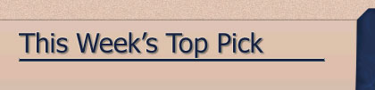
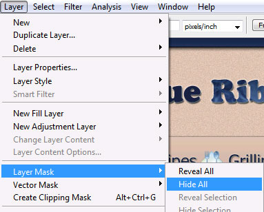
Then I rasterized the line layer and chose “Hide All” for the layer masks:
Once you hide the layer mask, you should see the line disappear from your layout and in your layer palate you’ll see a new layer mask thumbnail linked to your title bar:
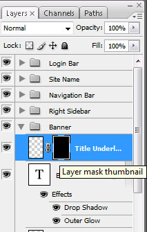
Make sure you click on the Layer mask thumbnail and then choose the gradient tool set to the default settings for black and white. Then drag your mouse across to apply a faded effect for the line:
This makes the line fade out nicely:
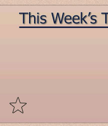
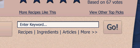
I continued to fill in more information using the type tool with color #0B1F44 and the Tahoma font. For the star ratings, I used the Polygon Tool set to create a five-point star with no fill and 1 pixel stroke:
I then duplicated this layer 4 times, giving me 5 stars all together and applied this gradient to each star:
For the caption on the photo, I added these layer styles to the text:
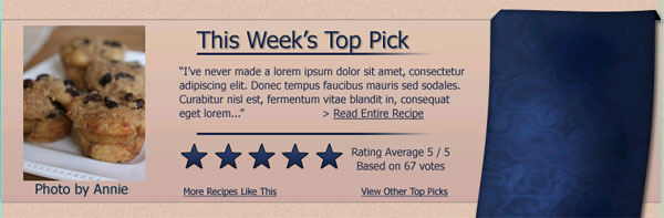
I also duplicated the line that we placed under the banner title and used it as a separator between the recipe teaser and the star ratings. Finally, here is how my completed banner area looks:
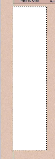
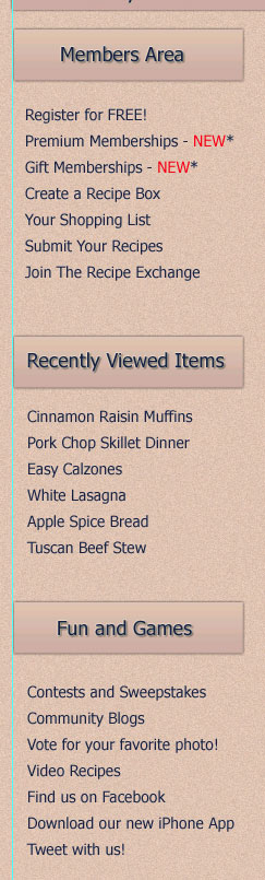
For the left sidebar, I used the Rectangular Marquee tool to select an area about the size of the ribbon (at least the ribbon’s width before we applied the wave):
I then filled in this selection with white. It’s not going to stay as this, but I wanted to use this as a guide for my block titles that go along the left side bar:
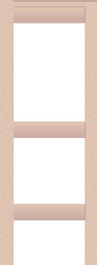
Next, I created these shapes along the left sidebar using the Rectangle Tool:

Finally, I copied the layer styles from the navigation bar and pasted those layer styles onto each of these shapes, leaving me with this look:
I then filled in the rest of my information along the left sidebar using the type tool set with Tahoma Font and color #0B1F44. I also applied these layer styles to my titles along the sidebar:

Once my text was laid out correctly, I was able to delete that white layer that I had used as a guide for spacing, leaving my left sidebar looking like this:
The main content area was done very similarly to the left sidebar, but I added the search area near the top so that my content titles could be slightly off-line:
I finished out the main content area using the same techniques as I used for the left side bar and using the same separators as I had used for the banner area between the search bar and the content:
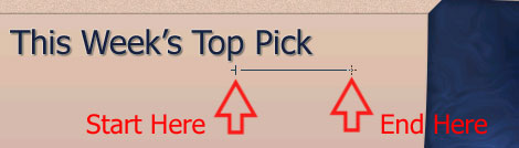
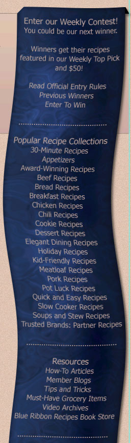
And now we can finally get back to filling out that ribbon. I used the Type Tool with color #CDADA2 to fill in the text along the length of the ribbon:
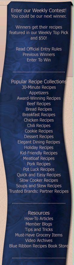
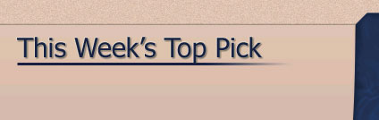
But of course, this looks really bad right now, right? Because the ribbon has that nice wave to it and the text doesn’t. So, we are going to select the layer with the text on it and apply the same wave as we did on the ribbon:
You may need to use the move tool on your text to make sure that the wave effect lines up nicely with the wave of the ribbon. Here is my result:
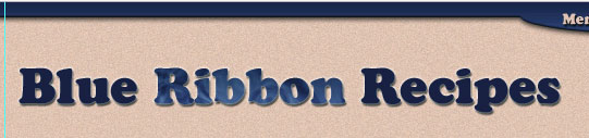
Last but not least, I used the Type Tool to add in the secondary links and copyright information along the bottom of the site. And here is the finished layout:

Your ads will be inserted here by
AdSense Now!.
Please go to the plugin admin page to paste your ad code.