Your ads will be inserted here by
AdSense Now!.
Please go to the plugin admin page to paste your ad code.
Hello everybody, welcome to a new tutorial from HV-Designs. In this tutorial Naomi will walk you through the steps to create tourism web layout.
Hello again! One of my favorite things to do is to find all the free tourist attractions, whether it be around my home or when I travel to other places. The hard part is finding tourist attractions that are free. But once you find them, the free tourist attractions are everywhere. New York City is one such place with hundreds of things to do to discover the history and majesty of the city for free and every time I go I find something else to do. One of my favorites is walking across the Brooklyn Bridge. So when I found this photograph of the Brooklyn Bridge at DeviantArt I absolutely had to design a site around it.
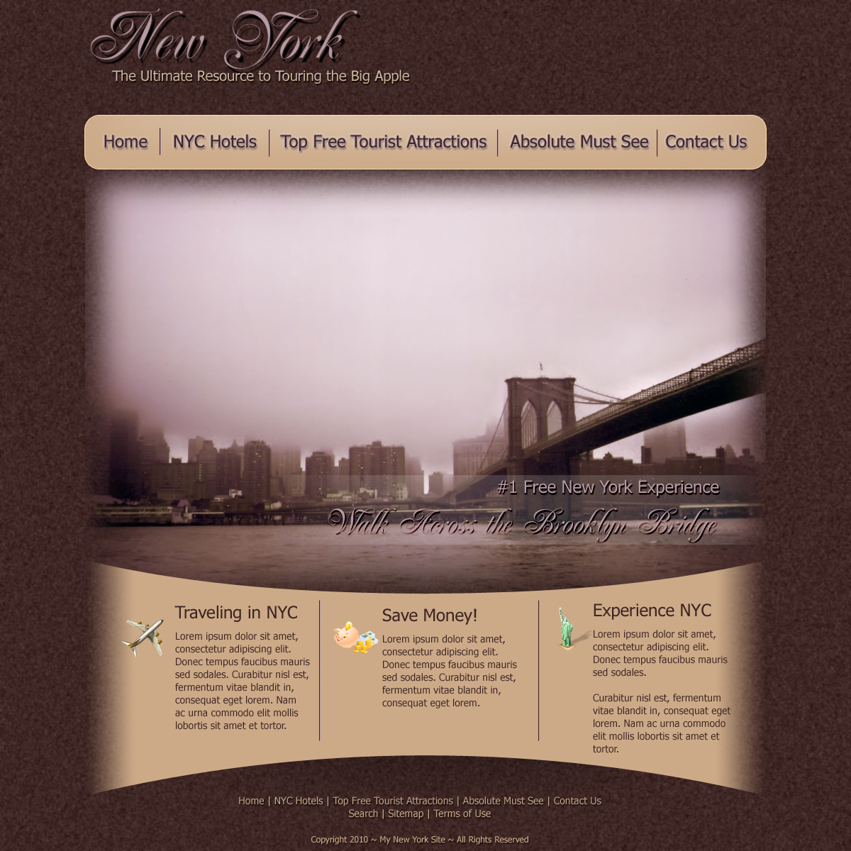
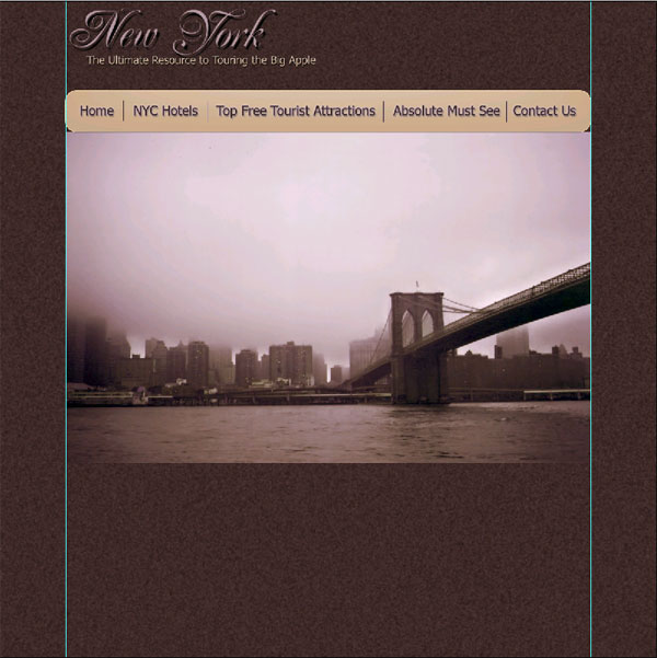
What We’ll Be Creating
Click image for full view.
Resources Used In This Tutorial
Lets Get Started
To start, I opened a new document:

Then, using color #3E2624, I filled in the background layer:

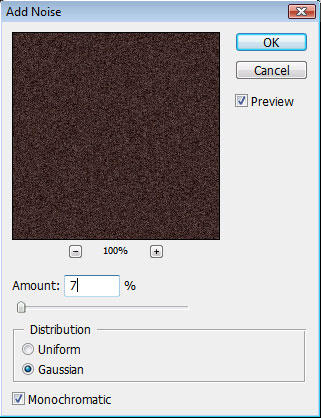
Once the background is filled in, I added some noise:
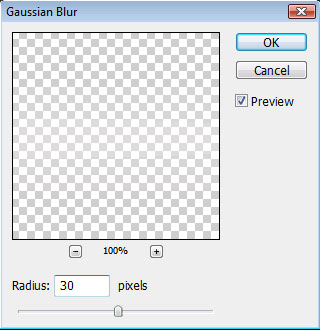
And then set a Guassian Blur:

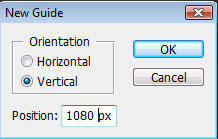
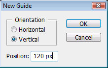
Then I set my guides:

Using these settings for my guides:
Right now, you should see something like this:
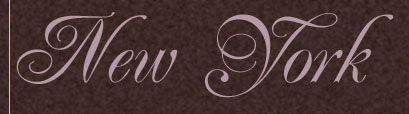
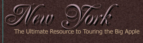
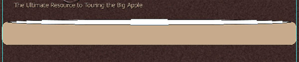
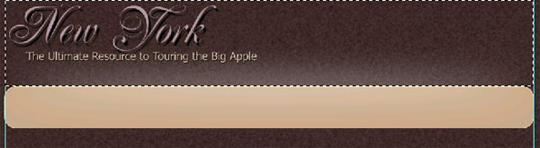
With the background complete, it’s time to add in the logo. To start, I used Renaissance Font, which you can download from the link shown at the beginning of this tutorial, with color #B59AA. Then I used the Type Tool to type in my site name:
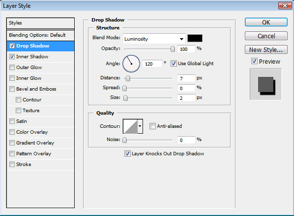
Then I applied these layer styles to the Logo:

Which gives me this look for the logo:
Next I used Tahoma Font with color #CCAA88 to type in the slogan:
And applied these layer styles to the slogan:

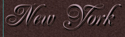
Here is my finished logo and slogan:
![]()
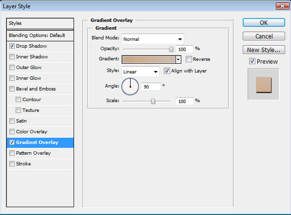
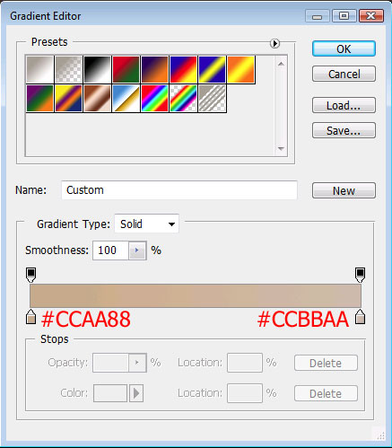
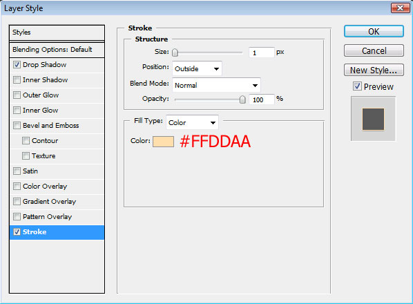
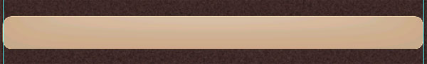
For the primary links area, I set my foreground to color #CCAA88. With the Rounded Rectangle Tool and a radius of 20 pixels, I created this shape:
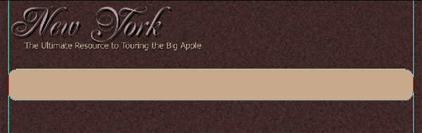
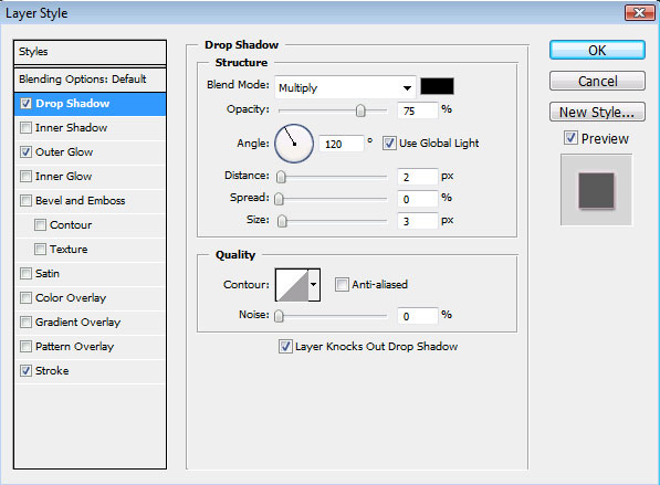
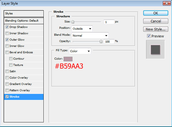
I then applied these layer styles to my navigation bar:

For some added shading that was a little more than just adding a gradient, I created a shape using the Ellipse tool:
And then applied a Guassian Blur:
Next, I used the Rectangular Marquee tool to make this selection:
And then I deleted the selection, leaving only the highlighter over the navigation bar – which now has a nice, smooth finish to it:
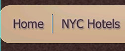
I filled in my links with Tahoma font and color #3E2624 and then applied these layer styles to my links:

For the separators between the links, First I used the line tool with color #3E2624 to create a line 1 pixel wide:
Then I duplicated that layer, and moved it slightly, adding a color overlay of color #B59AA3. Here is a close-up of the two lines:

Next, I went into my layer palate and selected both layers that make up the separator:
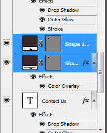
And then merged the two layers together by pressing CTRL E:
Your ads will be inserted here by
AdSense Now!.
Please go to the plugin admin page to paste your ad code.
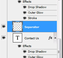
Finally, I duplicated the separator layer 3 times (giving me 4 separators all together) and moved the duplicates between the other links. Here is my finished navigation bar:

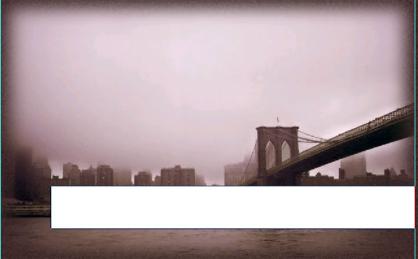
Now, the best part – adding in that beautiful picture of the Brooklyn Bridge. First, open the picture and resize it to fit within our space (960 pixels wide):

And then place the photo just below the navigation bar:
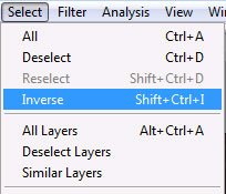
Next, I set my Rectangular Marquee Tool to a feather of 25 pixels and selected the photo:

And then I inverted my selection:
Once the selection inverted, I hit the delete button 3 times to achieve the faded affect around the edges of the photo:

For the caption over the photo, I used the Rectangle Tool to create this shape:
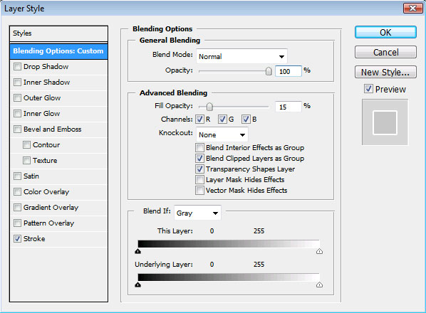
And then applied this blending option to this shape:
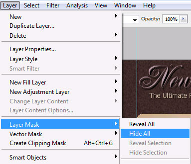
After the blending option is set, rasterize the layer and then hide the layer mask:
Once you hide the layers, you’ll see the shape disappear off your layout and you’ll see a black thumbnail in the layer palate next to the shape:

Make sure you click on this black thumbnail and then select the gradient tool with the default black and white settings. Then drag your mouse across where the shape is:

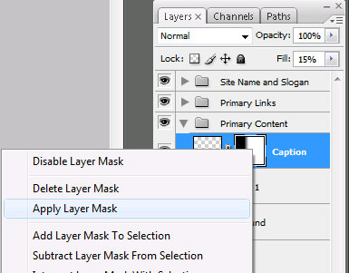
Then right click on the layer and apply the layer mask:
Then we start the whole process over again. Hide the layer mask, click on the black Layer Mask Thumbnail, use the gradient tool with the default black and white settings and drag the mouse to apply the fade:

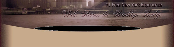
Then I used the Type Tool with color #B59AA3 and a blend of Renaissance and Tahoma fonts to fill in the caption. This drop shadow was applied to the caption text:
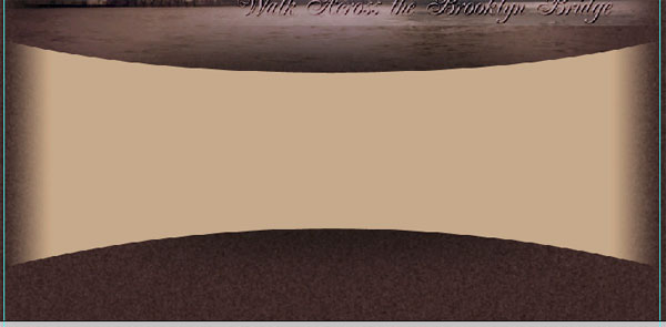
Here are the results of my layout so far:

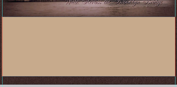
Now we’re ready to move onto the bottom area of the site. First, using color #CCAA88, I created this shape:
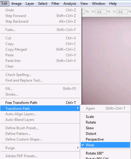
Next, I applied a warp by going to Edit > Transform Path > Warp:
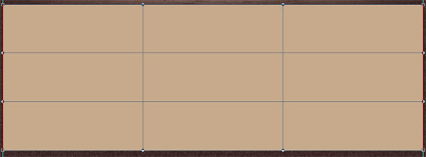
This sets up the shape so that you can see the different paths you can use to warp the shape:
Instead of warping the shape manually, I used the preset settings for Arc-Upper:
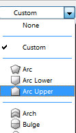
And set the bend to -15%:

Finally, I applied the warp and repeated the process using the Arc-Lower setting:
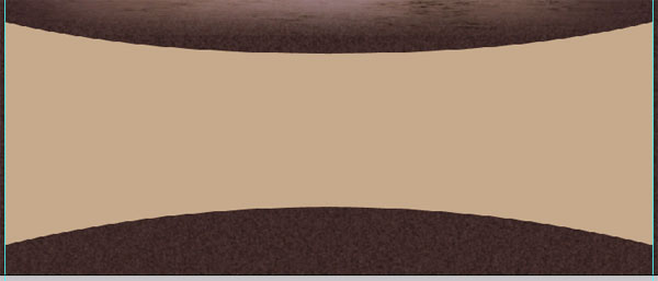
Using the same technique that we used for the caption, I rasterized the layer, applied a layer mask using the gradient tool, and created the fades on both sides of this shape:
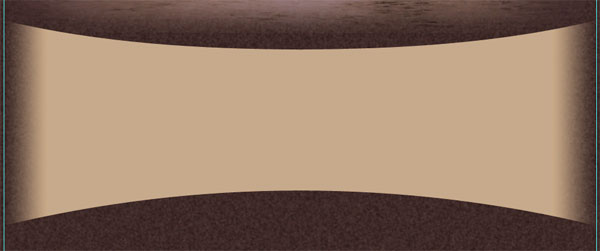
To create a bit of shadowing, I created a new layer underneath this shape and then used the Ellipse Tool to create this shape:
And then applied a Guassian Blue to the shape:
I then repeated this for the bottom of the shape, gaining this as my result:
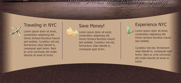
The icons that I used for the bottom were created by Icons Pedia. The typing was done using Tahoma Font with color #3E2624 and the separators were made exactly the same as the separators we did earlier in the navigation bar:
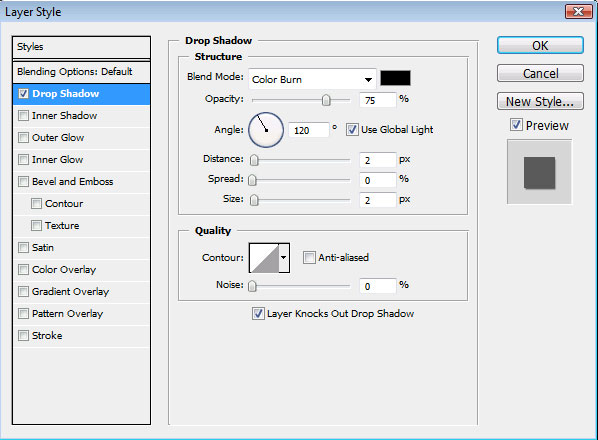
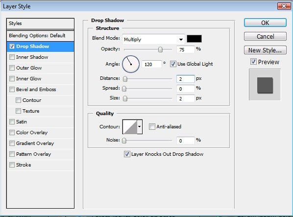
Finally, I used the Type Tool with color #CCAA88 to type in the secondary links and copyright notices. Then I applied this drop shadow to that text:
And voila! We are done. Here is how my completed layout looks:

That’s it all done, hope you enjoyed this tutorial, look out for more tutorials coming soon. Thanks.
Your ads will be inserted here by
AdSense Now!.
Please go to the plugin admin page to paste your ad code.