Your ads will be inserted here by
AdSense Now!.
Please go to the plugin admin page to paste your ad code.
Hello everybody, welcome to another tutorial by hv-designs. In today’s 3 part tutorial il be showing you how to create a personal vCard. In the second installment il be talking you through the process of coding it into a live working template.
What’s A vCard?
vCard is a file format standard for electronic business cards. vCards are often attached to e-mail messages, but can be exchanged in other ways, such as on the World Wide Web. They can contain name and address information, phone numbers, URLs, logos, photographs, and even audio clips. (Wiki Description)
The Final Layout
This is what the finished result will look like. (All 4 pages)

Lets Get Started
Create a new document 1200 x 1200 pixels, don’t worry if the canvas size is a bit big to start with as you can crop the layout later. Set your foreground color to #fdfefd and background color to #d6d6d6, now select the gradient tool with a radial gradient.

About 400 Pixels down from the top of the canvas start to drag the radial gradient. Drag the radial gradient in any direction. The look were trying to achieve is a simple round glow of light in the middle of our work area, just like the image below.

Creating The vCard Frame
Select the color white (#ffffff) for your foreground, then select the rounded rectangle tool from the tools menu.

Drag out a rectangle with a width of about 850 pixels, the more accurate you design your layout the less problems you will have regarding image sizes when it comes to coding. The height of the rectangle should reflect the amount content you are planning on putting inside.

Place the rectangle in the center of your canvas over the top of your gradient overlay, then add these layer styles.
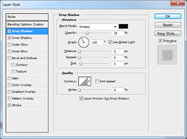


You should have something like this.

Creating The vCard Content Area
Load a selection around the vCard frame, you can do this by either selecting the layer then going to “Select > Load Selection” or by clicking the little thumbnail icon inside the layer’s palette whilst holding down the CTRL key on the keyboard.
Once you’ve loaded the selection go to “Select > Modify > Contract”, contract the selection by 10 pixels then press enter. Create a new layer above your vCard frame layer then fill the selection with any color.

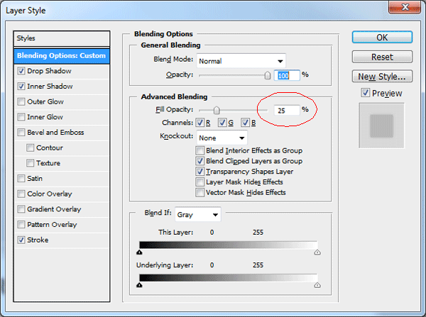
Label your new layer “Content” or something similar then add these layer styles.


You should have something like this.

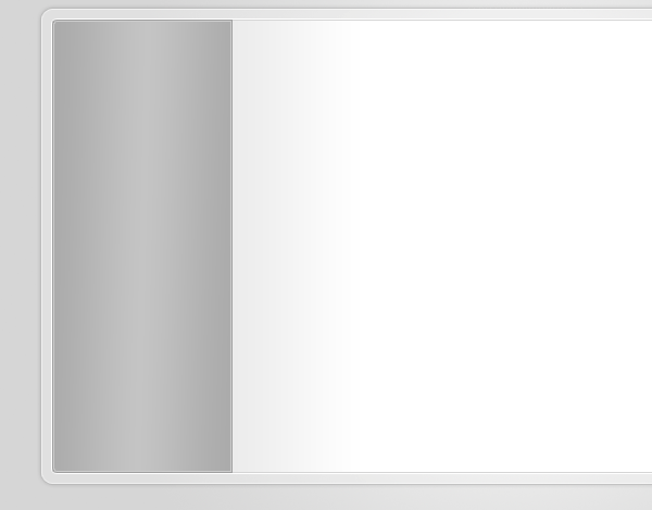
Creating The Navigation
Select the “Rectangular Marquee Tool” then make a selection around the left side of the content box and frame. Fill the selection with any color, label the layer “Navigation”.

Load a selection around your inner rectangle, (Content area) but keep the navigation layer selected in the layers palette. Were now going to inverse the selection by going to “Select > Inverse”, once inversed hit the delete key on the keyboard.
Now load a selection around the navigation rectangle then contract the selection by 1px. Once you’ve contracted the selection leave the selection active and inverse the selection then hit the delete key.

Your navigation should now be set for some layer styles, add the following layer styles to your navigation rectangle.
Your ads will be inserted here by
AdSense Now!.
Please go to the plugin admin page to paste your ad code.


You should now have something like this.
Adding The Navigation Elements
On the right side of the navigation, next to the stroke, add a 1 pixel white line. The line should span the height of the navigation.

Inside the navigation area add some spliffy icons to represent each section. I’m using some icons from WooThemes.

Label each icon using the following settings and layer styles.


In between each icon and label add a divider/separator. We make this by creating two 1 pixel lines on top of each other, one white and one black. Create the lines the width of the navigation then set the layer opacity to “Soft Light”.
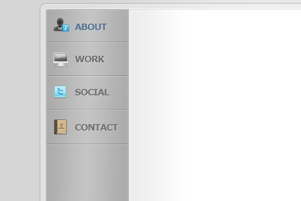
Were now going to make the navigation hover button, create a new layer underneath your blue text layer. Once you’ve created the new layer make a selection around your first button.
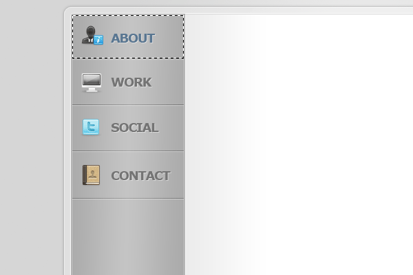
Fill the selection with any color then add these layer styles.


You should have something like this.

With the “Pen Tool” make a curved path over your navigation hover button. Once you’ve made the path fill it with the color white (#ffffff). Lower the opacity to suit, I’ve lowered mine down to 15%.

The Content
For the content area on the about page il be just using text, a couple of paragraphs about myself.

Creating The Layout Reflection
On my finished layout if you look at the bottom of the layout you will notice i have a reflection, we do this by selecting “The layout frame, Content box and Navigation” layers. Once you’ve selected the layers duplicate them then flip them vertically, move the layers down in the layers palette above the background layer.
Merge the duplicated layers into one single layer then add a 2 pixel guassian blur.

Add a layer mask to the reflection layer then drag a linear gradient from the bottom of the reflection to the top.

It might take a couple of attempts to get it too look decent, once you’ve finished you should have something like this.

Things Left To Do
Now that’s the first page out the way, now its your turn to create your own 3 additional pages to go with the layout. Don’t worry if you don’t manage to finish the layout as il be giving away the FREE PSD file before we start part two.
Thanks for reading.
The Final Layout
Learn To Code This Layout
You can learn how to code this layout by following this tutorial HERE.
Your ads will be inserted here by
AdSense Now!.
Please go to the plugin admin page to paste your ad code.