Hello welcome to the web design layout sitebuild tutorial, today i’ll be taking you through the process of converting it into a one page template.
You can download the template already coded by clicking the button above. You can also view a live version of the website by clicking here.
Getting Started
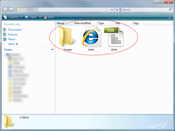
Before we even start diving into any HTML and CSS, lets create our files and its structure. On your desktop create a new folder and give it a name. Inside the folder create another folder called images. Also in the main folder create a blank HTML document called index.html and a blank CSS document called styles.css.
Mocking Up Our HTML
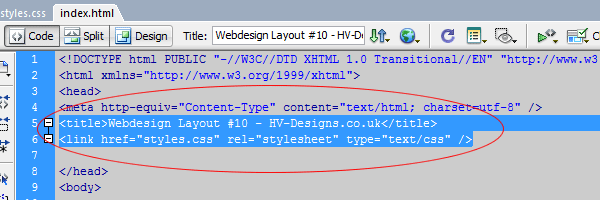
We’ll start by adding a few DIV tags into our HTML document, so go ahead and load up your HTML file in your favourite code editor. Set your website title within the “title tag” then link your style sheet using the usual method.
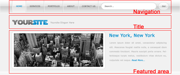
Inside the body area of our document create a DIV called “container”, everything for our website will be contained within this DIV.
<div id="container"><!--CONTAINER STARTS-->
</div><!--CONTAINER ENDS-->
Inside our DIV “container” add 3 more DIV’s “navigation”, “title” and “featured”.
<div id="container"><!--CONTAINER STARTS-->

<div id="navigation"><!--NAVIGATION STARTS-->
</div><!--NAVIGATION ENDS-->

<div id="title"><!--TITLE STARTS-->
</div><!--TITLE ENDS-->

<div id="featured"><!--FEATURED AREA STARTS-->
</div><!--FEATURED AREA ENDS-->

</div><!--CONTAINER ENDS-->
The DIV navigation will contain our navigation elements, the title DIV will contain our website title and the featured DIV will contain our featured area.
Slicing Our Background
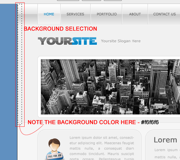
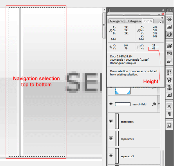
There arn’t any seperate images for the navigation and our featured area, infact the navigation and the featured area is just a snippet and repeated over and over again. Open up the layout PSD in photoshop, using the rectangular marquee tool make an all in one selection covering the navigation bar and the featured area. Also note down the color code for the background using the eye dropper tool.
Once you’ve made the selection go to “edit > copy merged”, then go to “file > new”. Once the new document dialog opens the selections dimensions you just copy merged should be automatically input into the width and height areas.
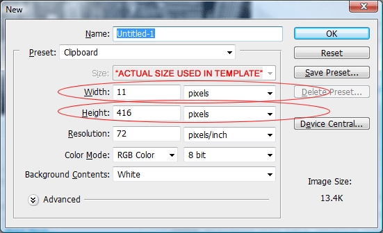
The dimensions in the image above are the actual sizes used for the template image. Finally save the image as “bg.PNG” inside your images folder.
Adding Some CSS
Now we have a few DIV’s setup and our background image ready to rock ‘n’ roll we can begin to add some CSS. Open up your CSS style sheet in your favourite code editor, inside the style sheet were going to add a simple reset, our body tag and then our DIV tags. The code looks like this.
* {
	margin: 0px;
	padding: 0px;
}

body {
	background-color: #f6f6f6;
	background-image: url(images/bg.gif);
	background-repeat: repeat-x;
	font-family: Verdana, Arial, Helvetica, sans-serif;
}

#container {
	margin: auto;
	width: 850px;
}

#navigation {
	float: left;
	height: 68px;
	width: 850px;
}

#title {
}

#featured {
	float: left;
	height: 223px;
	width: 850px;
}
Lets look at the styles in abit more detail. Our first style displayed by an asterix (*) is our simple CSS reset. There are many methods to apply a CSS reset, but for the sake of the beginners, i’ve chosen to use this following method. The reset just resets all padding and margins to 0.
The next style is our body tag, on this tag we set our website background image (bg.PNG), background color and font family. Make sure the background is repeated along the X-axis (horizontally).
We then have our container style, this ones real simple, the container need to have a auto margin, this will center our website, the container also has a width of 850 pixels this will be the width of website.
Our navigation DIV is floated left inside our container, it has a fixed width the same as our container and has a fixed height of 68px. The height was measured in photoshop.
The title DIV style has been left empty for now as we need to slice up our image.
Finally we have our featured DIV, the same as our navigation it has a fixed width and height which was also measure in photoshop (down to the last pixel) again we also float the DIV left.
Slicing Up Our Title
For the website title make a selection 347 x 105 pixels using the rectangular marquee tool.
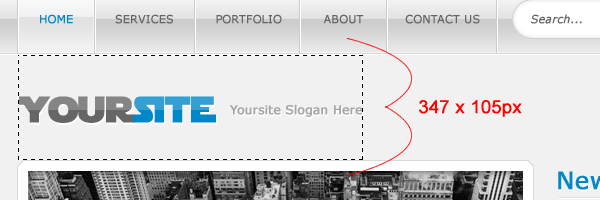
Save the website title and slogan on a transparent background, save the file as “title.PNG”.
Adding The Title Styles
The styles for our title DIV are as follows.
#title {
	float: left;
	height: 105px;
	width: 850px;
	background-image: url(images/title.png);
	background-repeat: no-repeat;
	background-position: left top;
}
We float the DIV left and give it a fixed height (same dimesion as our title.PNG image). We also give the DIV a fixed width but its not going to be the same as our title.PNG image, instead it will be 850px same as our container. We’ll then add our image as a background, set it to no repeat and position it in the top left corner.
Adding Our Navigation
Now we have some basic foundations we can start adding in some of our elements starting with the navigation. The navigation is the same as any other, we present it in list form.
<div id="navigation"><!--NAVIGATION STARTS-->
<ul>
<li><a href="#">home</a></li>
<li><a href="#">services</a></li>
<li><a href="#">portfolio</a></li>
<li><a href="#">about</a></li>
<li><a href="#">contact us</a></li>
</ul>
</div><!--NAVIGATION ENDS-->
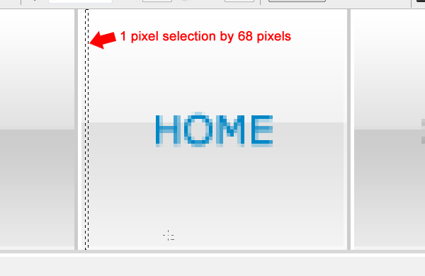
There are of course two more slices we need to make to get the navigation working as intended. The first slice will be one of those little seperators (2 pixels by 68 pixels). The second slice will be the hover state on the home button, the selection on the hover state should be 1 pixel wide by the height of the navigation, we can then repeat the background in CSS.
Navigation CSS
The navigation CSS looks like this,
#navigation li {
	display: block;
	list-style-type: none;
	float: left;
	background-image: url(images/nav_seperator.gif);
	background-repeat: no-repeat;
	background-position: left;
}

#navigation li a {
	color: #666666;
	font-weight: bold;
	width: 108px;
	height: 42px;
	text-align: center;
	text-transform: uppercase;
	font-size: 12px;
	padding-top: 26px;
	float: left;
	text-decoration: none;
	margin-left: 2px;
}

#navigation li a:hover {
	background-image: url(images/nav_hover.gif);
	background-repeat: repeat-x;
	color: #0087c7;
	margin-left: 2px;
}
On each LI element we add our navigation seperator image with a background position of left. The list style type should be set to none this will remove the bullet points.
On the list links (a) we style everything to do with our text, we also need to add some sort of padidng to push the text down into the middle. We’ve added a fixed width and height, the width has gone by the longest word, again measured in photoshop. The height matches the navigation bar height just remember to take the padding into account as this also makes up the height.
Our hover style is pretty simple we just add our hover image as background repeating along the X-axis. The left margin of 2 px pushes the background image away from our navigation dividers. This in turn makes the hover image load directly between them instead of covering them up.
The Search Box
The search bar ive decided to include inside the LI of the navigation. The search itself will be made up of 2 DIV’s, the left rounded side and the right rounded side.
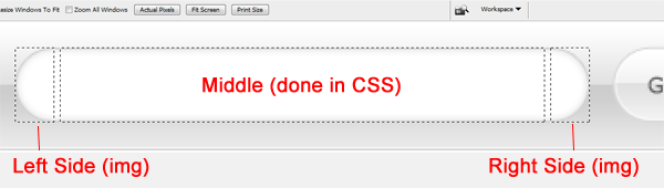
When i coded the layout to make things easier i removed the inner shadow within photoshop. Make your selection around the ends of the search form, each end should 21 x 40 pixels. The navigation code looks like this.
<div id="navigation"><!--NAVIGATION STARTS-->
<ul>
<li><a href="#">home</a></li>
<li><a href="#">services</a></li>
<li><a href="#">portfolio</a></li>
<li><a href="#">about</a></li>
<li><a href="#">contact us</a></li>

<li>
<form action="" class="form" method="get">

<div id="search-left">
</div>

<input type="text" class="search-field" value="Search" size="25" />

<div id="search-right">
</div>

<input name="submit" type="image" src="images/search_btn.png" class="search-btn" value="Go!" />

</form>
</li>

</ul>
</div><!--NAVIGATION ENDS-->
So in our last LI tag we have a simple form with a class of “form”, we then have an empty DIV of search-left which will be our left search bar image. We then have our actual search field with class of “search-field”, underneath that we have our last DIV “search-right”, this will be our right search field image. Then finally we have our actual search button which you’ll also need to turn into a single image. The search button also has its own class assigned called “search-btn”. We can now style each element by using the following styles.
.form {
	float: left;
	padding-left: 20px;
	height: 54px;
	padding-top: 14px;
}

#search-left {
	background-image: url(images/search_field_left.png);
	background-repeat: no-repeat;
	float: left;
	height: 40px;
	width: 21px;
}

#search-right {
	background-image: url(images/search_field_right.png);
	background-repeat: no-repeat;
	float: left;
	height: 40px;
	width: 21px;
}

.search-field {
	float: left;
	background-color: #FFFFFF;
	border-top-width: 1px;
	border-bottom-width: 1px;
	border-top-style: solid;
	border-bottom-style: solid;
	border-top-color: #d1d1d1;
	border-bottom-color: #d1d1d1;
	padding-top: 11px;
	padding-bottom: 11px;

}

.search-btn {
	float: left;
}
Lets break each style down,
“.form” – Is the class we assigned to our form element or form container, we need to float this left to align it in the navigation. It has a fixed height of 68 pixels same as our navigation, remember the top padding also makes up the height. The left padding pushes the search form away from our last navigation button.
“#search-left & #search-right” – These are our two DIV’s which contain our search end images which we sliced in photoshop, they both have a fixed width and height which matches the dimensions of the images. These elements are also floated left.
“.search-field” – The search field class is style to replicate the photoshop version of the form, we add a 1pixel top and bottom solid border in the same color as our stroke. We must also set the background color to white and add sufficient padding.
Mocking Up Our Featured Area
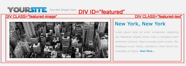
Our featured contain’s two classes within our featured DIV.
The code looks like this.
<div id="featured"><!--FEATURED AREA STARTS-->

<div class="featured-image"><!--FEATURED IMAGE STARTS-->
<img src="images/featured_image.png" alt="Featured Image" />
</div><!--FEATURED IMAGE ENDS-->

<div class="featured-text"><!--FEATURED TEXT STARTS-->

<h2></h2>
<p></p>

</div><!--FEATURED TEXT ENDS-->

</div><!--FEATURED AREA ENDS-->
The class featured image contains our image within the featured area (without the white background/border). The class “featured-text” contains our title (H2) and a simple paragraph (P).
Featured Area CSS
Our CSS for the featured area looks like this.
.featured-image {
	float: left;
	height: 206px;
	width: 517px;
}

.featured-image img {
	background-color: #FFFFFF;
	border: 1px solid #d9d9d9;
	padding: 10px;
}

.featured-text {
	float: right;
	width: 323px;
	height: 206px;
}

.featured-text p {
	margin-top: 10px;
}
Our feature image class has a fixed width and height which matches the dimensions of our image. Beware though as ther style underneath “.featured-image img” is also linked the featured-image class. You have to take into account when dealing with the fixed width and height that there is also 10px padding all the way around and image which increases the dimensions.
Slicing Our Content Boxes
Before we mockup our left and right content boxes we must slice our images, each box will contain 3 elements “top”, “middle” and “bottom”.
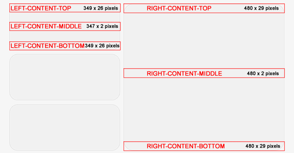
When slicing the the right content box you may need to make it smaller as our website is 850 pixels wide where as the PSD is 1000 pixels wide. The actual sizes are listed on the image above.
Mocking Up Our Content Boxes
As mentioned above each box will have 3 elements top, middle and bottom. The top and bottom will be empty DIV’s but will contain our images top and bottom content box images. The middle will contain our content and our content box background image.
<div id="left-content"><!--LEFT CONTENT STARTS-->

<!-----------BOX 1 STARTS----------->

<div class="left-top"><!--LEFT CONTENT BOX TOP-->
</div><!--LEFT CONTENT BOX TOP ENDS-->

<div class="left-middle"><!--LEFT CONTENT BOX MIDDLE-->
</div><!--LEFT CONTENT BOX MIDDLE ENDS-->

<div class="left-bottom"><!--LEFT CONTENT BOX BOTTOM-->
</div><!--LEFT CONTENT BOX BOTTOM ENDS-->

<!-----------BOX 1 ENDS----------->

</div><!--LEFT CONTENT ENDS-->
The CSS looks like this.
#left-content {
	float: left;
	width: 349px;
	margin-top: 20px;
}

.left-top {
	background-image: url(images/left_content_top.png);
	background-repeat: no-repeat;
	float: left;
	height: 26px;
	width: 349px;
}

.left-middle {
	background-image: url(images/left_content_middle.png);
	background-repeat: repeat-y;
	float: left;
	width: 307px;
	border-right-width: 1px;
	border-left-width: 1px;
	border-right-style: solid;
	border-left-style: solid;
	border-right-color: #d1d1d1;
	border-left-color: #d1d1d1;
	padding-right: 20px;
	padding-left: 20px;
}

.left-bottom {
	background-image: url(images/left_content_bottom.png);
	background-repeat: no-repeat;
	float: left;
	height: 26px;
	width: 349px;
	margin-bottom: 10px;
}
Again everything has its own fixed width and height. The top and bottom classes fixed width and height are the same dimensions as our top and bottom images. The middle class is slightly different, when i sliced the middle image i didnt included the dark grey border, i decided to add it in using CSS.
Adding More Left Boxes
In the HTML code of the first left content box you should of noticed i put a big comment saying where the content box starts and ends. You just need to duplicate it whith the left content DIV. So 3 boxes would look like this.
<div id="left-content"><!--LEFT CONTENT STARTS-->

<!-----------BOX 1 STARTS----------->

<div class="left-top"><!--LEFT CONTENT BOX TOP-->
</div><!--LEFT CONTENT BOX TOP ENDS-->

<div class="left-middle"><!--LEFT CONTENT BOX MIDDLE-->
</div><!--LEFT CONTENT BOX MIDDLE ENDS-->

<div class="left-bottom"><!--LEFT CONTENT BOX BOTTOM-->
</div><!--LEFT CONTENT BOX BOTTOM ENDS-->

<!-----------BOX 1 ENDS----------->

<!-----------BOX 2 STARTS----------->

<div class="left-top"><!--LEFT CONTENT BOX TOP-->
</div><!--LEFT CONTENT BOX TOP ENDS-->

<div class="left-middle"><!--LEFT CONTENT BOX MIDDLE-->
</div><!--LEFT CONTENT BOX MIDDLE ENDS-->

<div class="left-bottom"><!--LEFT CONTENT BOX BOTTOM-->
</div><!--LEFT CONTENT BOX BOTTOM ENDS-->

<!-----------BOX 2 ENDS----------->

<!-----------BOX 3 STARTS----------->

<div class="left-top"><!--LEFT CONTENT BOX TOP-->
</div><!--LEFT CONTENT BOX TOP ENDS-->

<div class="left-middle"><!--LEFT CONTENT BOX MIDDLE-->
</div><!--LEFT CONTENT BOX MIDDLE ENDS-->

<div class="left-bottom"><!--LEFT CONTENT BOX BOTTOM-->
</div><!--LEFT CONTENT BOX BOTTOM ENDS-->

<!-----------BOX 3 ENDS----------->

</div><!--LEFT CONTENT ENDS-->
Right Content Box
The right content box is mocked up and coded the same way.
<div id="right-content"><!--RIGHT CONTENT STARTS-->

<div class="right-top"><!--RIGHT CONTENT BOX TOP-->
</div><!--RIGHT CONTENT BOX TOP ENDS-->

<div class="right-middle"><!--RIGHT CONTENT BOX MIDDLE-->
<h3></h3>
<p></p>
</div><!--RIGHT CONTENT BOX MIDDLE ENDS-->

<div class="right-bottom"><!--RIGHT CONTENT BOX BOTTOM-->
</div><!--RIGHT CONTENT BOX BOTTOM ENDS-->

</div><!--RIGHT CONTENT ENDS-->
We wrap the whole block in a DIV called right-content. Inside this DIV we then add our 3 elements which make up our content box “top”, “middle” and “bottom”. All our content is adding inside the middle DIV. The CSS looks like this.
#right-content {
	float: right;
	width: 480px;
	margin-top: 20px;
}

.right-top {
	float: left;
	height: 29px;
	width: 480px;
	background-image: url(images/right_content_top.png);
	background-repeat: no-repeat;
}

.right-middle {
	background-image: url(images/right_content_middle.png);
	background-repeat: repeat-y;
	border-right-width: 1px;
	border-left-width: 1px;
	border-right-style: solid;
	border-left-style: solid;
	border-right-color: #d1d1d1;
	border-left-color: #d1d1d1;
	float: left;
	width: 438px;
	padding-right: 20px;
	padding-left: 20px;
}

.right-middle h3 {
	margin-bottom: 10px;
}

.right-bottom {
	float: left;
	height: 29px;
	width: 480px;
	background-image: url(images/right_content_bottom.png);
	background-repeat: no-repeat;
}
The Footer
For the footer i’m going to use the whole image instead of slicing the corners and having 3 parts. The layout isn’t really that graphics intensive, most of the graphics are small snipets which are repeated.
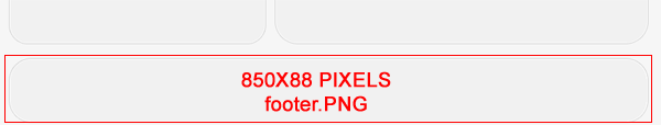
The footer code is pretty simple its just a single DIV inside the container at the bottom of your website. The code looks like this.
<div id="footer"><!--FOOTER STARTS--> <p>Copyright © yoursite.com | All Rights Reserved - Design By Richard Carpenter</p> </div><!--FOOTER ENDS--> </div><!--CONTAINER ENDS-->
The CSS looks like this.
#footer {
	background-image: url(images/footer.png);
	background-repeat: no-repeat;
	float: left;
	height: 88px;
	width: 850px;
	margin-top: 20px;
}

#footer p {
	color: #666666;
	text-align: center;
	padding-top: 35px;
}
Thats it all done.
Download CSS Template
Dont Forget…
You can download the CSS template for free, have a play around with it, your free to edit as you want.