


October 4th, 2007 in Photoshop Tutorials by Richard Carpenter
Portfolio Web Layout #2 Tutorial

 4 Votes, Rating: 4.25
Create a new document “850×650″ pixels color the background with a gradient. ive uses #181818 and #5c5c5c. Drag the gradient from the top left corner to the bottom right corner.

Find a suitable narrow picture to fit the right hand side. Scale and crop if you have to.

Now under your picture, to keep the line going down create a rectange underneath using the “rectangular maquee tool”. Fill with the colour #181818, ive also added a small reflection, by duplicating the picture, flipping it vertically and adding a mask. If you dont no how to do reflections go HERE. Merge all the layers APART FROM THE BACKGROUND LAYER and add a 2 pixel stroke using the colour #595959. You should have something like this.

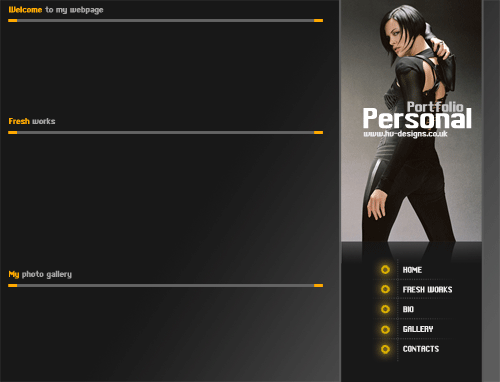
Lets add our title, select the type tool and type your site name, address and logo if needs be. See image below.

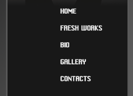
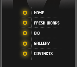
Lets also add out site section in a list below.
Now lets create some nice little cirlces to go by the side our menu. Select the “elliptical marquee tool” and draw out a circle, fill with an orange color, while it is still select goto “select > modify > contract” contract by about 4 pixels then hit the delete key. you should be left with this.
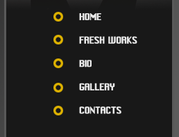
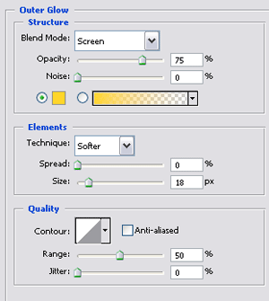
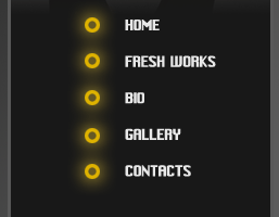
Still a little boring so add this layer style.
Your menu now should be like this.
Still needs something eles. Select the type tool and just type out a row of dots using the full stop button (……………….) duplicate many times and rotate them and place like so. Ive also added a slight layer mask to make it blend in more.
Now select the “rectangular marquee tool” and draw out 3 lines Colour the big one #606060 and the 2 little lines colour #ffa800.

Join them together, merge the layers and place like so, these will act as our dividers.
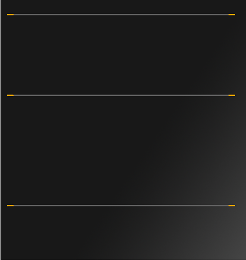
Add some menus above your dividers.
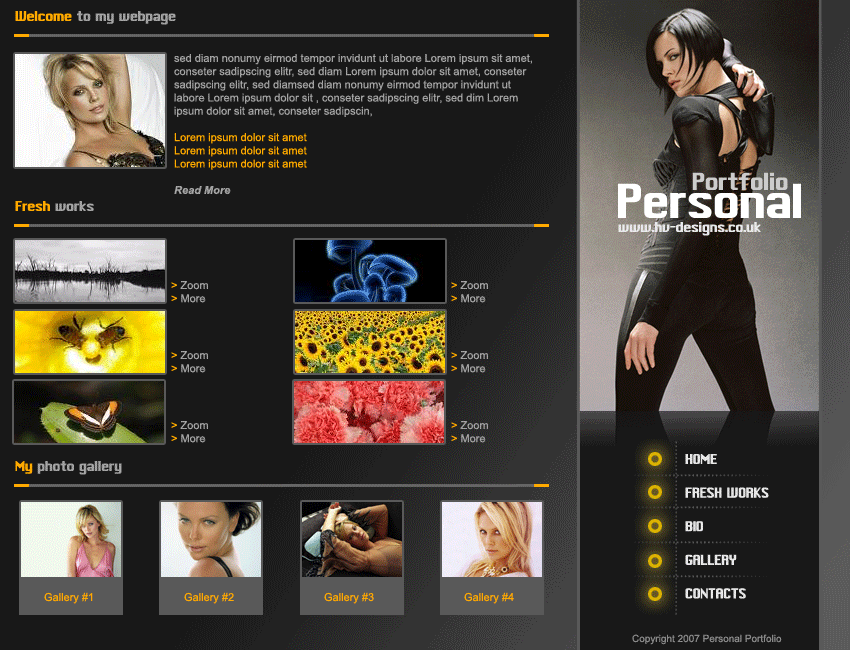
Thats it all done, and with some content it shall looks as stunning as the image below.

Be Part Of The Community!
Become part of the hv-designs community.
Subscribe Via RSS or Follow Us On Twitter.


7 Responses to “Portfolio Web Layout #2 Tutorial”